Advertising
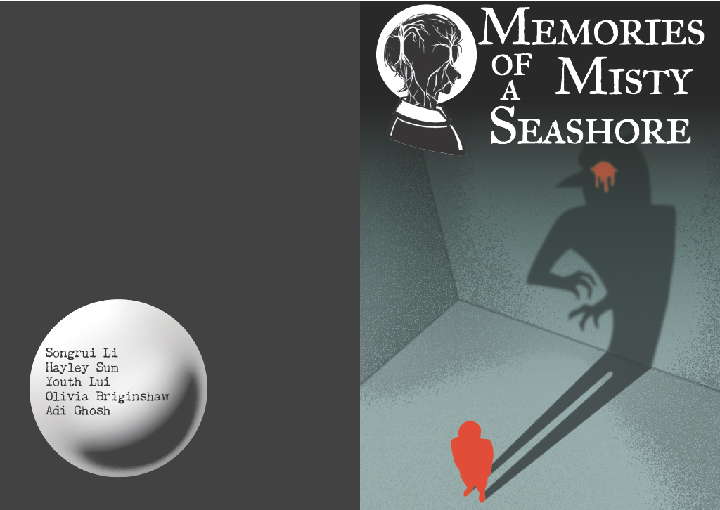
We decided that we should create a poster and handbook in order to advertise our game in preparation for the the Year 2 Games Showcase, which would be our final playtest. We decided that this should be my job since I wouldn’t have much more to contribute in the week before the Showcase as all of the environments had been completed. It was important that we advertise our game, as we want a plethora of information from our playtest to ensure that our build is the best we can make it in the week before our deadline. Using the logo for our game that Youth made based on Hayley’s character artwork, I created the poster below using Adobe Illustrator:
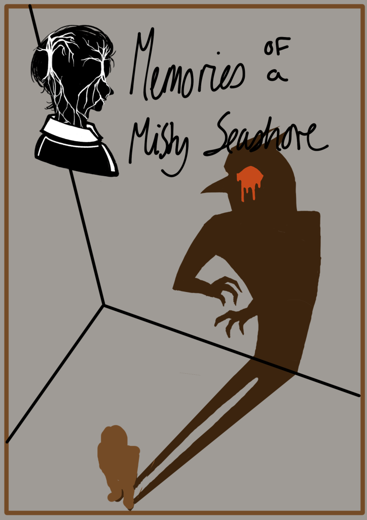
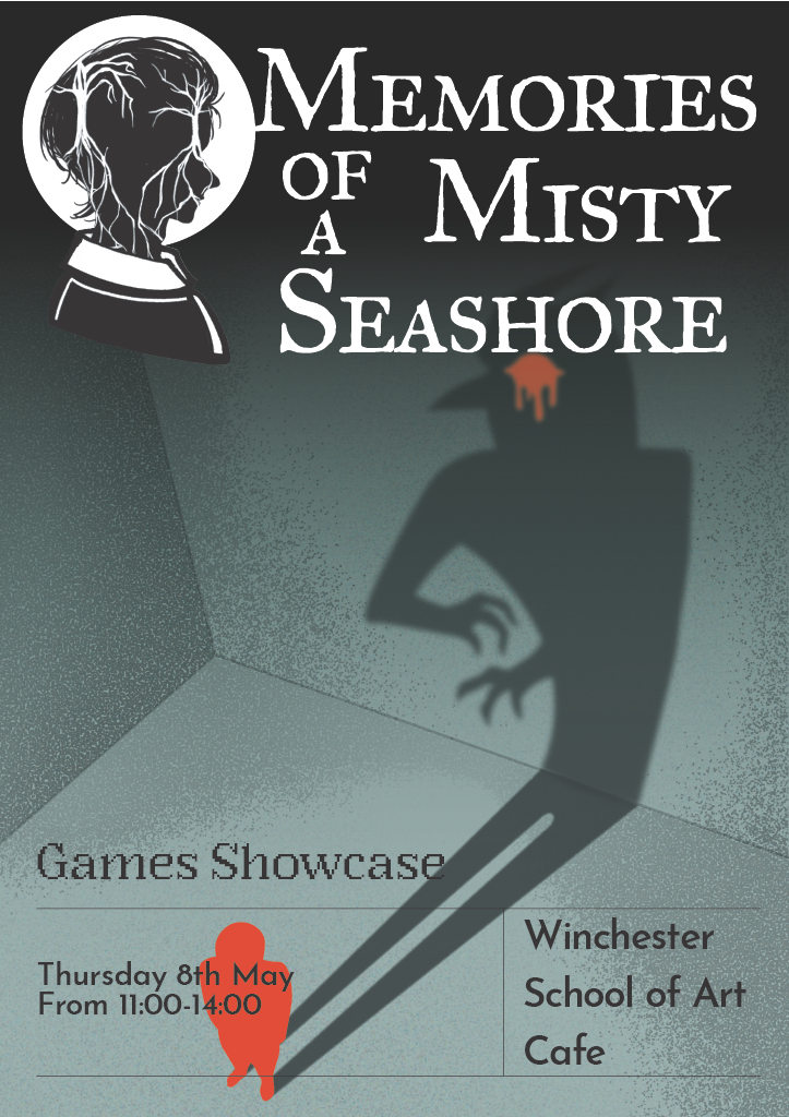
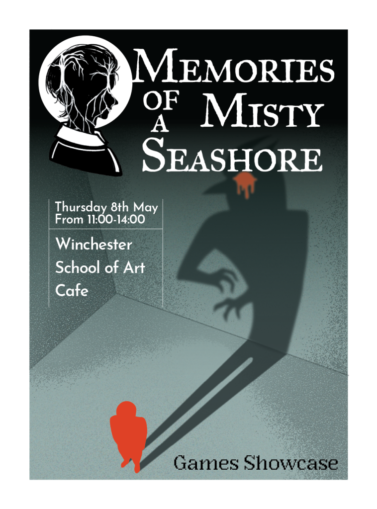
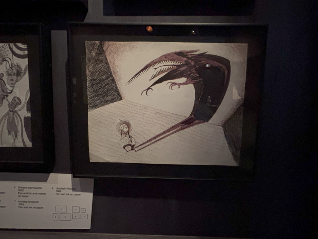
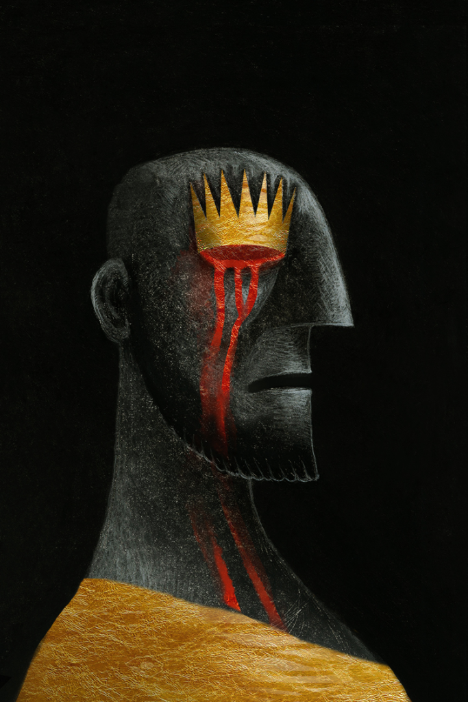
This poster design was heavily inspired by Tim Burton, specifically this piece that Burton made for Vincent (1982). I liked this piece, since it had an interesting use of perspective that emphasises the horror, the shadow distorting the further from him, the further from humanity it is, the more monstrous it becomes. The shadow is a part of him yet seems to pop off the wall as if it is it’s own entity, becoming a threat. In mine, this creature is representative of the looming motives for murder, envy, threatening to consume Rose.
The bleeding is also a reference to Oedipus, as he gouges his eyes out once he realises that he has both killed his father and married his mother. This represents the inner regret, as well as continuing the motif of Oedipus in the narrative that was highlighted through the paintings of Oedipus in the Corridor and Rose’s room.
I made the figure red in the poster to bring the attention to the killer, only a silhouette as this is the main mystery of the game.
I created two versions of the poster, one covering the red figure with text and the other with the text to the side. I wasn’t sure which one I preferred, so my teammates voted and we ended up going with the one with black text. This was because we thought that the positioning of the text helped draw the viewers attention to the red figure, and I also felt that the empty space it left gave the poster a lop-sided framing created a feeling of unease due to the unconscious idea of stability being disrupted, as well as accentuated the figures that are there.
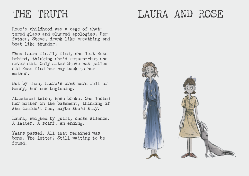
I also created a booklets for people that did play the game, reusing the design for the poster and including a passage written by Youth and Suri, ‘The Truth’, which explains the truth that you discover at the end of the game. On the second page, we put some artwork of Rose and Laura together that Youth made, as the player doesn’t get to see these characters outside of the Animation that Hayley made at the end of the game. We felt that these booklets would make for a nice memento of the game and make the player think of the game and its story outside of playing the game.