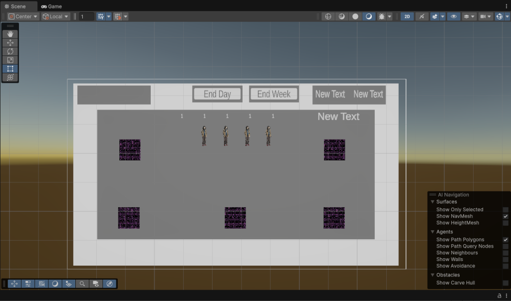
Joe had already set up a Testing scene in the project with greyboxes (below). The idea of the process I had was to replace the greyboxes/placeholder sprites with the assets I imported into the asset folder.
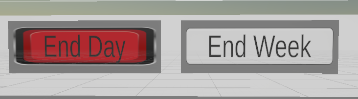
I sliced the sprites and tried to add the button sprite to the End Day button. This did not work as expected and I was getting a lot of stretching and distortion that wasn’t supposed to be happening. I tried resizing my assets back in Illustrator to a more standard resolution, but that didn’t seem to be the problem.
First Independent Attempt
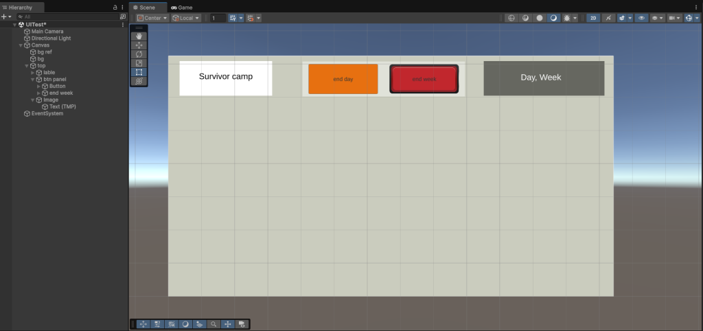
While this did work to an extent, it was not at all the correct way to implement UI. I essentially set the background image to the mockup image and moved the scene objects around it to seem integrated. Before I did anything further, I waited to meet with Sophie in week 8 to get a rundown of the Unity UI basics.
Unity UI Basics with Sophie
First of all, huge thank you to her because this short 1-1 was super helpful and it turned out not to be the three headed beast I was expecting. She talked me through the steps in an empty scene as we reconstructed my mockup of the UI using the UI Unity Package.
With her guidance I started from the top, working left to right, making sure everything was anchored properly to avoid scaling issues. In this practice section I got to experiment with images, panels and buttons, which is about everything I would need really. The most interesting thing was looking at layout groups and how it handles arranging UI elements.
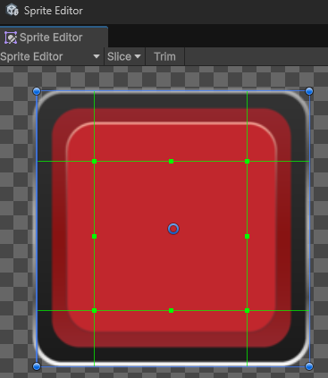
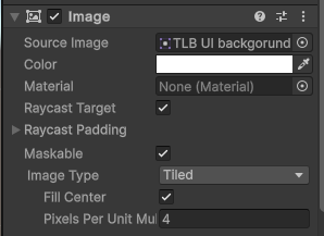
She also showed me how to properly fix the earlier issue with the button sprite looking weird – I needed to:
1. Slice and set the correct borders to the sprite in the sprite editor.
2. Change the image type to tiled and set the correct pixels per unit multiplier in the inspector.
Doing it on my own
I restarted the in the scene Joe had used as a test space, if everything works out we would move it into the scene used for playtest 2.
Before I started, I went back to Illustrator and made sure I had the components I may need to use.
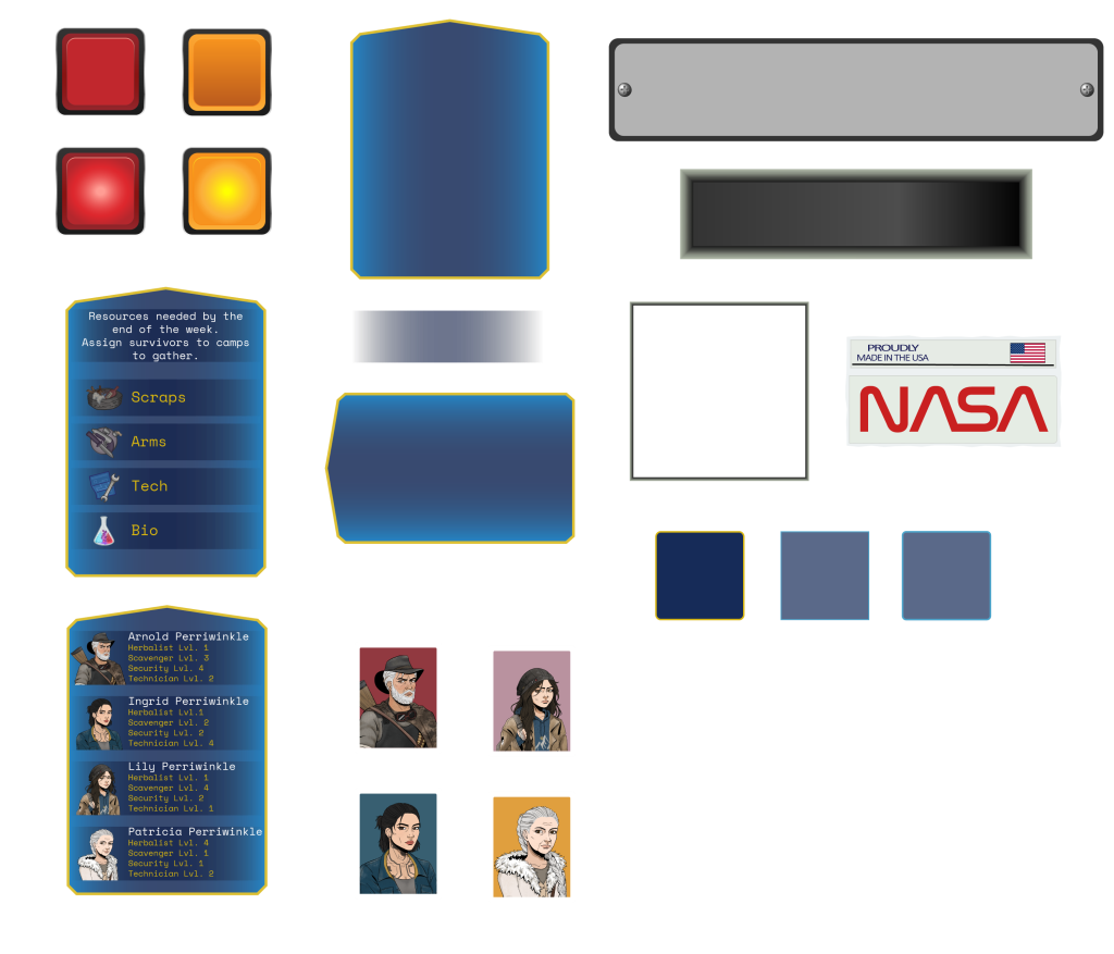
Following the same process I did with Sophie, I started by setting up the background with the right colour, then creating the necessary elements and anchoring them in the right areas of the screen. It was a lot of fiddling about to understand the elements already on the scene.
Pressing Button Opens Panel
For both the weekly tasks and the character profiles buttons the idea is that pressing on them would open a new panel with information that could be closed by clicking again. First I played around with the dropdown feature but it wasn’t quite what I wanted so I watched a tutorial, which involved minimal scripting. I also colour coded the placeholder camp sprites to make it more obvious what was what, at this point Rosie had also sent in the asset for the scavenger camp.
Problems
| Problem | Fix |
|---|---|
| Game would not advance past day 3 – button did not work. | – I accidentally deleted the pre-existing fail panel in the hierarchy – I brought back the fail panel from an old scene – Realised I needed to insert the fail panel and its button in the game manager – Fixed |
| Impossible to complete the weekly task and finish the week. | – After importing the new sprites for the character cards I hadn’t put the chars in the right order so char bonuses were assigned to the wrong char – Reassigned the correct ID number for each char to the corresponding camp in the controller – Fixed |
| Vertical Layout Group component doesn’t work as expected: sprites become large empty red crosses | No fix found* Will need to ask around |
Leave a Reply to Week 8 Reflection – Anna Bonadio ✧ Game Designer Cancel reply