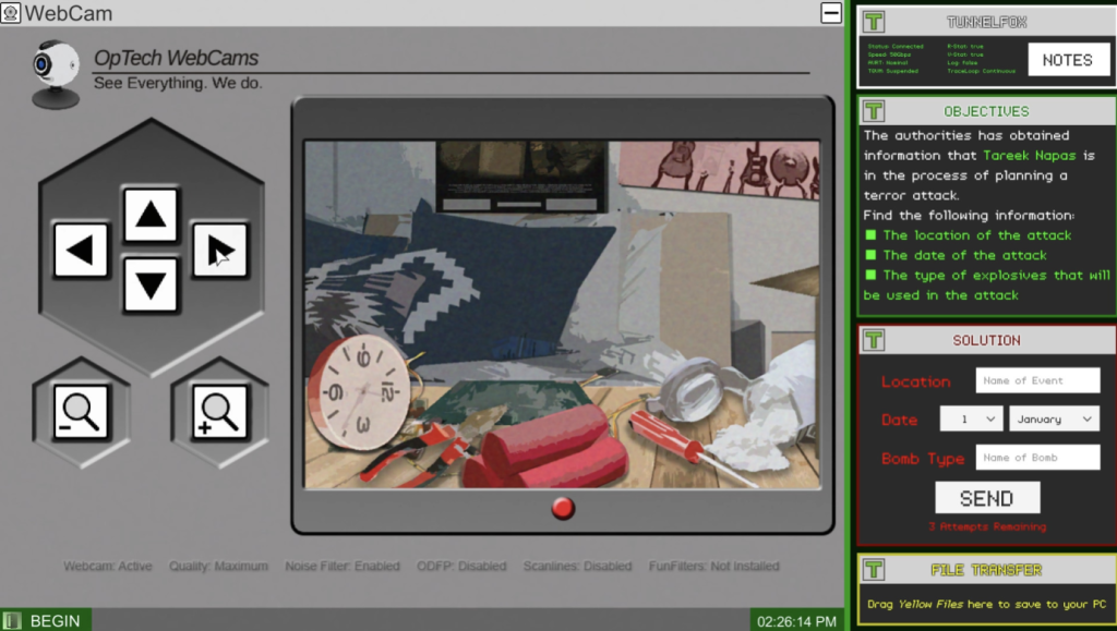
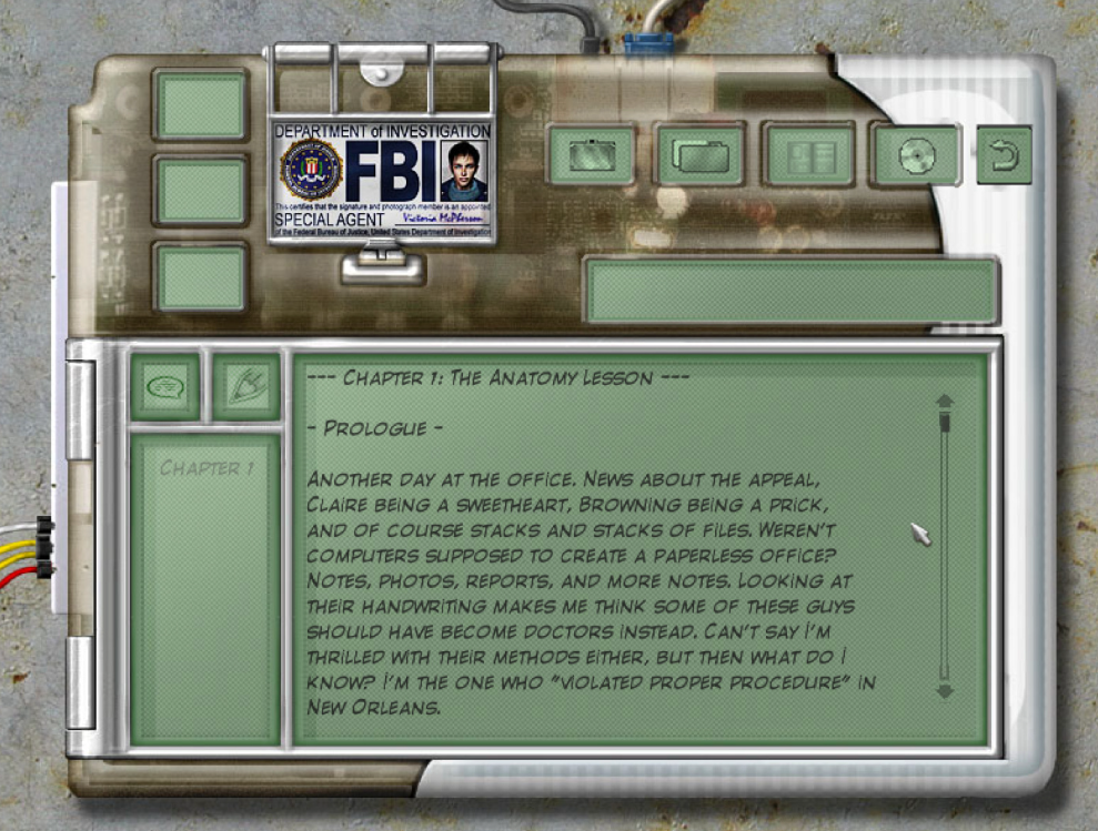
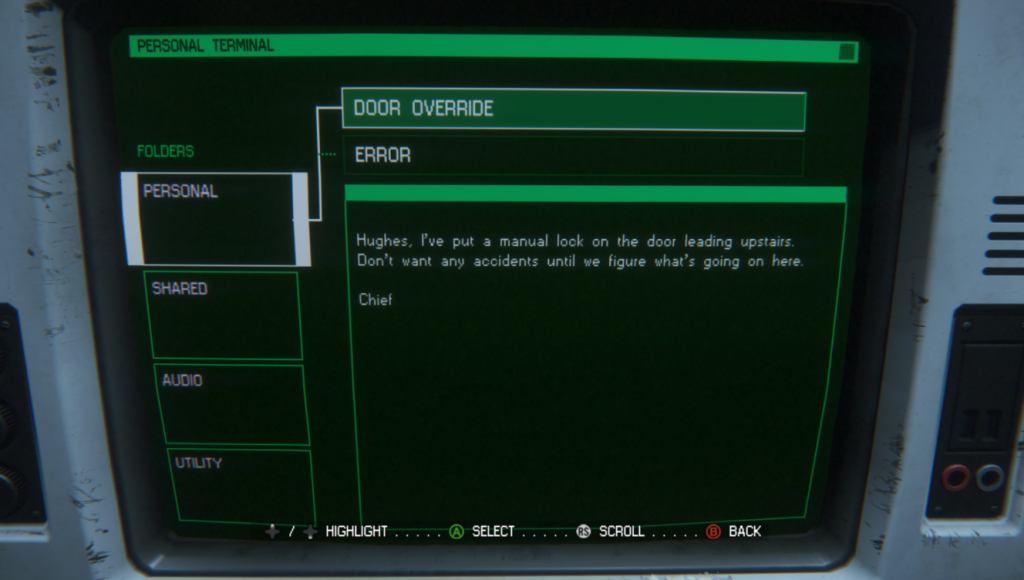
I started the research by looking at UI-heavy games based on computer interfaces. I found three that I was most drawn to.
- Greyhat
- Duskers
- Last Call BBS
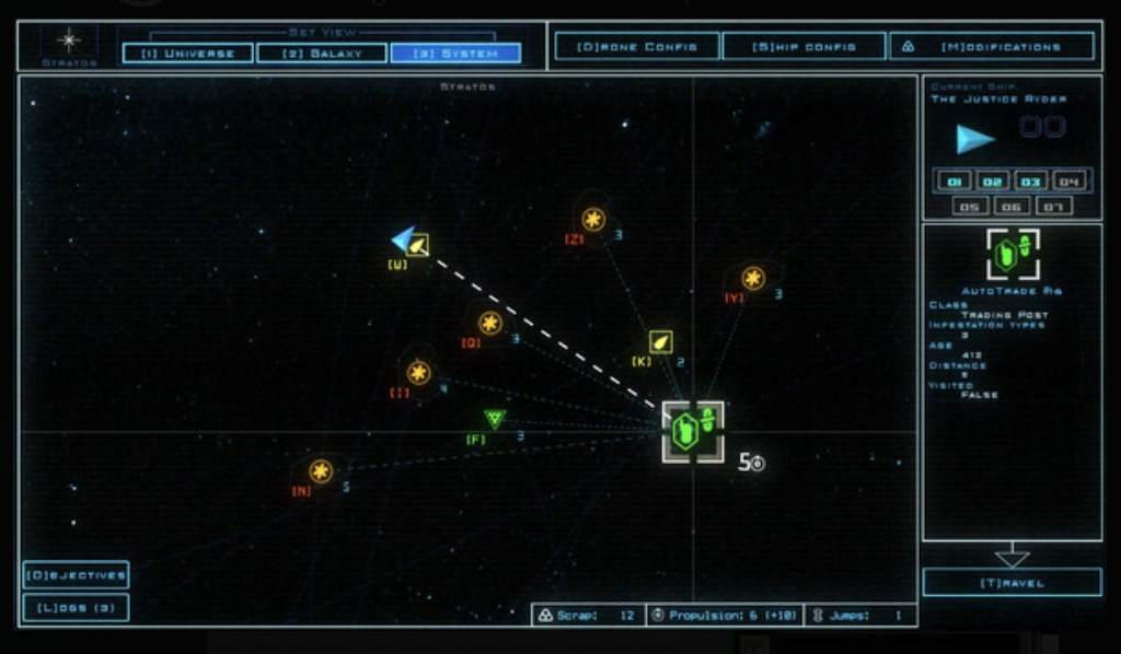
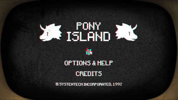
Other games mentioned by Joe to look into were Uplink and Pony Island. Joe already had a sketch prepared of the new UI layout and shared his inspirations below. I’ll be using it to further my research.

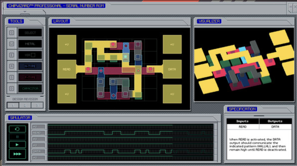
I wanted to look at screen that used a computer or some sort of frame but found it difficult to find any good references. I used the game UI database Sophie recommended to see if I could find anything similar and found these.
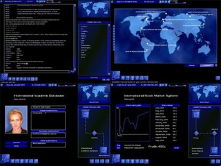
They were great examples of what I was searching for but none of them really stick out in the style or theme of Those Left Behind. What I’m really looking for is a mashup of retro and post-apocolayptic, the closest thing to it that I could think of was the Fallout franchise. What I found most interesting was the first Fallout game from 1997.
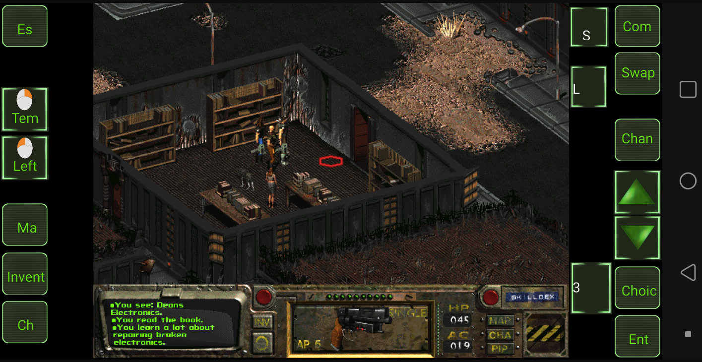
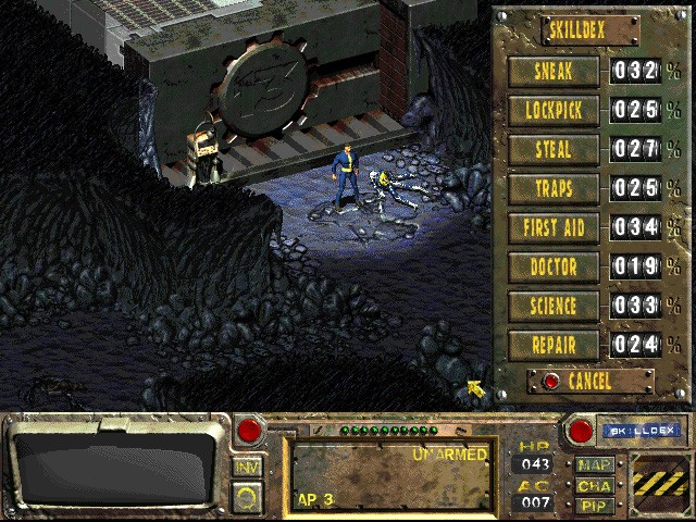
The UI in Fallout (1997) was dense, mouse-driven, and designed for turn-based gameplay, featuring a static isometric layout, grid-based inventory, and text-based dialogue. In contrast, modern Fallout games have streamlined, real-time interfaces with immersive 3D Pip-Boy menus, quick-access hotkeys, weight-based inventory, and fully interactive world maps with quest markers. Overall, the UI has transitioned from a methodical, strategy-focused design to a more accessible and action-oriented experience.
Mood/inspoboard
Looking at old nuclear control room machines and panels, various computer consoles and existing UI as inspiration.
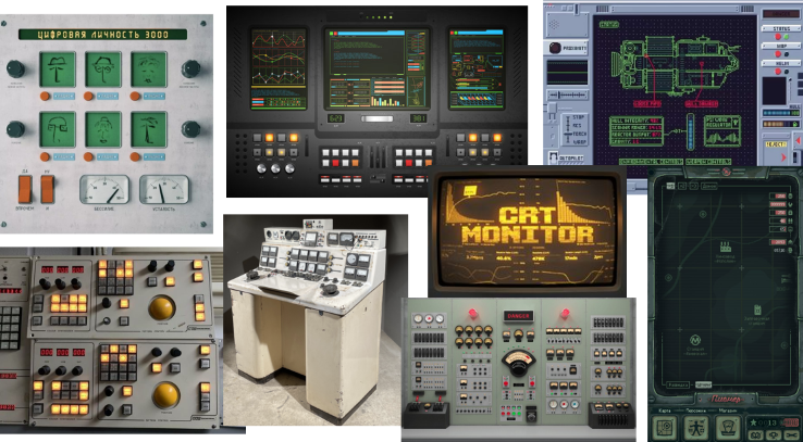
Additional section was amde in the team’s shared Pinterest board for UI. This board focuses on retro-futurism machine UI and feautures some of the GDDs original old internet aesthetic.
When looking at the material and textures I googled industrial consoles finding that they are generally mild steel boxes, although other materials such as plastic, GRP and stainless steel are commonly used too.
Button shapes on these types of machine panels are always perfectly square or circular, common colours of these buttons are red, orange, grey/white or green. Alongside buttons, typically there are switches, knobs, ports, sldiers and various lights.
Leave a Reply to Background – Anna Bonadio ✧ Game Designer Cancel reply