After the very important ocnversation about the shortcomings of our game in week 9, we decided to look into some big changes (more info in linked post). This also meant rehauling the UI to better suit those modfifications.
Note: the designs for the UI were started during the Easter Break the week before week 10.
Changes:
- No more retro machine UI
- More reminiscient of management sims
- simple and minimalist
- less buttons
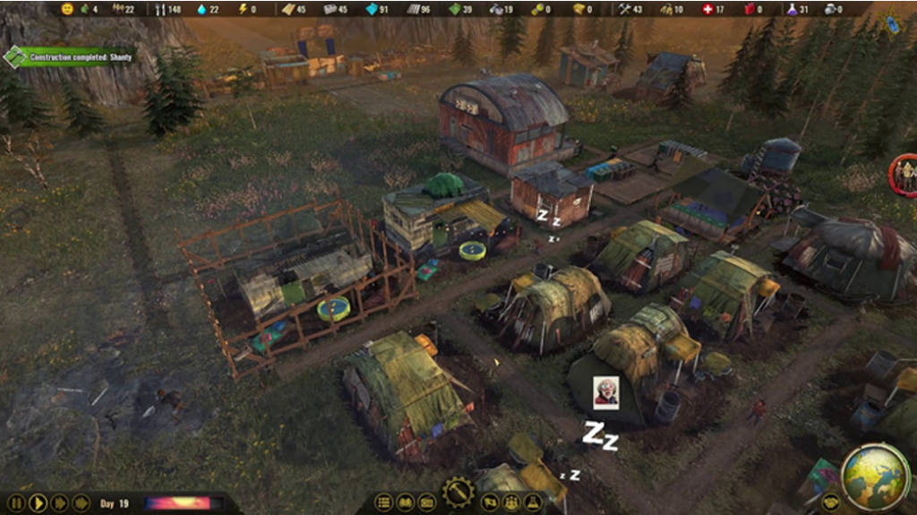
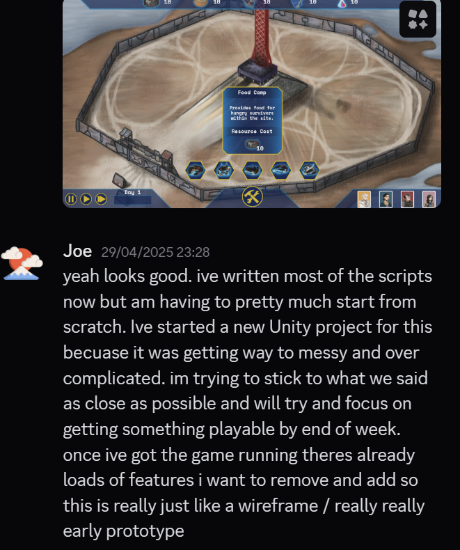
I started by tearing away all of that surrounding machinery and starting on a blank slate, which would be an “empty” game world (the survival camp with no buildings).
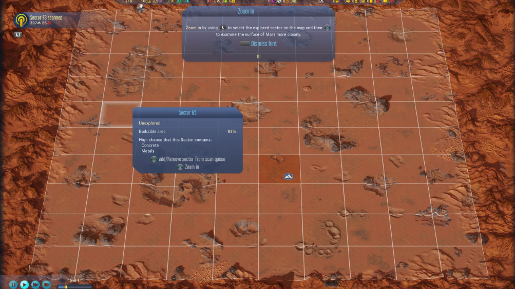
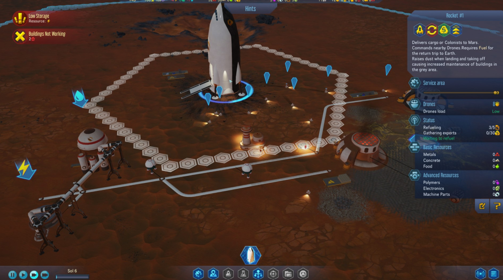
My inspiration for the UI came from two primary sources – Surviving Mars and Surviving the Aftermath (STA), both games published by Paradox Interactive. I’d dedicated many hours to STA and a couple on Surviving Mars, to get a feel for how they worked within their games.
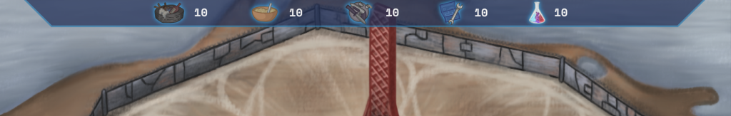
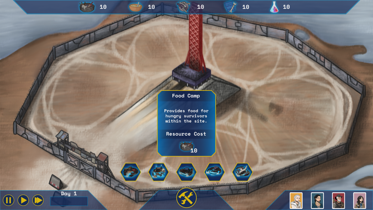
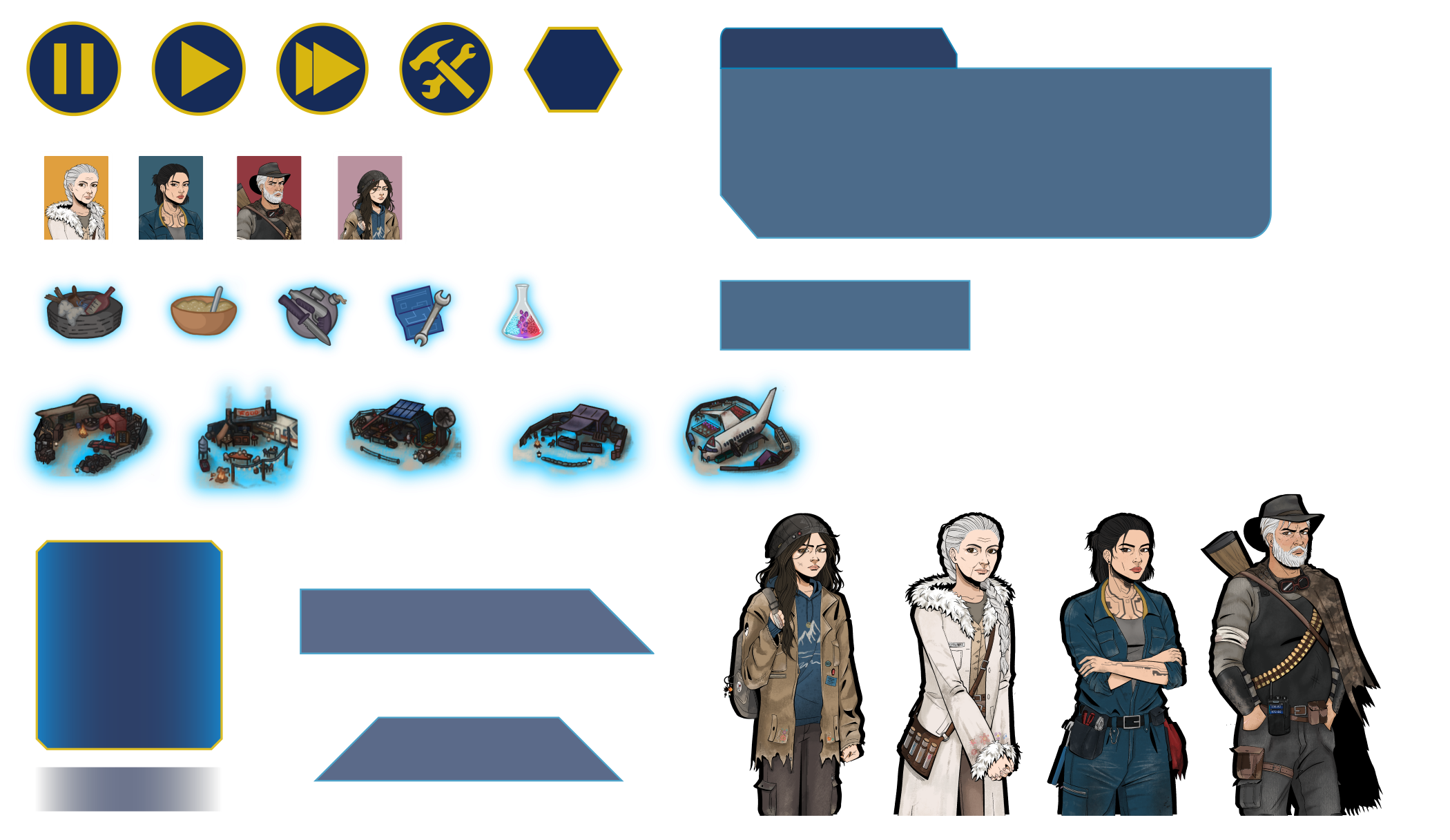
Resource Bar
I started with the resource bar at the top, a typical location of most resource management games. Reusing the previous asset from my first UI. This time I wanted the resources to “pop” and contrast a bit more from the bar itself so I added a subtle light blue glow effect around them.
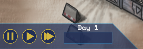
Time Panel
Much like the games I used as references, one of the more intuitive locations for displaying time is in the bottom left corner of the screen, with pause, play and speed buttons. This panel would also update with the days/weeks that pass in-game time, with a bar that would fill to signify the hours passing. I kept with the same colours and sharp straight lines.
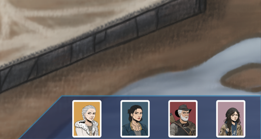
Character Panel
The characters should still be interactable and have been moved to the bottom right corner, this helped balance out the UI throughout the screen and meant they would always be accessible throughout the gameplay. I reused the same character cards from the previous UI.
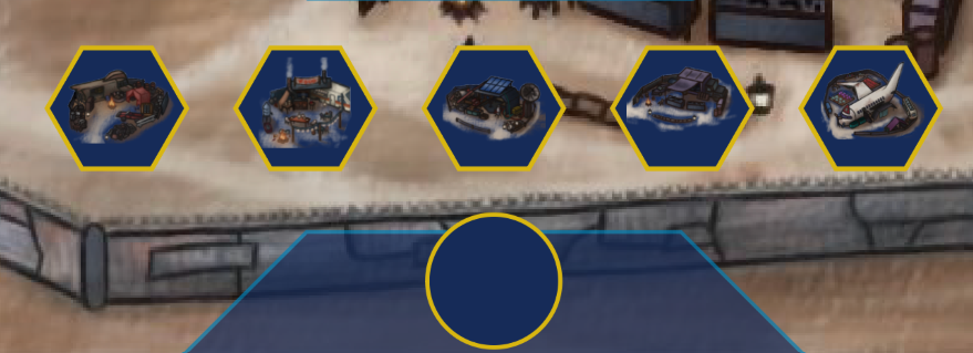
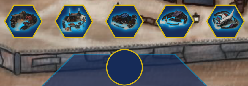
Build Button/Menu
As mentioned in the week 9 post, we had agreed to implement a build mechanic where the player would build the survival camp from the ground up using the resources they gathered. I used the remaining space at the bottom of the screen to do this with a construction button.
The idea being that this button would be pressed and a small menu would appear above it showing the player the camps available to them, as they hover above the building icons a panel would appear to show that building’s information: name, cost, purpose. I used the same affect as the icons on the resource bar on the building icons to make them stand out against the dark blue hexagon shaped butons. I tried different shapes like circles and squares but I felt that the futuristic and organic nature of polygons felt more appropriate (and just cooler).
With this done that was the UI essentially finished, the same panels would be reused for other information such as for showing upgrades and character tasks/bios.
*Week 11 Update: Due to miscommunication, the build mechanic I had in mind was not the same as the one that was implemented in-game. In the end there was no dedicated build menu.
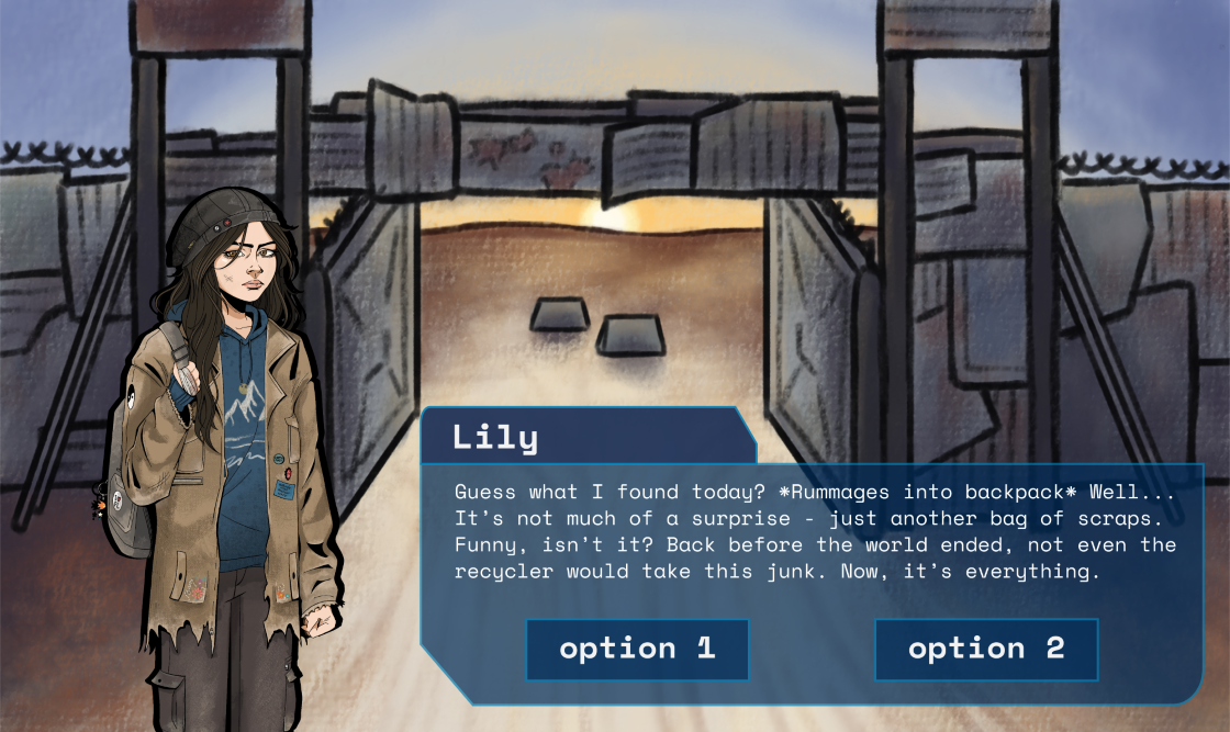
Narrative Scene UI
This would be much easier to design as it would only really be comprised of the text box and dialogue option buttons. With finished artwork from the character and environment artists I was able to design this fairly quickly. Despite the differences in genre and themes, the first games that came to mind as references were Dream Daddy and Hades (quite the combination, I know).
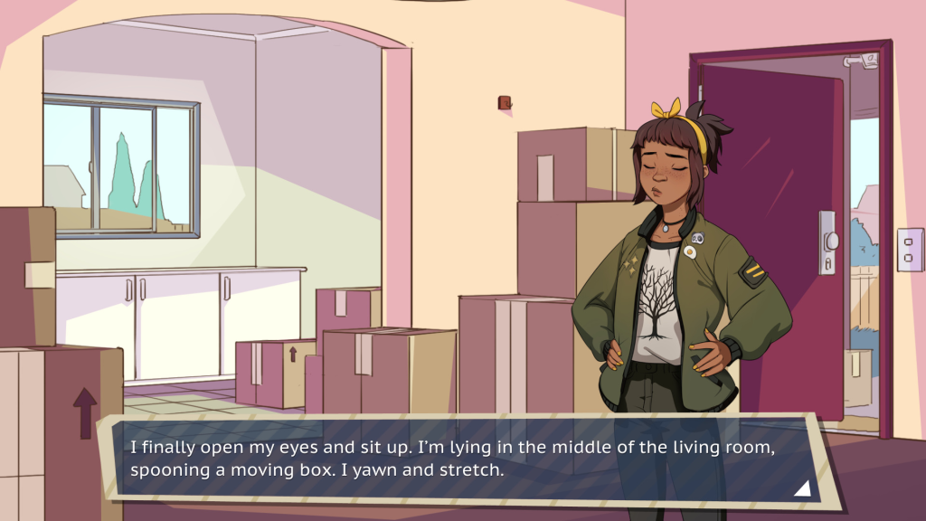
I wanted to continue the sharp straight lines but this time I added some roundness to break it up a little bit at opposite corners, I wanted to make interactions in this scene feel a bit softer and more human. I also added a thicker black stroke around the character art so that they would stand out more against the background and further emphasise that comic art style.
Living with one of the artists I was able to get early feedback about the style before sending it off the team, safe to say we both felt a lot happier with this new UI than the previous one. I sent the mockup images to the technical designer for feedback and approval and all was well.
Here is the complete asset pack that was sent to the team and posted on the shared dev blog:
Leave a Reply to Easter Break – Anna Bonadio ✧ Game Designer Cancel reply