Tiles
Introduction
For making the tiles I had to create multiple sprites of tiles that could interconnect with each other and appear many times without becoming repetitive. They also had to have a certain level of detail that wasn’t too abrasive and hard on the eyes while also having just enough detail to get the point across as to what material they were supposed to be.
Dungeon Tiles
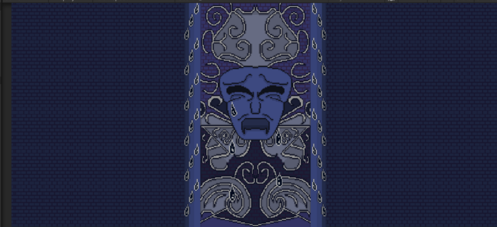
The realm of depression was described in the GDD like this: “Cold, empty wasteland. Uncomfortably wet and blue.” There were also some images provided of dark caves and lagoons that helped characterize what the realm may look like. As such I decided with my group to go for a cave-like appearance as though the realm was one massive cavern; this would of course effect the tiles I produced.
Floor
The floor tiles went through several variations before settling on one myself and my group agreed was best.
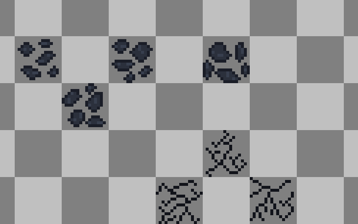
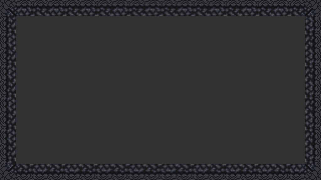
This was the original floor tile. I did not like it as it looked very generic. It was just a craggily floor with only two colours; dark blue and darker blue. It was boring and I imagined it would be hard on the eyes if repeated a lot, as such I decided on redrafting.
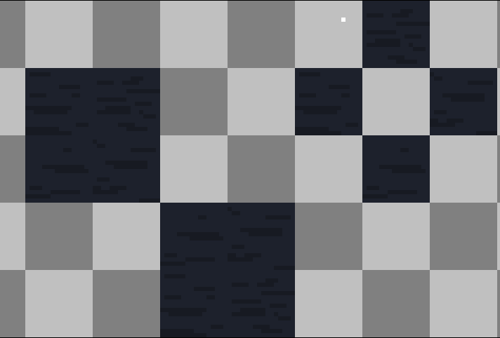
This next version was lighter and I actually tested it out on what a screen would look like in the game. However it was very hard on the eyes and looked cluttered. My groupmates told me so and I agreed with them, thus I scrapped this version and decided to redraft once again.
While I was thinking of how to do the floor tiles I decided to make a few unique textures that could be overlaid on the floor to add texture on top of the floor. I had looked at other top-down pixel art games and noted how not the entirety of the floor was texture but rather that there were detailed tiles scattered randomly throughout the floor. Thus I decided to try that method out instead.
This level example showed what the new overlaid textures may have looked like over a basic blue colouration. I showed this example to my groupmates who noted that it looked good but that it felt a little empty to which I agreed. Thus I continued efforts on making a floor texture that wasn’t too busy and could accommodate the overlaid textures.
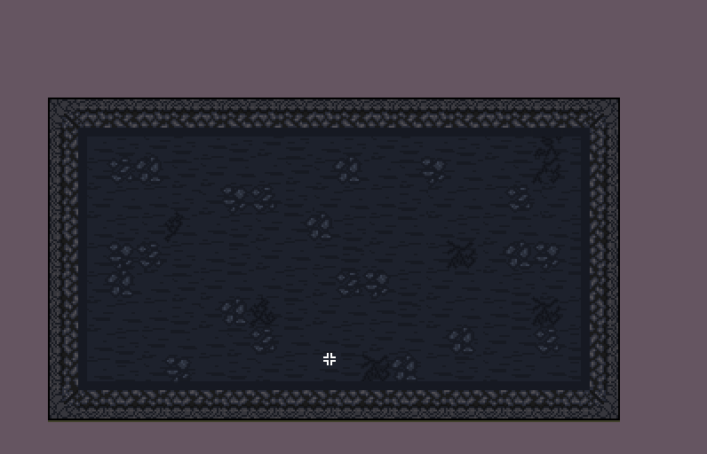
This was the new floor texture I produced. It had a bit of shading to indicate some kind of ground texture, like different rocks making up the floor. I believed it looked good and was not cluttered and could make for a good base layer for the floor texture, but before deciding on it I tested it in a level mock-up.

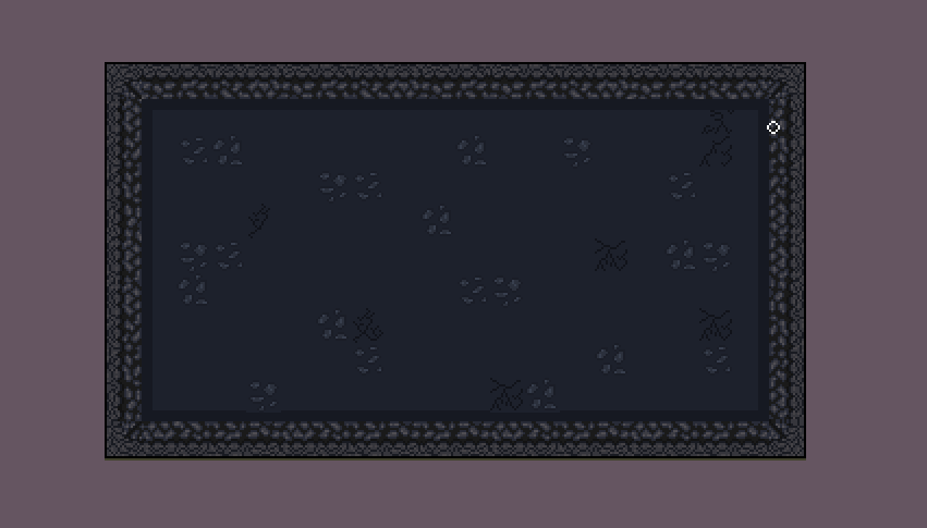
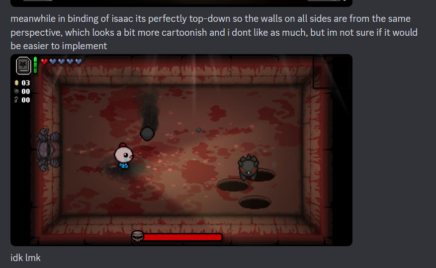
This was the level mock-up. My groupmates were very pleased with this design and thus it was agreed upon to be the final design. I had also added some shadows to the overlaid textures as well as at the base of the walls for some depth to the image. The floor texture was completed.
Walls
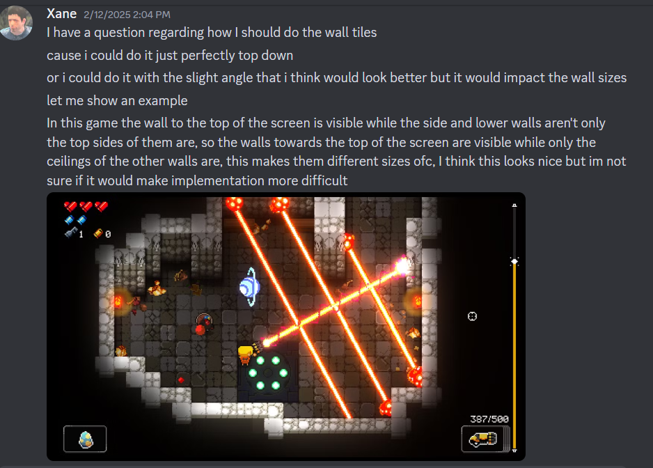
For the wall textures more thought needed to be put into how they would appear in terms of perspective. The game would be top-down but what would the precise angle be? Also, how big would the walls be? Multiple tiles? Or one tile? All these were questions myself and our main programmer, E-Jay deliberated on. He said it was easiest to keep the walls one tile large as making them larger would shrink the room’s size, and if we made them bigger we’d have to make the room in its entirety larger to keep it as a multiple so that the screen’s resolution would have continuity across all screen-types. Thus we decided on the doors being one tile large as it was the easiest and most efficient solution. As for the angle more deliberation went into that.
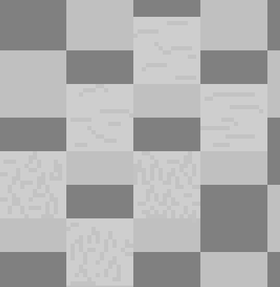
This was the first draft of the wall tiles. The first issue I noted (aside from the fact they did not seamlessly connect with each other) was that they were too gray and generic. The realm of depression had been characterized by cold colours such as blue, meanwhile these were just boring gray colours. Thus I redrafted them.
With this design I added more blue tones to the design. While this made it less generic an issue was still present which was the lack of tops of the walls. There was no “ceiling” to the walls which made them appear as though they could’ve just been part of the floor. I had to redraft this somehow.

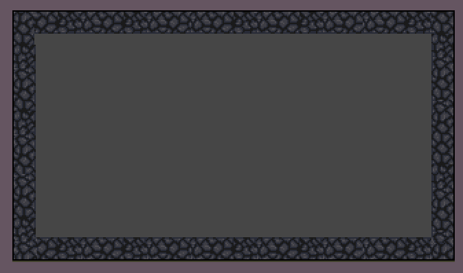
This was the redraft. It did not look very good as while the top walls had bene implemented they were more cut off than they should have been and the way each tile merged with each other was not particularly good. I had also changed the texture of the rock to make it less cluttered but it ended up looking worse as a result.

I then changed the wall tiles to this design with a larger emphasis placed on the tops of the walls. This was better but now the wall design itself was too bright and cluttered, as such I redrafted it again.
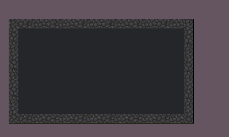
This design was practically the final design as it fixed the issue with the last one as now there was a better and less cluttered stone texture while maintaining a defined separation from the top of the walls. I would later add shadows to the room to add depth so the player could more easily distinguish the walls from the floor.
This was the final design realized and my groupmates were pleased with it. The walls now had more of a defined perspective and the rock designs were not generic and gray but had a blue hue that fit the level’s theme. Overall I was happy with how it turned out.
Doors
The last tiles I had to make for the dungeon’s environment was the doors. This was done after everything above. This was relatively straightforward as I just had to edit the already existing wall tiles into doors. The doors would be two tiles wide instead as the room sizes were an even number of tiles and it made sense to center the doors, it also worked out that the size was big enough to easily be distinguished but not overbearing.
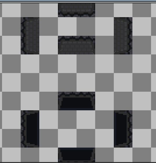
I made two versions, one that was open and one that was closed. At a later date I would go on to animate them, but for now at this stage of development I left them as they were and implemented them later at the behest of E-Jay when he implemented the code for the opening and closing doors as the player would be locked in the dungeon’s room upon entrance and would only be able to leave upon defeating all the enemies.
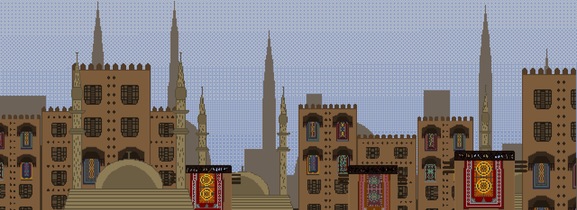
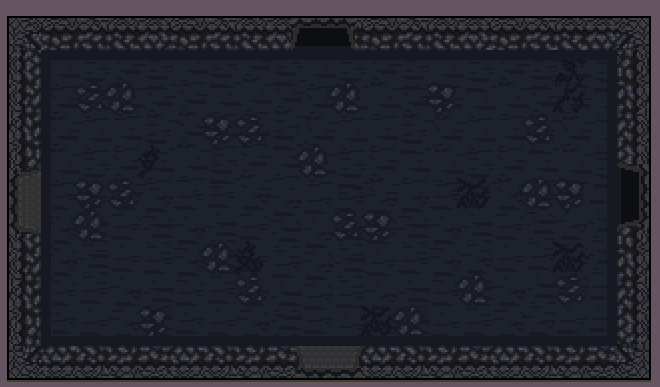
Below is the (mostly) finalized room concept, complete with all the floor tiles, wall tiles, and the door sprites (Later on I would add smaller detailing in the form of puddles, and of course actual enemies and obstacles would be added in the gameplay).
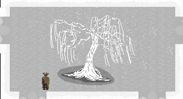
Hub Tiles
For the hub world I used the GDD of Lament to figure out how it would look like. I took inspiration from the prototype that Anna had created for the GDD of the hub world. Her prototype was white and gray and the hub was also described as a foggy/cloudy space.
Overall the tiles were relatively easy to produce. They were just meant to fill out the background surrounding the tree of sorrow and act as a juxtaposition to the colourful gates an realms, with the hub being simple shades of light gray.
Gate Tiles
For the gates of each realm I had to create both a floor tile and a wall tile. A wall tile to cover the space around the gates themselves and a floor tile to cover the space between the room entrance the walls. This was relatively straightforward as I already had a colour palette to work with for each gate and an idea of what each texture should be.
Walls
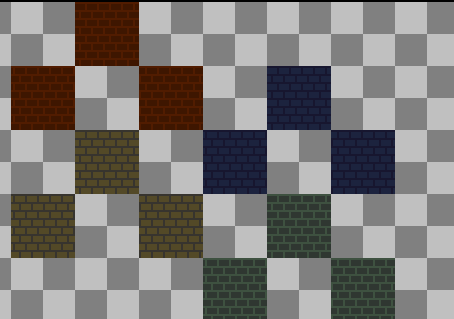
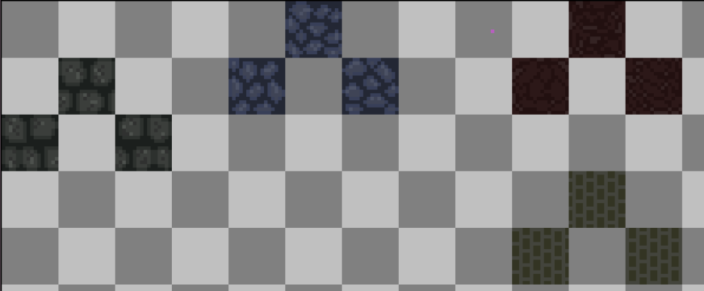
For the walls I simply made brick textures with differing colours. It was straightforward and I think the final result is rather effective. It immediately fills the player’s vision with the colour that characterizes the realm and sets the tone upon entry. These tiles were also 32×32 pixels as opposed to the 16×16 tiles I had been making up until this point. This was just to make implementation more efficient.
Floor
The floor is still a work on progress admittedly. I had made it rather hastily in preparation for the play-test. I believe the tiles are good in that they too exemplify the realms well, but they may be a bit cluttered and a redraft will be necessary when I have the time.
Reflection
Creating these tiles advanced my pixel art skills by a lot. I adapted to the constraints of making 16×16 sized sprites as well as learned how to better use shades of a single colour effectively. I also taught myself how to make a sprite that could be inserted in any order in any way. Overall, I am pleased with the output of my work and I am much more confident in making tiles now then I was previously.