Art
Overview
THE MERCENARY OF KNOWLEDGE will have a pixel art style that has a slightly cartoonish aesthetic but remains grounded. Its art style will not aim to be wholly realistic and may be stylized however it would not have a style that would be too cartoonish. The style should not clash with the tone of the game, the game itself is somewhat serious with moments of brevity and humour spliced in throughout. As such, the art style will reflect this as well as the overall gameplay style and setting of the game. Considerations should be made for the movement of the player and the type of enemies they will encounter, as such the art style will reflect this.
Cutscenes
The cutscenes in specific, will be detailed pixel renders of characters and scenes. They will reflect the tone of the game but will remain distinct from the gameplay, as to add more emphasis on them.
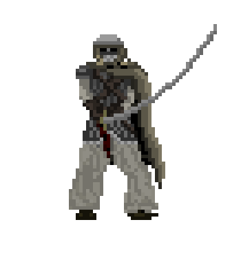
- Examples
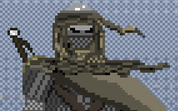
- Some examples of characters may be seen in the earlier section “Central Characters & NPCs”
- Example from Shovel Knight Specter of Torment (the detail here is the level of detail the cutscenes should strive for)
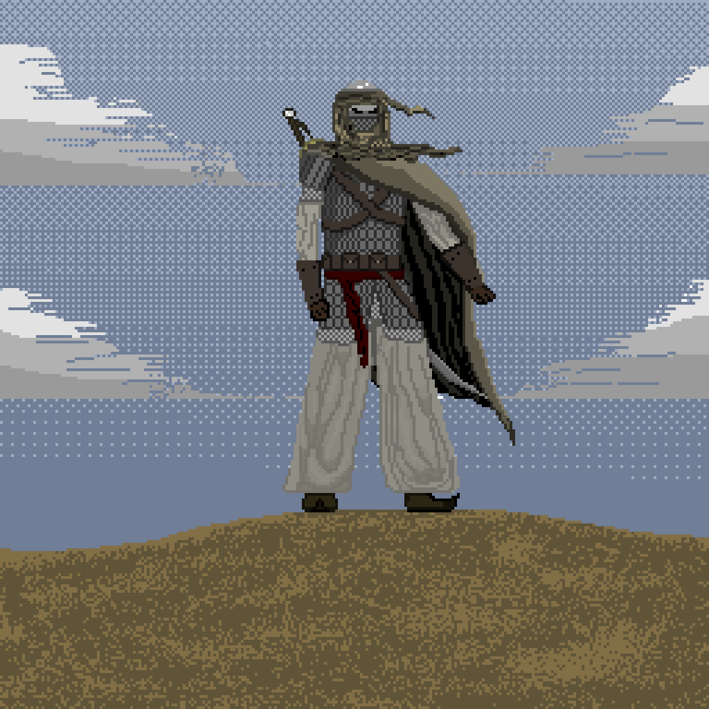
- Rough example produced by myself.
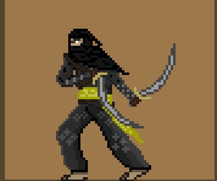
Gameplay
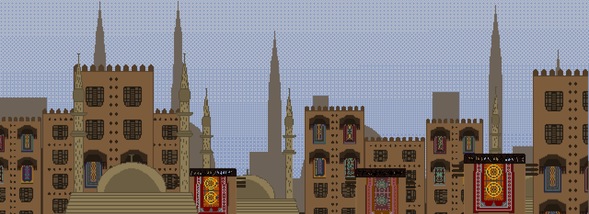
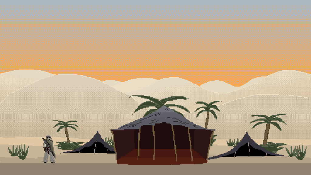
The gameplay will have a slightly more simplified 16-bit inspired art style. It should be semi realistic (in terms of proportions & design) but maintain a simple aesthetic as seen in the image renders below. The protagonist will take up a small portion of the screen, but his position will remain clear to the players as he will stick out compared to the more washed out backdrop.
- Colour:
Black outlines should be used sparingly, close attention should be paid to colour palettes. Each level should have different yet similarly dark colour palettes. Since there are a variety of levels in many varied locations (deserts, seas, plains, cities, etc.) it would be impossible to layout one consistent colour palette for this entire game. The colours should not be vibrant (except in rare cases, such as for specific enemies or magical/holy effects). Background environments & objects should be clearly differentiated from the foreground via usage of perspective (i.e. scaling) and colour palettes (i.e. the further an object is, the less clear the colours are, the more washed out it is). I have left some examples below of different level concepts with differing colour palettes.
- Resolution:
Given that the game utilizes pixel art, the base resolution should be one that can be upscaled. It should also be able to be upscaled on any monitor, as such, the best resolution to use is 640px by 360px.
Mood Board:This mood board displays examples from other games that The Mercenary of Knowledge takes inspiration from.
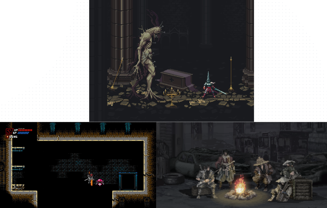
The games here are Cyber Shadow (bottom left), Blasphemous (middle top), and Meifumado (bottom right). Blasphemous and Meifumado have more realistic art styles, their colour palettes are the sort of palettes The Mercenary of Knowledge should have, dark and washed out colours, with brighter colours being used sparingly for specific objects/characters. Meanwhile the more subdued and simplistic shapes and objects of Cyber Shadow reflect the type of detail that would be seen during gameplay.
Original Examples:
Example:
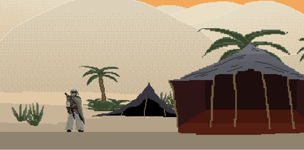
This shows approximately how much of the screen the protagonist should take, as well as snapshot of the art style that the game aims for. (full screen below)

Key Art
The key art will undoubtedly be influenced by mediaeval and 19th century etchings such as those used to depict historical figures and events. They will be black and white ink pen depictions of the characters and scenes. It will be used for the box art and some promotional material as well, although some posters and renders may include colour.

Etching by Daniel Hopfer 16th Century
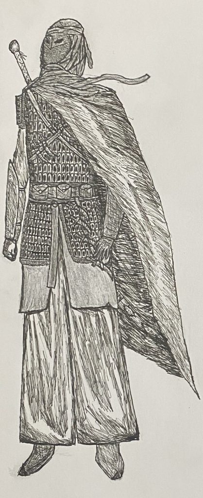
Example by me