Final Edition:
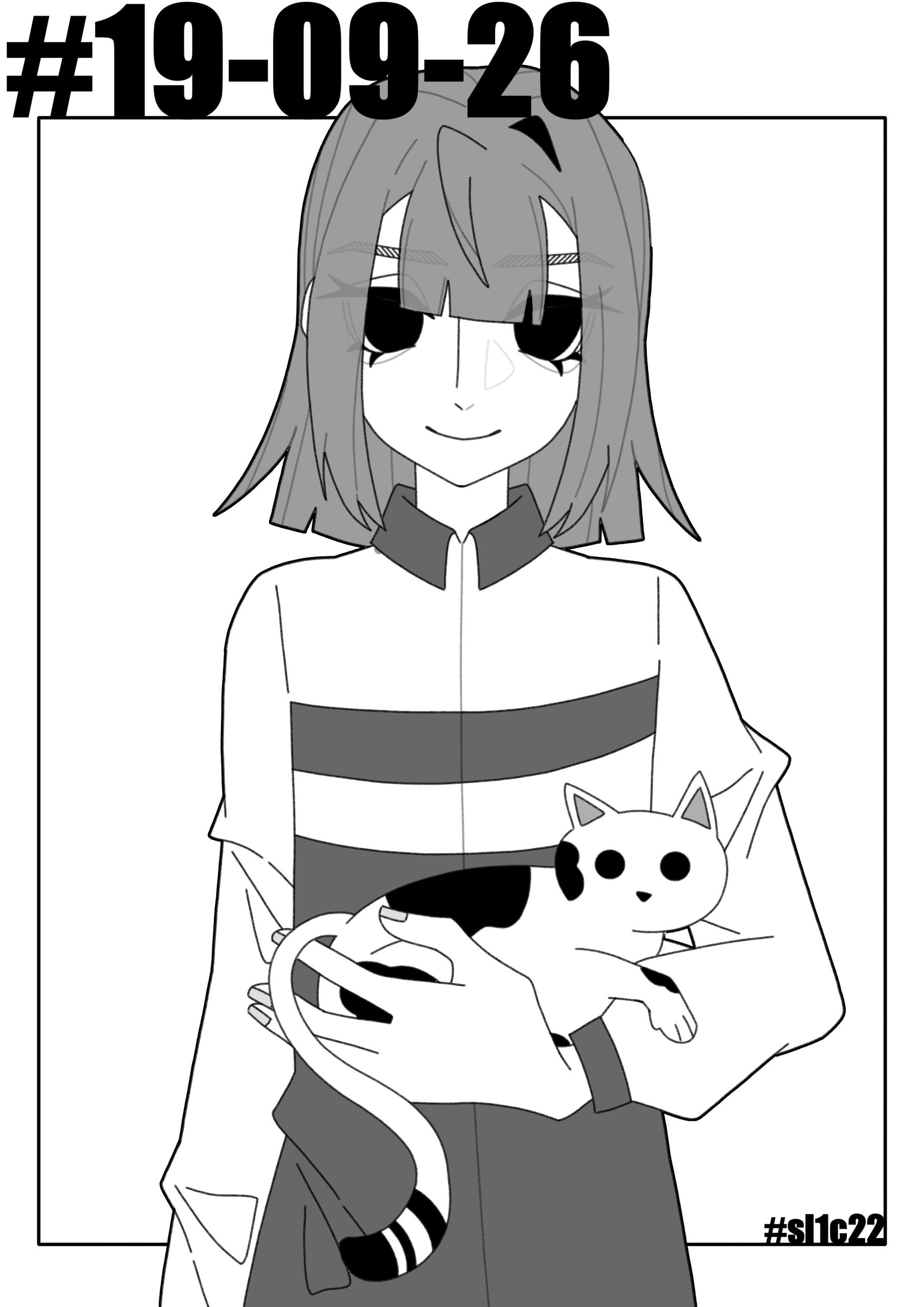
- In the final version, I placed the two main characters directly in the centre and then put the eye-catching title. The simplicity of this worked with the prototype game screen, and also met my colour requirements for the overall look, and showed the game’s two main characters even more, so I decided to use this version.
Second Edition:
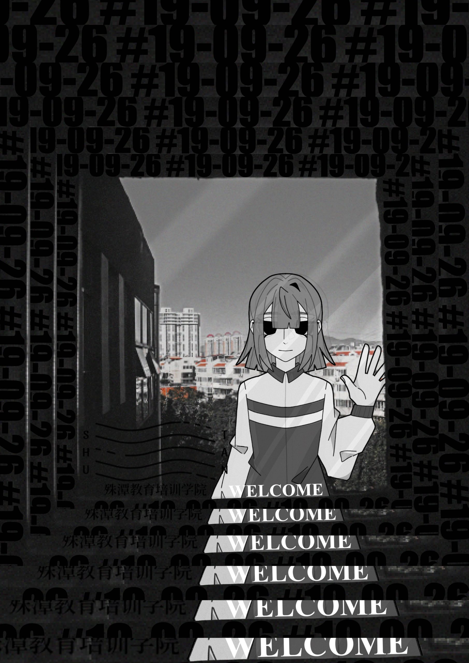
- For the second version, I used an image I took in high school as a background and wanted to show a sense of the heroine standing in front of a window. What you see on the poster is her reflection, thus showing a feeling that she is trapped inside this building. The black lettering around it is the title of the game as well as the heroine’s school number, and the welcome in the only white lettering is an ironic device.
- This version was discarded because I thought the characters and backgrounds didn’t have the differentiated but interconnected feel I was looking for, and as a poster, its title doesn’t stand out.
First Edition:
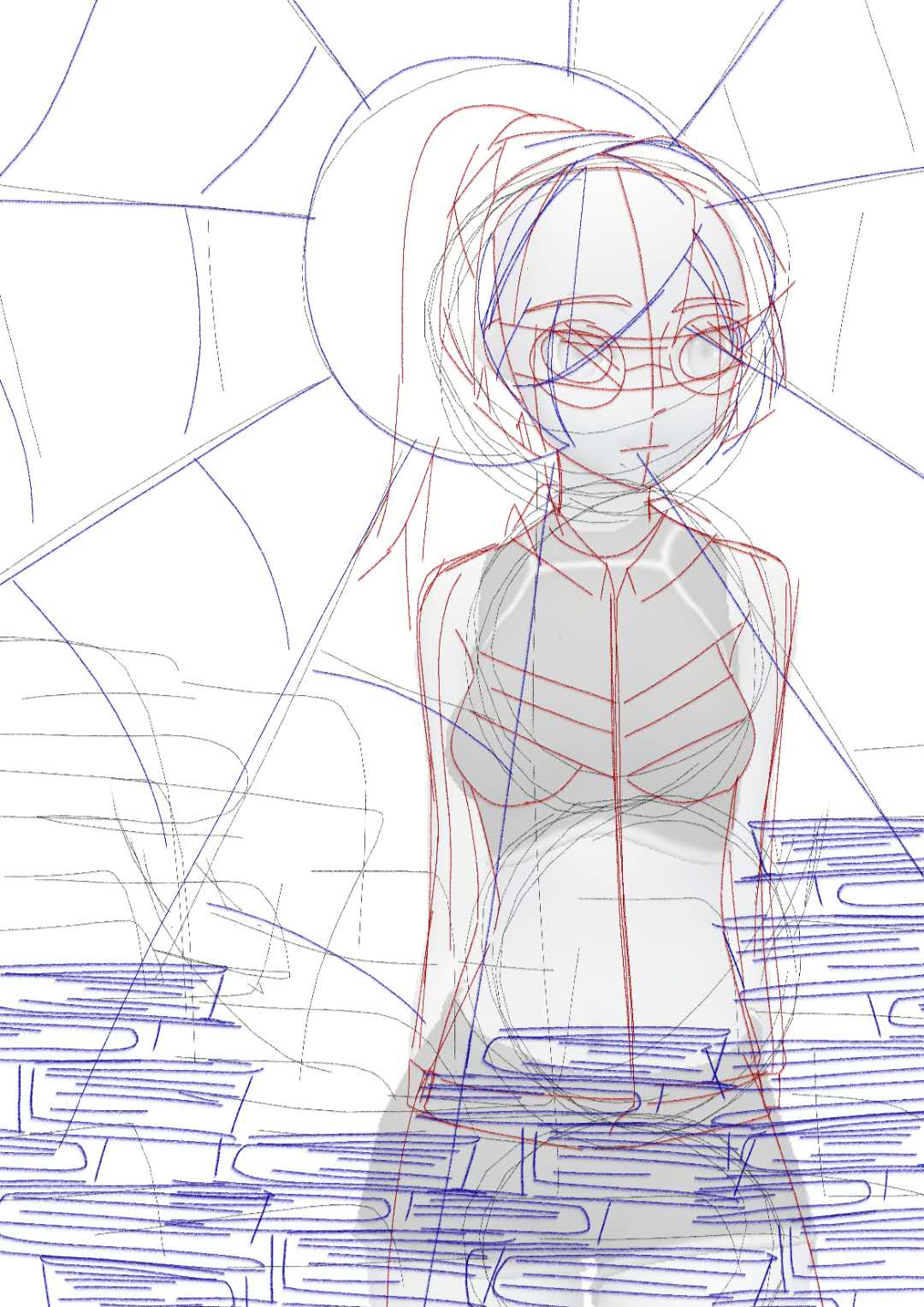
- The original version was conceived a long time ago. Behind the heroine is the sun, and the light emanating from it forms the shape of a spider’s web, while the books in front of the character form a fence, which also represents the feeling that the protagonist is trapped in a prison called a school.
- However, because the draft was too old and unfinished, and the content of the game now wasn’t quite the same as my original idea, this version was scrapped.
Reference:
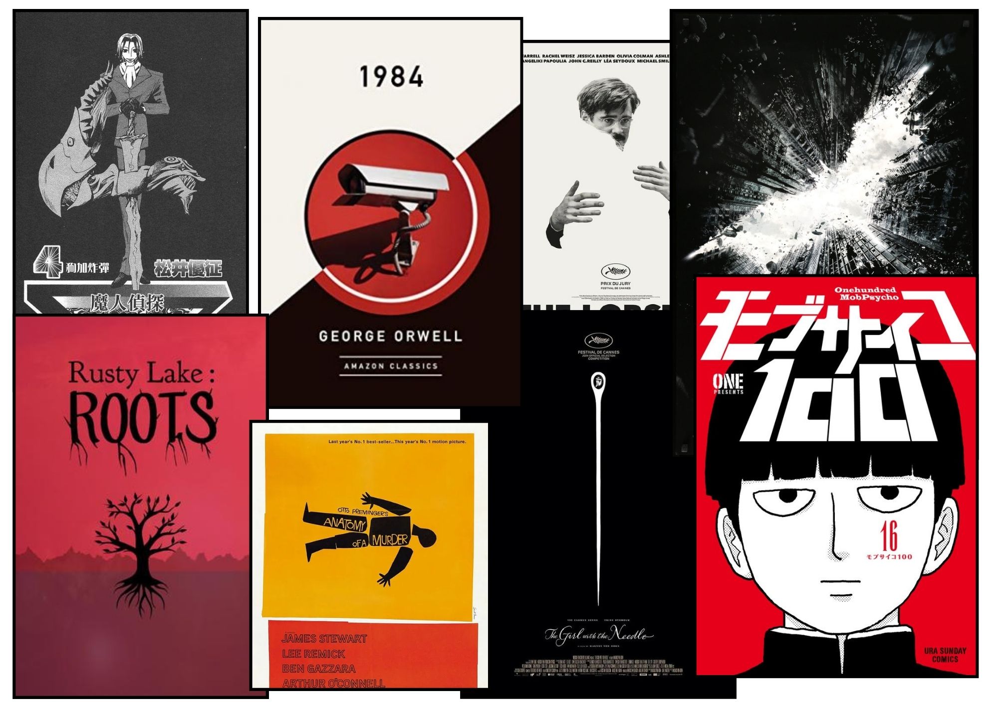
- I referenced some black and white film and book posters, from which I found that actually displaying the title enlarged in the centre was also a very effective composition, and with the addition of the main character’s face, the whole cover would be very simple and clear.
Leave a Reply