Final Edition:
Examples:
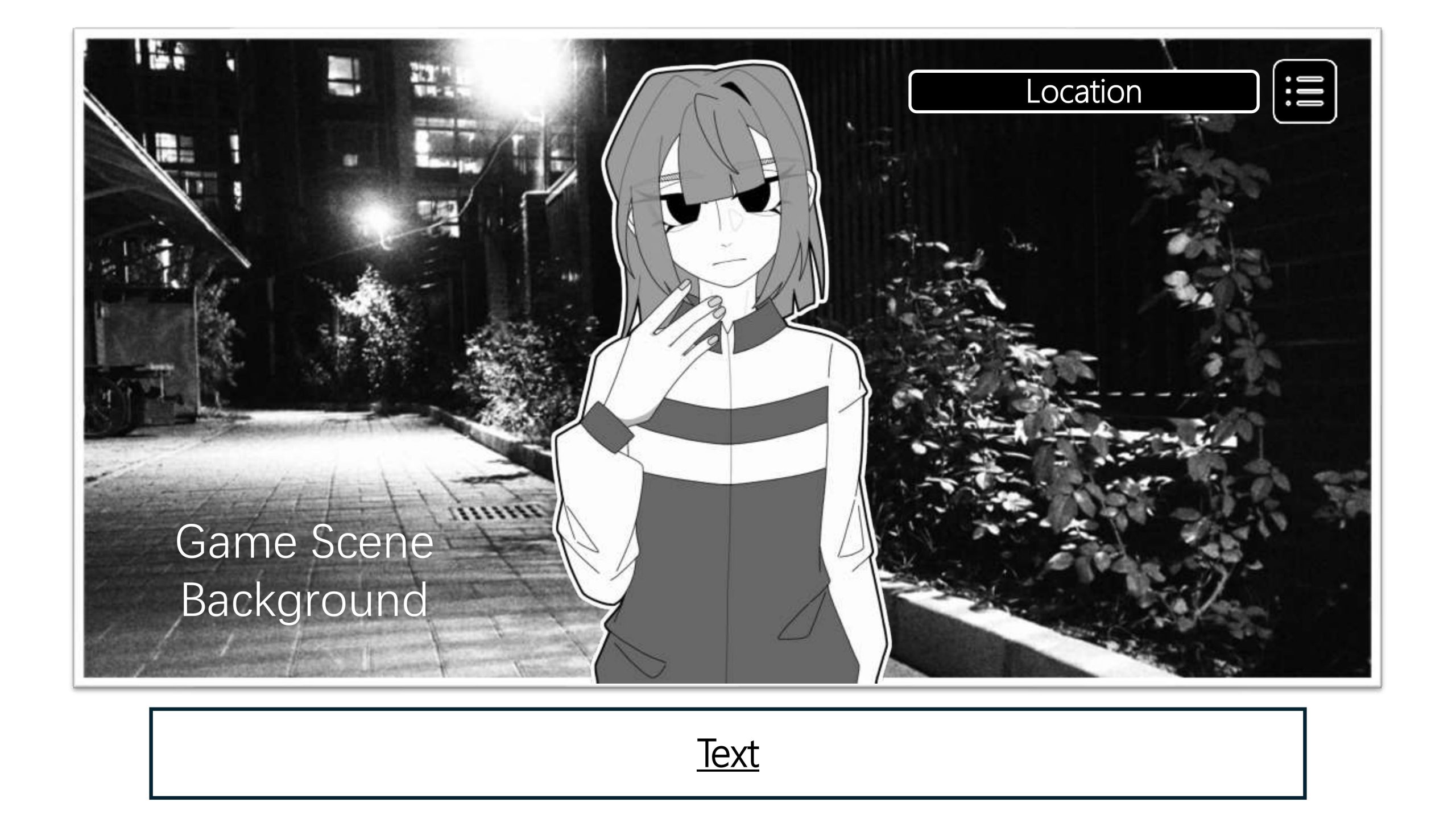
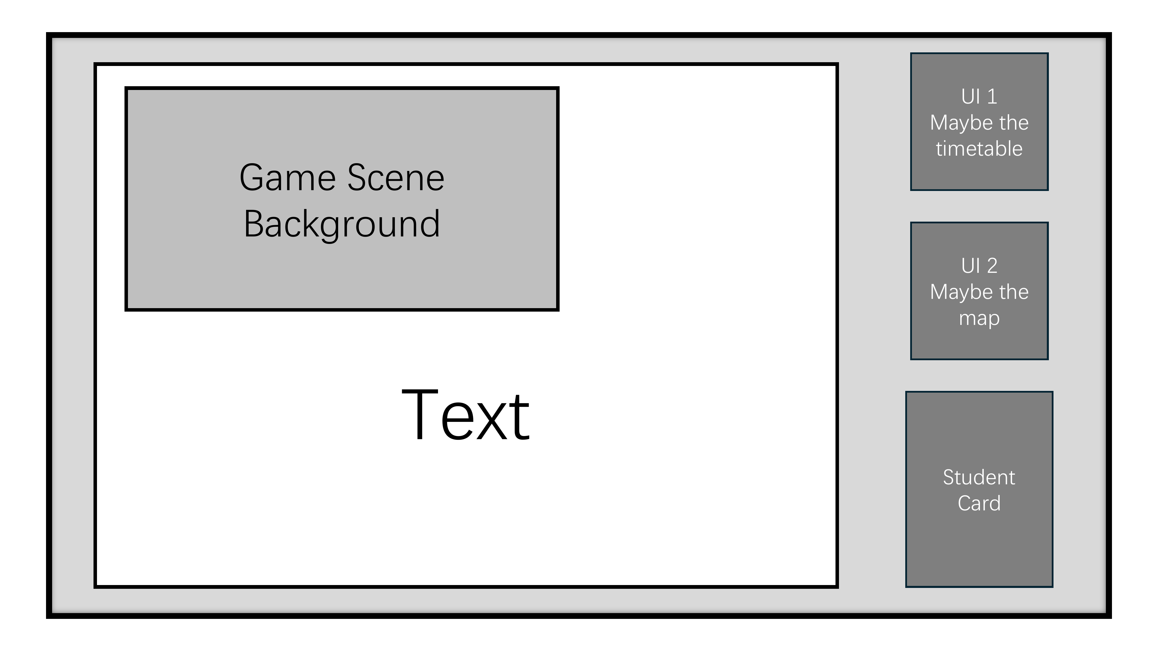
- Since the game prototype was made from a presentation, I needed to scale the background and characters to fit a 16:9 ratio, so the elements in the main game page are in a square outline. To differentiate, the game dialogue has a white background, while the map and other UI screens have a black background.
- For the final version, I removed the menu icons as well as the functions, keeping only the dialogue boxes and location displays. There’s less functionality but it’s straightforward enough for a prototype.
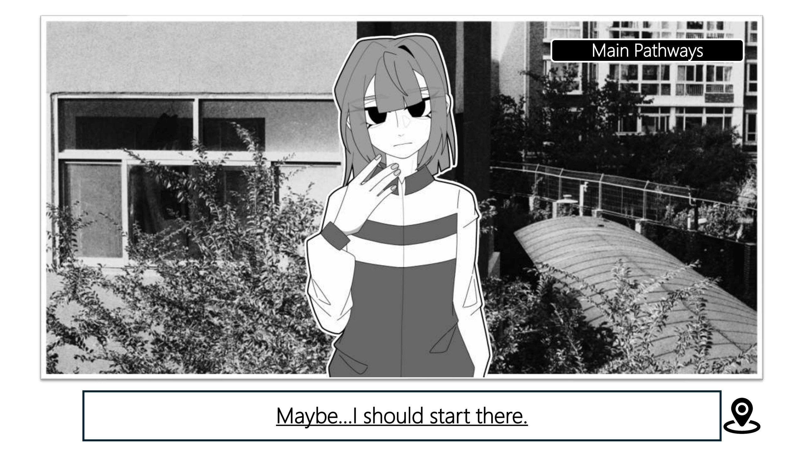
Third Edition:
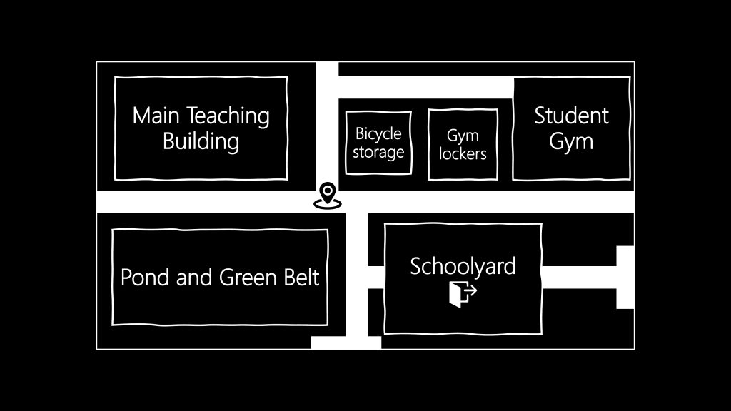
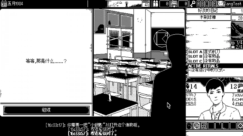
- The third edition is close to the final version, but after testing it with a few friends I found a bug function on the menu key, as the menu popup uses the zoom function, but using zoom requires allowing the use of a single click to switch the slides page, which can lead to the player going from the menu directly into the later game screens resulting in the wrong order of playing, so I decided to remove this after experiencing feedback from friends feature and may enable it again in subsequent development.
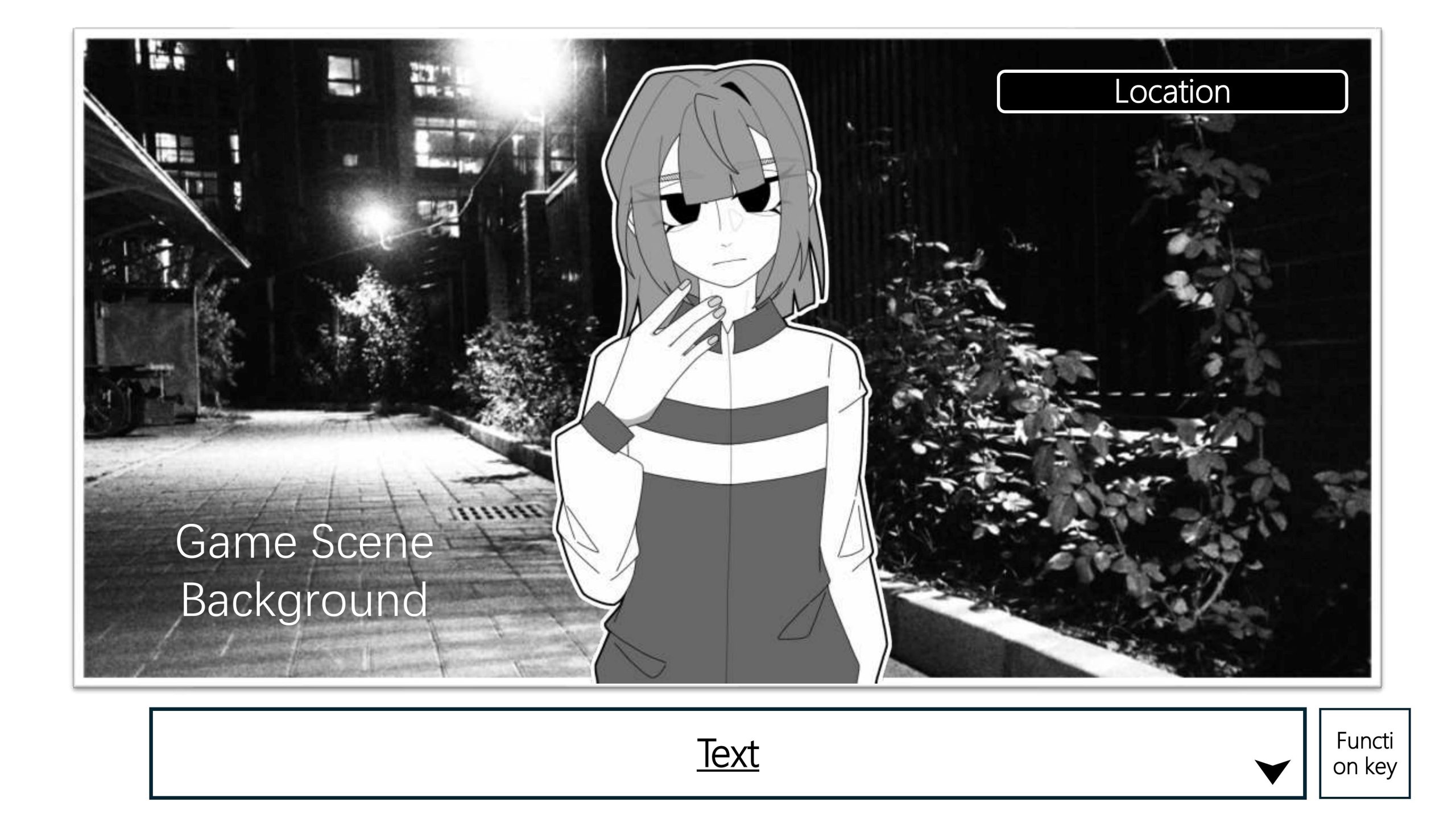
Second Edition:
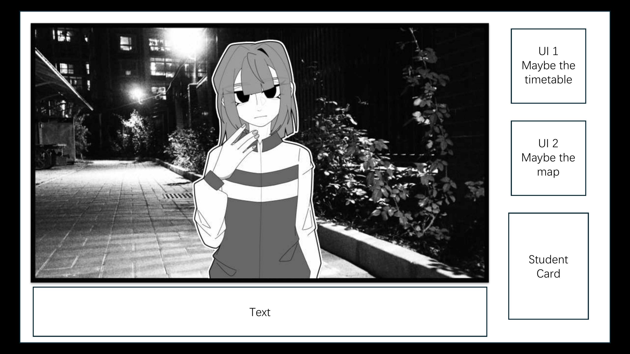
- The second version retains the UI design of the draft but changes the backgrounds, characters, and dialogue box locations. Since this was early in the game’s development, the course timetable and map remained in the UI, and with further development these two items were deprecated, so this version of the game was also deprecated.
First Edition:
- During the draft, I was trying to get closer to the game page of恐怖の世界 (World of Horror) by Panstasz. So I referenced the typography of its game characters and created the very first version. However, I realised that the scale of the PowerPoint wasn’t enough to support the effect I wanted, as the background would have been forced to be cropped out for the most part, resulting in a lack of information on the context, so the initial version was discarded.
恐怖の世界 (World of Horror) by Panstasz
Reference:
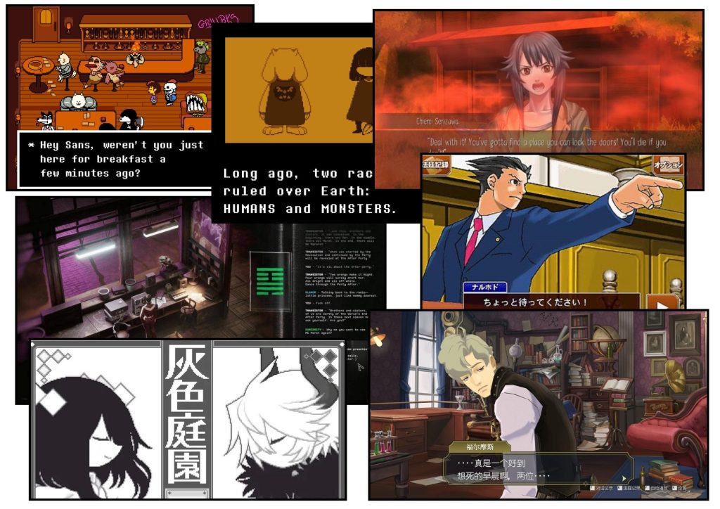
- After the first draft was discarded, I re-referenced the interactive fiction games I had played, and I found that the backgrounds and characters were dominating the screen, with the dialogue boxes all at the bottom of the screen, so I followed this typography and continued to work on the second until the final version.
Others:
- For more information please go to:
Leave a Reply