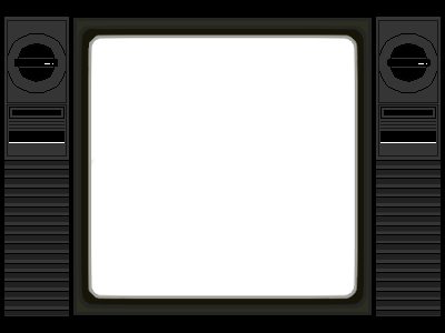
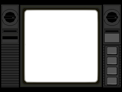
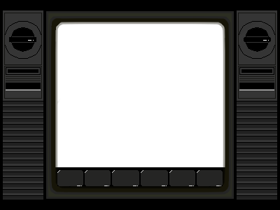
Game Main Page UI
At first, I didn’t fully understand the role of a technical artist, but I decided to start with the UI. Following Olivia’s suggestion, we chose to design the entire screen to resemble a monitor or an old television set.
I went through many iterations, since UI design isn’t really my strength. I kept adjusting the button placements, but none of the layouts looked quite right. In the end, I decided to go back to the original version—a symmetrical layout without the button location indicator. Later on, with Youth’s help, we turned it into a dynamic UI.

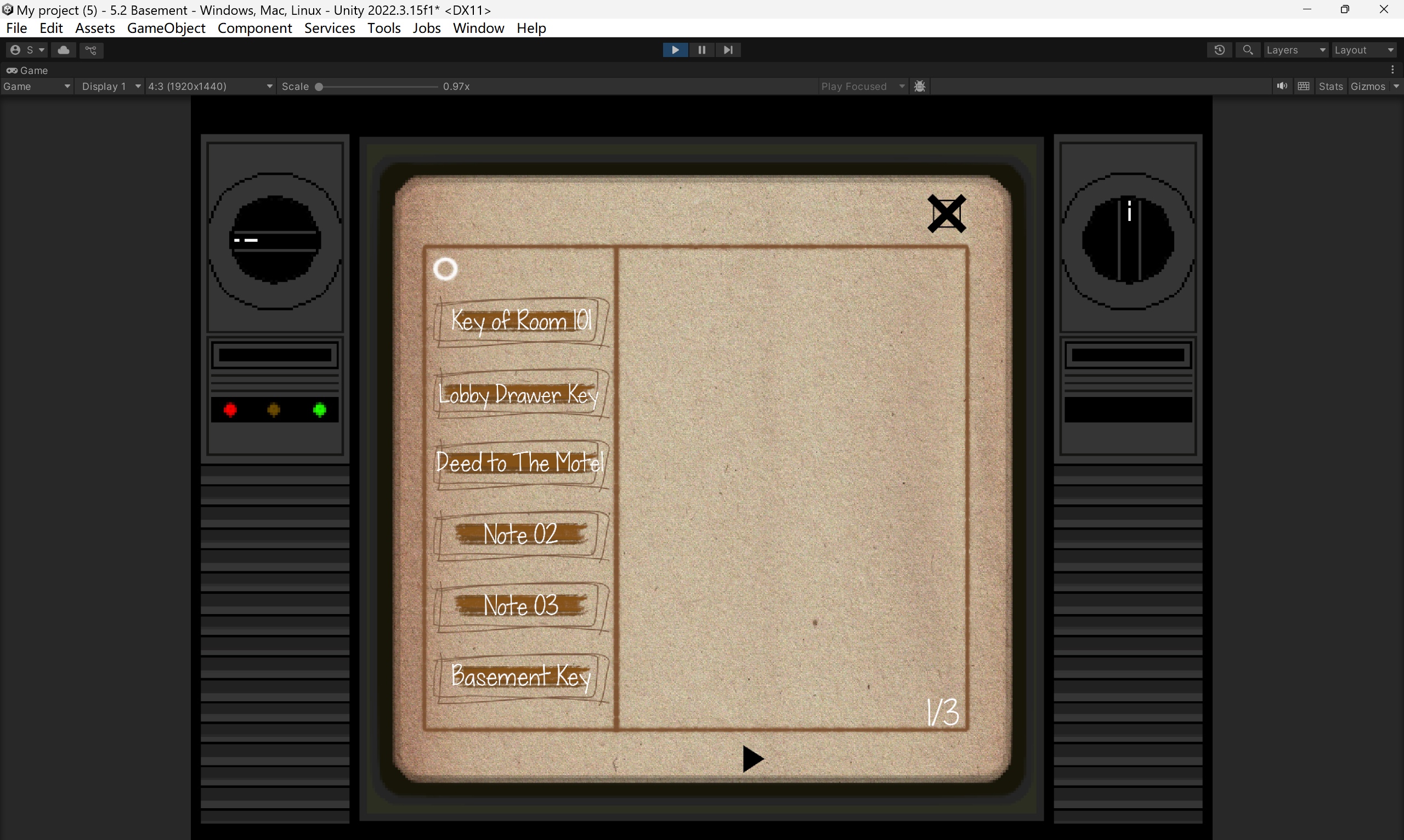
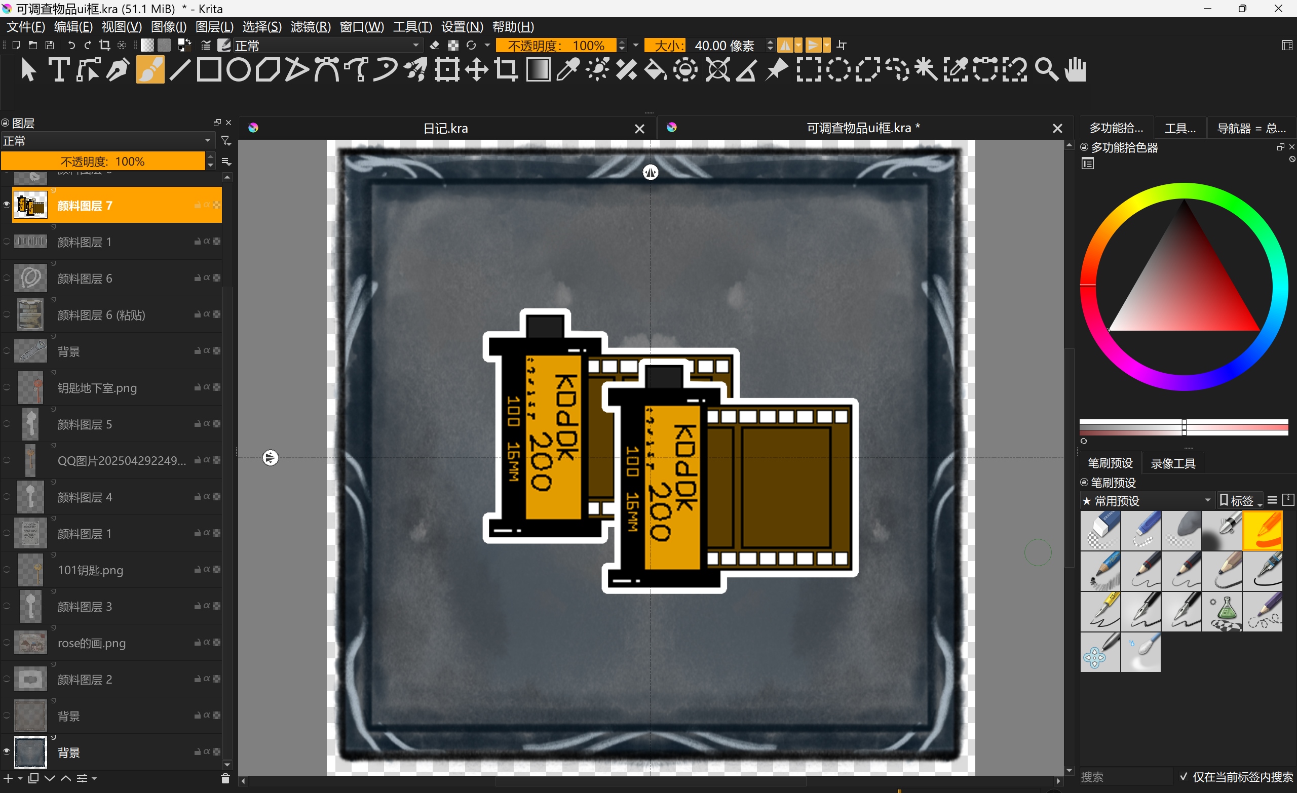
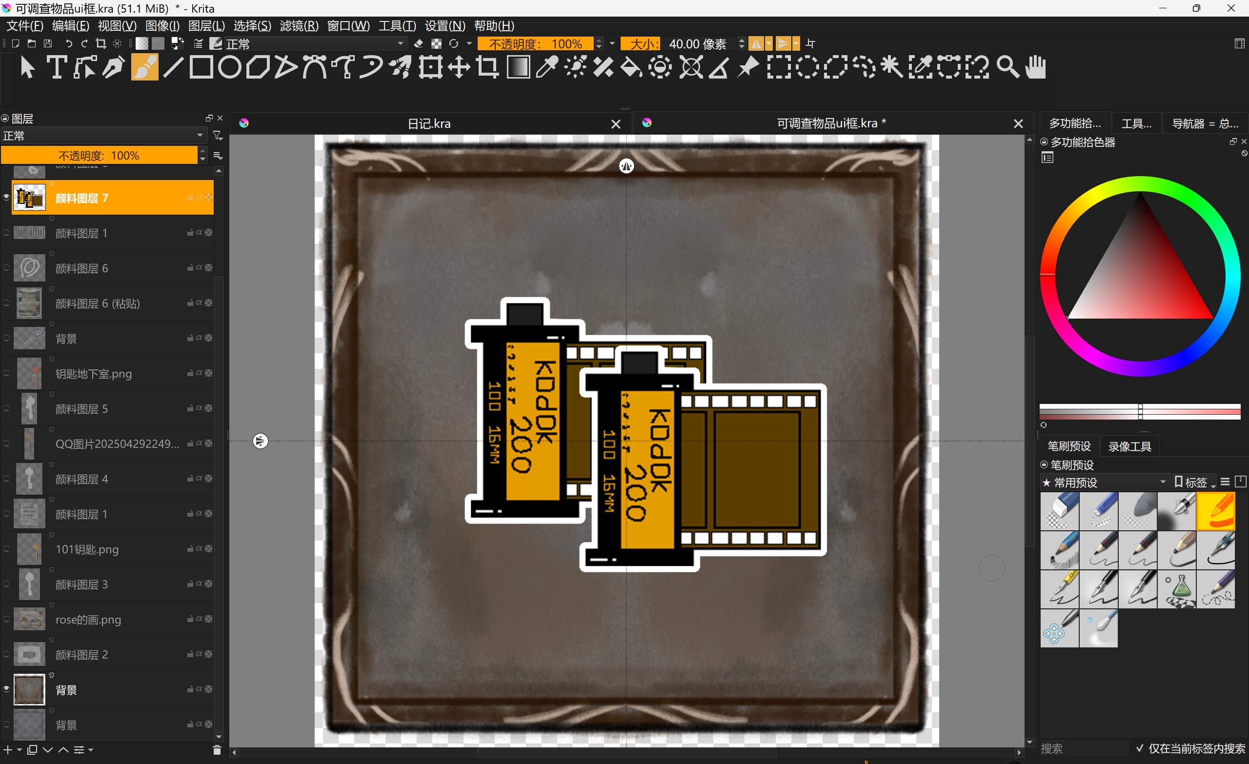
Game Inventory UI
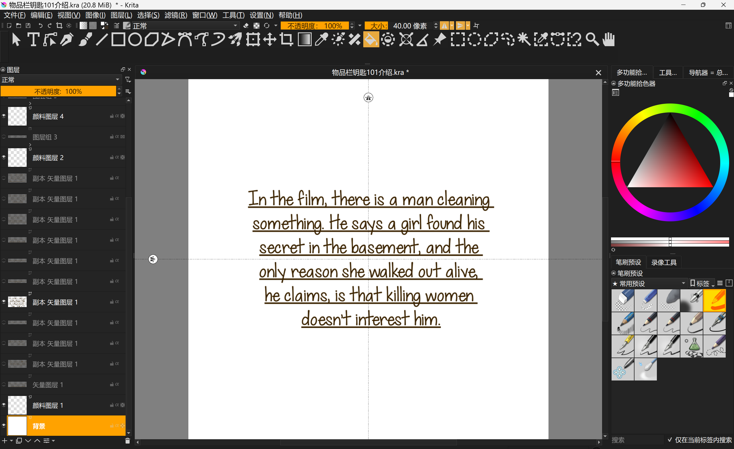
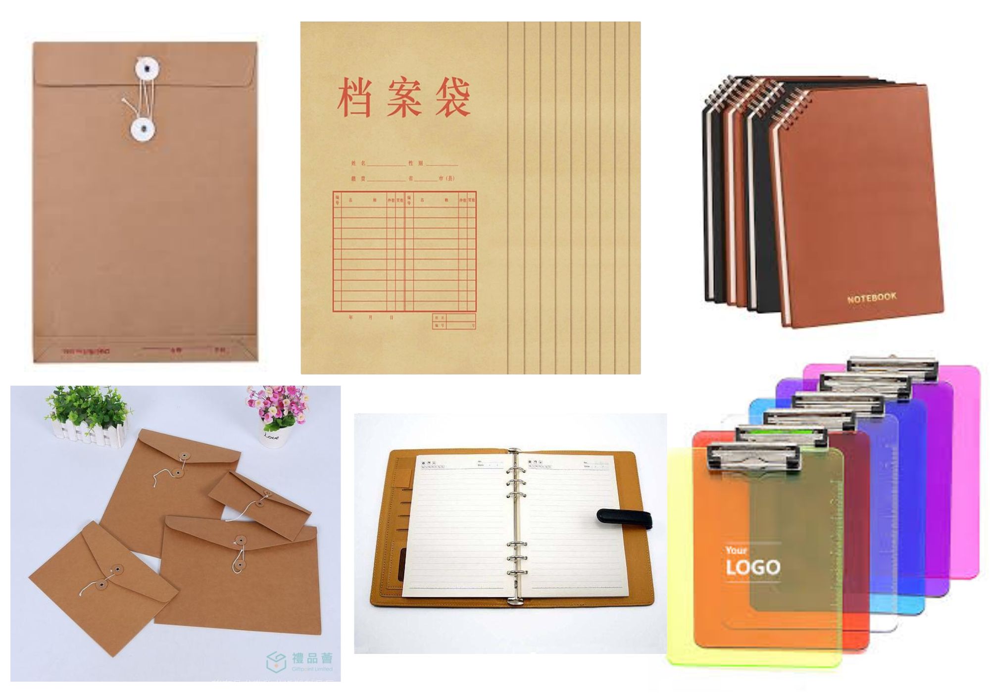
Since we had an item called the “evidence bag,” I wanted the inventory to feel like a document folder or file pouch. So I searched for a Kraft texture to use as the background and drew several boxes on it to display the evidence.
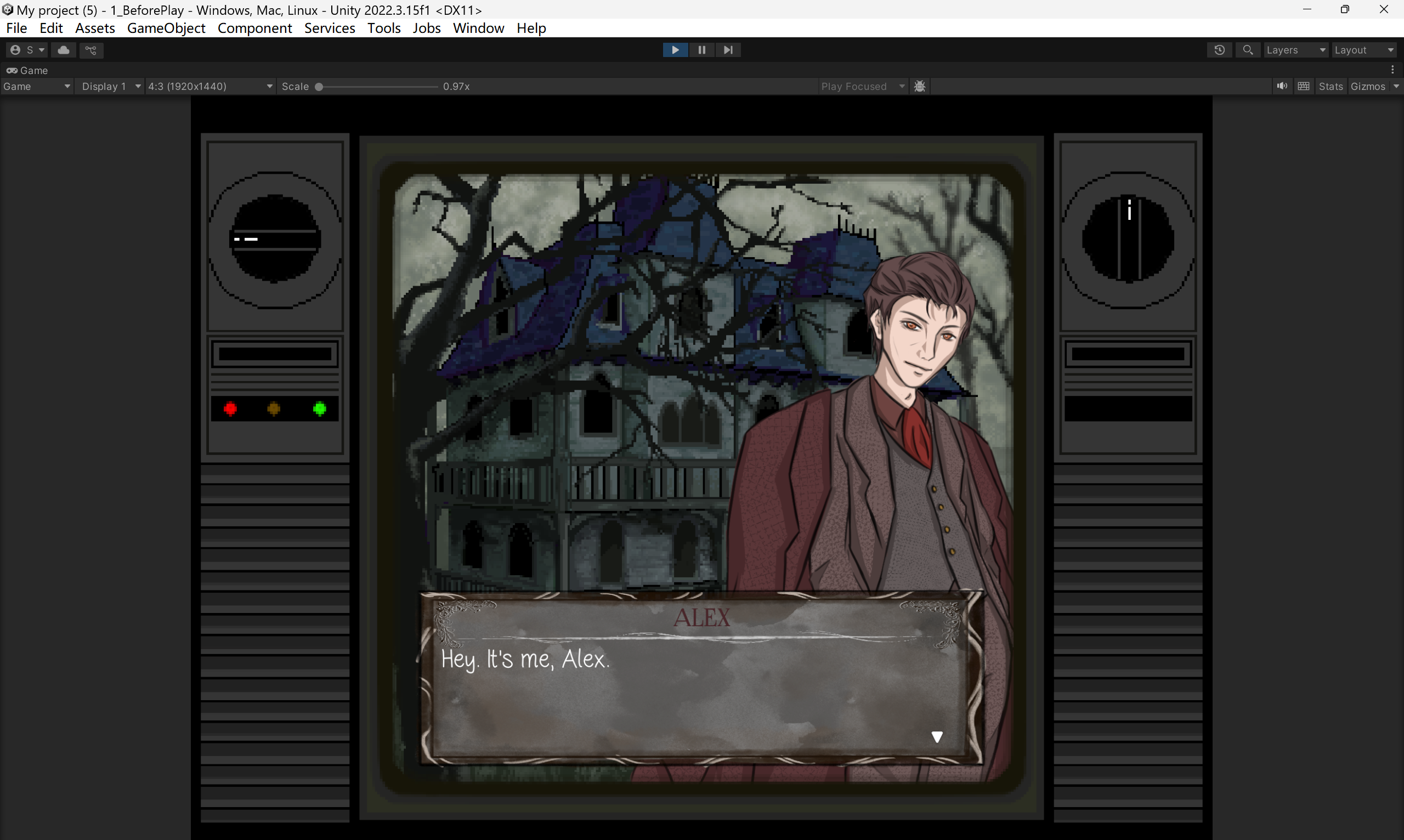
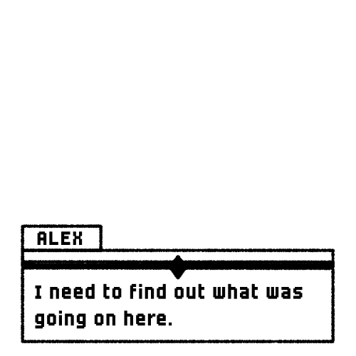
Dialogue UI
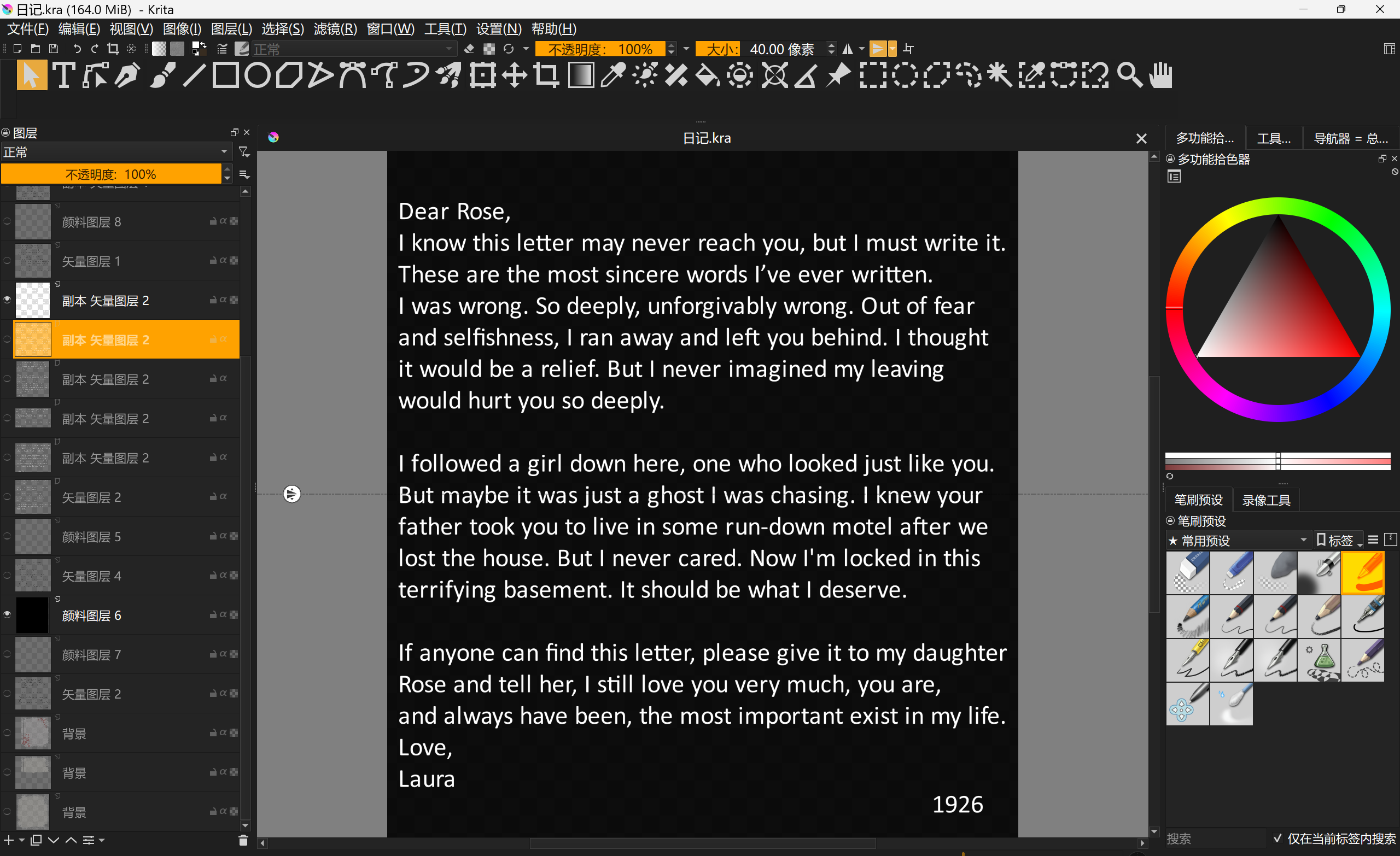
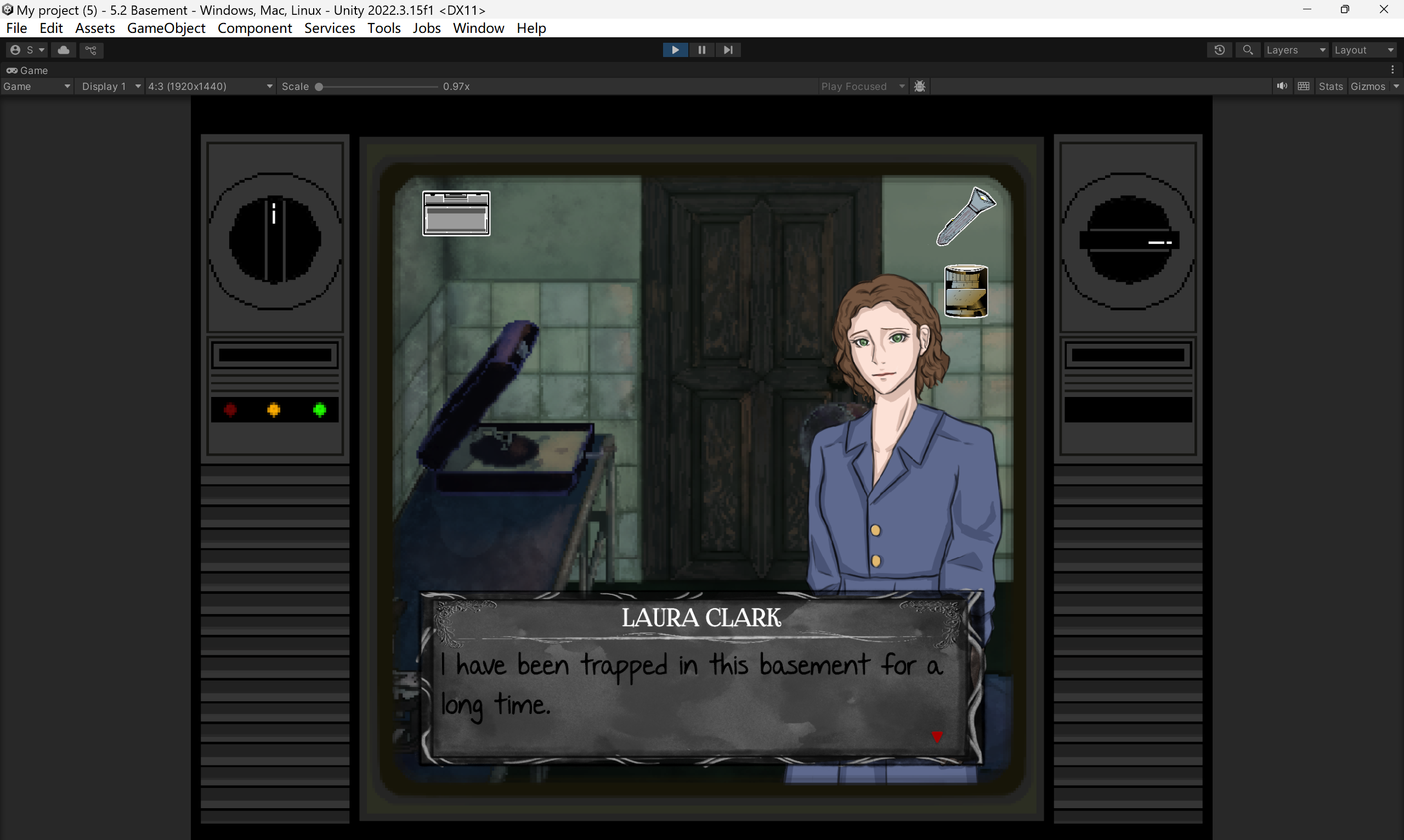
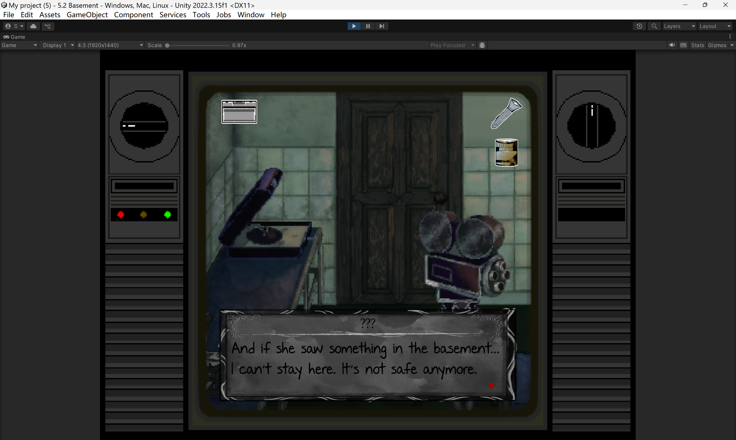
I used the built-in dialogue system from Fungus, but customized the UI to better fit our game’s style.
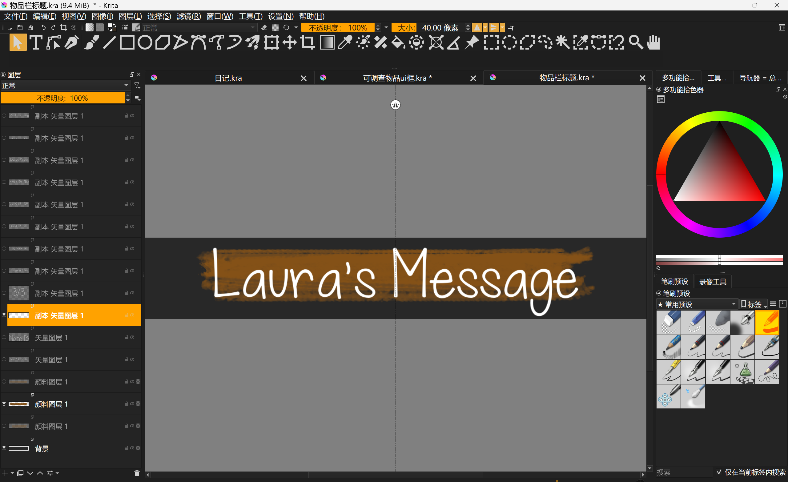
I initially designed a dialogue box myself, but it clearly didn’t fit the overall tone of the game. So I asked Youth to help by drawing a new frame for it, the same one we used for the inventory UI.
Main character dialogue system setting.

Normal narration dialogue system setting.

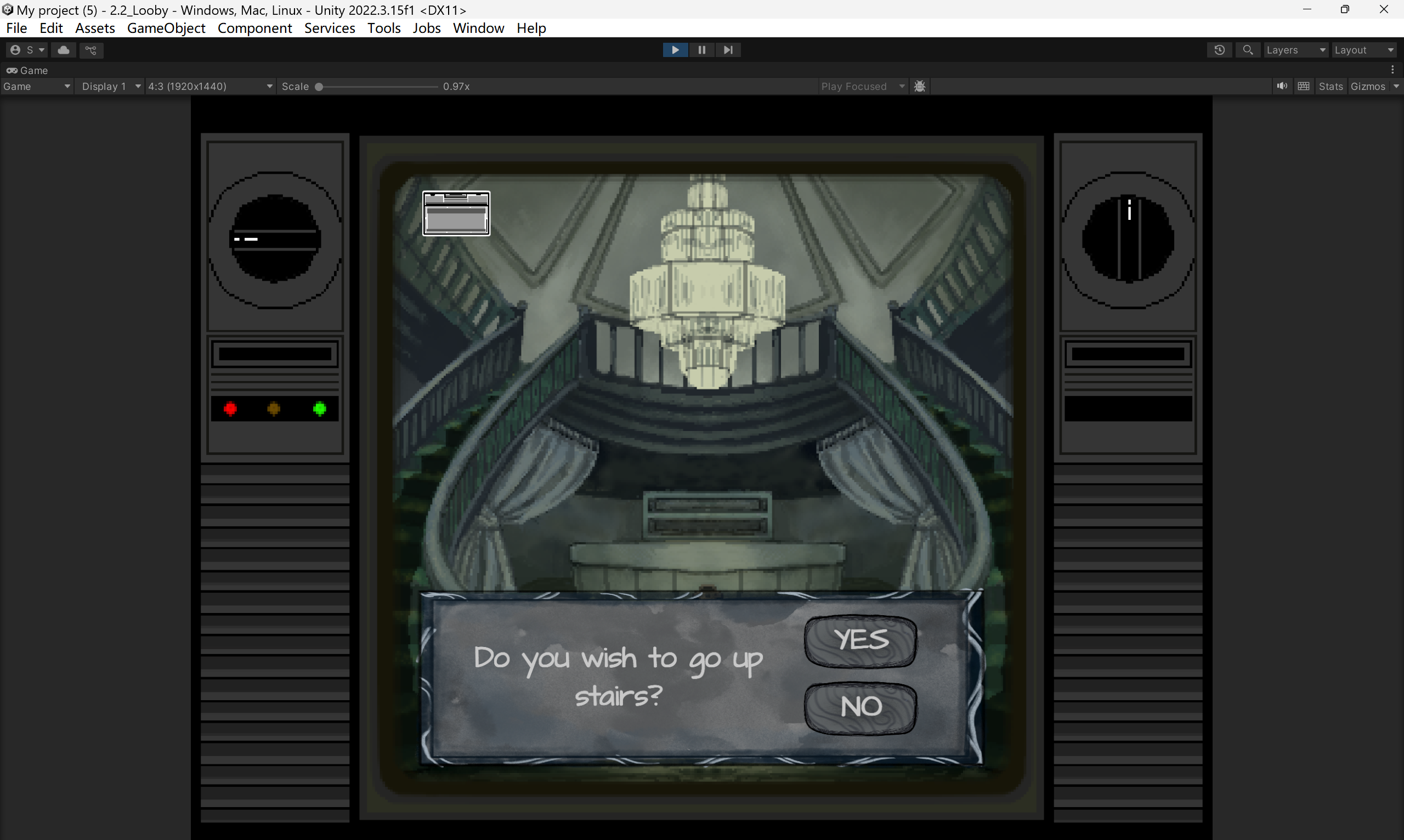
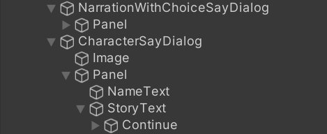
Narration with a choice dialogue system setting

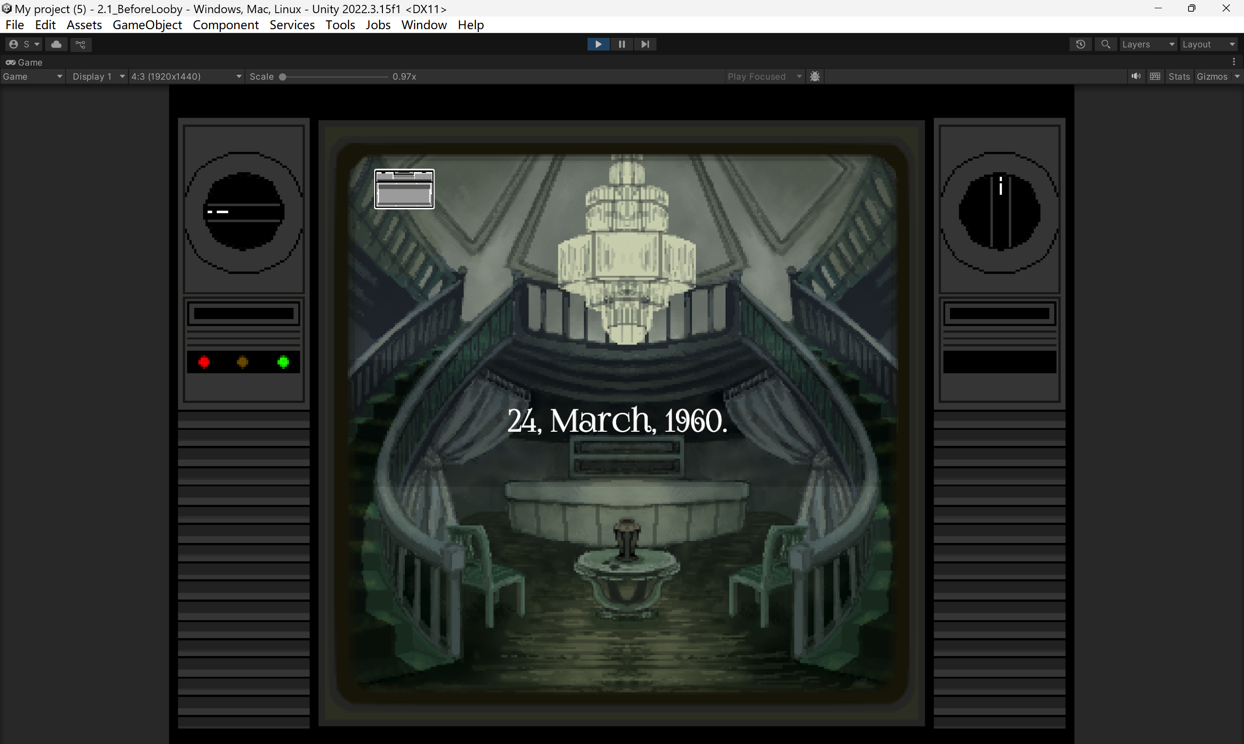
Narration in the middle, usually used to show date, dialogue system setting

This was my initial concept for the dialogue box, but it was created at a very early stage of development, before we even had the full background art. As a result, this version was eventually scrapped.
Others
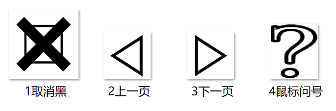
The icons used to close the inventory and flip pages were actually downloaded from PowerPoint’s built-in icon library. I have to say, that feature is surprisingly useful—the icons are clean, minimal, and fit perfectly. As for the question mark on the mouse cursor, it’s taken from the FoglihtenNo07 font.
Leave a Reply