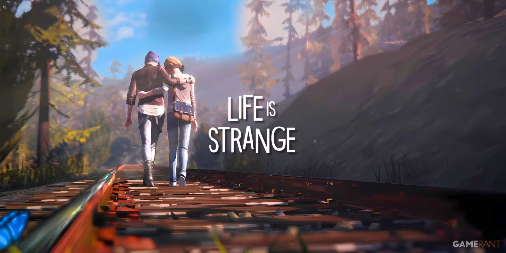
I included art from Life is Strange (LiS) in the character design guide, which mixes realism with a painterly style. It seemed like an appropriate choice as the GDD mentioned that the game’s visual style could be a mix of collage art and photorealistic images. Photorealism can be hard to replicate and sometimes be a little boring to look at so LiS’ art style was a good example of a stylised form of realism.
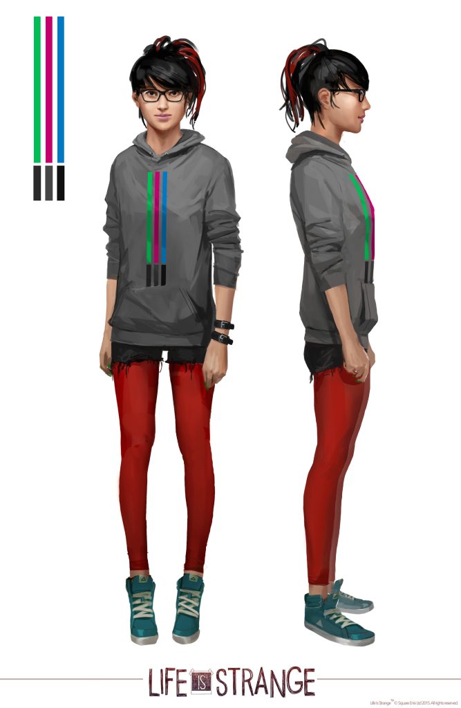
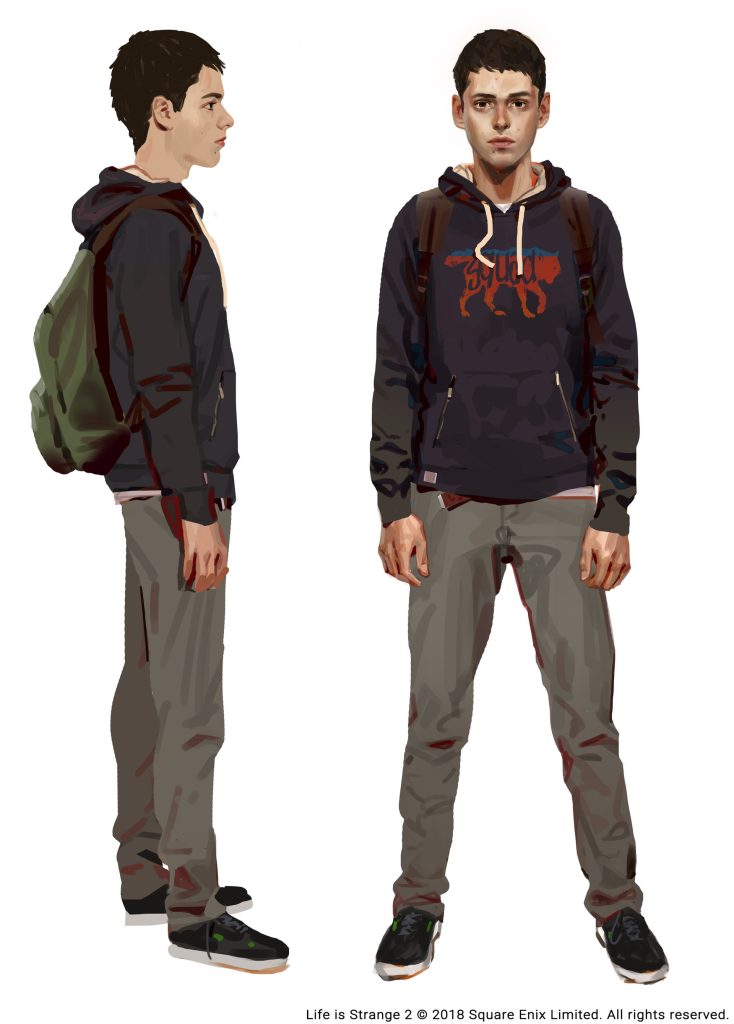
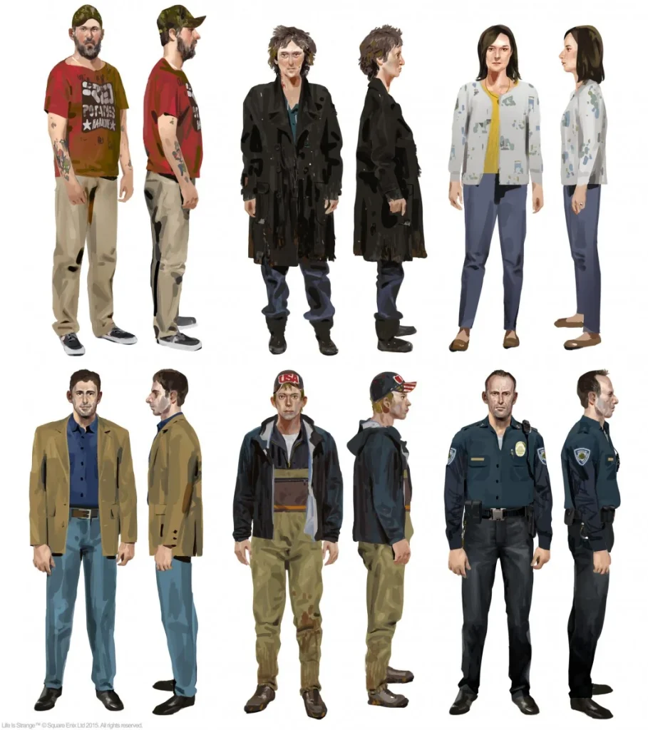
The concept artworks (which were inspired by Alberto Mielgo and Phil Hale) above were created by Fred Augis and Eduoard Caplain for LiS and LiS 2. Looking closely, the concept art is quite loose in terms of the brush strokes. Despite the vague lines and shapes, it still translates into trousers, a hoodie, and a face.
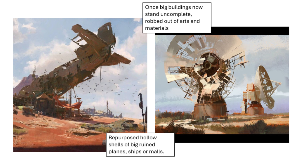
The style has been used in in-game assets such as postcards and photos. The soft lines lend itself to the nostalgic nature of the game and would work well in evoking life before the tragic events that led to the new world in TLB. The image below was used as an example in the GDD for some of the environment art, which also has looser brush strokes and little to no line art. If we were to go in this direction, the LiS art style would be a better choice as it would be more cohesive.
Key elements of the style :
- Painterly and loose brush strokes
- Shading follows the face planes
- Realistic shapes but a stylised texture
- Slightly desaturated colours
- Two main colours that set the tone (e.g. orange and blue)
Reply