Environment Art
The artistic goal is for the player to feel like they are looking at a 50s stylised commercial advertisement – a mixture of retro and flat design. Each environment will have a bold, imaginative, monochrome/limited colour palette and slightly exaggerated props with cartoonish shapes. Like 2000s/early cartoons (e.g. The Powerpuff Girls, Foster’s Home for Imaginary Friends, etc), backgrounds are two-dimensional with softer/minimal lineart to make the characters stand out. Any interactable items may be bolder or brighter, encouraging exploration and making it clear to the player that they can interact with it.
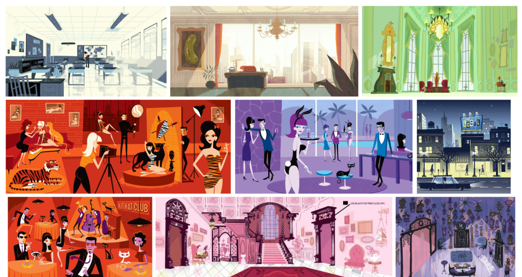
As the game progresses, with the horror unfolding as the main character discovers it, the art will reflect this. The focus is on Genevieve’s desperation for fame and the darker side of Hollywood. The colour palette of the background will also reflect her mood and the environment. Unease can be created through: the colour palette having a darker tone and less saturated as well as the visuals becoming more gloomy as the main character’s psyche unravels.
E.g. The bottom two images on the right side of the moodboard show colour palettes changing from inviting and bright to sombre.
E.g. John’s office at the start of the game will be brighter yet still feel oppressive, starting to fully lean into a darker colour palette as the game progresses, uncovering his true colours.
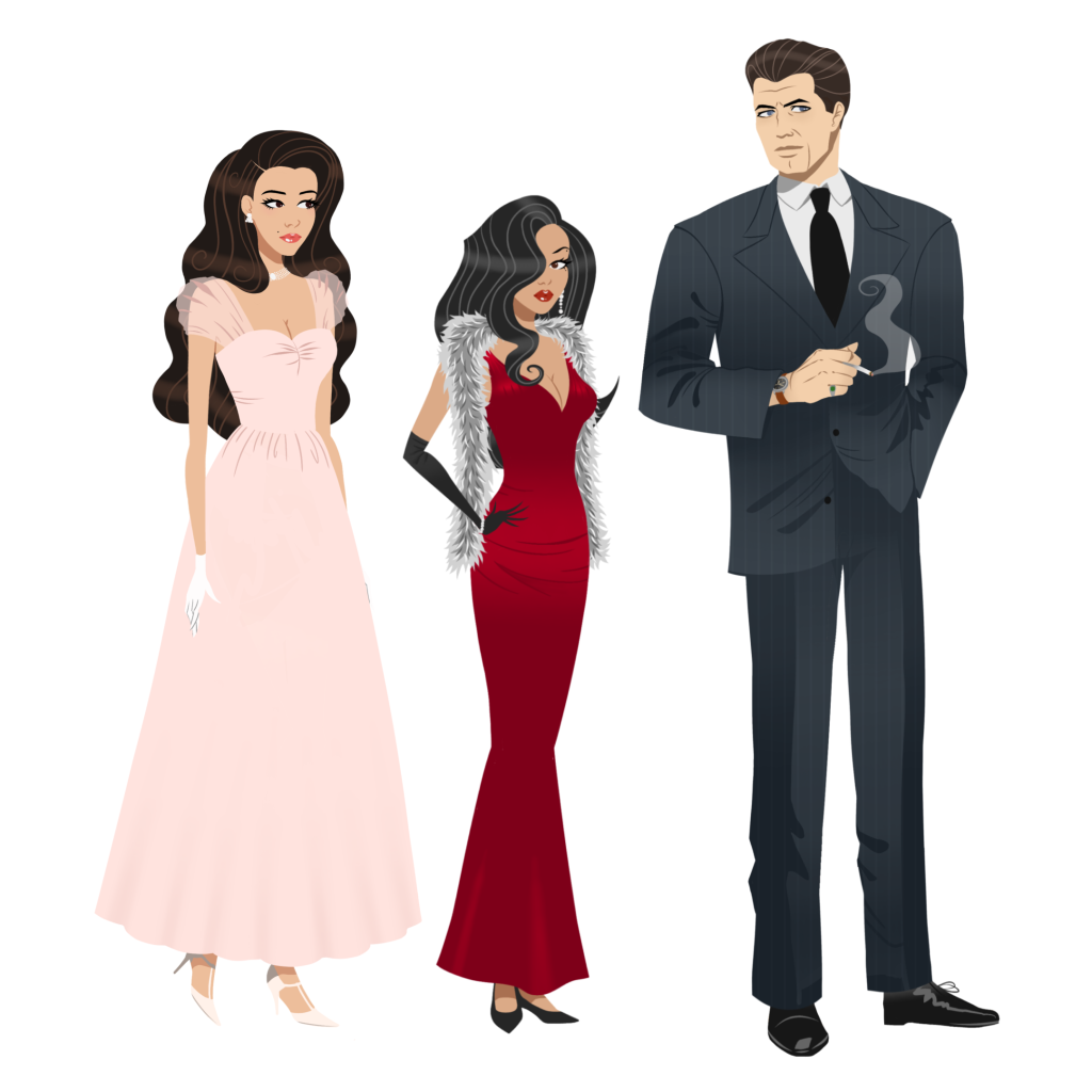
Character Designs
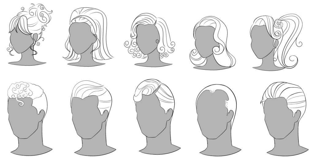
I wanted the character art to be reminiscent of fashion illustrations: exaggerated long limbs and thin torsos but still anatomically accurate. Each character will have their own 3/4 view pose/idle animation that evokes their personality and makes them distinguishable from each other. Genevieve and Angelie’s character designs (on the right) should be opposite but still mirror each other in some way. The main female characters should have extravagant hairstyles and their beauty should look almost caricature-like. In contrast, for John’s character, imperfections are encouraged. Although he is canonically good-looking, adding subtle wrinkles and creases will show his age as well as reference the lax standards for men, especially in his position.
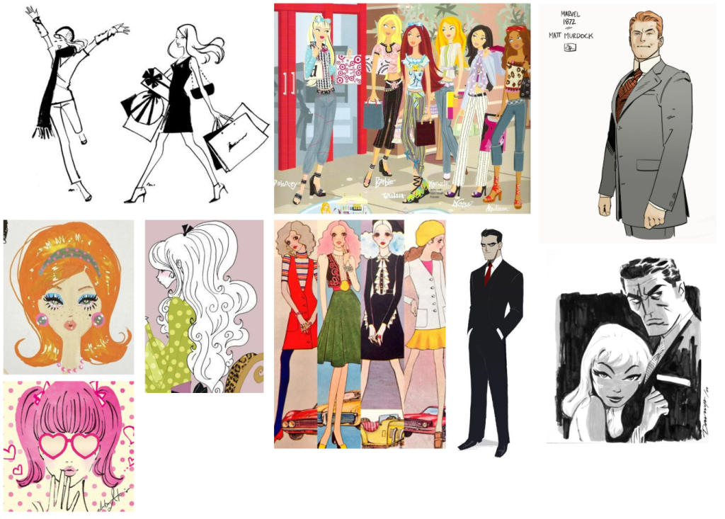
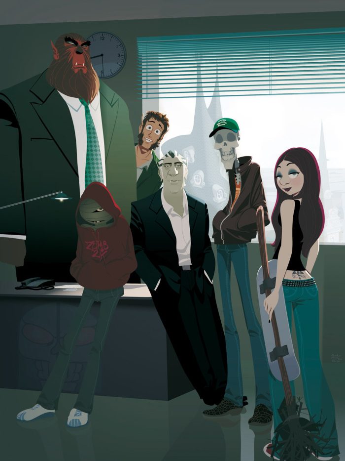
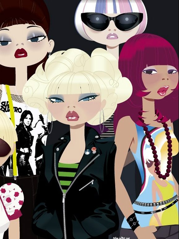
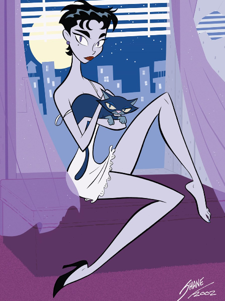
Although the artists I had researched inspired the starting point of my concept art, I was heavily inspired by Arthur De Pins and Shane Glines. While looking at art on Pinterest, I found some of Arthur De Pins artwork for his comic Zombillenium (2009) as well as some standalone work. His style is characterised by mostly flat colours and minimal lineart but with enough shading and detail to make it legible. Shane Glines’ character designs have exaggerated silhouettes and features.
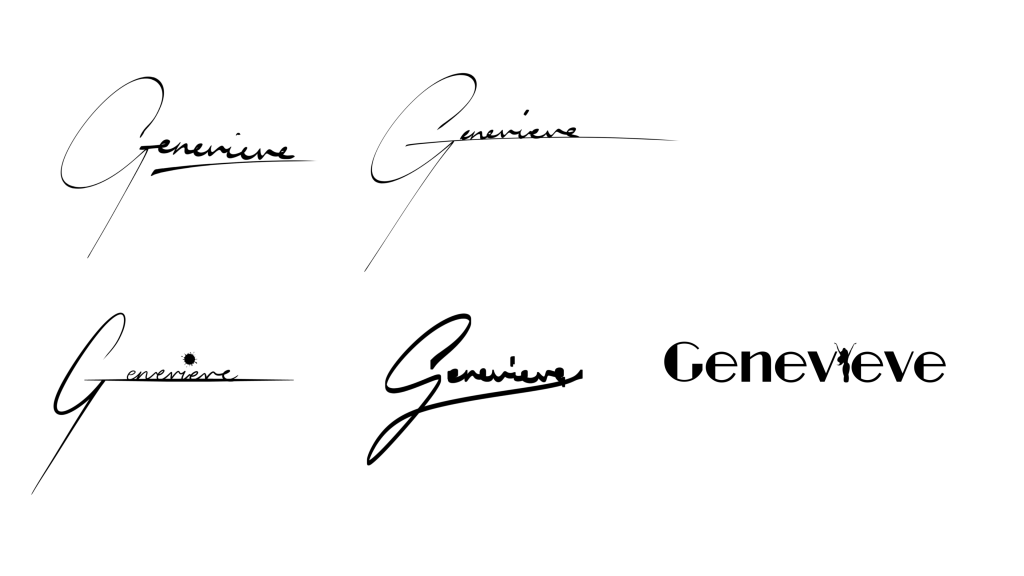
Logo Design
I looked at the logos for Sally Face and Fran Bow as they are also point-and-click games. They incorporated the art style into the logos and were able to evoke the vibe of the games.

For my logo, I thought of putting her name in lights but her name would’ve been to long and repetitive. I wanted to keep it on the simpler side and since the title of the game was the main character’s name, I also thought that making it look like a signature would be interesting. While experimenting with some scrapped concept art, I made a silhouette of her and wanted to incorporate it by replacing the “I” (bottom right) but found that it looked a bit hard to read and the font was more reminiscent of Art Deco which was more 1920s to 30s. I tried different styles, using an ink blot on the “I” to suggest something sinister but ultimately decided on the top right as it was clean, very obviously a signature, and the sharpness also linked into the hidden horror aspect of my game.
Reply