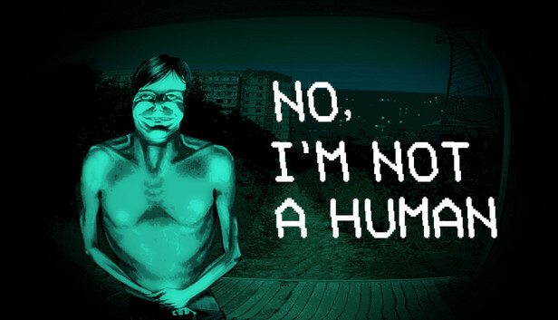
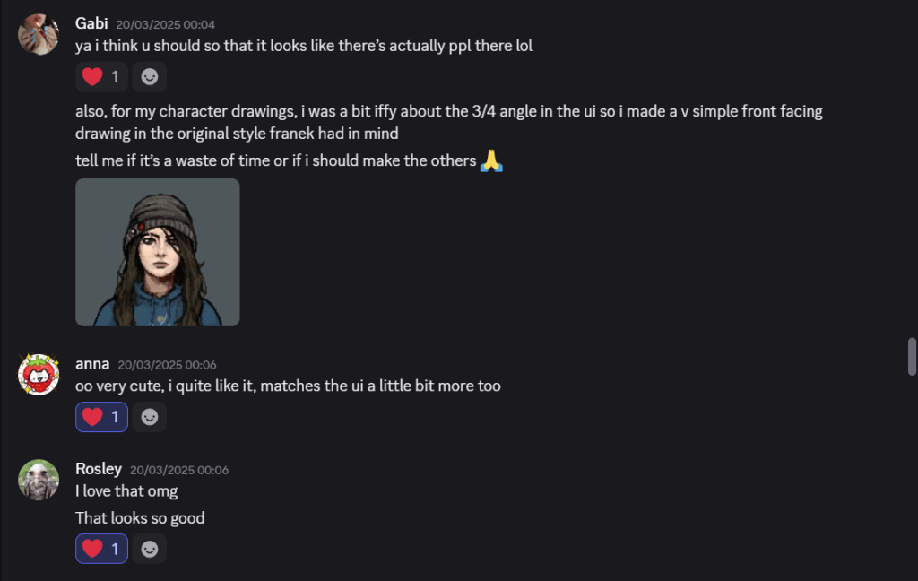
No, I’m Not a Human wasn’t originally going to be one of my sources of inspiration. However, after reading the GDD again, I decided that it matched the vision (see below) for the character cards. Before this, my team and I were using the full-body 3/4 character assets for the cards. Although I was satisfied with how they looked for the dialogue scenes, I didn’t like how they looked in the character cards. I thought they would look much better pixelated and front-facing.
The art style of the characters in the game could be described as slightly pixelated and posterized. Each character’s palette has colours that are complementary or monochromatic. Although the style is sort of realistic, each character has something “off” about them.
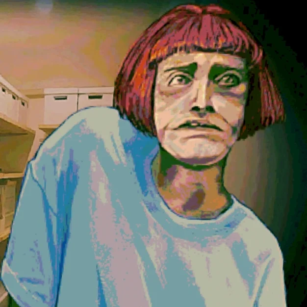
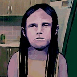
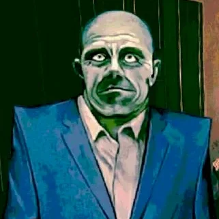

Rather than wanting to mimic the style, I liked the uncanniness and blurriness in the faces. Those Left Behind is meant to have an air of eeriness (at least in the environments) to show how the Otherworld is a husk of what Earth once was. Pixel portraits would tie in with the old media style of the UI, like archival footage or photos.
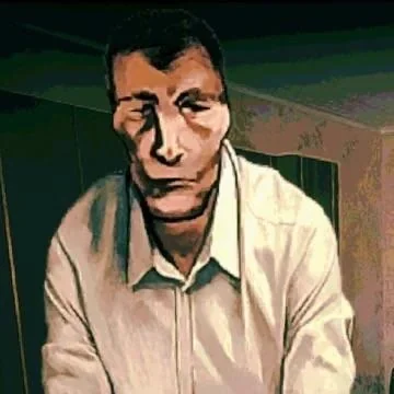
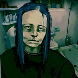
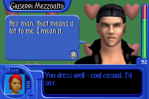
A classmate also recommended that I look into The Sims Bustin’ Out, as it has that pixelated style I was looking for. On the right image, the features are vague, only shadows give the impression of eyes, a nose, and mouth. (See finished character cards in Character Assets)

Reply