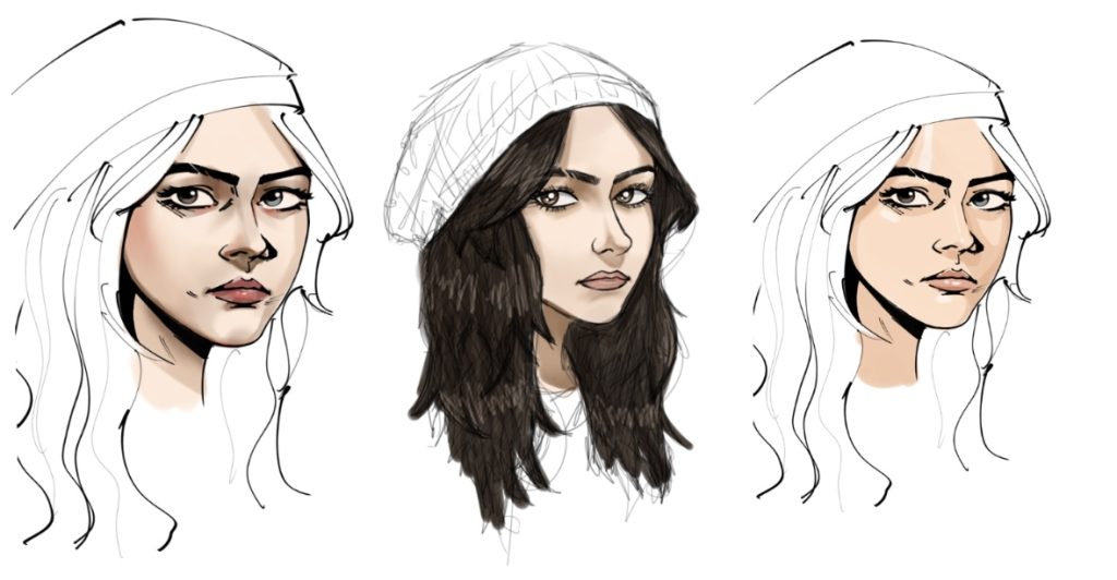
After researching, I experimented with different art styles, ranging from flat shading to more 3D. After a verbal discussion with my team, I ultimately decided to stick with the flat colour and more comic art style (far right). This style fits more with the vision in the GDD and is visually pleasing as the lines and colours are cleaner, meaning the characters stand out more.
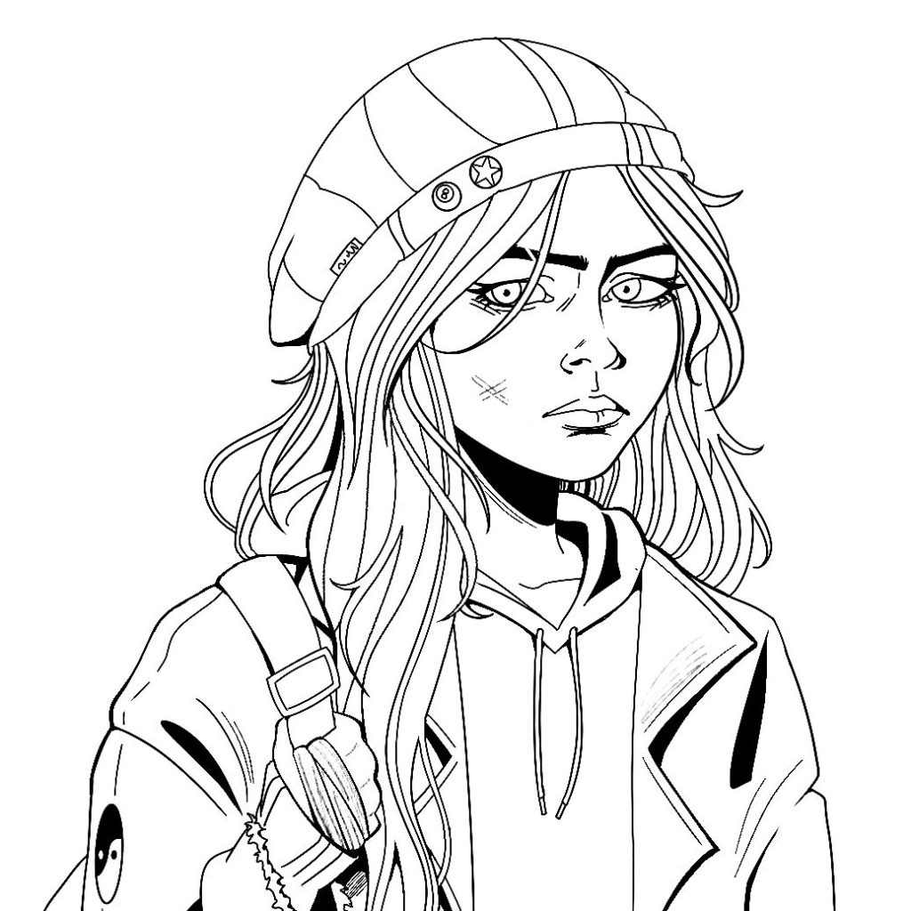
Halfway through drawing the lineart for the first character asset, Lily, I found that a consistently thin line weight was not visually interesting enough and had the lines almost blending into each other. Although it was a very subtle difference, thicker, bolder lines draw more attention and can be used to imply shadows.

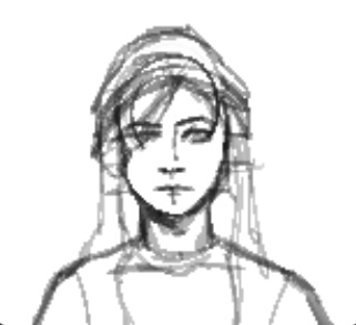
As stated in my research on the game, No, I’m Not a Human, the character cards were made in response to me being dissatisfied with the 3/4 angle of the pre-existing assets. This is due to them being specifically made for the dialogue scenes. I already decided on the artstyle being pixelated so I started by making sketches of the character busts. Since Procreate is not the recommended/preferred software for pixel art, I found a tutorial on how to make high quality pixel art drawings. Using a custom brush I made, I started by sketching Lily. Rather than drawing lineart, I rendered the sketch and added colour using the multiply blend mode.

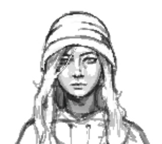
However, a challenge I faced when making this was the quality lowering when attempting to export the artwork to my files. After contemplating on restarting the artwork on a different software, I found an easy fix through a tutorial on YouTube. See the finished character cards in Character Assets.
Reply