Genevieve’s Apartment & Neighbourhood
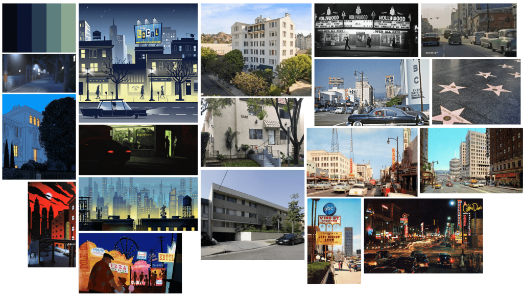
Since Genevieve, at the beginning of the game, is just starting to make it big, it made more sense for her to live in an apartment. Apartments in LA in the 1950s were cheaper and many newcomers would start in apartments in Hollywood and West Hollywood (which was also close to the entertainment). The flats usually have views of the mountains and Hollywood (which is just over a 40 mins walk). It should feature iron fixtures, arched doorways, wood paneling, and a terrace. Architecture usually took inspiration from the Spanish Colonial Revival style. During the day time, it’s lively and bright but when Genevieve is confronted by her fan it should be dark and eerie.
Genevieve’s Dressing Room
Genevieve would have three main dressing rooms: one in her apartment, another at the performance venue, and on the film set. Her dressing room on the film set would be smaller and simpler with the choices for clothes and makeup being limited.
Her Bedroom
In theatre, pink/magenta lighting suggests intimacy and seeing the world through rose-tinted glasses. It is also believed that magenta can help individuals connect with their deeper subconscious. I also quite liked the idea of her room having lots of mirrors or pictures of herself.
The images on the right side are examples of the closet and vanity. The dressing room/bedroom acts as a hub for both.


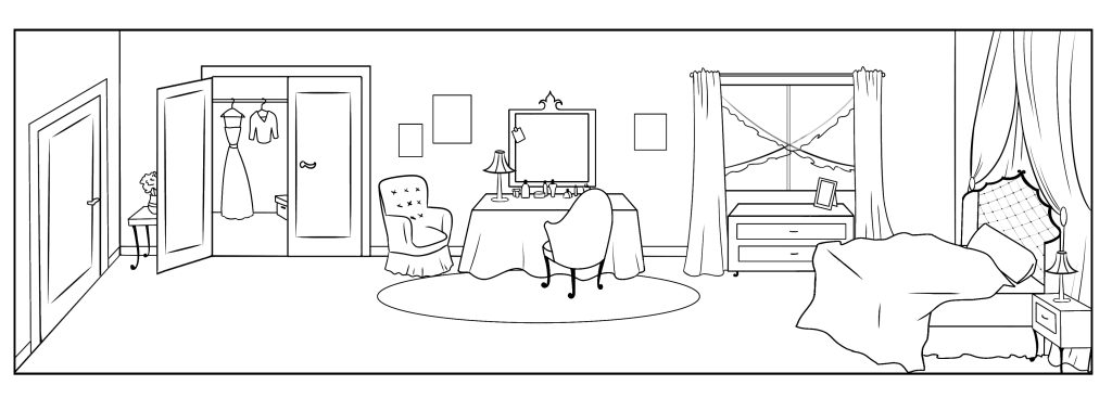
While designing her room, I wanted it to be chic but also lived-in and a little eclectic. This website informed me of what was popular at the time and how different demographics might style their room. However, much of the colour scheme and designs were pastels and very feminine prints. Since Genevieve’s colour palette is quite striking, she stood out a bit too much with the lighter colours. To balance this out, the colours of her bedroom should be saturated and bold, although, the satin sheets were something that I think suits her personality.
The Film set/Dressing Room
The film set and dressing room look like traditional 1950s sets. The dressing room is smaller and sort of makeshift. The pig head on the bottom right is what the NPC’s heads look like when Genevieve starts to have her drug-induced hallucinations during filming.

The Stage & Backstage
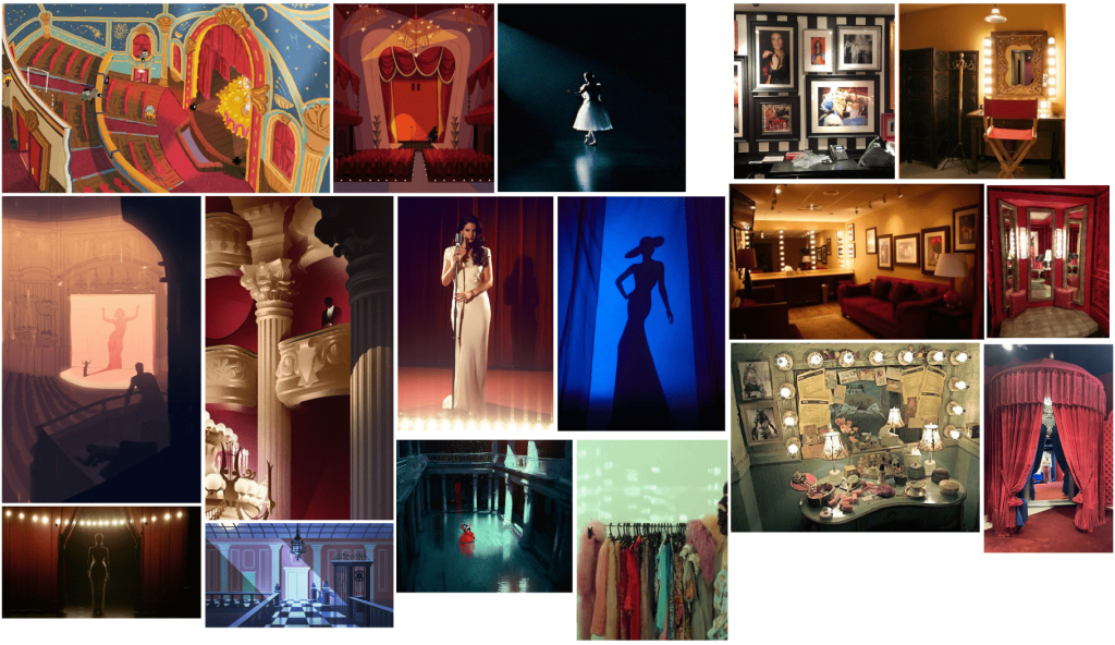
I wanted the stage to feel extravagant and glamorous with bright spotlights and velvet curtains. The colour palette is warm and inviting at the beginning of the game but turns cold and unwelcoming when Genevieve starts to spiral.
Her backstage dressing room is also glamorous with eclectic clothes and other items.
John’s Office
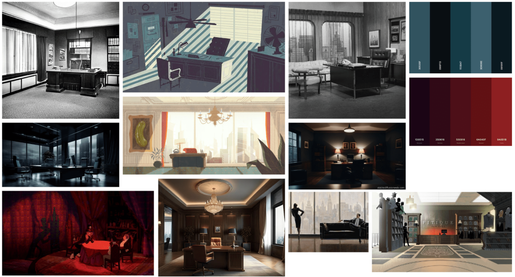
My goal was for his office to feel oppressive and convey that someone of authority owned the space. After all, he’s materialistic, always seeking the best, and enjoys displaying his achievements. Once I created the moodboard, I sketched thumbnails to plan the space’s layout and composition. I wanted the desk to be the room’s focal point, but the 3/4 view wasn’t having the intended effect of making his character feel domineering. In many cartoons and films, silhouettes and shadows often reveal something the antagonist is hiding (e.g. the shadow of a seemingly unassuming character has devil horns). I thought altering his shadow with other objects in the room or making a hidden image in the pictures on the wall would be an intriguing way to tie into how the game is disguised.
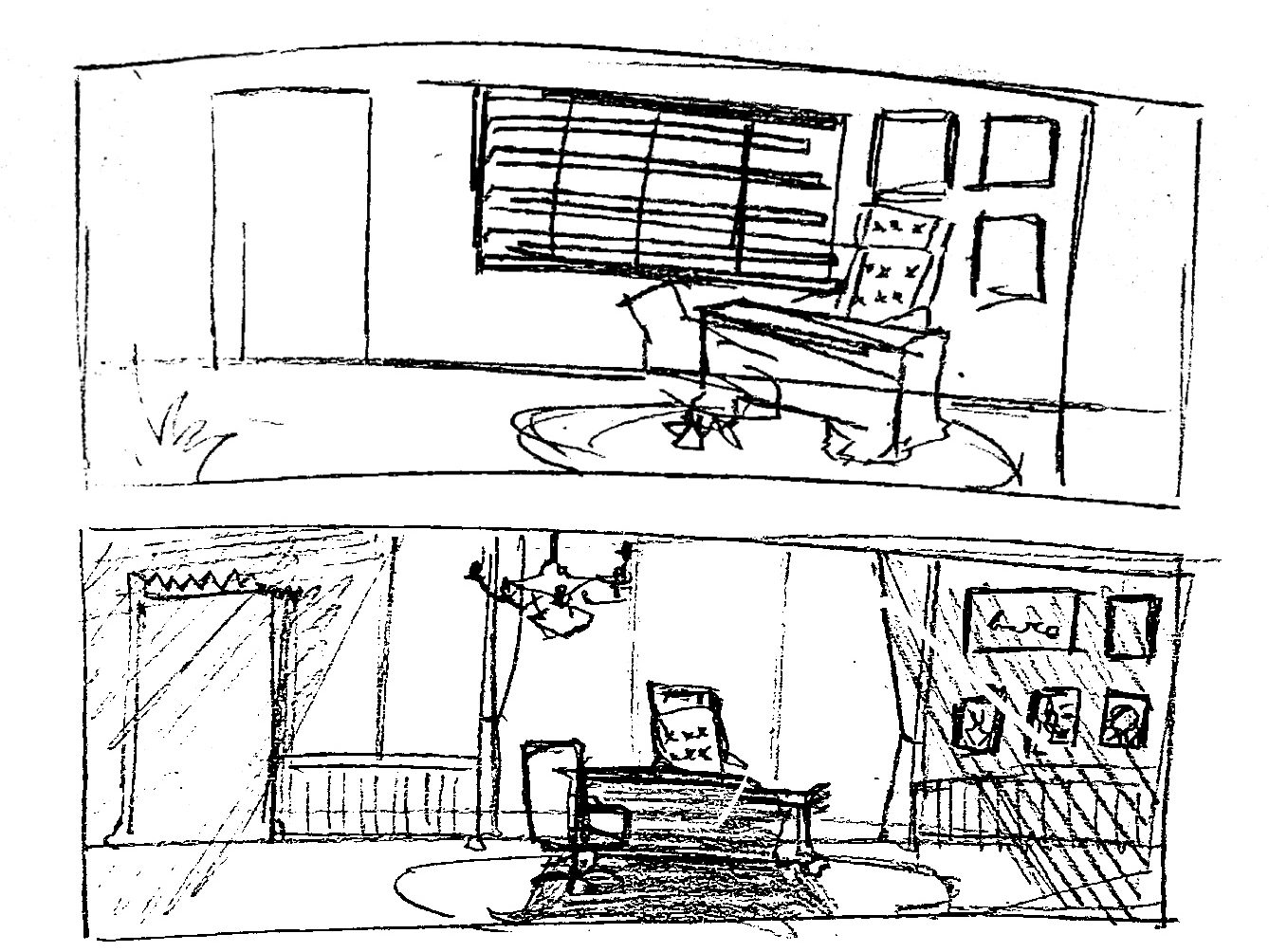
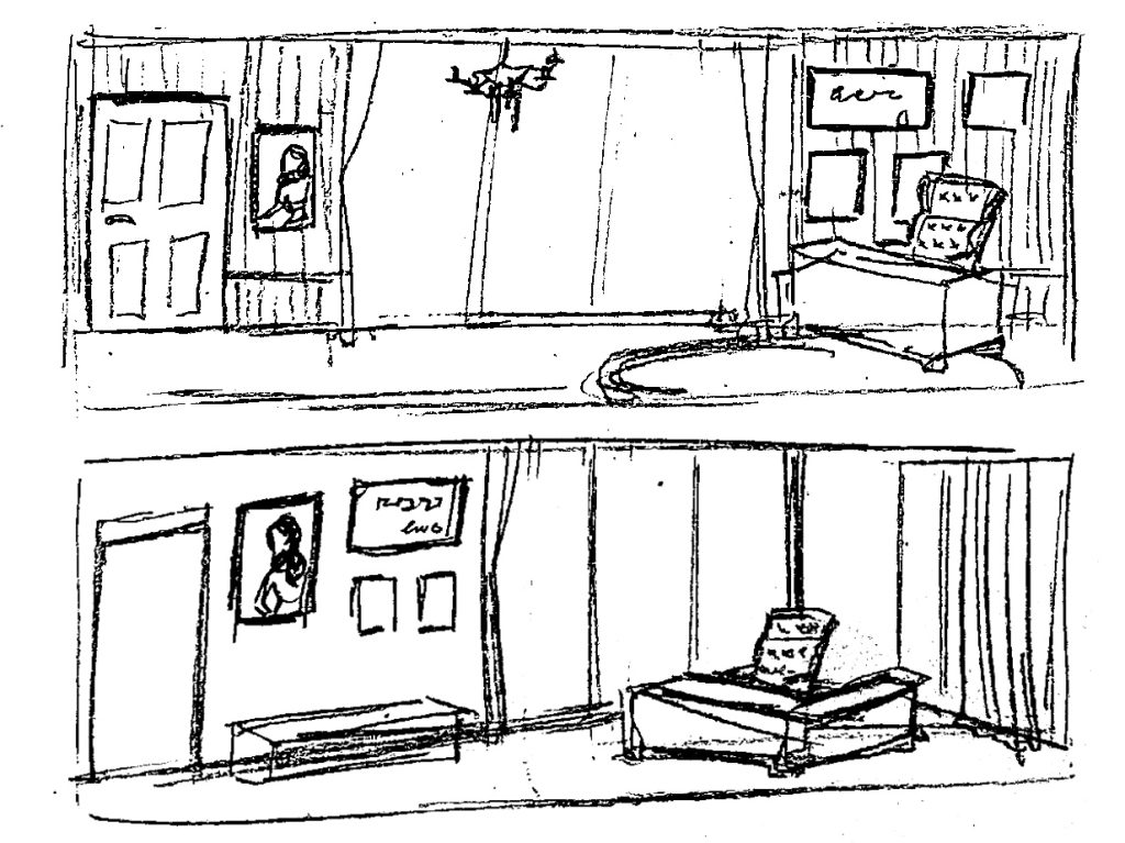
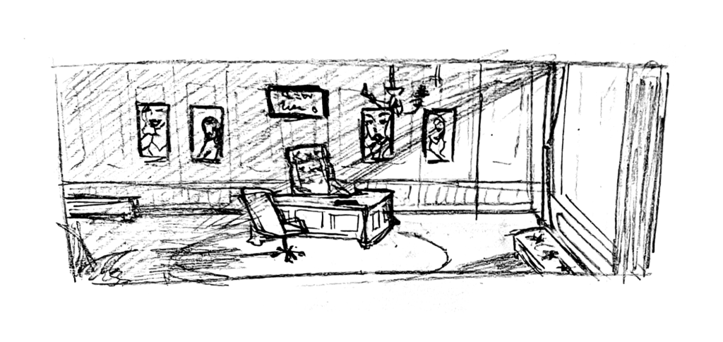
I liked how the bottom left sketch looked and it would work with my idea of having the shadows. However, it was a bit too bright and I wanted the wall behind his desk to be more “useful”. I drew another sketch with framed photos of previous performers and certificates on the wall instead and found that I preferred this much more. The light coming in from the side leaves the other half of the room shrouded in darkness, making the atmosphere more moody.
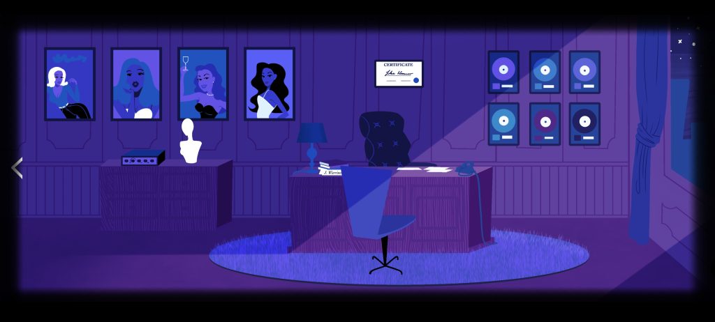
For the concept art, I experimented with the colour palettes seen in Josh Agle’s artwork. The textures, shapes, and harmony between the colours worked well but I wasn’t sure if it seemed to make the characters stand out too much. In Agle’s work, the characters are the same colour palette as the background, making the style more cohesive. If I were to make this again, I would make the colour palette more similar to what I had on my moodboard – less purple and more blue, black, and red.
To demonstrate scale, movement, and interaction in my game, I made a very bare bones animation of a scene using Ibispaint and Procreate.
Reply