⋅─⊱✧✧✧⊰─⋅
Feedback:
I received 16 responses to this survey, and all responses were collected anonymously so responders wouldn’t be afraid to give criticisms. Below are all the responses to the questions:
⋅─⊱✧✧✧⊰─⋅
Feedback analysis:
I will now analyse the feedback I have received! This will help me understand how outsiders perceive the artwork and get tips on what I can improve. I will be referring to people who completed the survey as responders, and categorising the most important results for easy reference. My comments on findings will be in Italics and green.

⋅─⊱✧✧✧⊰─⋅
Part 1:
Q1 – Responders first impressions:
| Correct Impressions | Incorrect Impressions |
| ✧ Desolate ✧ Isolated ✧ Barren ✧ Sinister ✧ Desert ✧ Wasteland ✧ Harsh environment ✧ Launch zone ✧ A camp ✧ Like Mad Max ✧ Base | ✧ Wild west fort ✧ Satellite system ✧ Top secret ✧ Underground community ✧ Watchtower ✧ Pink wafer :’) ✧ Military camp ✧ Beacon ✧ Sports track ✧ Modern castle ✧ Big waffle ✧ Arena ✧ Prison encampment ✧ Government operation |
Its so interesting how varied peoples first impressions of the camp are with little exposition. However responders were still able to identify the post apocalyptic environment, with 1 responder identifying the launch zone immediately!
Q3 – Responders thoughts on the camps purpose:
| Correct Impressions | Incorrect Impressions |
| ✧ Scrappy hand-made, enclosed safe space. ✧ To protect inhabitants and keep intruders or possible danger out. ✧ Safety and shelter. ✧ An area that has been converted into an old apocalyptic base. ✧ A reclaimed settlement. ✧ The home base. ✧ Some kind of launch zone. ✧ Isolating setting. ✧ Separation from surroundings. ✧ To show foreboding and mystery. | ✧ A camp or training area like the military. ✧ Communication. ✧ A Gladiator arena. ✧ It has a prison watchtower entrance. ✧ Industrial bunker or compound – doesn’t feel like a residential area. ✧ Runway track for space vehicles or cargo. – Not far off. |
Responders were able to correctly identify multiple functions of the base with minimal exposition. I believe if the rest of the backstory was revealed and the resource camps were visible then responders would be much less confused.
Notes on Question 4 – Can you identify any specific elements / items in
the surrounding? What are they?
- 4 responders identified the water as snow.
- 1 responder mentioned that the bollards look huge in scale.
I was very surprised to see how many responders thought the water was snow, highlighting a clear issue with its design. This is something I will have to modify in the future, to give it a more obvious appearance as water. I also agree that the bollards are way too large and scale and will need to be shrunk down.
Notes on Question 5 – Do the colours in the environment suit the
games synopsis?
- Comments I found interesting and would like to potentially include in a future iteration:
- “The tower in the middle is a brighter red to presumably help inhabitants find it when they are lost.”
- “Add more contrast or shadows (like from the structure in the middle to show how much the sun is beating down).”
- “I feel more debris and unnatural colours may help to facilitate a post apocalyptic wasteland.”
- “Could be a bit darker and more miserable looking; maybe make the edges of the snow ashier/muddier. But keep the red bright”
- Other responders generally agreed that the colours fit the synopsis well.
⋅─⊱✧✧✧⊰─⋅
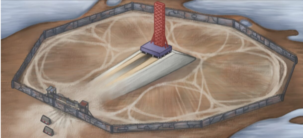
Part 2:
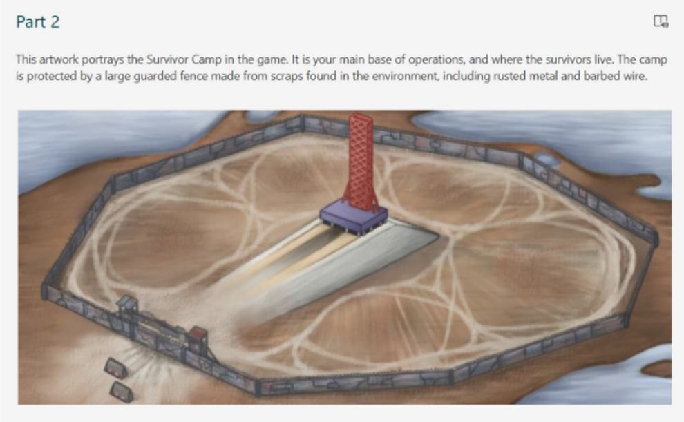
Q7 – Responders thoughts on the guarded fence:
| Positive | Negative / To improve |
| ✧ Rust adds detail ✧ Suits metal that would be found in this place. ✧ Nice dark contrast ✧ Looks worn and rusted ✧ Looks like it was made from scraps ✧ Cool colours and textures ✧ Patchworked together ✧ Obviously a barrier | ✧ Should be more guard towers on other sides. ✧ It looks a bit flat, some thickness could be added to make it look more defensive. ✧ Looks a bit small to be a genuine wall. ✧ Hard to tell how tall it is. ✧ Looks quite low – Could be taller. |
To summarise, responders generally liked the colours, textures, materials and style of the fence, but struggled to understand the scale of the image, or found the wall too low and flimsy / undefended.
Q8 – Responders thoughts on the gate and guard towers:
| Positive | Negative / To improve |
| ✧ Breaks up the perimeter really well and its purpose is clear – entrance & exit. ✧ Remind me of the gates in the mad max fortresses. ✧ Overall responders generally liked the design. | ✧ Define its silhouette more. ✧ The colours could be slightly different from the rest of the fence. ✧ Make the gate a little taller than the surrounding fence. ✧ Make them a bit bigger so They are easier to see. ✧ Defences would be stronger as it looks quite easy to get into. ✧ Add more around the camp as they may want to be guarding all sides. ✧ Pyramid shaped rooves may look more imposing. ✧ Add spotlights. |
To summarise, responders generally liked the gate and guard post design but thought they could contrast with the fence more, and should be spread around the fence to provide the camp with more protection.
Q9 – Responders thoughts on the launch pads purpose:
| Correct Impression | Incorrect Impression |
| ✧ To help them find their way home ✧ Launch pad | ✧ To protect survivors ✧ To alert them of danger ✧ Water tower ✧ Radio mast ✧ Protection against flooding ✧ Entrance to underground shelter |
Notes:
- 6/16 responders thought it was a launch pad
- “To help them find their way home” was not originally the intention behind the launch pad design, however it does make sense for it to be a guide for survivors due to its height and bright colour.
⋅─⊱✧✧✧⊰─⋅
Part 3:
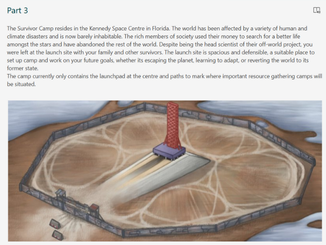
Notes on Question 10 – Now that all the information has been revealed, what are your new thoughts or questions?
Interesting comments from responders:
- The context is very helpful in understanding the elements of the camp.
- The launch pad could be more detailed.
- Is it the sea closing in?
- Where are the toilets?
- I kind of worked it out so that means the artwork serves its purpose!
Responders agreed that once the context had been revealed they could clearly see that it was a launch site. Therefor having clear exposition before players are introduced to the environment might help them understand the surroundings and context more easily.
Q12 – Responders thoughts on whether they thought the environment design suited a post-apocalyptic Florida:
| Positive | Negative / To Improve |
| ✧ 7 responders agreed without ideas for improvement. ✧ Lots of responders thought it looked post apocalyptic but could have improvements to help it look more like Florida. | ✧ 2 responders still thought the water was snow. ✧ 3 responders suggested to add gators/crocs. ✧ Add more props like piles of materials, unused resources/garbage – wood, metal, tires, broken down vehicles. ✧ Add nuclear waste ✧ Add some swamp or marshes. ✧ Could be a nuclear winter ✧ Looks too much like a normal desert and not post apocalyptic. |
Unfortunately due to the GDD prohibiting the use of green, many features that people associate with Florida would not be as obvious, especially in a post apocalyptic wasteland. However responders provided good suggestions to combat this issue. I particularly liked the suggestion of including nuclear waste, and I could add debris to the water to make it more obviously flooded.
Q14 – Responders thoughts on the launch pad design:
| Positive | Negative / To Improve |
| ✧ 10 responders said they liked the design. ✧ It looks very clean and polished in comparison to the rest of the camp – I put this comment here as that was the intended effect. ✧ It’s a different colour than the rest, so people will pay attention to it more. ✧ The layout of everything is very striking and unique. ✧ I like the tracks that have been outlined around it. ✧ It is accurate. ✧ Would be a good site to be stranded in. | ✧ Define its silhouette more; give it wires, scrap bits hanging out. ✧ Maybe there should be some little solar powered buggies a la Signal Simulator that drive around it for checks. ✧ Could there be some of those arms that attach to the rockets? ✧ It could benefit from a bit more detail that implies it is a launch pad. ✧ Add more soot / charred earth. ✧ Top could be scorched. ✧ Very hard to define it without a spacecraft in the picture but it looks good. |
Overall most responders agreed it would be even better and more identifiable with slightly more detail.
Extra comments from responders (some responders gave gameplay ideas so I won’t write those down):
- “Overall I’d say it looks great! It reminds me a bit of Helios One from Fallout New Vegas. I think the game’s concept also reminds me of a game I’m playing right now called Laika: Aged Through Blood in regards to talking to other survivors at the camp.”
- “I wanna see more! For a fun reference the end of Men in Black 3 is set at this location.”
- “I think maybe the colours of the important parts of the camp could be brighter to highlight them to the player, although maybe that would just be highlighted with UI.”
- “This has been a rollercoaster of emotions. I’m not sure what the environment around the edge is supposed to be though – snow or floodwater? Hard to tell. Maybe give it some more definition.”
- “I think it’s engaging and as the player you would want to continue to find out where the story – game takes you.”
- Can you include Wall-E in the design !? – answer: yes.
Now that I have finished analysing the feedback, I will write a conclusion and my next objectives on the post below:
⋅─⊱✧✧✧⊰─⋅
Reply