⋅─⊱✧✧✧⊰─⋅
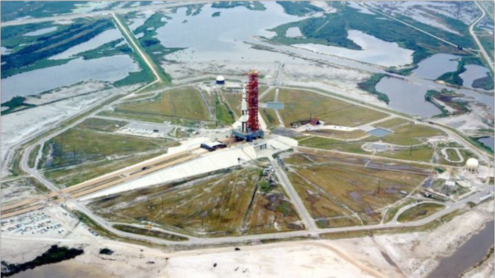
Using the illustrations in the post above as inspiration, I decided to take a photo of a current launch site, and create a concept of it if it were to exist in the world of those left behind. I would use the original photo as a base and layer my artwork on top, building from the existing landscape.
⋅─⊱✧✧✧⊰─⋅
Survival Camp concept art development
I used this photo of the launchpad to map out a concept of the survivor camp and surroundings.
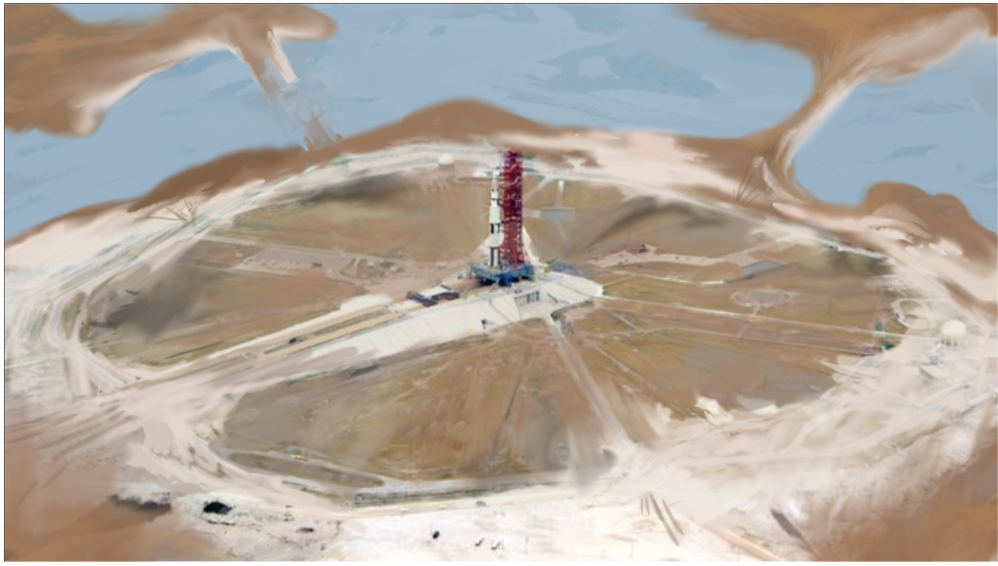
I first changed the environment to resemble post apocalyptic Florida – flooded and dry. I kept the important features such as the launchpad and its outskirts to provide a guide for the guarded fence. I used a low opacity brush so the textures of the launch site would show through, creating greater texture and depth. I also added some black tones, demonstrating how the launch of the Off-world ship may have scorched the surroundings during its take off (for dramatic effect). While there will be no rocket ship in the centre during the actual game, I decided to leave it in the concept art to make it obvious that it was a launchpad.
I drew a simple depiction of the guarded outer fence with a main gate and side gates all accompanied by watch towers. I also added a tiny human on the left for scale. I added in the resource camps using simple triangle shapes with coloured flags and initials to tell them apart.

I then filled in the camp with smaller ‘house’ tents showing where the survivors may sleep, if the colony grew in size. Around the camp I added in things mentioned to be in the world. This included fungus (identifiable from the bright reds and purples), Trash heaps (brown piles with stink emitting from them) and nuclear waste heaps (black spiky things). Franek mentioned the nuclear waste disposal heaps would show up in the game, but I also like the idea of using these black specs to portray pollution. All these things would appear more naturally in the finished design, as this is just a concept I added everything for a demonstration of the possibilities.
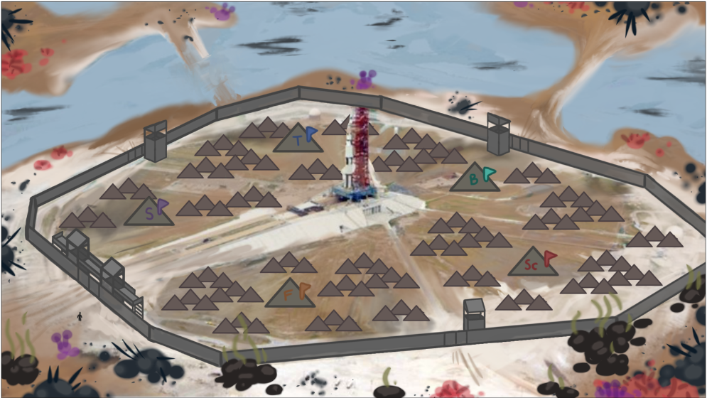
To finish off the design, I added ‘smog’ – a low opacity layer of yellow to enhance the polluted look of the world. This world has not healed from the apocalypse, in fact it has only just entered it, so the environment would resemble a similar state as the second Horizon illustration.
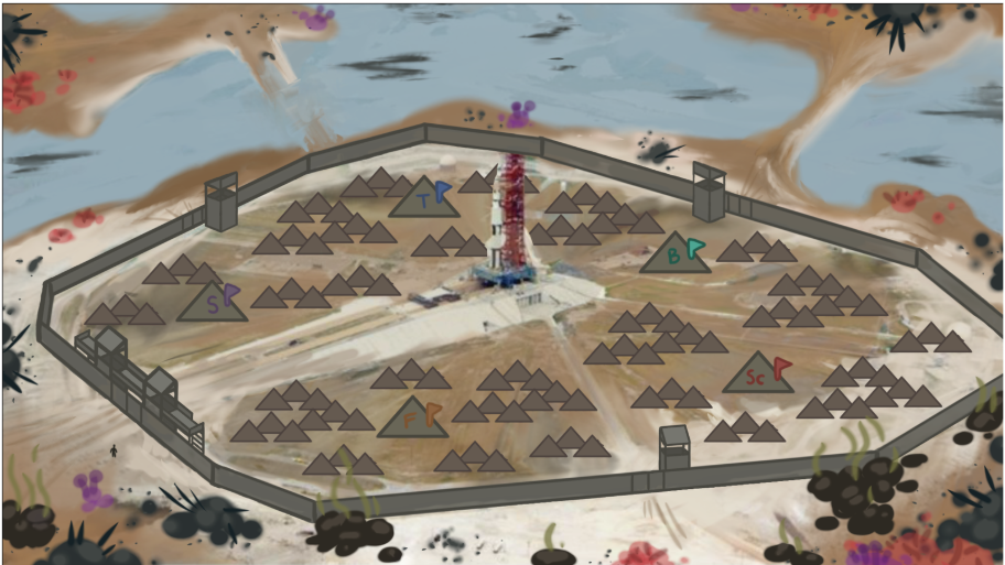
I shared all of these process images with my team and we used the second photo in the playtest as the camp background, using the resource icons as temporary resource camps.
⋅─⊱✧✧✧⊰─⋅
Reply