Mood Board:
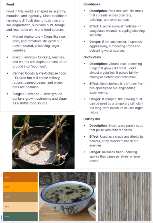
Food Camp design:
Colour Pallet: Oranges, browns, greys
Resource appearance: Bowl of gruel looking substance.
Development photos:
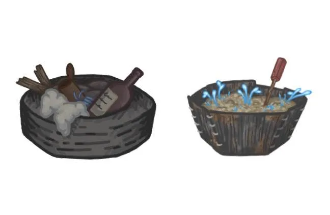
First iteration: I wasn’t very happy with this design, I liked the idea but it was too different to the scrap design. It was too light and too detailed. I wanted it to look kinda gross but this design is too off-putting.
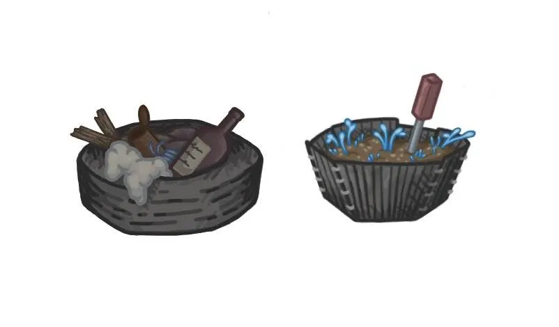
Second iteration: I prefer this version much more, however after consulting my teammates they said the blue mushrooms looked a bit too much like water, so changing the colour may make it look more realistic. I also think it looks like a plant pot and not food.
I also realised I need to make the resource colours match the camp colour pallets to enable easy association, so I will attempt to implement this in my future designs.
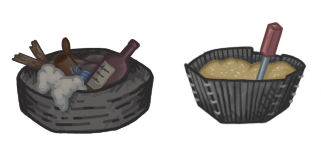
Third iteration: I think the bowls colour is too similar to the scrap resource and as I want to colour code each resource, I need to use orange in this design. I also think having the screwdriver as the mixing utensil would no longer fit with my vision of this design.
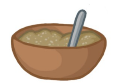
Final iteration: I made the bowl and spoon much more simplistic, fitting my new vision much better. The orange colour allows it to be both easily distinguished from the other resources, and clearly a product of the food camp.
Reply