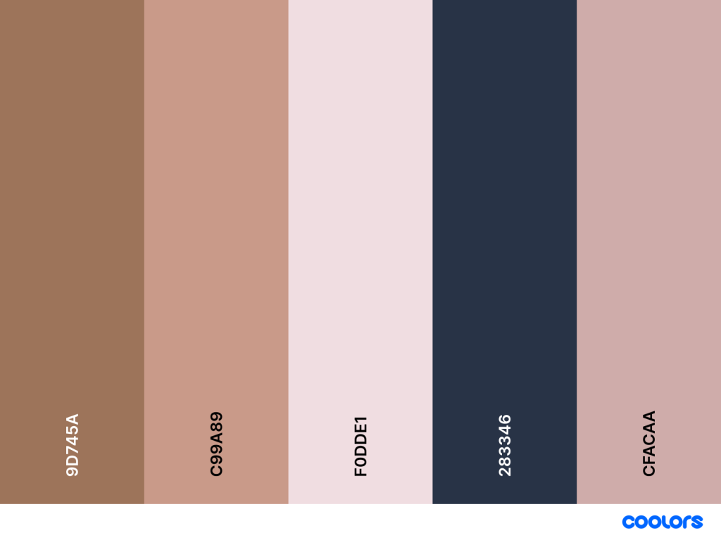
Once we had the meeting with Sophie about colour palettes and thumbnails, the team has finally come down to the conclusion of a finalised colour palette that was picked out by a survey which can be found here.
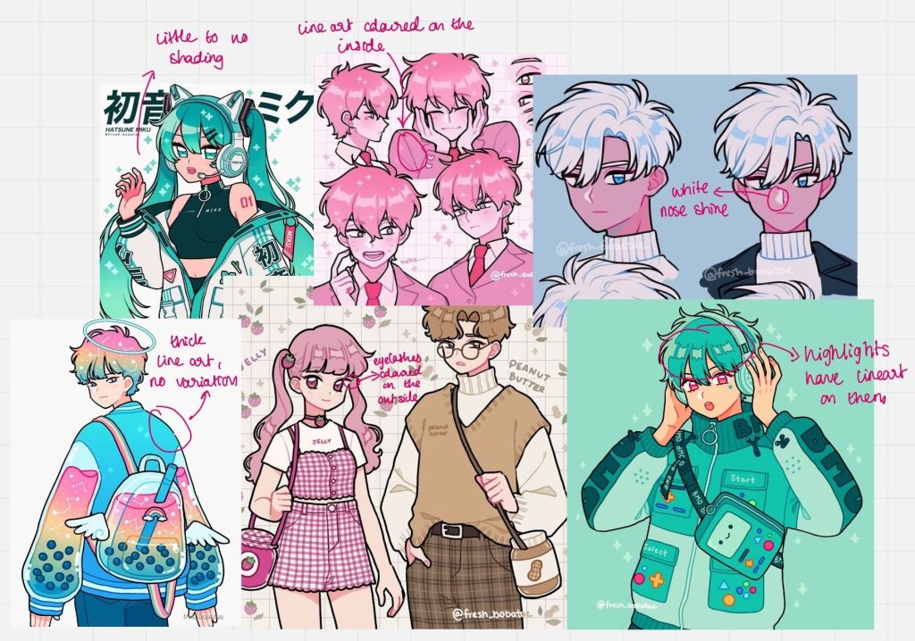
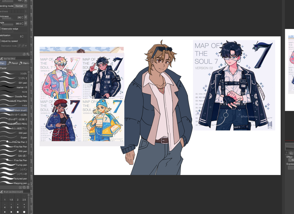
The next step from here is to remake Yami’s design and fit the environment a bit more. As the background uses no line weight variety and little shading, I looked at a couple of artists that have the same art style as Izzy’s. Once I had looked at these artists, I didn’t bother with a mood board and just switched between drawings whilst I was drawing Yami. Here are the images I used and I mainly used @freshboba_tae on Instagram as reference for this new art style (I have been a follower of her art for a very long time, she inspired me a lot growing up!).
Process:
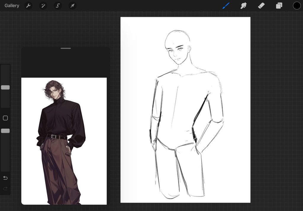
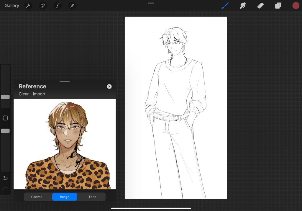
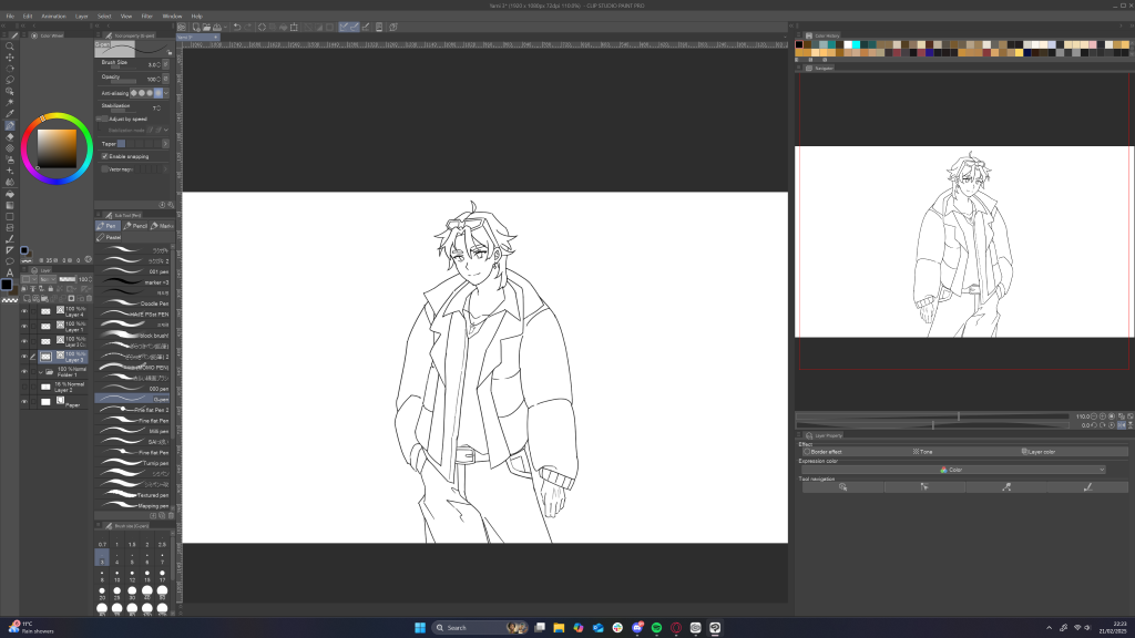
This time, I wanted to approach my design process a bit more different. By this I mean that I wanted to complete a sketch on Procreate and import it to another software that supports vector layers. This is because I have noticed that in Procreate, whenever I slightly transform the drawing, the pixels become a bit deformed and it doesn’t look very nice, especially if the main attraction will be the character. I tried to do the drawing on Adobe Illustrator on iPad, but I wasn’t familiar enough with the brushes to change them, so I went to ClipStudioPaint to complete the line art layers.
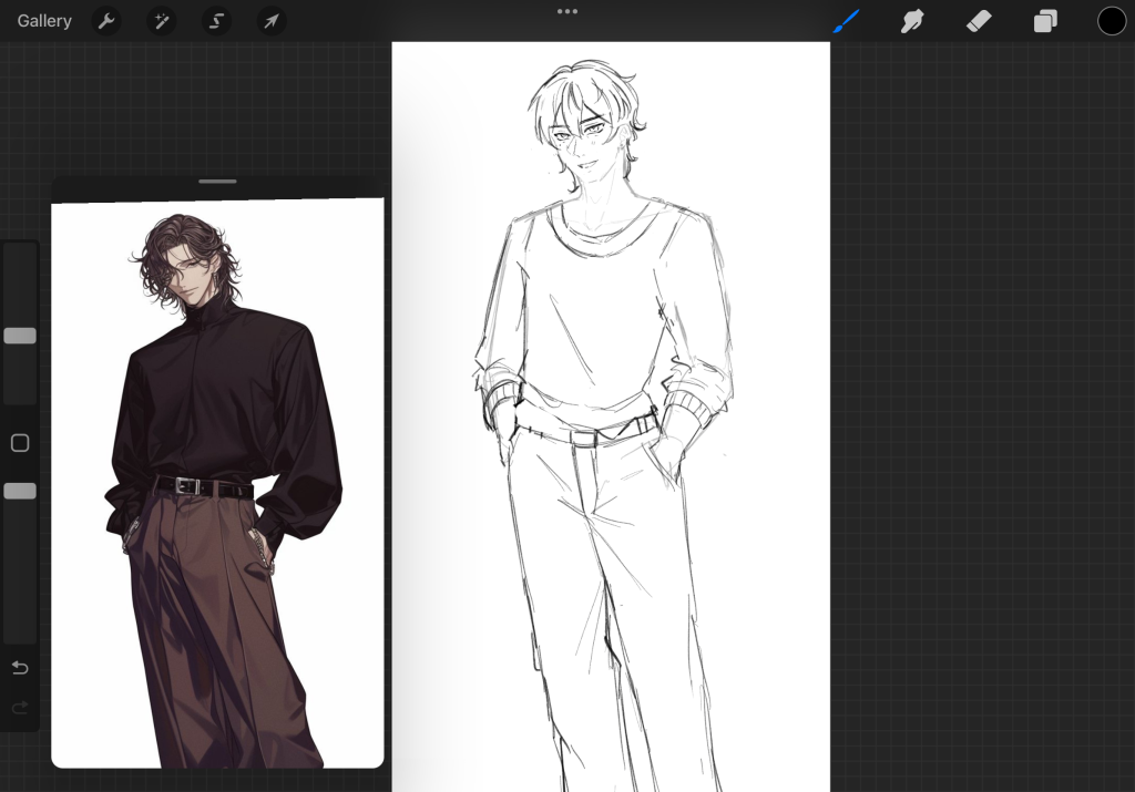
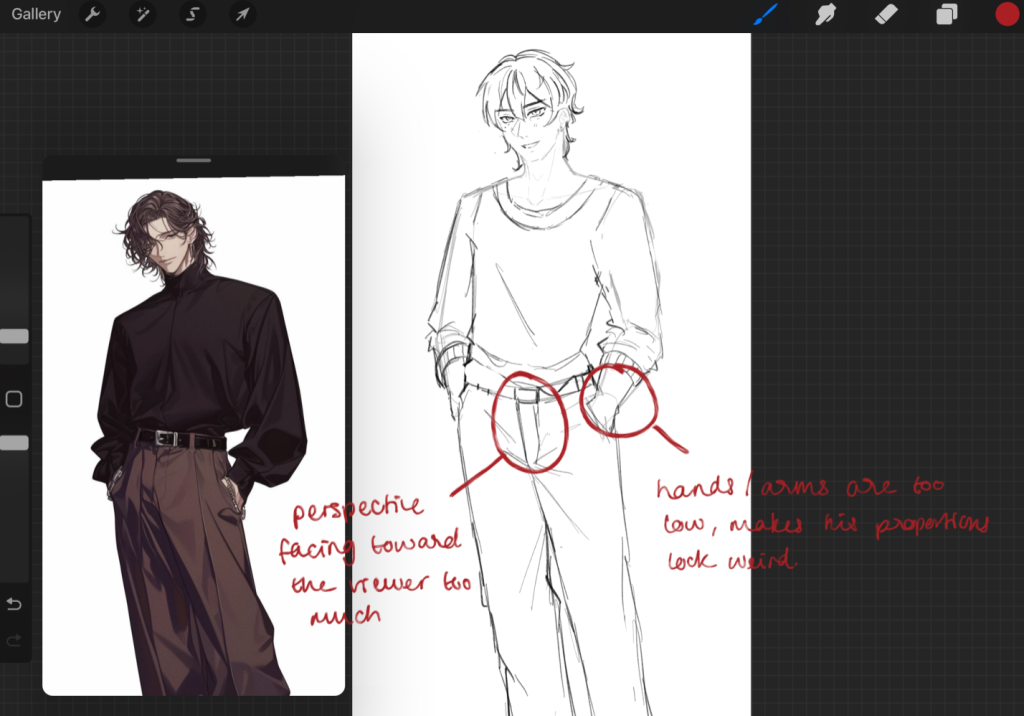
Base sketch (Procreate)
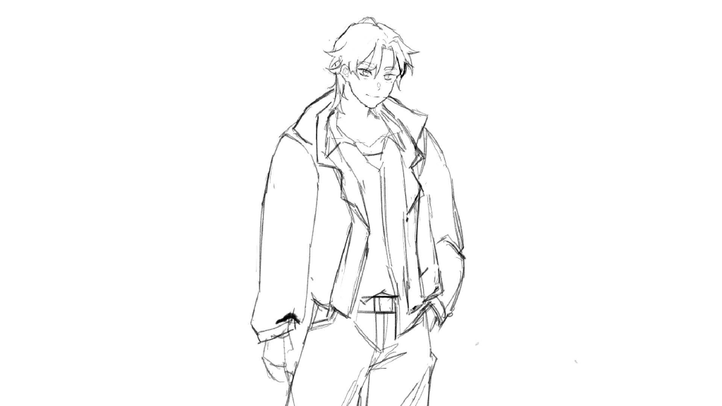
Although it isn’t as noticeable here, but the pixels get quite deformed, hence why I moved to a different software.
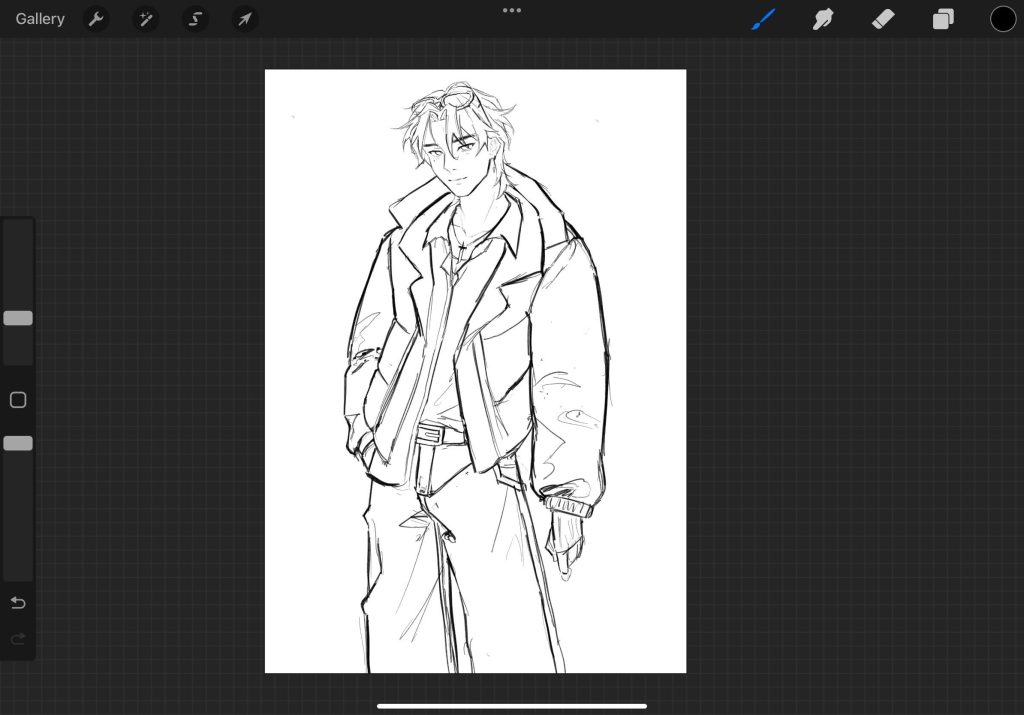
Line art
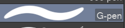
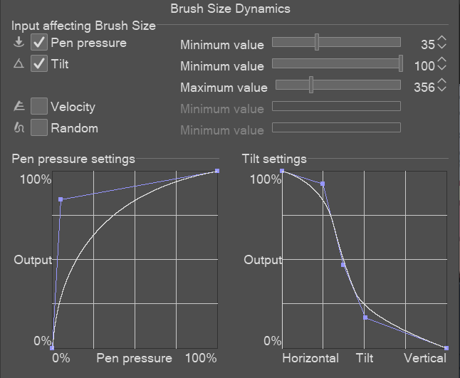
For the line art. I had to change the default g-pen to decrease the pressure output. This is to make it so when I draw, the line weight won’t be affected by the amount of pressure I put down so it stays relatively consistent.
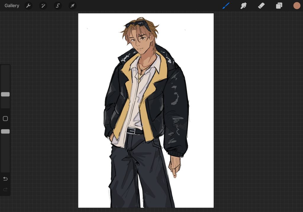
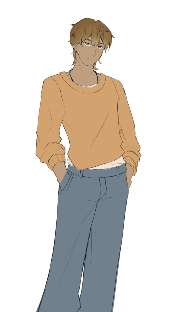
Base colours
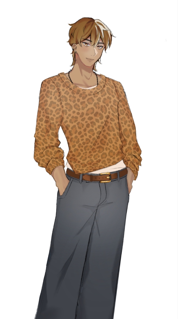
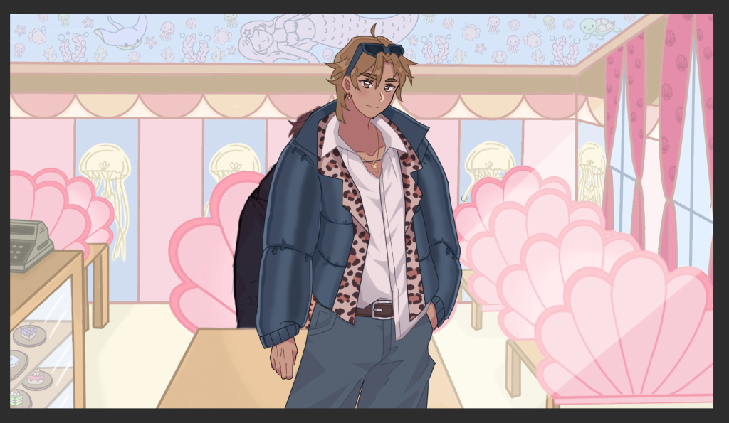
Rendered
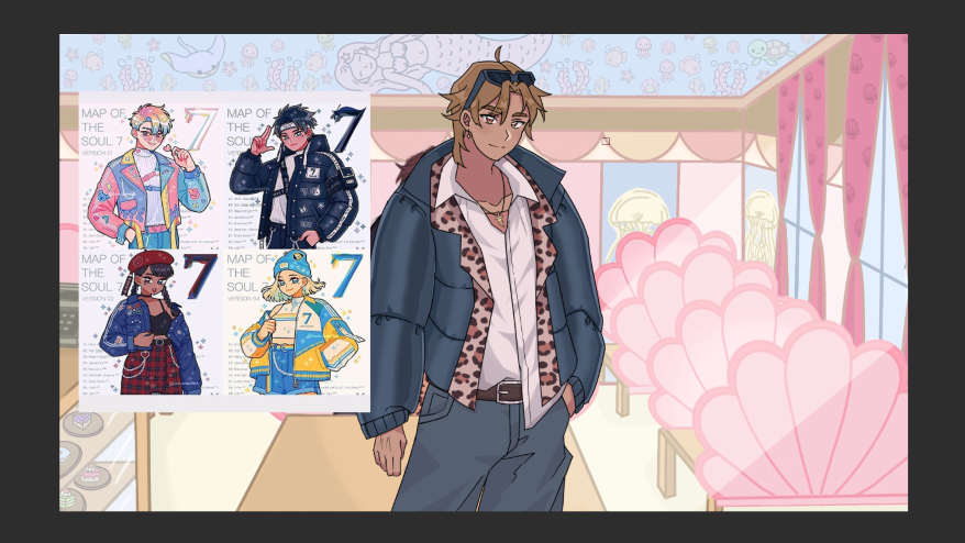
Against the background
My Thoughts:
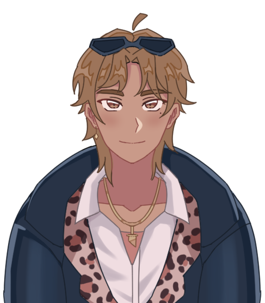
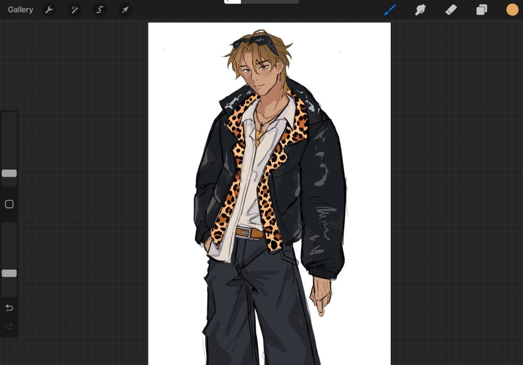
When I started sketching the draft on Procreate, I thought I was going to scrap the entire thing, however I decided to trust the process. Once I had imported the draft onto ClipStudio and worked on line art on vector layers, the vision started to look more coherent to me. To cooperate with the background, the leopard print had to be a slight pinkish hue.
Headshot of Yami:
I designed this alongside with the headshot of Violet (3rd iteration). My team needed a drawn headshot of Yami so the player doesn’t get confused as to who is speaking.