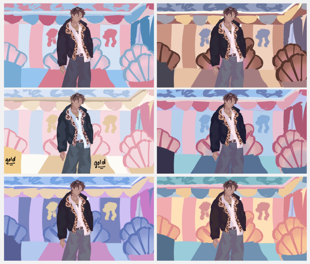
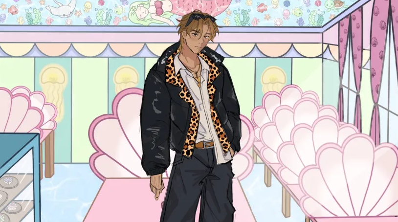
On the 3rd / 4th week, me and Izzy hit a fork in the road. Since both of us were strictly following the GDD colours, we didn’t expect the colours to clash against each other when the character is put up against the background.
Why does it look off?
Due to the set colour palettes on the GDD, the mermaid café uses more pastel colours of varying colours, but the main colour here is pink. Yami on the other hand originally uses a lot of oranges, browns and desaturated colours. Because of this, it makes Yami stand out too much, almost as like he doesn’t belong in the scene. After this realisation, I suggested to Izzy that we try different colours by using the colour curve feature on Procreate.
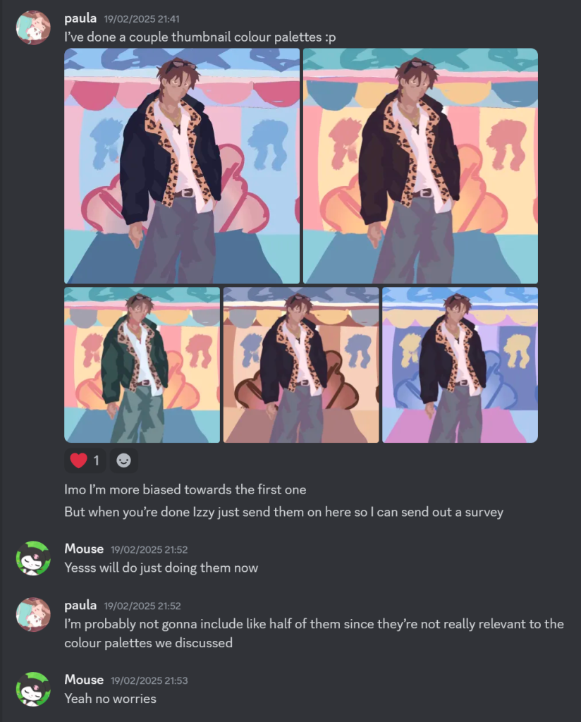
Izzy’s Iterations:
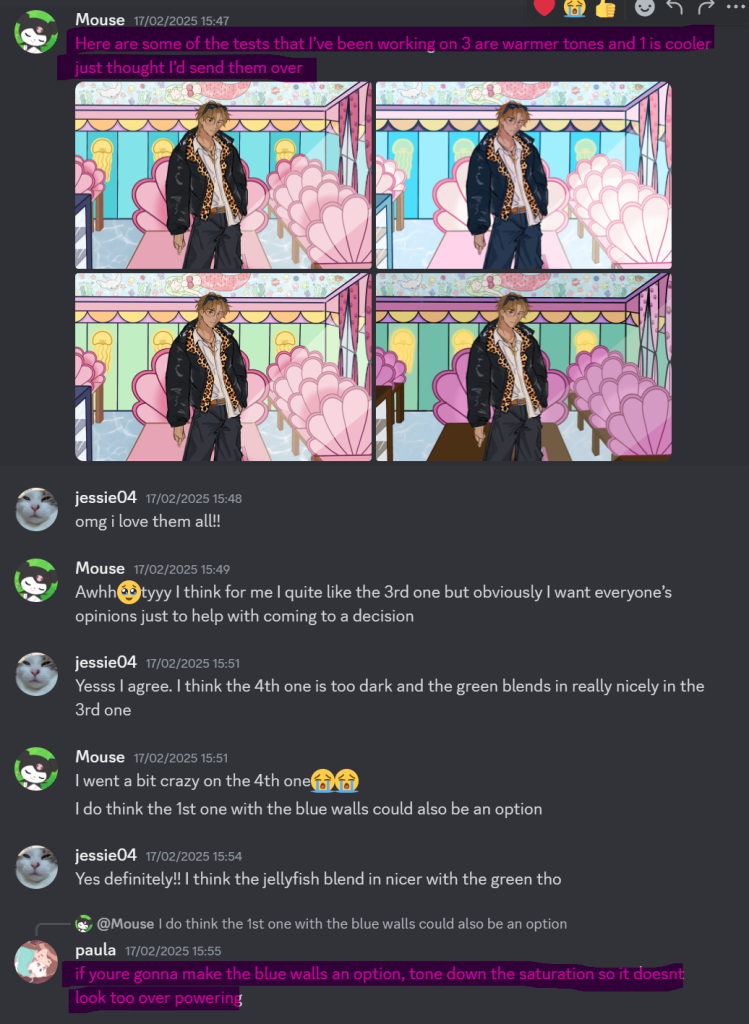
Communication in the Discord!
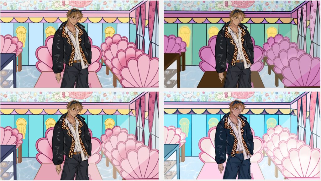
My Iterations:
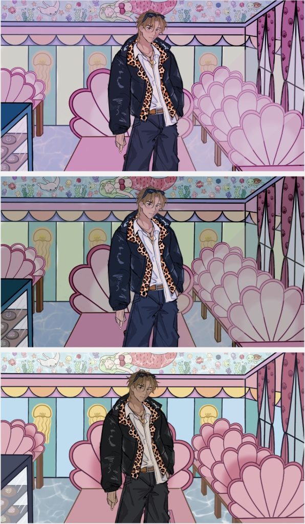
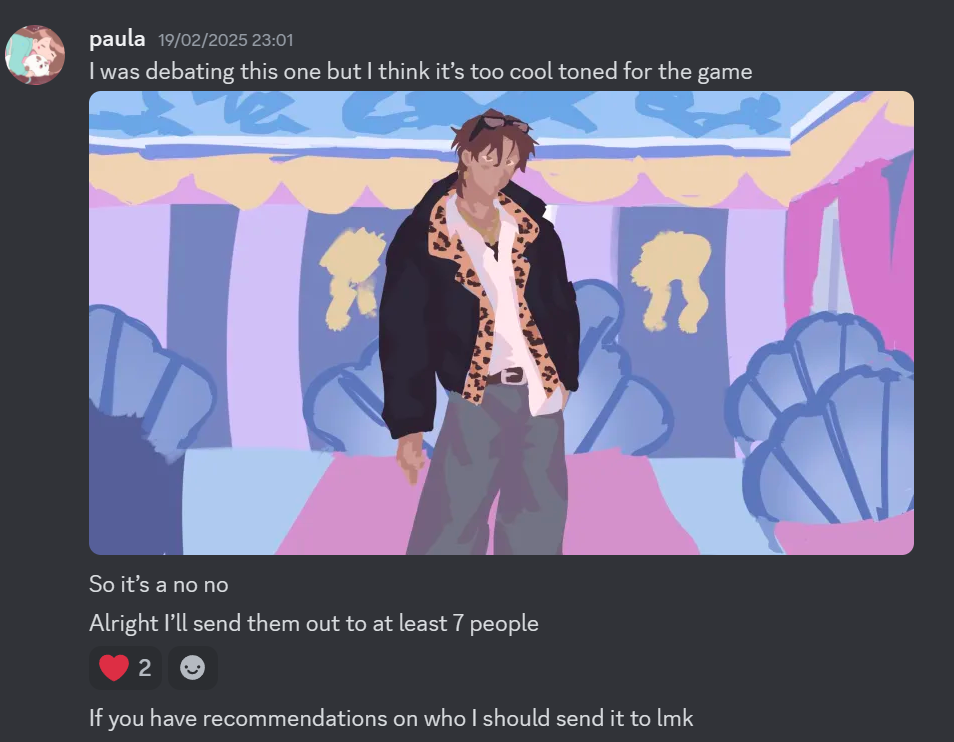
In these iterations, I used Procreate’s colour curve feature to help me figure out a cohesive colour palette. The first colour palette shows a more pinkish hue to be more on theme as it’s a dating sim. The second iteration shows a more dark and (unintentionally) gloomy atmosphere. The third iteration was me fiddling around with the colour curve feature, hoping it would look great. However, none of these iterations really spoke to me.
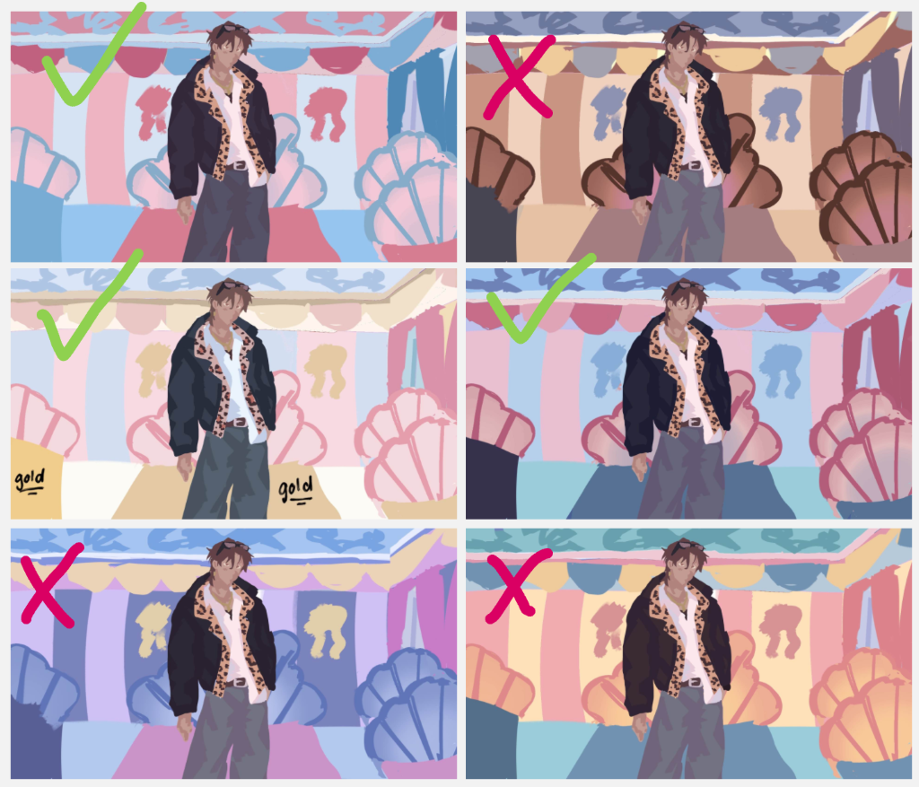
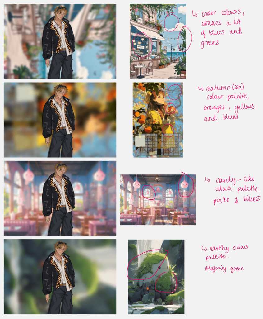
Using images and blurring
For these iterations, instead of coming up with the colour palette myself and possibly discarding hard work, I spent a few minutes on Pinterest looking at ready made art and blurring them. I found that this way was faster and more efficient.
However, by the end of the week, me and Izzy decided to talk Sophie and seek for her advice.