In my first week, I already analysed other GDDs (which can be found here), but I felt like it didn’t grant me an in-depth understanding of what it is and what it’s used for. In this post, I will be conducting some research on what a GDD is and it’s contents.
A Games Design Document (GDD) is a document that serves as a blueprint from which a game is to be built. This is especially useful since there will be a variety of people in the team with different professions such as sound designers, concept designers, 3D artists and programmers. This helps to define the general direction of the project and helps keep the team on the same page. Not only that but it ensures that effort is spent efficiently to produce a quality product. (Nuclino, n.d.)
Sections in a GDD
- Overview
- High concept
- Genre
- Purpose
- Impact
- Gameplay
- The experiences for the player
- Art Bible
- Character
- Objects
- Environment
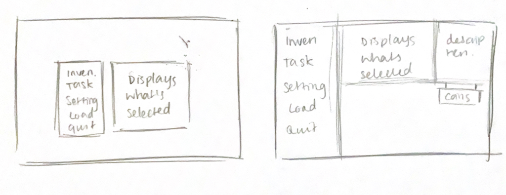
- UI
- Mechanics
- Win / Lose conditions
- What the game has to offer
- Combat systems
- Rules
- Level Design
- Skill trees
- Maps
- Puzzles
- Sound Design
- Music
- SFX
- Voices
- Platform specification and control mapping
- Player demographics
- Buttons and keybinds
- Market
- Player communities
- Monetization strategies