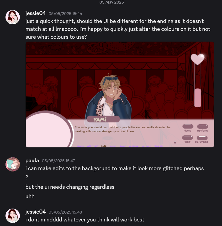
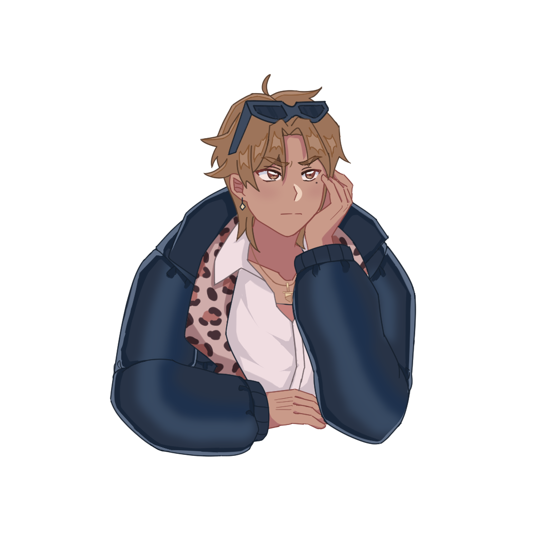
Before I had put any of the effects on, I thought the piece looked simple, that is when I started to explore looking into how to make a scene more lively using brushes I had previously downloaded. Safe to say, I like how this ended up looking!
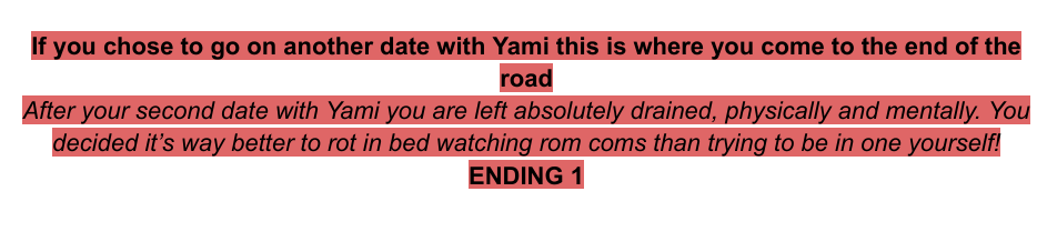
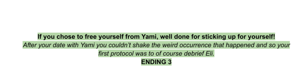
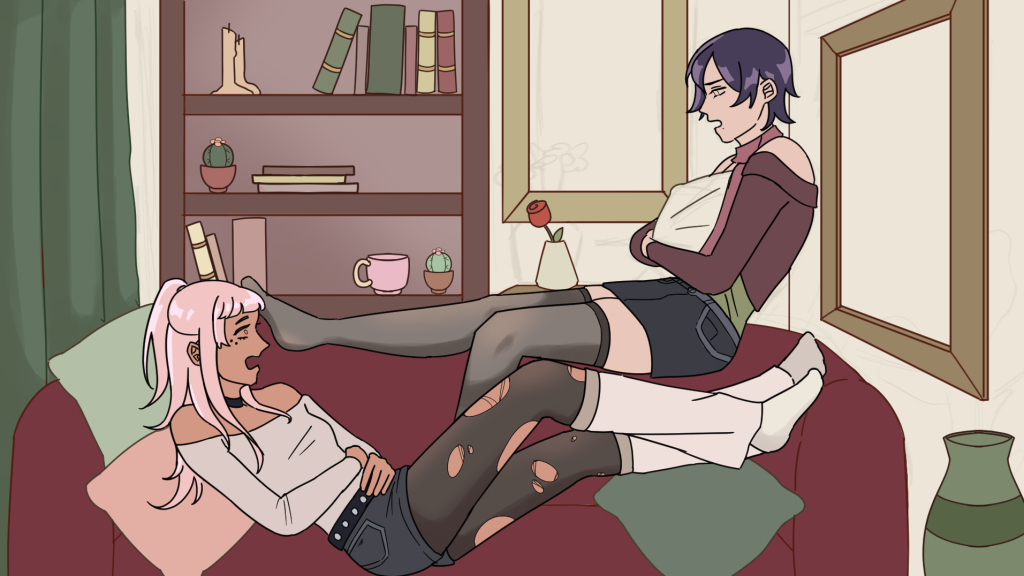
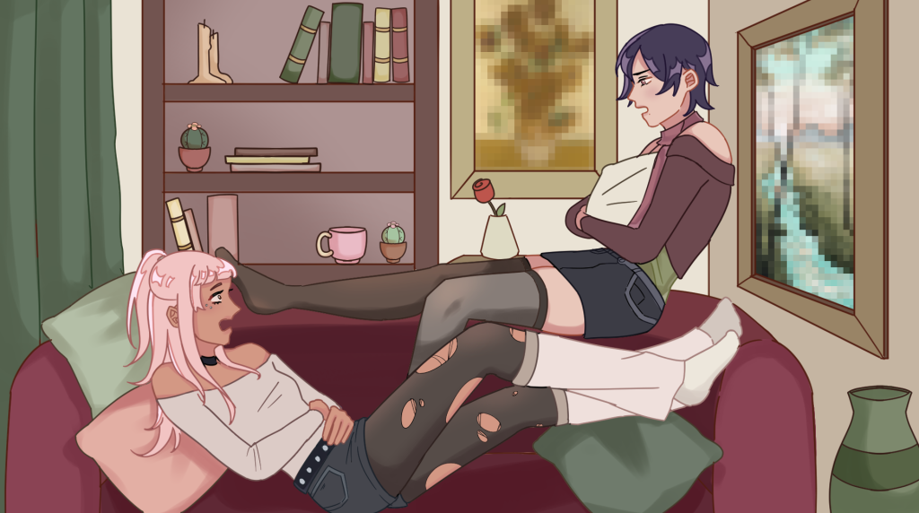
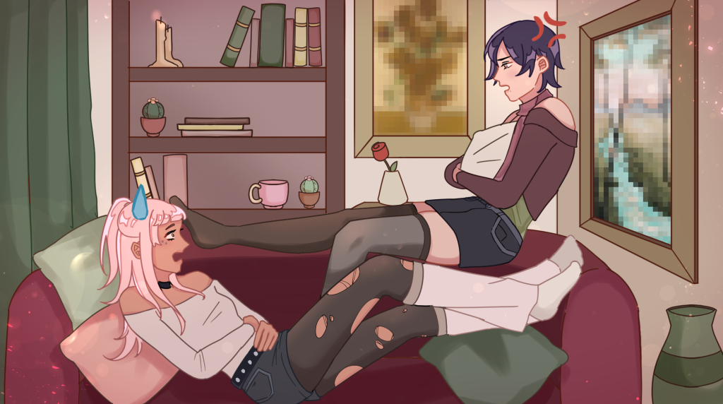
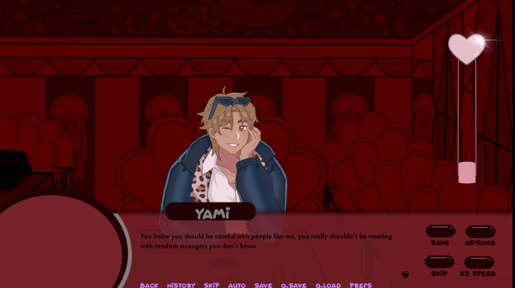
At the end of the game, the player will be given an art work of what happened to Violet as a result of her actions. There will be two endings to receive, the good and bad ending.
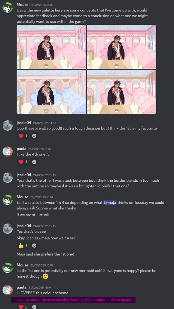
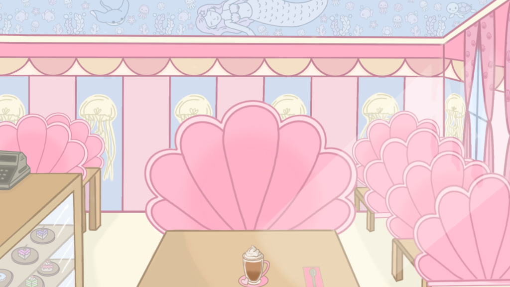
For this piece I wanted to use more warm and pink tones in contrast to the bad ending. In the bad ending I used a lot of blues to depict Violet’s loneliness and exhaustion after being with Yami for the day. In this piece, she has Elijah and the comfort of someone else that won’t judge her.
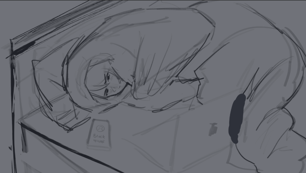
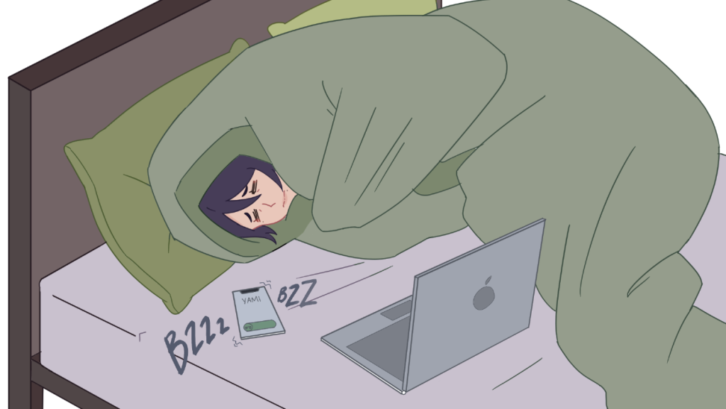
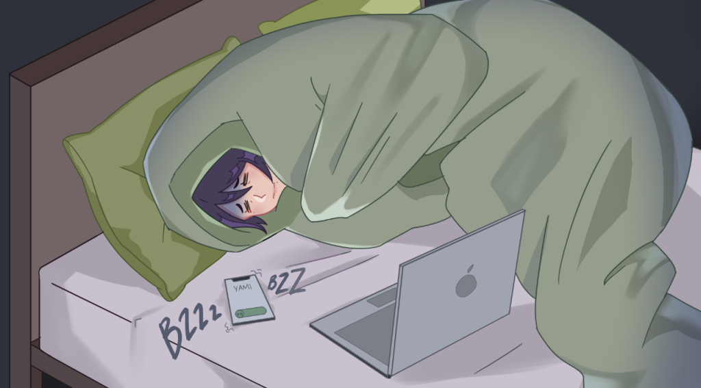
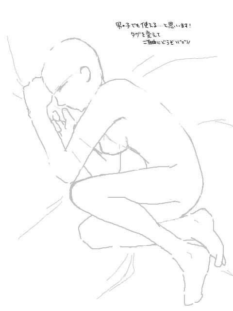
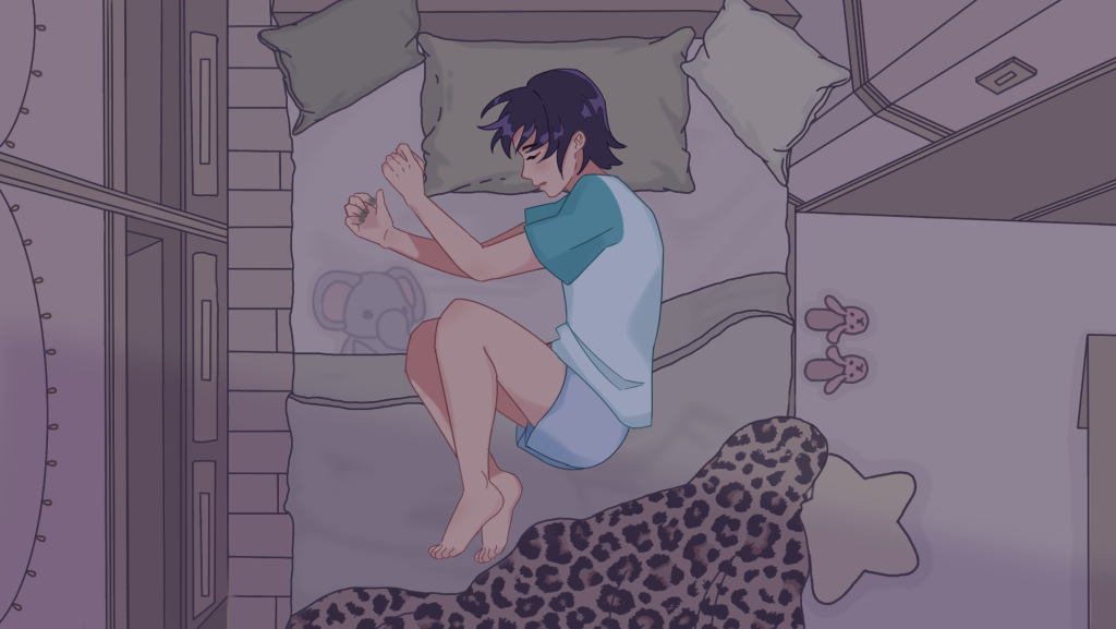
For the starting scene in Violet’s dates, we agreed to have a scene where the player sees Violet sleeping whilst the narrative plays. The background was drawn by Izzy and I asked her to send me a png or jpeg version of the image she had drawn.
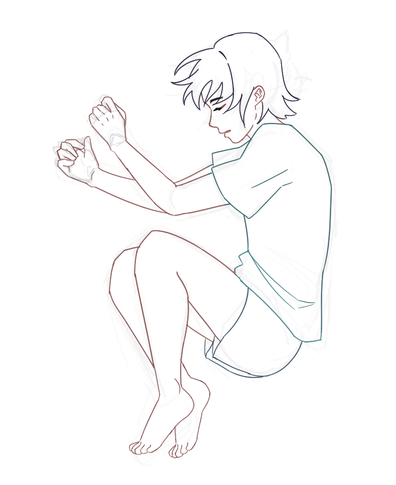
As I was having difficulty with the limbs in a sleeping position, I used these references to help me with this asset.
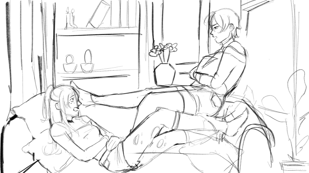
Rough sketch
Although it’s very shear, the basic outline is still seen (please turn your brightness down).
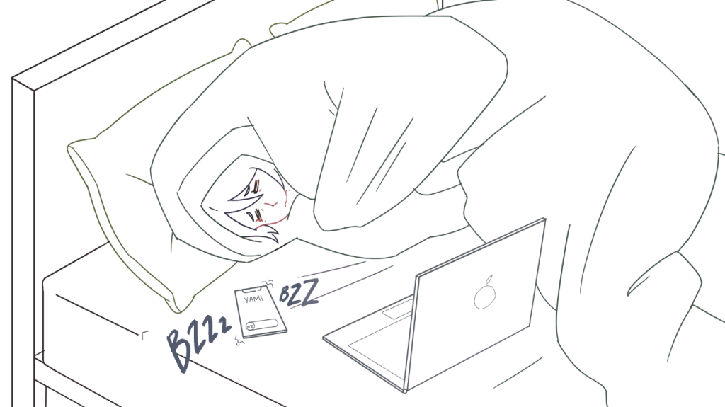
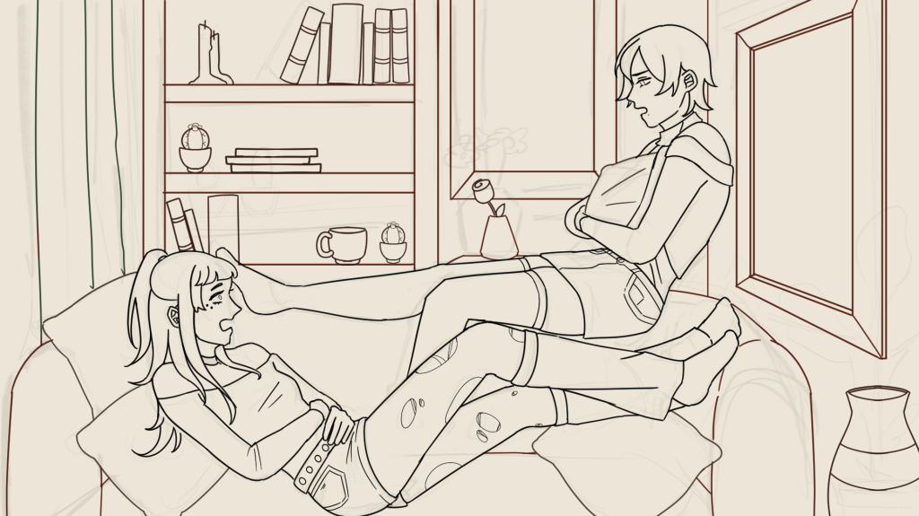
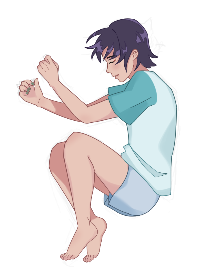
Line art
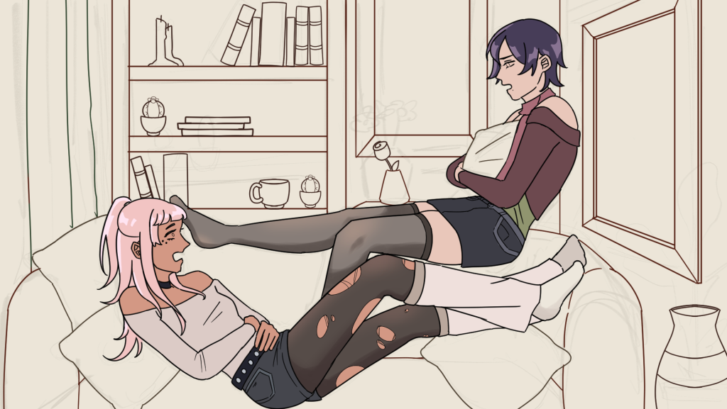
Colours
As I felt particularly confident with this piece, instead of using clipping masks, I painted directly onto the original layer.
Finishing touches + Final look!
To match the lighting of the background, I used a desaturated light blue, lowered the opacity, and set it to multiply mode.
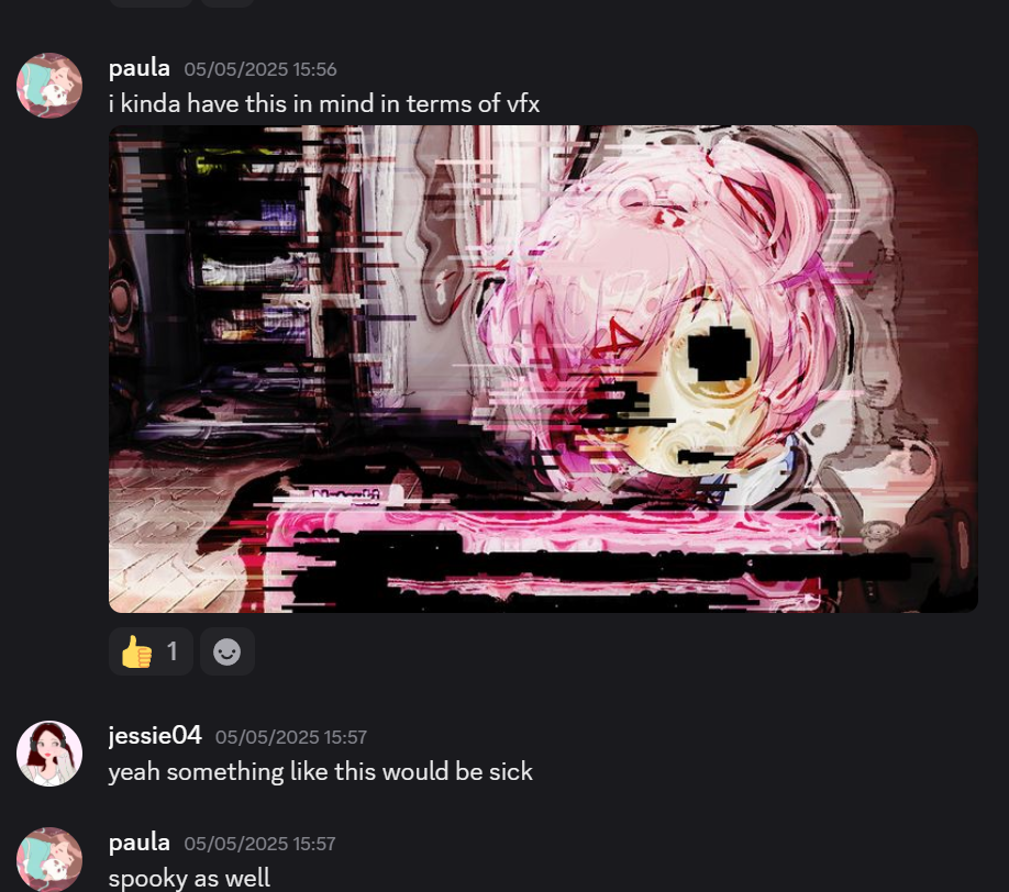
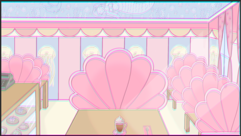
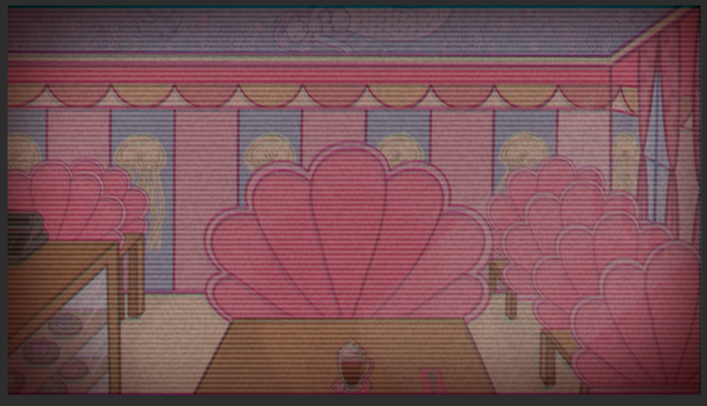
Initially, we were going to use Izzy’s first iteration of the the “evil” cafe, however, the red looked a bit harsh in comparison to the theme of the game. Although red connotes evil and horror, I asked if I could take this task up instead.
The first thing that I needed to do to make the background was find a video on how to make a glitch effect. Although Procreate has a feature that allows chromatic aberration, I wanted to use ClipStudioPaint again to build my confidence using a graphics tablet after getting used to my iPad for so long.
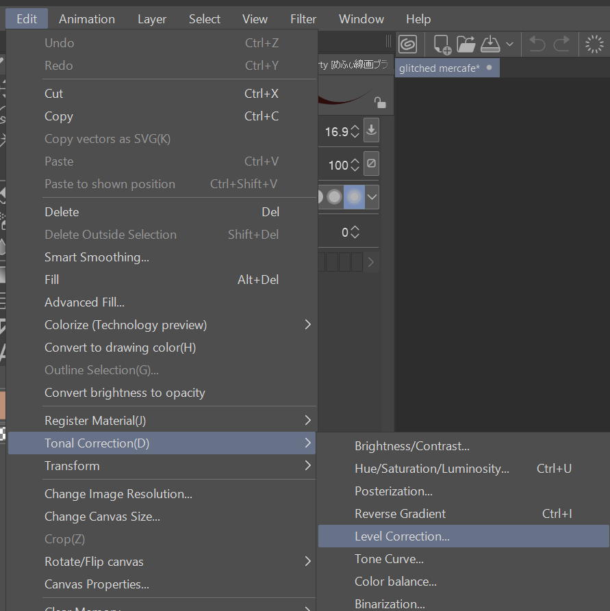
Although this tutorial uses Photoshop, the software I use has the same features. The tutorial starts off by copying the original photo twice, which results in three of the same photo. They should be in separate layers. Now, each image had to be a primary colour (CYM). I did this by going over to edit < tonal correction < level correction.
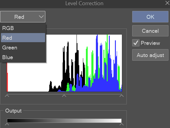
Once I had done that, to change the colour of the image, I needed to select RGB and select Red. At the bottom of the window, there is a section called “Output”, by clicking on the arrow furthest to the right and dragging it to the left, it completely gets rid of all the red in the image. This gives us the colour cyan. I do this for all of the images but select green then blue and dragging the right arrow left. This results in giving me the primary colours cyan, magenta, and yellow.
To make the chromatic aberration, I selected the top layer and changed the layer setting to “Lighten” I did the same thing with the bottom layer. Then I played around with the positioning of the cyan layer and yellow layer.
Eventually I came out with this result:
It looks really cool, but we aren’t done yet!
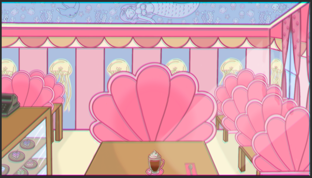
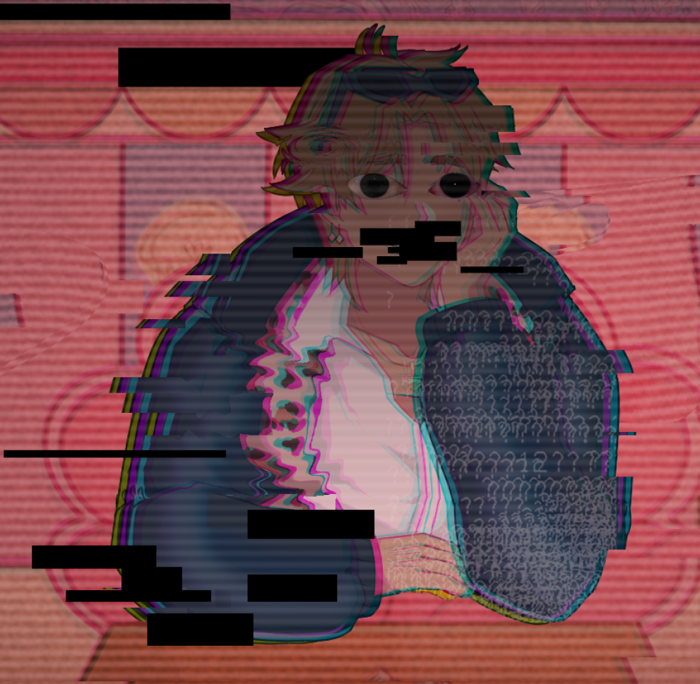
I duplicated the image and selected multiply mode, this makes the background look more saturated and it’ll look great with the effects I’ll add on later. Although it’s a small difference, a little goes a long way.
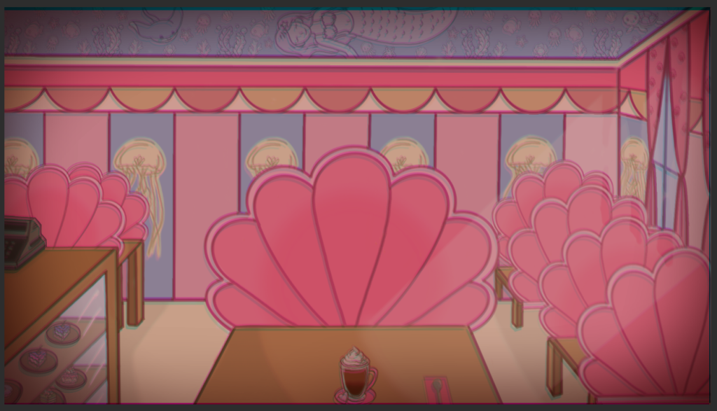
To make the atmosphere more sinister, I paint bucketed the entire image red and set it to multiply, then lowered the opacity to 35%. For the vignette, I used a dark red and airbrush to paint around the corners of the image.
For the finishing touches, I found a TV static image and set it to screen and used the noise feature and played around with the settings.
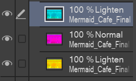
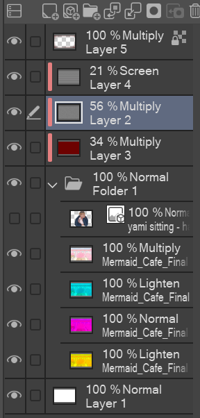
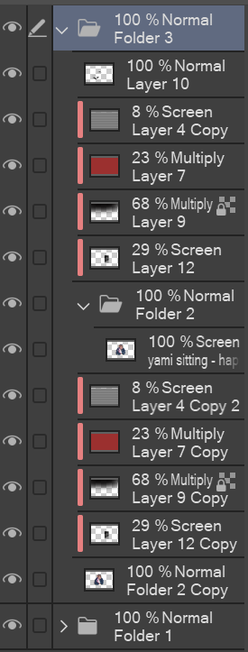
Layers that ended up being used.
Adding more effects
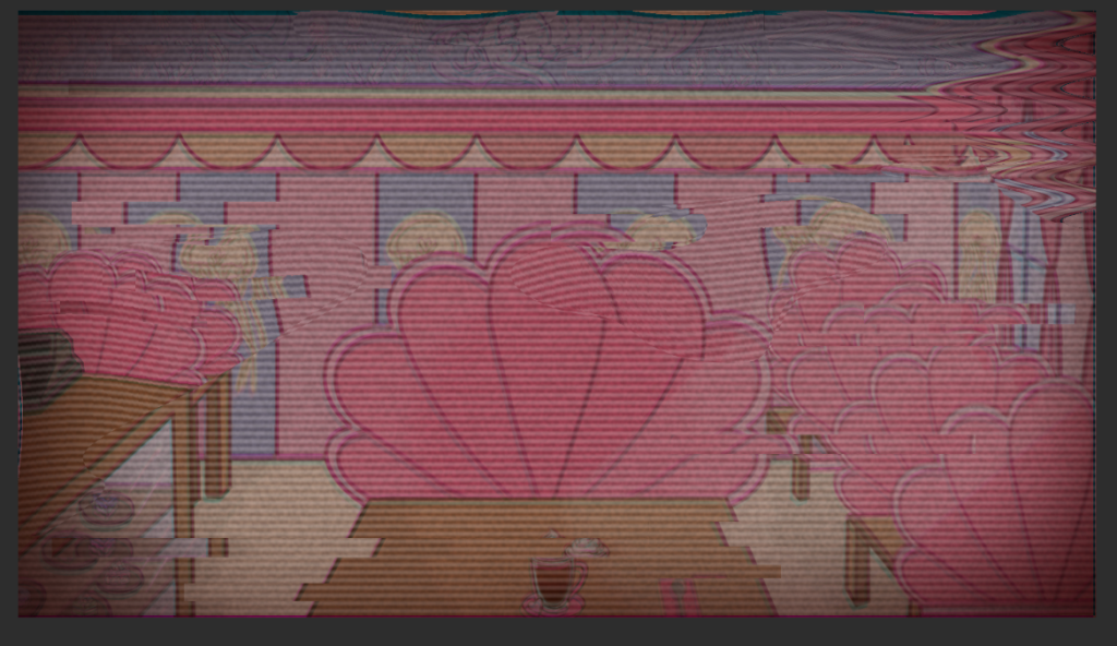
After a couple of days, I realised that the background looked too simplistic for me, so I decided to play more with the effect features and make it look more “glitched”. To avoid using too many layers again, I exported the image as a JPEG and imported it into a new scene.
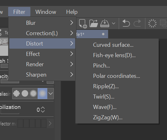
To make the glitch effect, I first duplicated the image. Then I used the rectangle selection tool tool to actually start making the glitch waves. With random areas selected, I moved some of them to the left and some of them to the right.
(Still using this tutorial)
To go the extra mile, I selected random areas again but with the lasso tool and played around with the different distortion effects.
To finish up the background, I made the background slightly more red by paint bucketing the entire image a light red and set it to multiply. Applied a dramatic vignette with a dark red airbrush in the corners and set it to multiply. To make the scene have more glow, I used a light red airbrush and painted the centre of the image and then set it to overlay. The outcome came out like this:
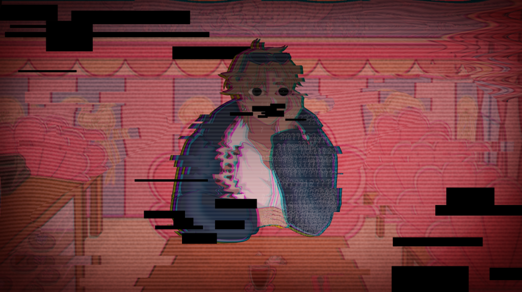
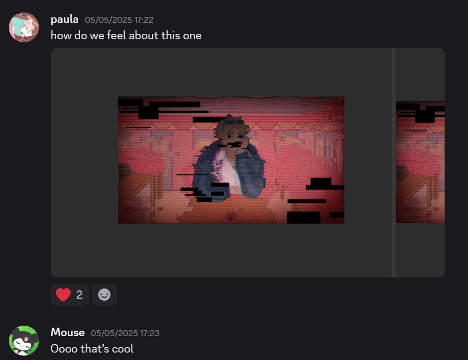
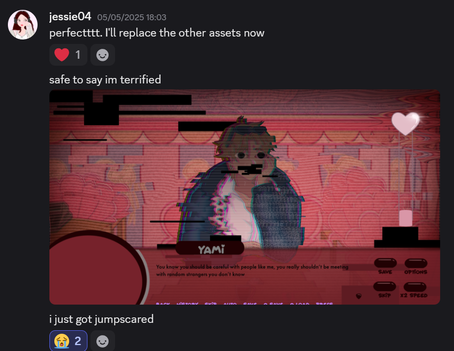
Yami glitch asset
To make Yami’s glitch asset I followed most of the steps as seen previously. I then added some more pngs from online to make it look creepier.
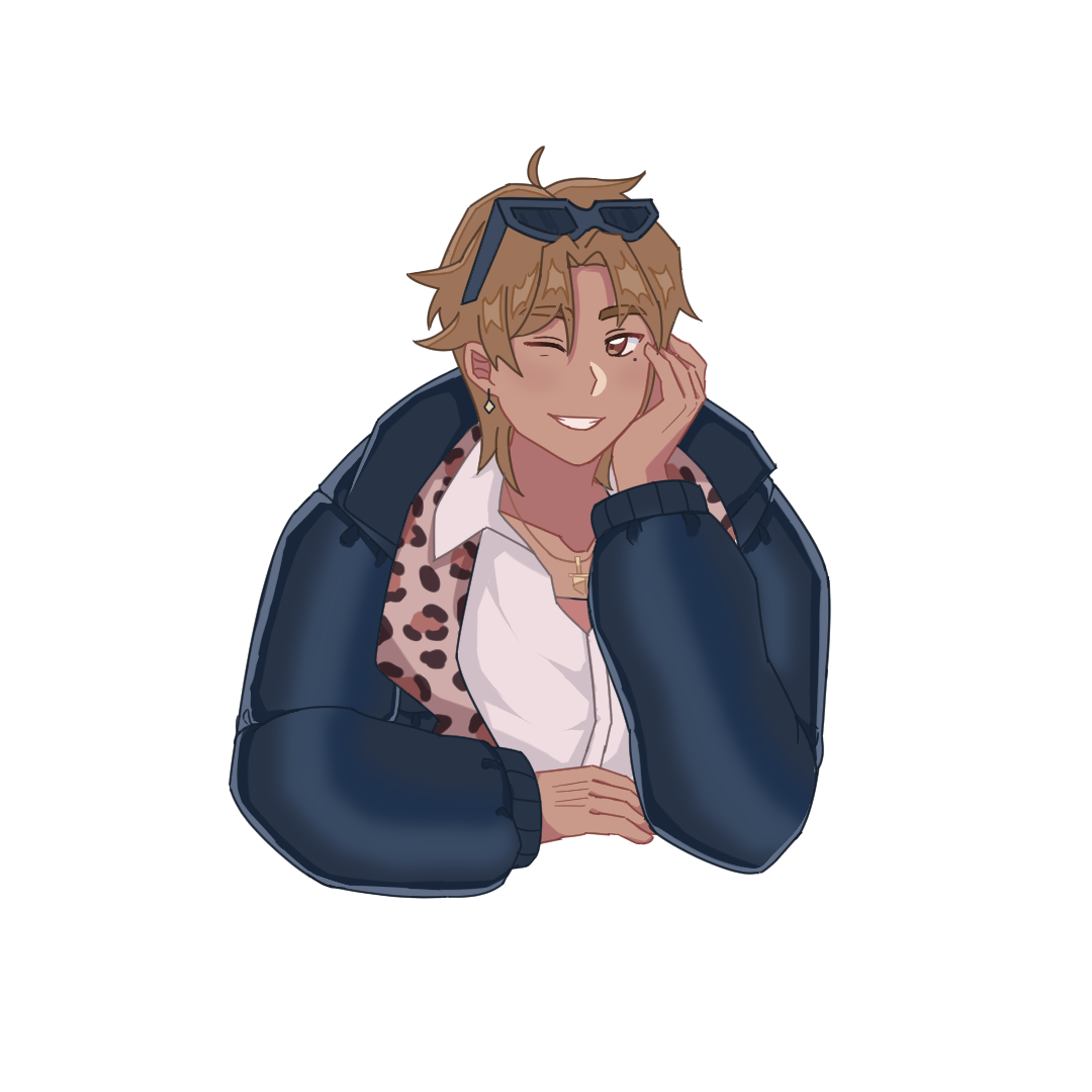
The finished look!
With the UI Maja designed:
My Thoughts:
Making effects on ClipStudioPaint wasn’t that challenging, however, in future, I would like to hone the skill to use Photoshop to make effects. The final look came out really well and I like how well it came out in the end!
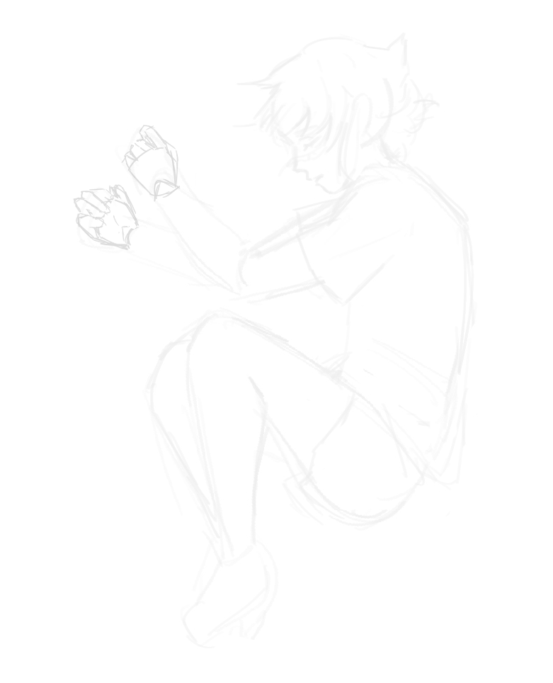
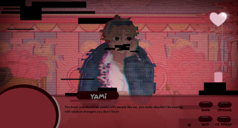
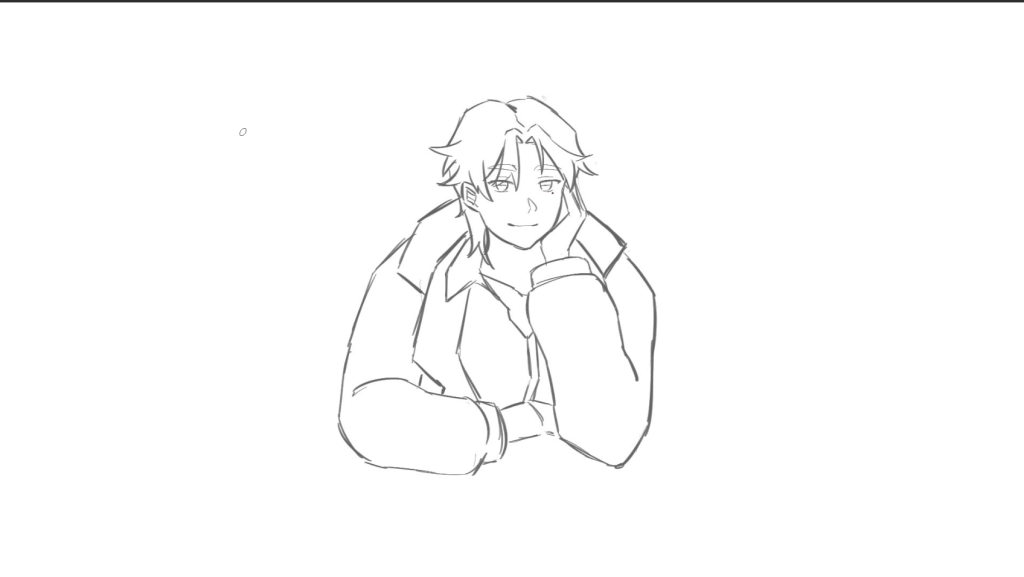
This week, we had discussed that Yami needed another asset for when the player interacts with him. The angle was quite weird, so we came to the conclusion that I draw an asset of him sitting down on the table.
Software used to sketch: Procreate
Starting canvas size: 1080 x 1920
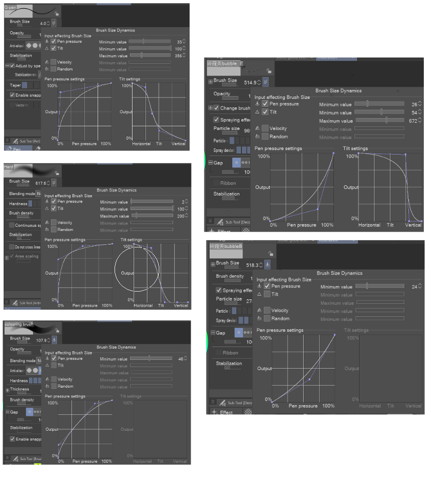
Brushes used: Custom G-pen size 4
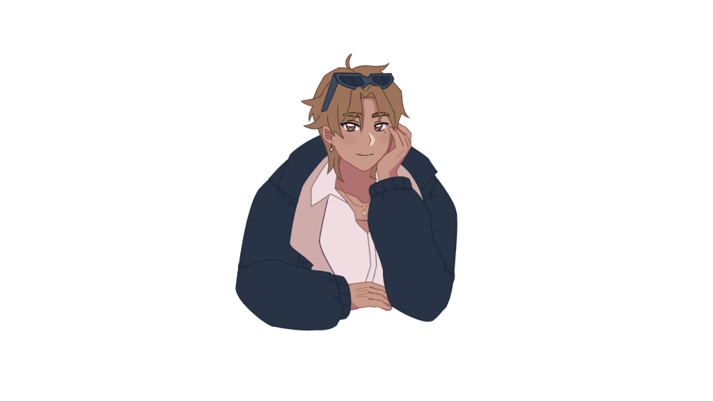
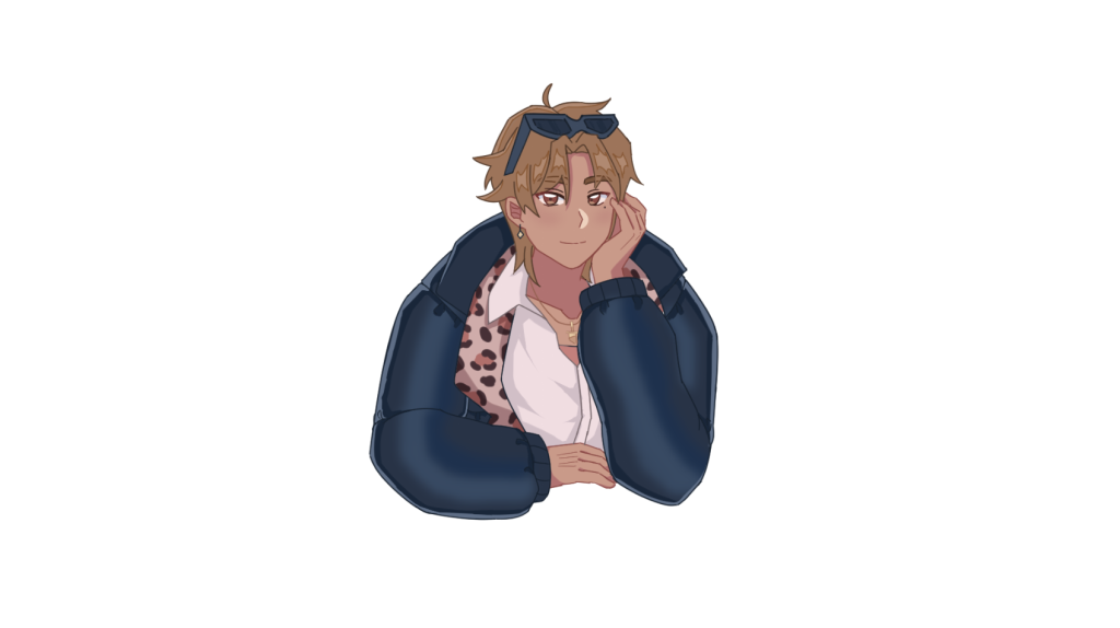
Rough sketch
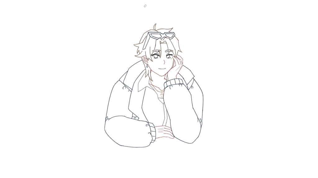
Line art
To make it easier for me when I have to draw 4 more expressions, I made the face line art in a separate folder (main is in red).
In this semester, I will be working on a game chosen from the previous semester, made by another student. This semester will test my ability working with a team and communication will be of the utmost importance.
Brief
This module represents the next step in the development of the Games Design module. You will take forward one of the Game Design Documents (GDD) from the previous module into production. You will choose and pitch for a specific industry role within the production of a “Vertical Slice” from said GDD and, during the semester, work within a team, to realise its development. You will take an in-depth approach to understanding and translating a GDD into production and utilise methods to realise in depth research and professional team work methodologies, to create the related assets dependant on your role within the team.
Weekly Sprints will take place to inform team progress. The teams for each “Vertical Slice” will be set up in the form of a small indie game operation, working under roles of Chief Technical Officer (CTO) and Chief Operating Officer (COO), which will be allocated by staff on the programme. Your own role will determine the specific nature of your work, be that translating mechanic ideas into code, or concept art into working 2d or 3d game assets.
In this semester, I will be creating a GDD for a game. Here, I have documented everything leading up to the final product, from weekly lectures to sketches and development. In this section of my portfolio, you’ll see me struggle and persevere as a concept artist, character designer, and a story teller.
Brief
You will be making a Games Design Document (GDD) of a digital game. This should be included in your blog (WordPress). You should use WordPress for your documentation and for the submission of your GDD. This is your chance for Blue Sky thinking! Take this opportunity to expand your creative abilities and critical thinking via game making.
You will have weekly sessions that will support each of the sections of your GDD, coupled with tutorials and crits. For each week, you are expected to produce a series of research- informed responses to the themes, justifications for your decisions, experimentations and reflections. These will support the development of your GDD in different phases.
Now that the deadline is less than 24 hours away, I want to close this project by reflecting what I have accomplished over the course of 13 weeks.
One thing I want to mention is that my goal for this project was space out work evenly throughout my week so I don’t get burned out easily. I found out the way I can efficiently work on this project was to allocate enough time for me. Self care is also very important to me as it boosts my motivation to work on a certain task and it gets it done efficiently. Unfortunately, I am someone who finds it hard to work under the wrong circumstances, so maximising and planning my day in advance really helped me out. In this project, I pushed my boundaries in terms of how much a single person could produce, creating 7 characters in a month served to be a difficult task, but pulled through in the end.
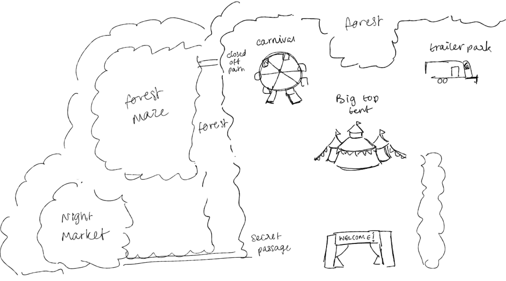
However, as a personal goal, I feel like there were aspects in my art development I could’ve had the chance to hone, but was too intimidated by the scale of the task to even begin trying. For example, I could’ve drawn out some of the environments in greater detail. Although the art style I have chosen for this project allowed me to do things in a more simplified manner, there are plenty of games out there that can have simple art styles and environments but still make the it look cluttered- in a good way. Even though looking at what other people can produce can sometimes be daunting, it also serves as motivation for me that if indie developers can make games of a vast scale, surely I can. If given the opportunity to conduct my own project again, I want to be given the chance to explore environment design and further hone my character designs in a way where they catch a player’s eye.
Regarding my major and minor foci which can be found here, I feel like I have covered them completely. I have further developed my skills as a character designer, doing research for a character’s background and made multiple iterations on a single costume. In regards for mechanics, I was a bit nervous choosing this as my minor focus. Admittedly, I don’t like being “bad” at something, which is quite a silly statement considering that starting from square 1 is the only way you can go up. I have talked about mechanics briefly on my game reviews and expanded on what stealth and sanity does to a player. Additionally, I have come up with the idea that the player must play minigames at the end of each day to get currency. These minigames vary in what keyboard buttons to use.
In conclusion, this project was very beneficial to me and my personal growth, I have also learned that although some tasks can be daunting, it’s imperative that I do them, or else how else can I grow?