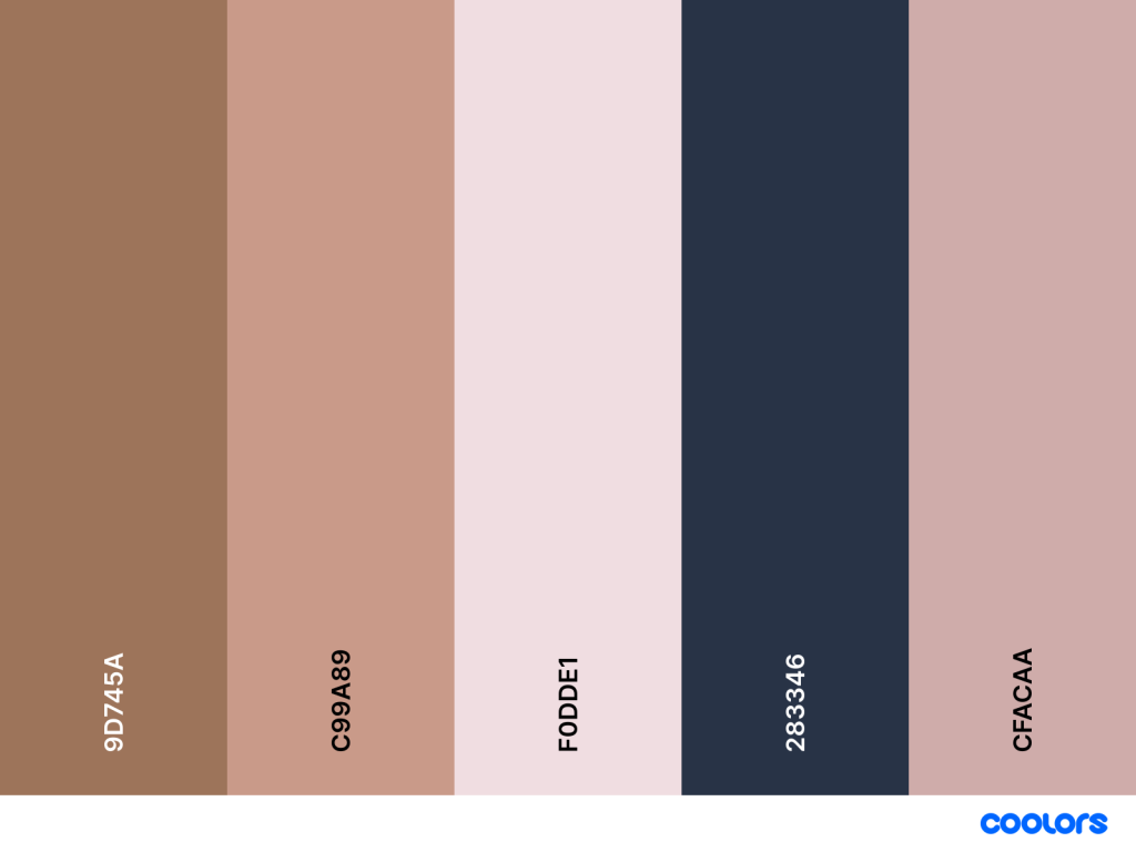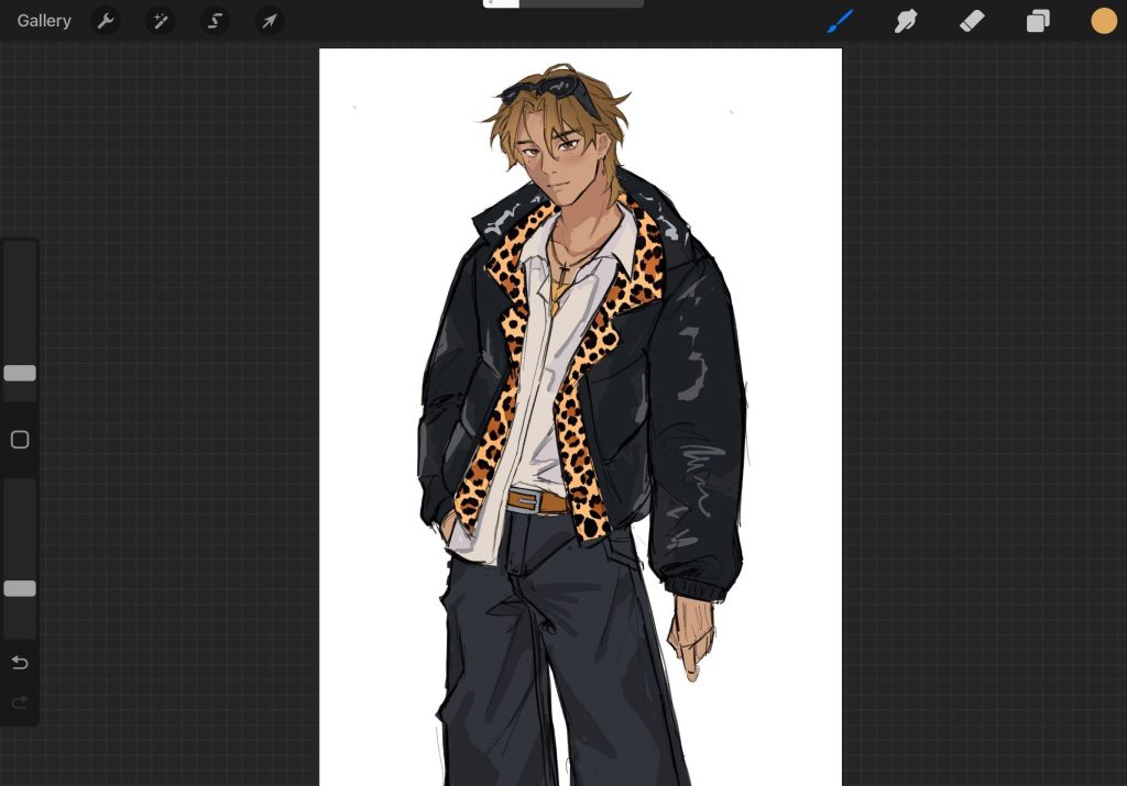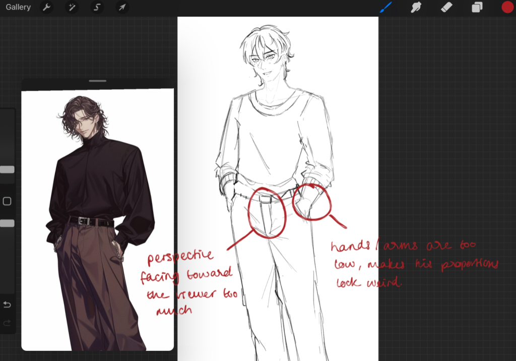
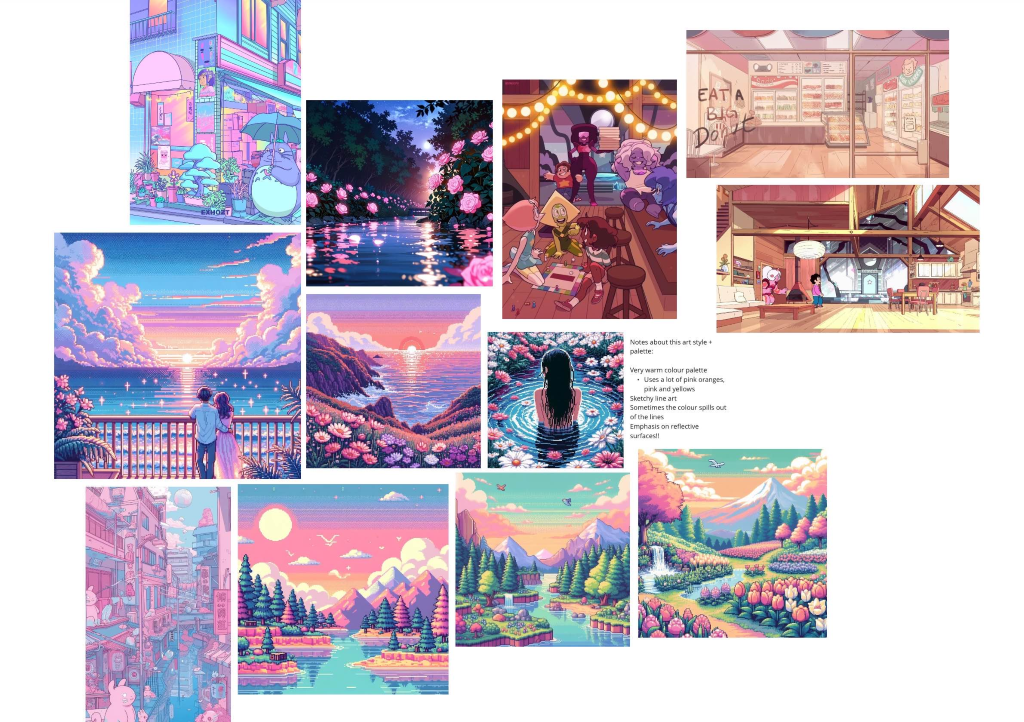
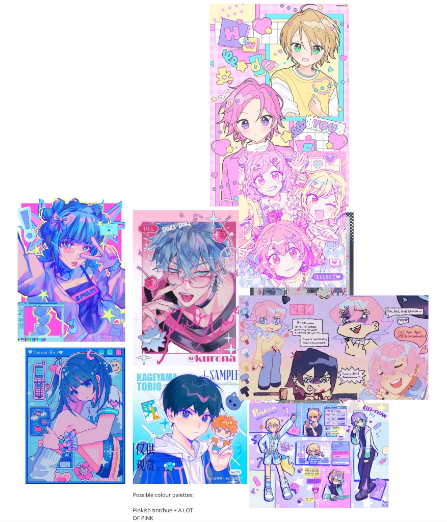
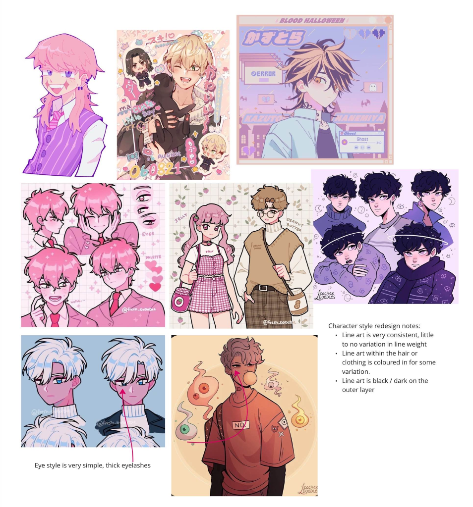
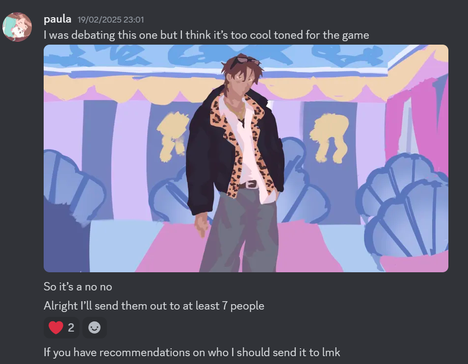
In preparation for our meeting, me and Izzy collabed on a Miro board and shared our ideas for both character style and environment colours. I said to her that I think that the game would work best with pinkish hues.
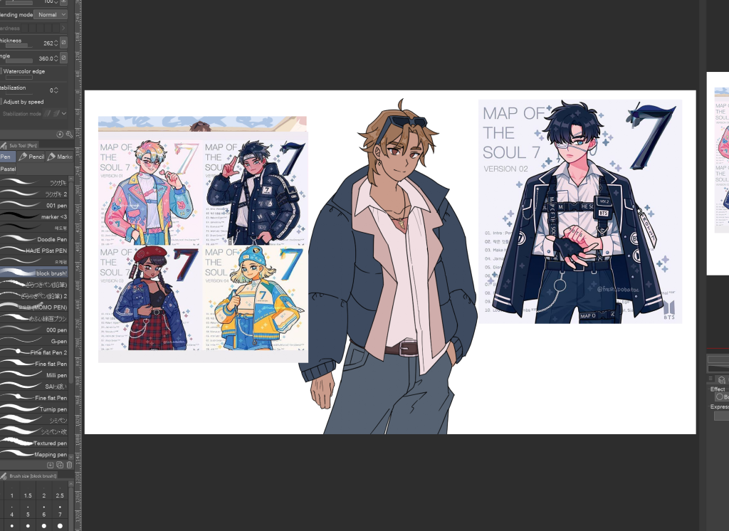
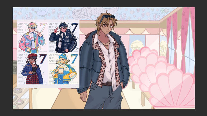
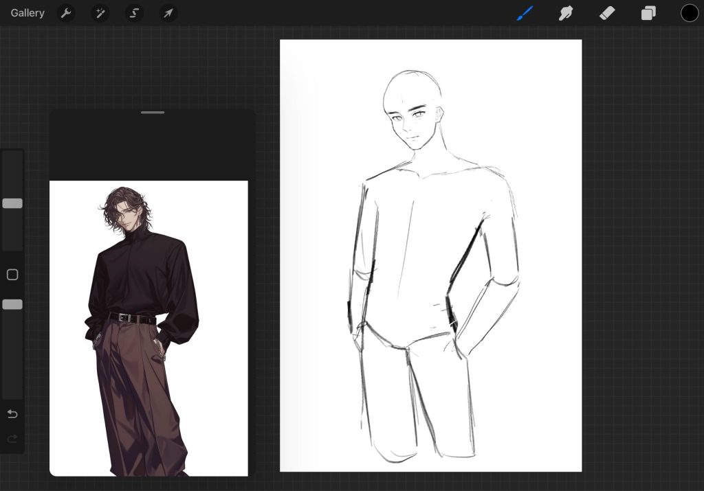
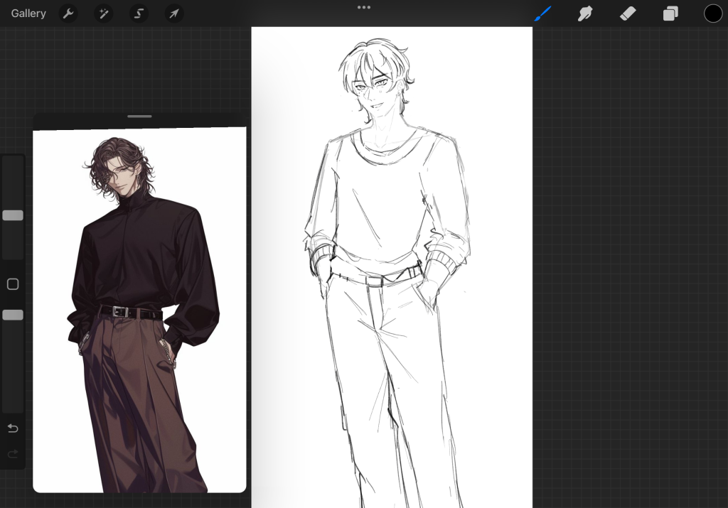
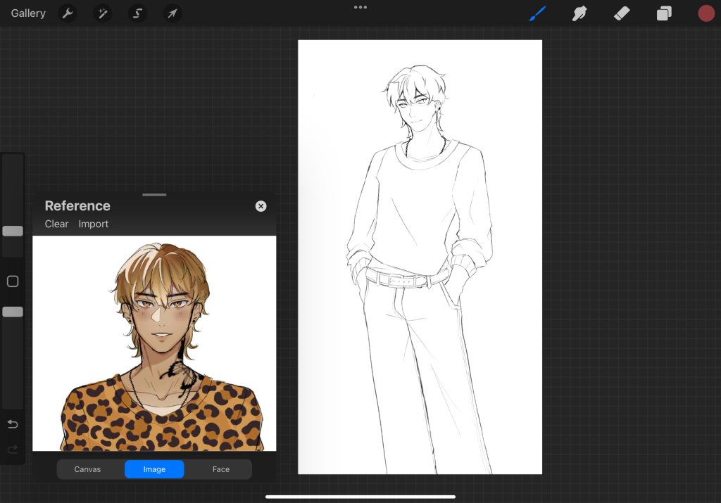
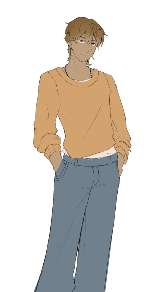
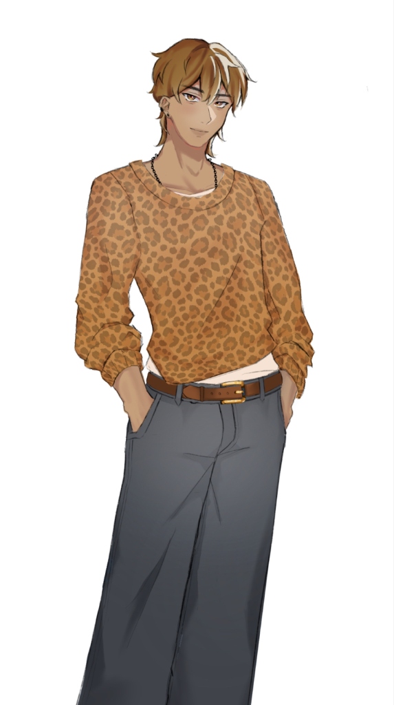
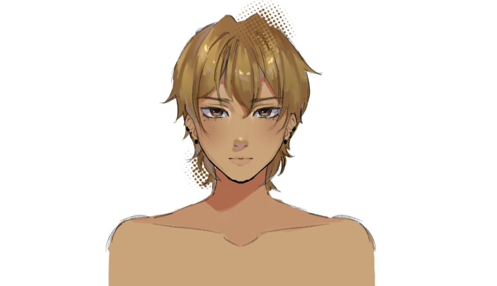
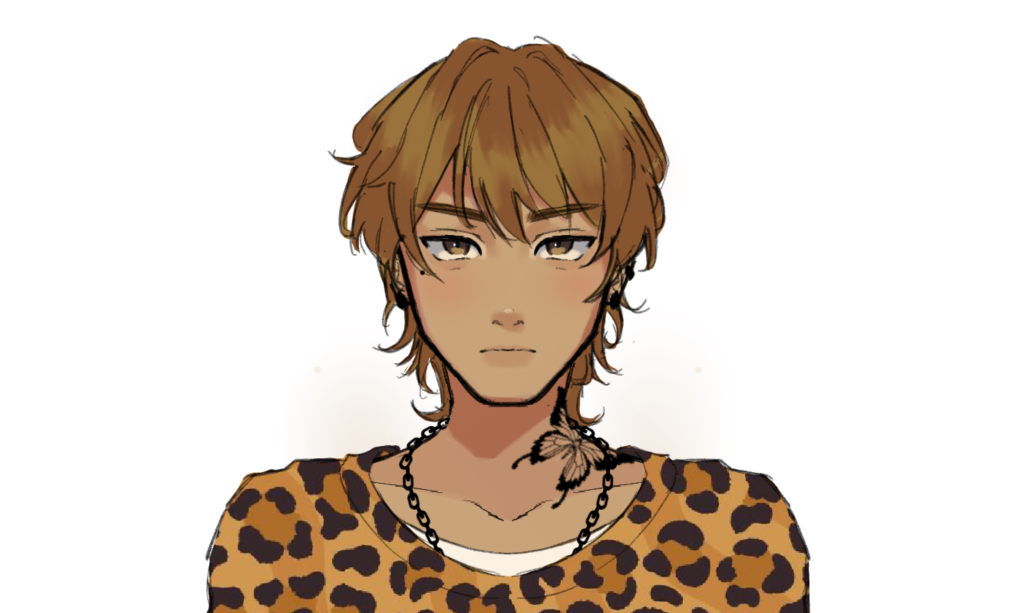
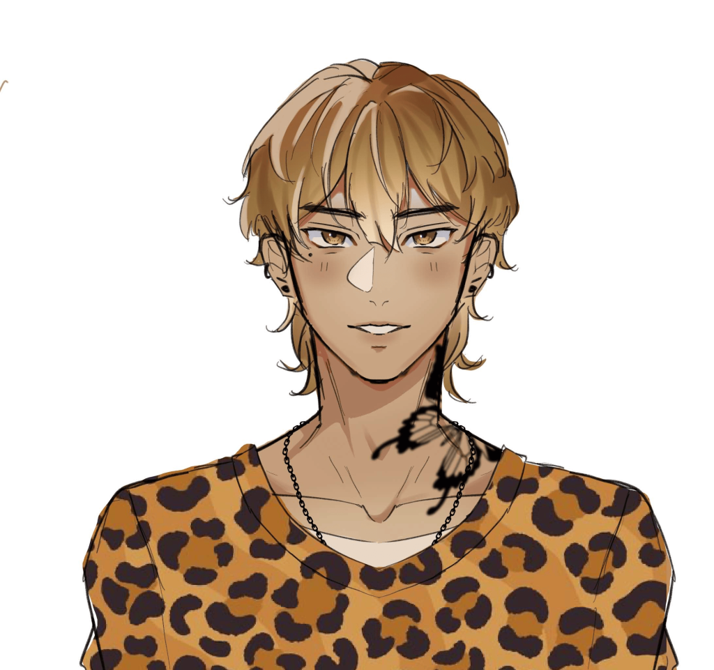
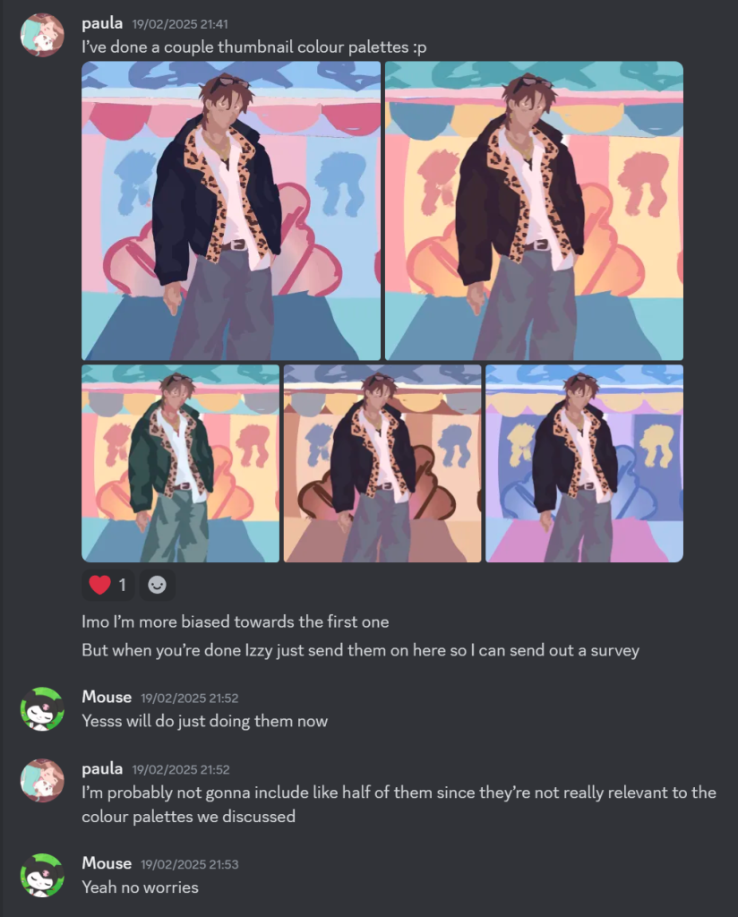
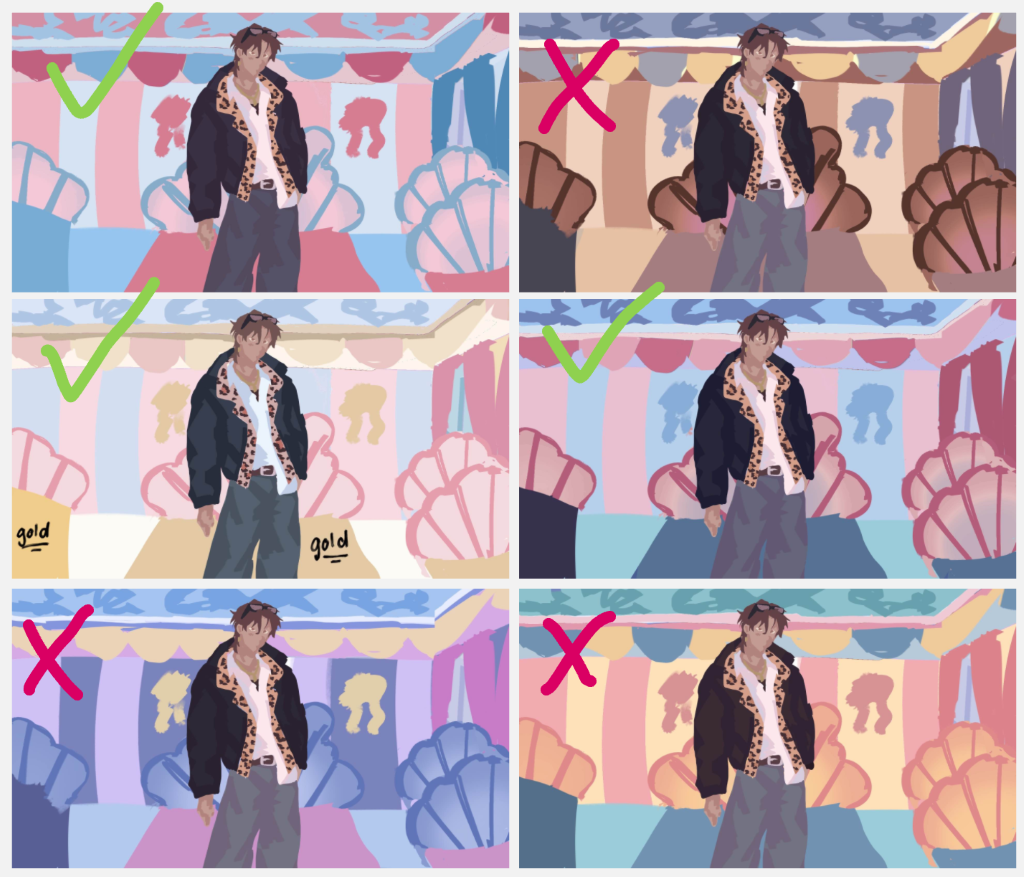
On Tuesday, we had a meeting with Sophie to discuss colour palettes and how to come to a cohesive style. One of the things that have stuck with me is making a thumbnail colour plot. Seeming as this task was quite easy, I helped make the thumbnail sketches to see which colour palette would look the best with Yami. Here are the thumbnail sketches that I came up with:
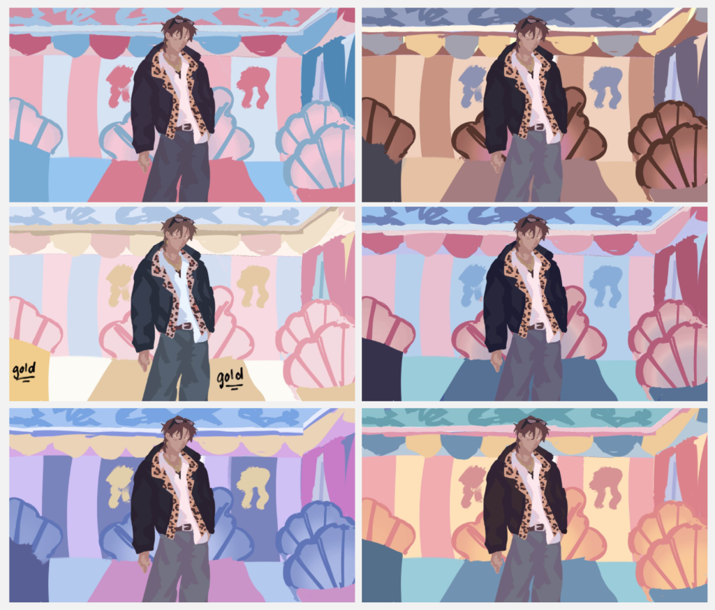
Once I had completed them, I showed my group mates but after a closer inspection, I decided to eliminate 3 of them as some of them don’t align with the colour palette I had discussed with Izzy.
Communication in the Discord!
Survey!
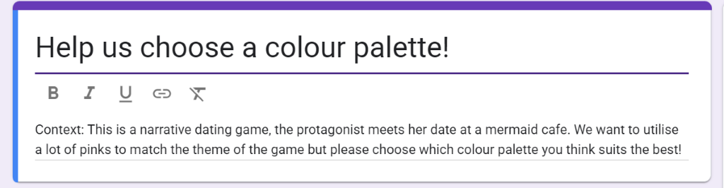
When me and Izzy had finished with our thumbnails, I made a google forms and sent it out to around 15 people. These are the questions that I asked on the form:
- Choose one out of these thumbnails has a mermaid vibe
- Which one out of these look visually appealing?
- We’re planning on using the colours for the you see on this logo for the UI, which thumbnail would look best if the UI had these colours?
- Out of all the thumbnails, which one do you think reaches all the requirements as listed above? How would you change it if you could?
Results:
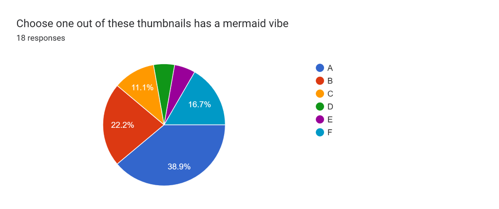
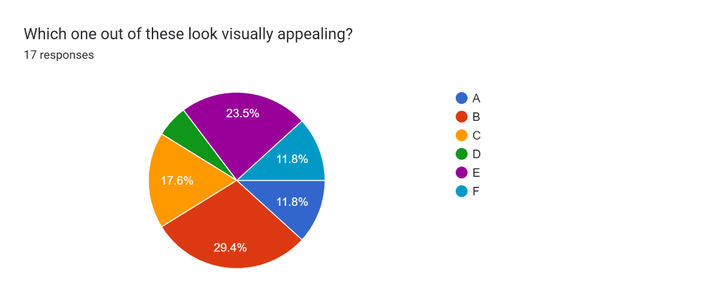
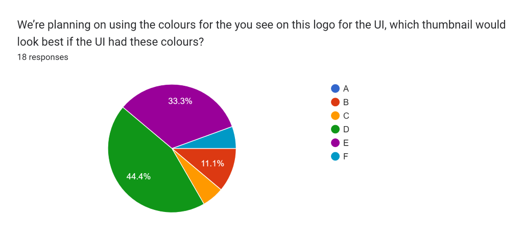
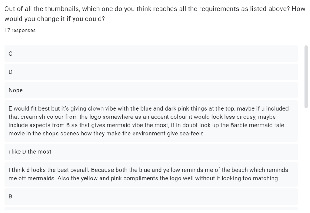
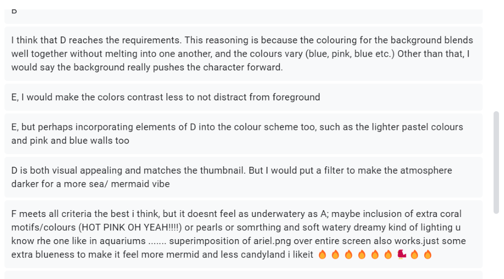
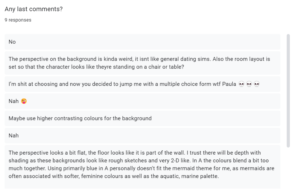
From these results, we have come down to the conclusion that colour thumbnail D would be the best looking out of the 6 for the game.