I left this aspect of the game near last because I wanted to focus all my efforts on the art aspects of the game. But now that the time is slowly being consumed, I think it’s best to get this small detail out of the way.
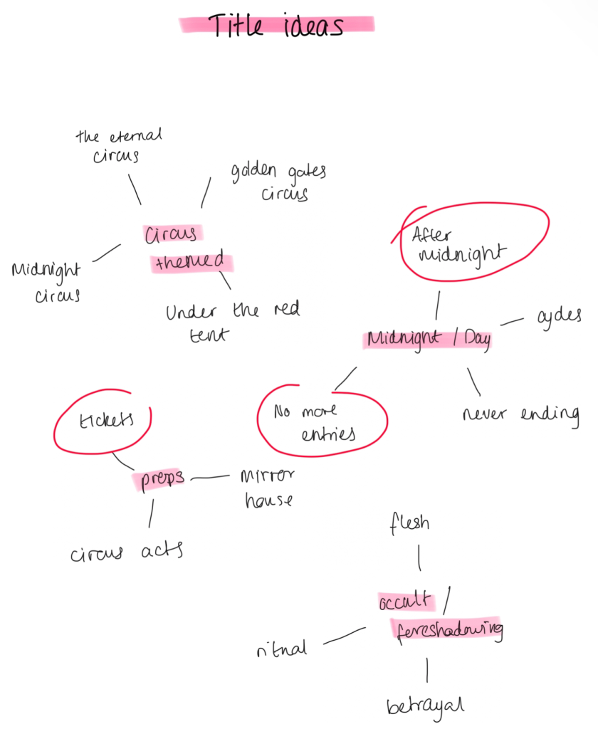
Above, I have made a start on plotting some words that I think associate with my game the best and branched out words and phrases that fit the theme. I came up with 4 words that I thought of on the spot to make titles out of. Initially, I wanted to name this game by calling it a generic circus title (E.G like Cirque du Soleil, which is a very famous circus) but decided against that as I wanted to have a deeper meaning behind the title that I chose. Once I was done thinking of simple words, I circled the phrases and words that I think I can make titles out of.
I also made a table inspired by some of the words that I circled, came up game names and explained my logic behind them as well as thoughts I had about these titles.
After looking at these titles, I favour the last one as it hints to the game’s plot whilst also using the text on tickets as a cover up.
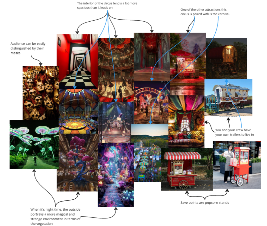
Here is a mood board of my plans for the environment and assets that can be found in game. As most of the story takes place on circus ground and the colour palette stays pretty stagnant, I want to depict the night and day having different colour palettes:
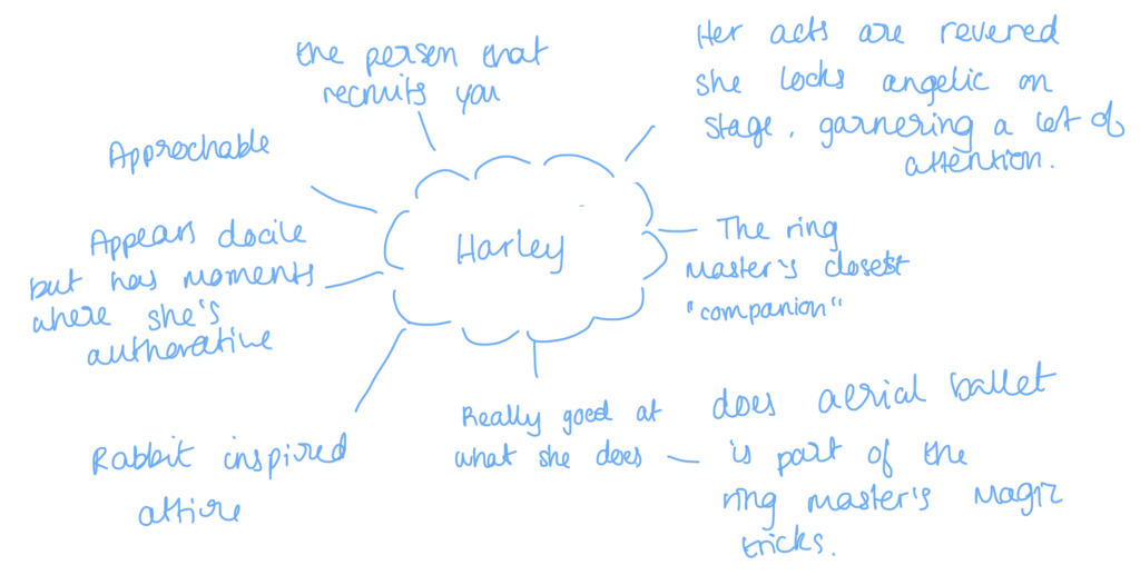
From this point, I started thinking about who would character A be, so I thought about possible characteristics this character would posses. Eventually, I came up with “Harley”, during my initial mind mapping, I was going to have the ring leader make the player join the circus, but as I wanted to add that layer of mystery and anticipation build up, I decided against that idea; Hence why I resorted to Harley being the plot behind the story unfolding at the introduction.
Initial plan
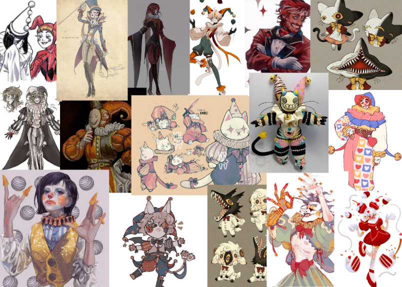
As most of my concept designs go, I started by looking at images on Pinterest to help me gather an initial idea of Harley’s aesthetics. Initially, I was set on making her an acrobatic, so I scoured Pinterest for acrobatic attire and costume designs. I was drawn to the checker patterns, eccentric silhouettes and lots of ruffles!
By utilising this mood board, I began to sketch out a template to do a few initial designs:
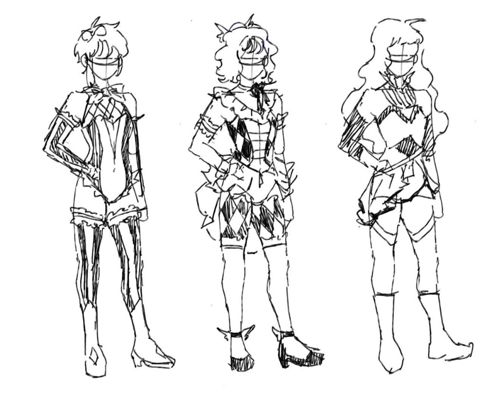
Design 1: This design was heavily inspired by the red and golden acrobatic costume, I wanted to play around with the circus type patterns, so I started off simple with the stripes as the primary feature of this design.
Design 2: Out of all the designs, I favoured this one the most as I love drawing very feminine and fluffy garments. I also toyed around with the patterns, expressing a playful feel through this design. By looking at this costume, it almost feels like a magical girl attire, which wasn’t what I wanted to achieve but nonetheless, I still enjoyed sketching this one out.
Design 3: In this concept, I was trying to mix and match my references, in my opinion, I think this design looks quite alien, but in a pleasant way. The skirt’s material is supposed to look see shear and translucent; so when she does acrobatics in the air, a long frilly skirt wouldn’t get in the way
Mini Reflection
The reason why I chose to stop these designs after the 3rd one was because I felt like the references I pulled weren’t speaking to me; therefore I felt quite disconnected to the concepts I was coming up with and designing just another character. However, I want to design things that I am proud of; especially woman characters as I have the most fun doing concept art for them. So, for these next steps I spent my time looking at my Pinterest and listed the things I want to include/explore in her design:
Neck ruffles
Ballerina attire
Rabbit symbolism
Elegant attire
Frills
Additionally, I mapped out who Harley is alongside some basic information:
Media Inspiration: Doll
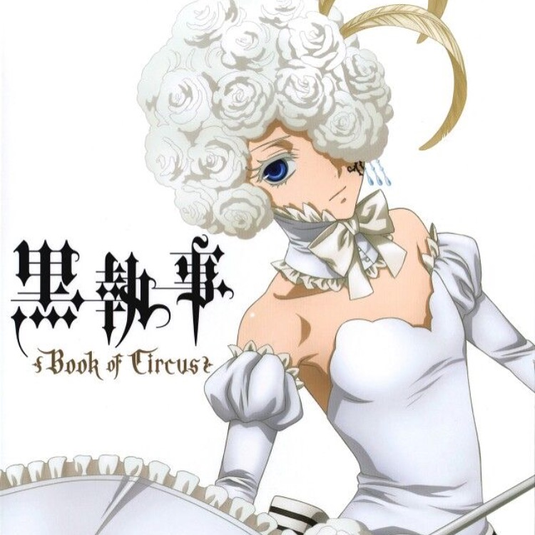
Whilst I was gathering images for my more refined design and thinking about Harley’s occupation within the circus, I suddenly remembered a character from a circus as well that was a pivotal point in Harley’s design. Doll, from Black Butler: Book of Circus (2014), is a young boy who when performing, wears a wig and dress made out of white roses. She specialises in aerial ballet and completes a “death defying” tight rope walk.
I remember watching this and thinking that her act was elegant and captivating, hence why I am switching Harley’s occupation from an acrobatic to an aerial ballerina; It’s a subtle change but I believe this act will fit her the most.
Change made: Harley is now an aerial ballerina instead of an acrobatic
Why rabbit symbolism?
I want Harley’s attire to symbolise a rabbit because it’s ironic yet true to her intentions:
Rabbits symbolise innocence because of how cute they are and unknowing of the world out there is, they’re also vulnerable because they are animals of prey and in my opinion, they also symbolise naivety. In Harley’s case, she posses the physical traits of a rabbit, looking both cute and pure of heart, however, her intentions to sacrifice the player for her friends is quite the opposite. It is a violent thing to want yet in a sweet way. She is also naïve in the way that she doesn’t realise that she’s being used as a pawn for the ring master’s evil deeds.
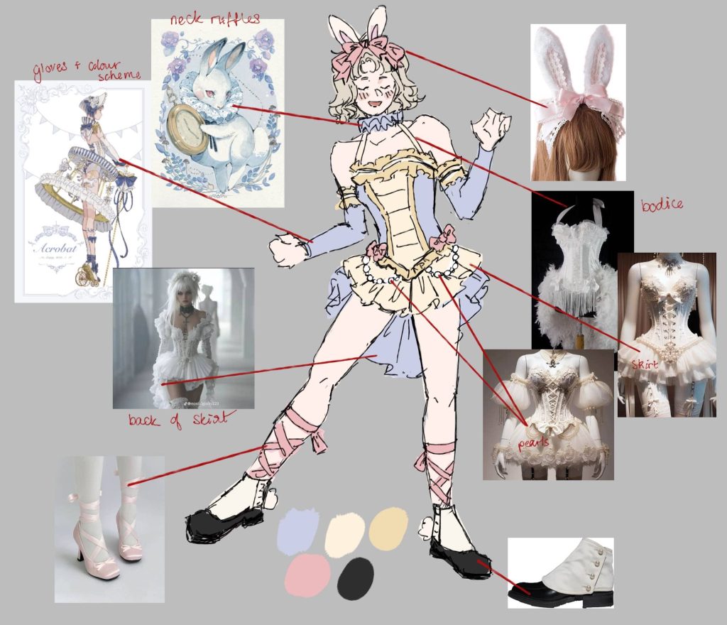
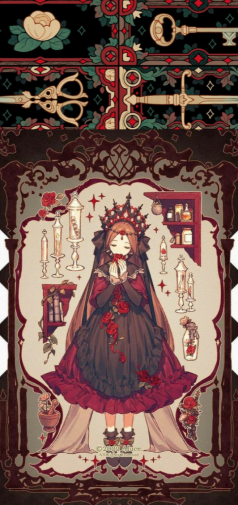
Finalised Design
Here is the finalised design! I am really happy with how it came out and the way it comes off visually. I want her design to be deceptive and ironic of her intentions.
Last time, I wasn’t truly satisfied with the game’s aesthetics mood board, although it had the majority of what I want, I was forcing myself to work in a style that wouldn’t suit the game that much. Although I do want to surprise the player with cute visuals paired with a darker undertone, the game’s true colours peel away as soon somewhere near the beginning of the game and it somewhat takes the shock value out of it when the player progresses.
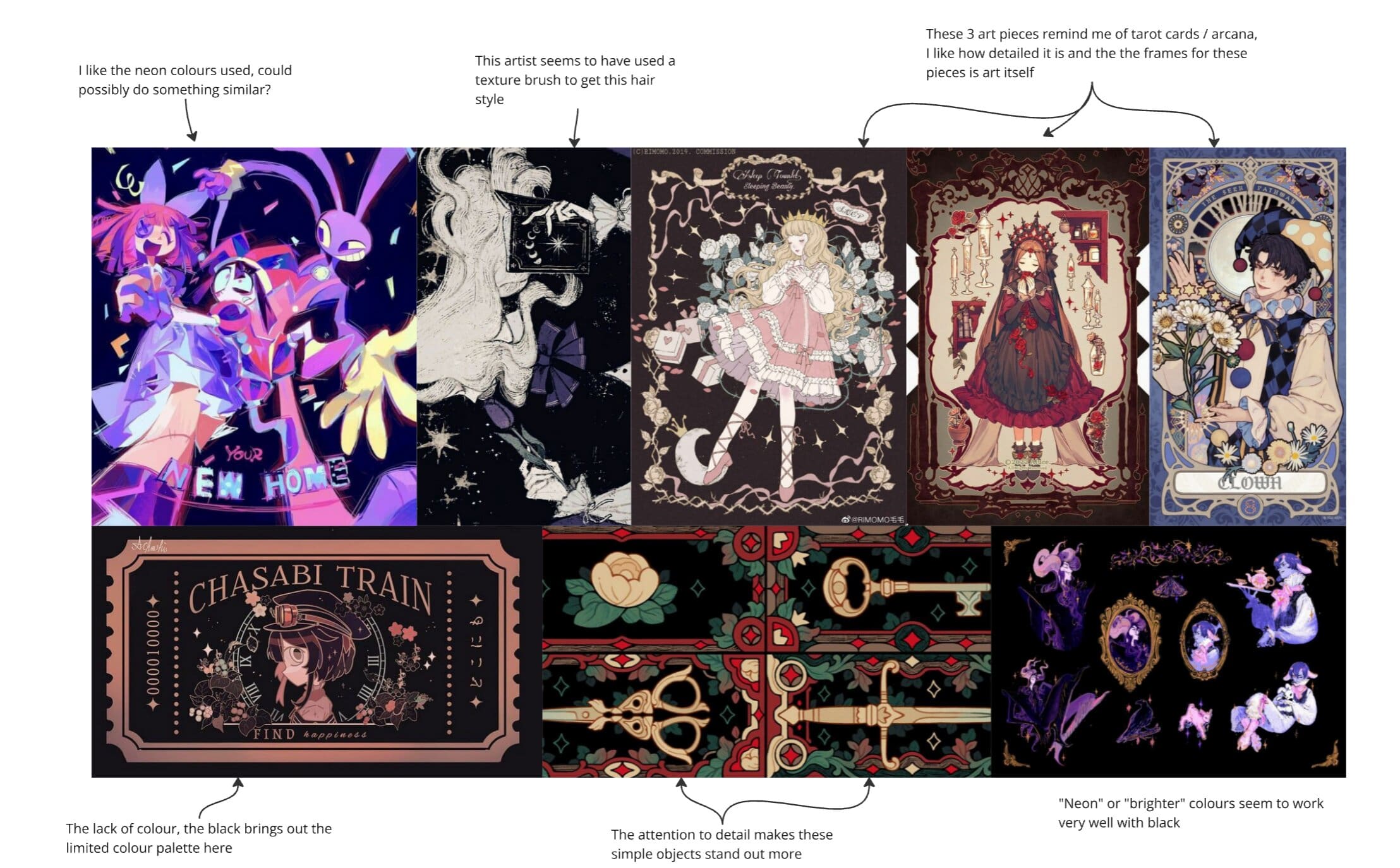
So, I have come up with a new mood board which I think depicts the game’s art direction better:
I am much happier with this mood board in comparison to the last, I think that the bright colours and black would work well together and depict my game the way I envisioned it.
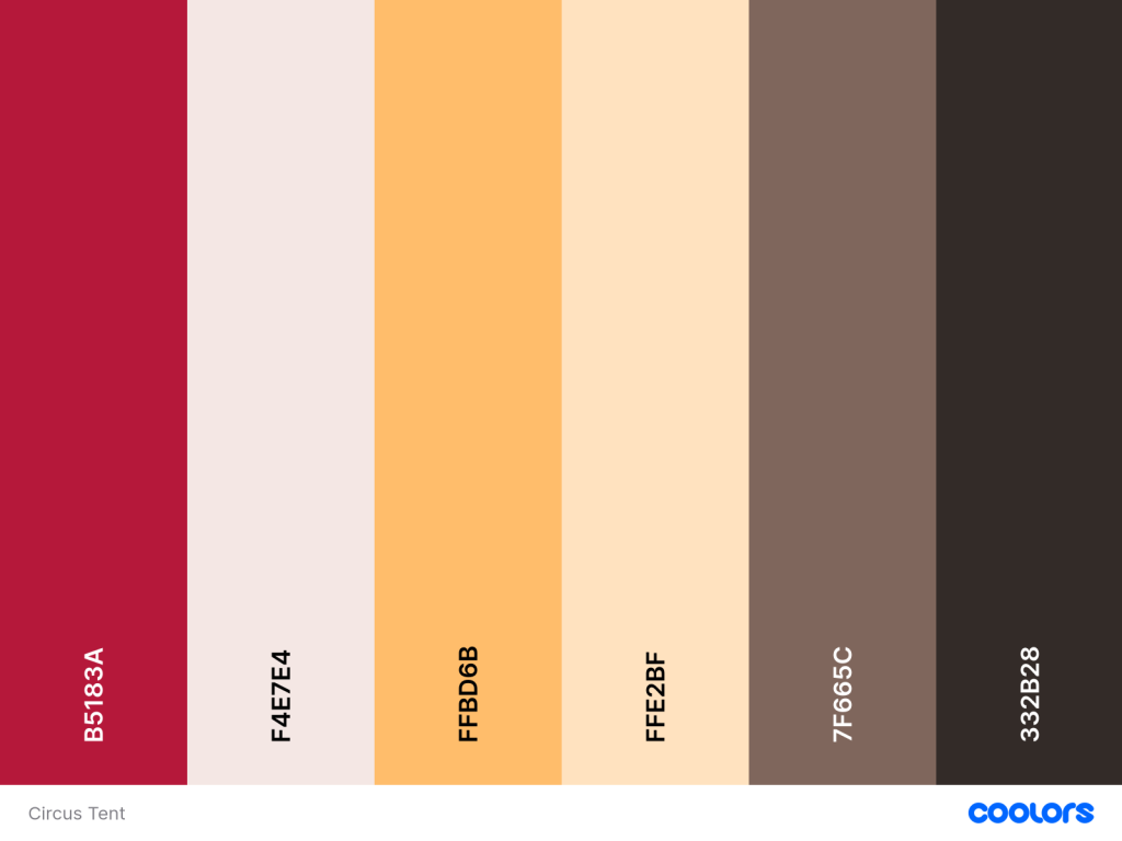
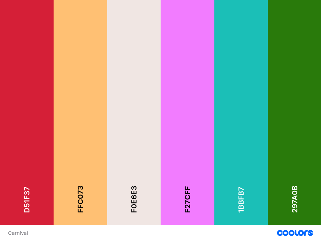
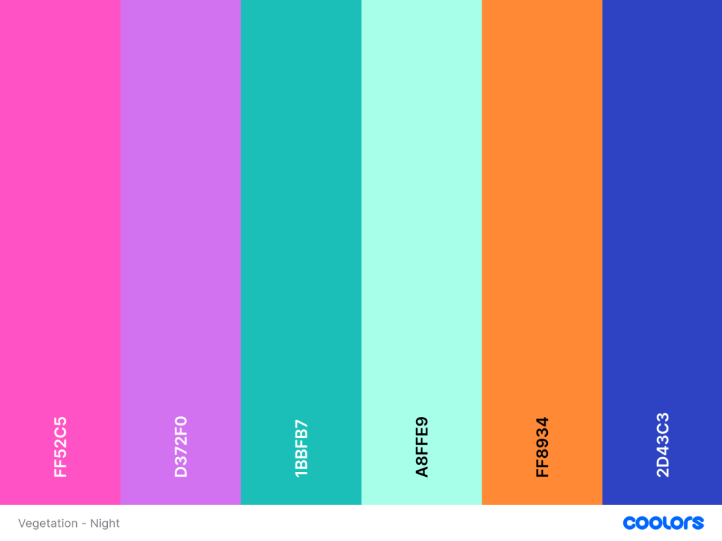
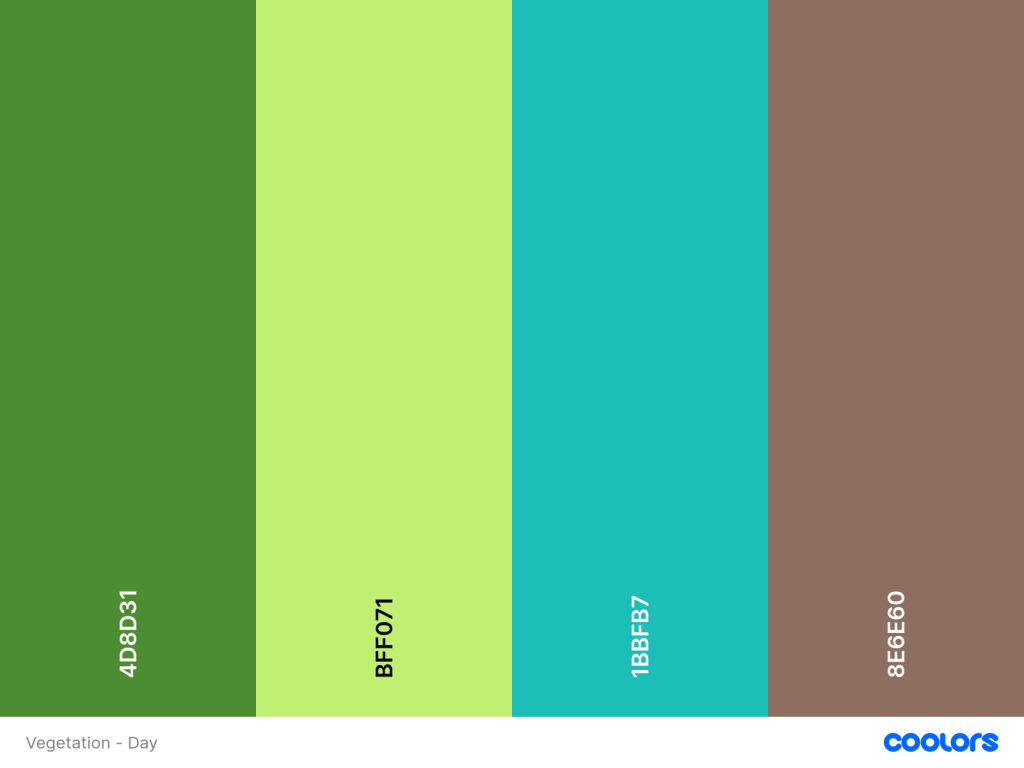
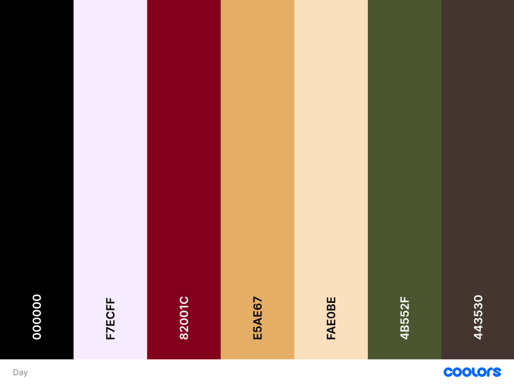
Colour palettes
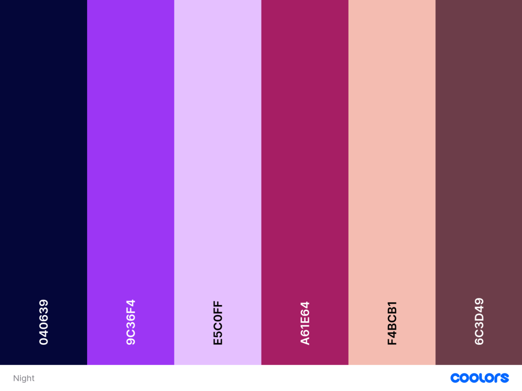
Night
As stated before, these two art pieces inspired me to use the colours as part of my colour palette. I wanted to extract the purple tints as the colour scheme looks harmonious in both pictures. The way that I envision using this dream-like, purple tinted palette is by utilising this during the game’s night cycle.
This colour palette symbolises that the player is in another realm, both figuratively and literally; The player has gotten sucked into this dream like world and now they don’t want to leave. This remains true until they see what really happens in the circus and to their crew.
Day
This colour palette depicts a more realistic approach regarding real life spaces. I want the player to distinguish the differences from reality and the alternate universe.
I used these two images to help me pick the colours used.
Stylisation
For style of the game, I want to explore a cartoony art style, this will best “cover up” the underlying themes of the game. I also think there is some horror when a cute looking character breaks the 4th wall and points out your behaviour and decisions.
As my major focus is character and concept art, I want to have a go at making my characters in this style for the finalised version. To re-create this art style use:
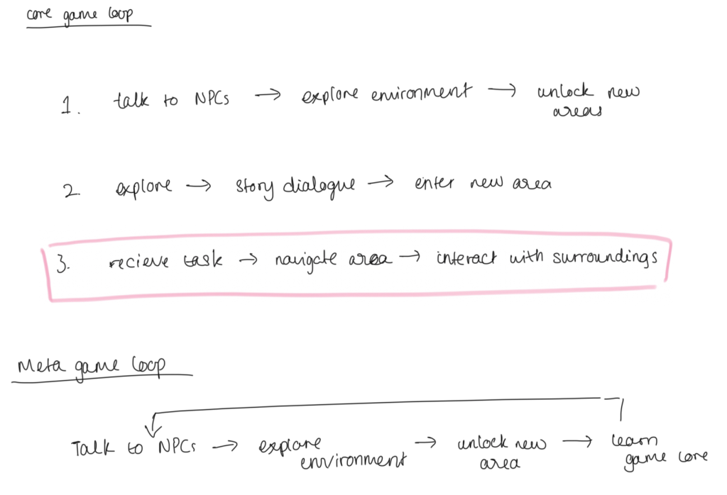
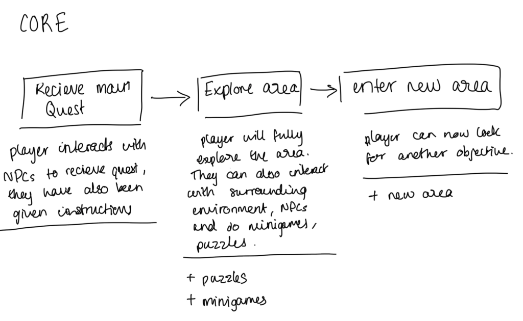
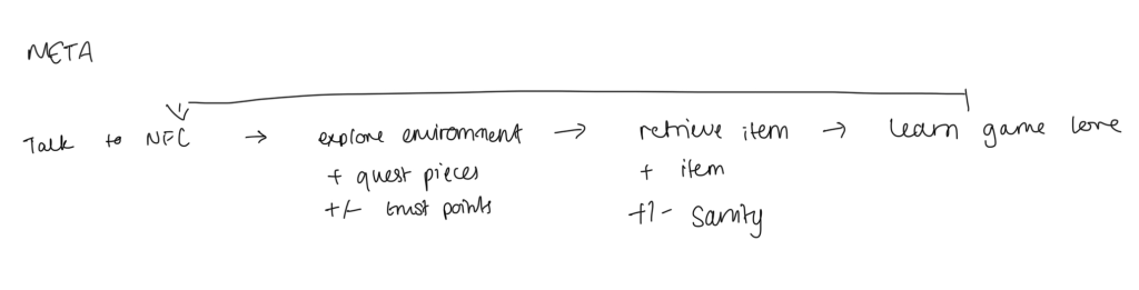
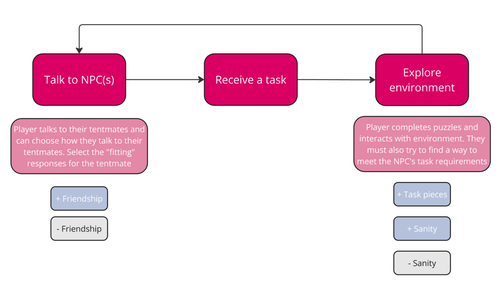
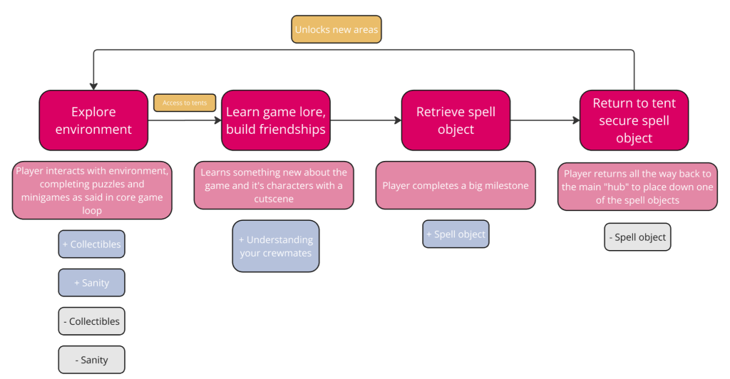
In week 6, we were given a run down of what a game loop is; When I was introduced to this term, I had realised this was one of the components that I didn’t think about that much in regards to my GDD. After Venezia’s lesson, I worked on my core game loop and my meta game loop.
Initial game loops
When I was in Venezia’s lecture, it made me think about the missing components of my game and components I hadn’t considered before.
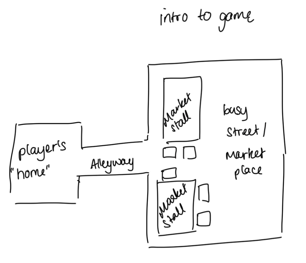
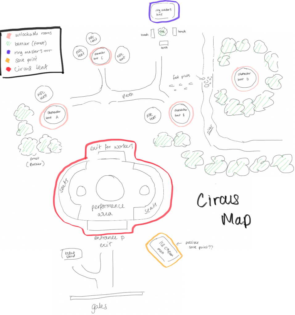
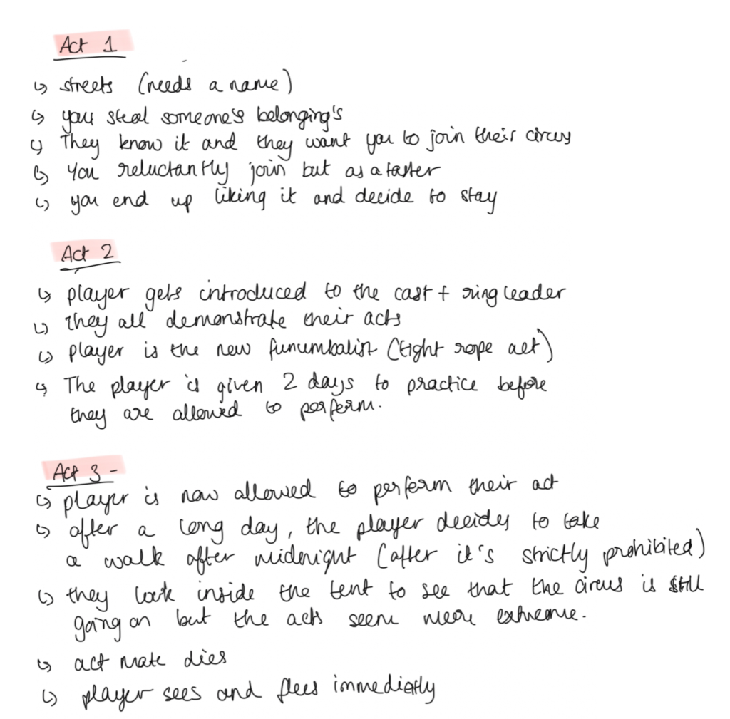
I have made two maps plots for my game in a bird’s eye view. At the beginning of the game, the player starts off in the streets next to market stalls and their home is in an alleyway. When they meet character A, they will be brought to the main map, the circus tent. Here, they will be spending most of their time. However, to me, these maps felt small and spaced apart, which leads me to my next steps.
Feedback
I had a discussion with one of my classmates about these ideas and how I felt about the initial concepts. I summarised their main points:
“It doesn’t need to be big” I told them about my main concerns about the map plots and felt like the player wouldn’t be satisfied with their experienced as all the “goals” are so close within reach from each other. Even so, when I thought and said these feelings, they reminded me that this does not have to be a big game at all.
“The tent feels a bit disconnected from the others” This statement encouraged me to redesign the main map plot again as it does feel a bit further away from the rest of the tents.
Conclusion
I will take their advice with me and remember what they have said. I think it was an insightful conversation and interesting to see what another person would say about these concepts. But deep down, although this is a “smaller” project, I want to stretch this out more and be more ambitious with what I want as an end goal. So, for my next steps, I want to redesign the map plots and play with the setting and how close everything should be in relation to each other and I also want to make another (or perhaps few) map plot(s). This way, it encourages the player to explore more and have more fun, interact with the environment and try find easter eggs in the game.
Extra take aways:
Don’t space out the important story event locations too far apart
Don’t be OVERLY ambitious to the point where you can’t deliver it
Play with the main area! As the player will be spending most of their time inside of the tent, explore what could be inside
From week 6, I had received information that I didn’t consider about implementing in my game, one of the things I had learnt was game pillars. In Venny’s lecture, she had emphasised that game pillars are a set of core principles and outlines that are fixed at the beginning of a game. and it usually consists of 3-5 pillars; However, seeming as this is our first time creating our own pillars, we needed to stick to the minimum, which is 3.
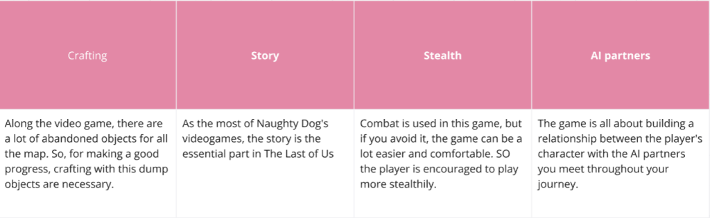
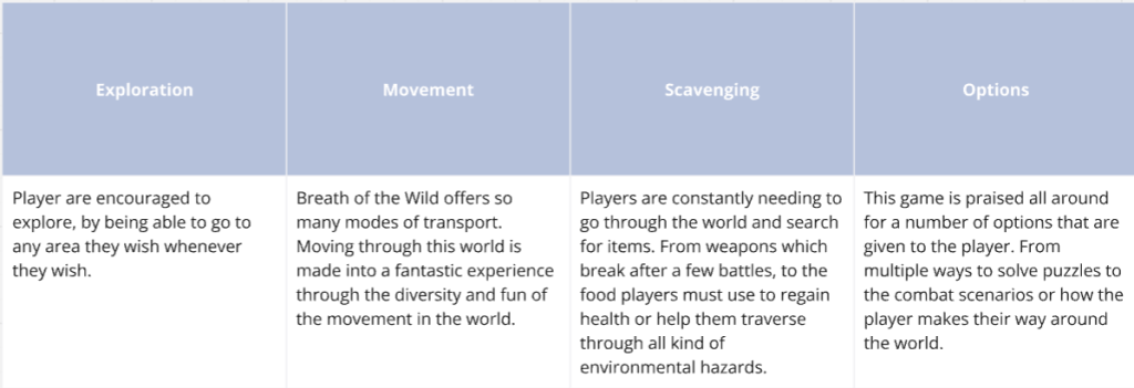
Whilst researching this topic, I was scanning different websites to help me collect information, then I found some resources from GitHub. On this page, it explains what game pillars are and it lists the game pillars of the most popular games. In the tables below, I have shown what the game pillars are in these games.
The Last of Us
Legend of Zelda: Breath of the Wild
GitHub (n.d.)
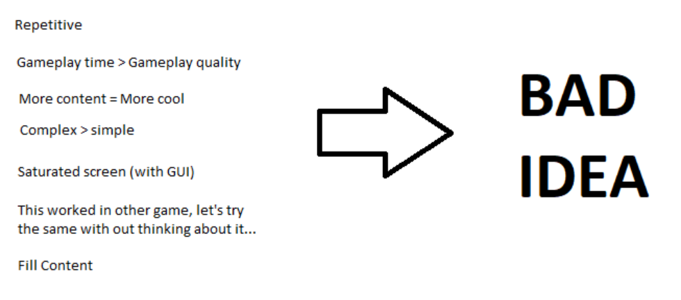
What makes a bad game pillar?
Empty words: For your game, do NOT make a concept like “make a funny game” or “a game that sells itself”. To fix this problem, you need to be more direct with what you want in your game.
Tasks: When coming up with your game pillars, do NOT establish a task as a game pillar. Your game pillars need to be a simple concept or word(s)- never a task. E.G a pillar that describes an “accessible mini map” direct the attention on that game mechanic.
Technical concepts: Similar to tasks, technical concepts are bad examples of game pillars.
GitHub (n.d.)
Things to remember when making the game pillars
Loyalty: When you establish your game pillars, you need to remember them, and stick to them. Otherwise, you can completely de-rail from the original concept completely.
Enough is great!: If there are too many changes in the design, there won’t be enough time to execute the product.
Relevance: If you’re adding a new concept just because you think it’s “cool”, stop and think; si this relevant to my work? If not, it might be a bad idea.
Don’t mess up something that works: If you already have working game pillars and thinking of adding or completely changing it, you may ruin the game play.
Ask two questions: Will this mechanic fir the idea? Does it satisfy the game pillars? If the answer is no to both of these questions, it’s best not to put them in.
GitHub (n.d.)
Developing my game pillars
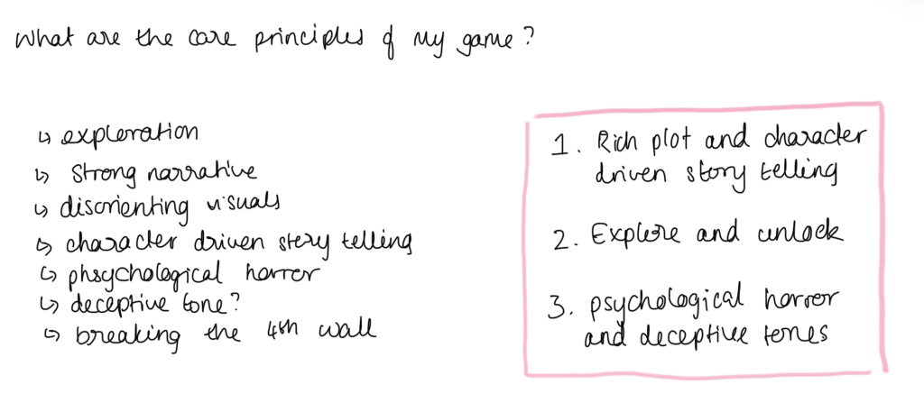
Before I dove straight into making my game pillars, I listed down the main principles of my game:
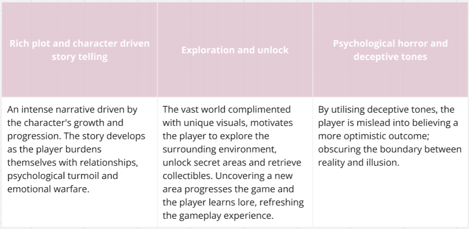
Eventually I settled with the following 3 pillars: Rich plot and character driven story telling, explore and unlock, psychological horror and deceptive tones.
The Ring Master in No Entry After Midnight is the main antagonist of the game. The player is introduced to this character when the player goes to the circus for the first time. The Ring Master likes to Portray himself to be relaxed, ditzy, full of energy and almost like a father to the circus’ residents, but this couldn’t be further from the truth; When the player finds out what happens during the night, the truth is revealed. He is a callous, twisted and calculated leader responsible for all the missing people in the circus.
Mood boards
Here is an initial mood I made for this character but as I started to make initial sketches, I figured that the images were too vague and I was thinking of the entire cast instead of one character. So I started from scratch again.
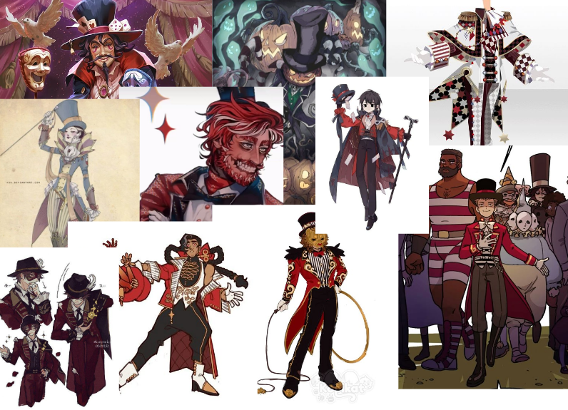
Then I started to look at Pinterest again with the Ring Master in mind- and ONLY this character. I thought about the possible colours he’d wear, the accessories and the silhouette of his design. Eventually, I compiled images that look like a stereotypical Ring Master.
The main things I want to include in his design are:
The colour red and yellow
A big top hat
A slicked back hairstyle
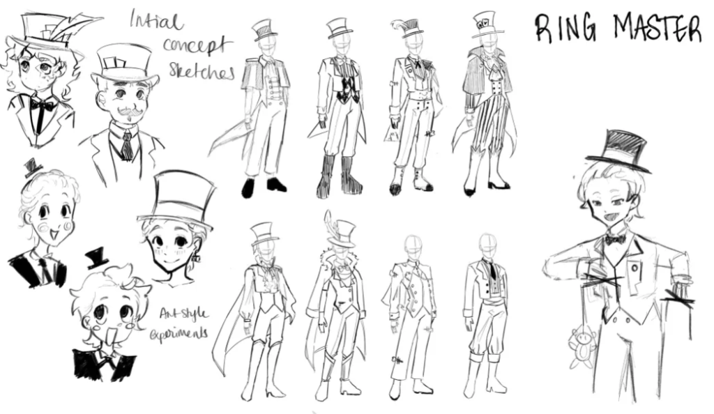
Initial Sketches
I came up with several different sketches for this character as I wanted to nail the design on the head. In the majority of these concepts, I have designed the Ring Master to be in a long tail coat as I think it’s fitting for his profession, I also experimented with different types of hats and shoes.
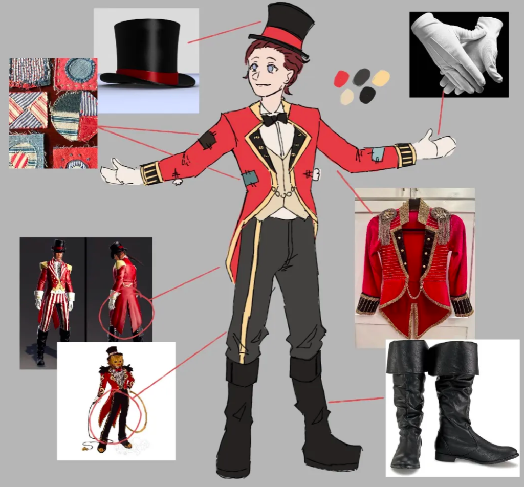
Finalised Design
Finally, I came up with this design as his costume. I went back onto Pinterest to find more specific images for the aspects of his design and stuck with 3 main colours for his colour palette.
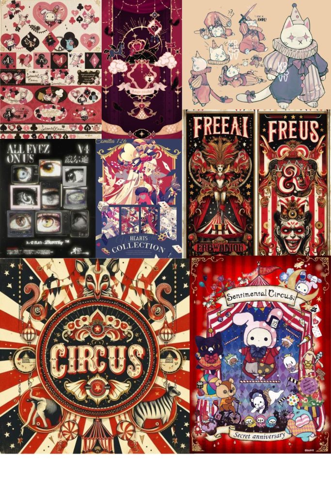
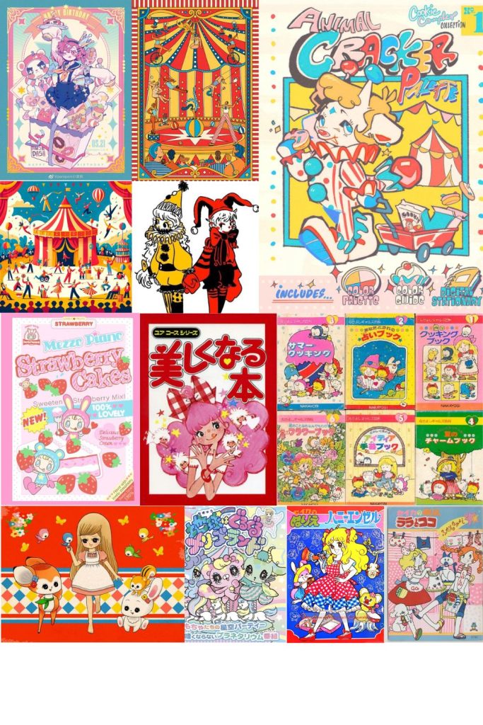
To help me decide my game’s portrayal, I have made two mood boards with contrasting aesthetics, as I had two approaches for my game. One goes for a more classical circus vibe, whereas the other mood board depicts a colourful and childlike portrayal.
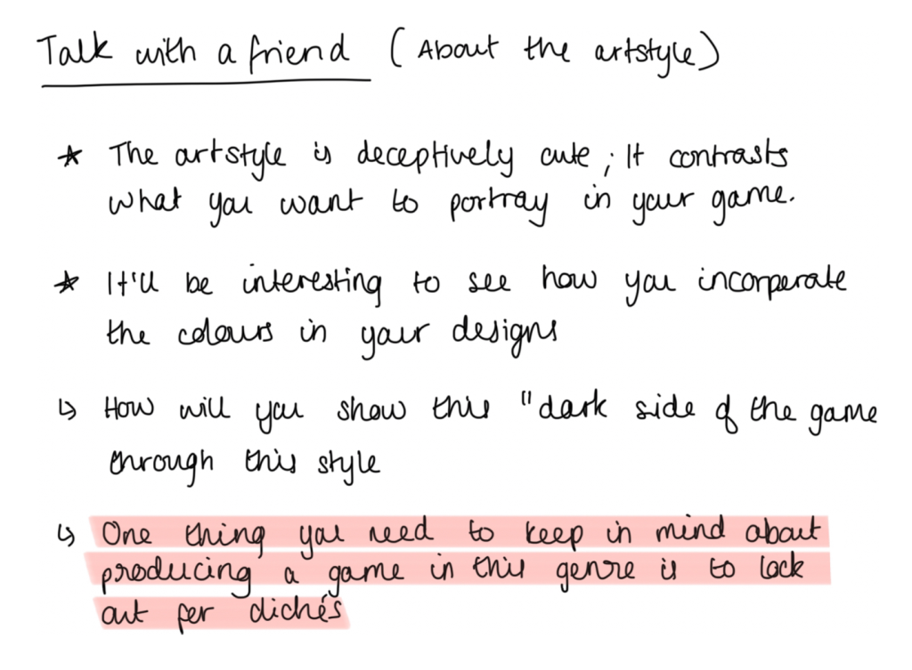
However, only one of the mood boards depicted can represent the lead art style and aesthetic. In the end, I found myself going for the second mood board with the brighter colours. I also had a talk with one of my friends from back home about these ideas:
After talking with her, it gave me some incredible insight about what I wanted to do. Although making the overall theme “cute-like” could fall into a cliché, which isn’t a bad thing, however, I believe to an extent that this genre of game is oversaturated. A very well loved game amongst fans, Doki Doki Literature Club! (2017), has somewhat increased the production for this sort of genre (because of the absolute jaw dropping mechanics; DDLC was one of the first games to read into the player’s account and sort of call out the player’s actions, breaking the 4th wall), although not being the first game to have made the “Oh wow this game looks wholesome! But it’s actually not!” category. As a result of this, it’s going to be harder to come up with ground breaking plot twists and a narrative.
To summarise, I still want to look into my game’s art direction and look at other forms of media to assist me with my overall game aesthetics.