
For the logo design, I wanted to make it look like a ticket or vintage. So the first order of business was to look on Pinterest for circus ticket designs and analyse a couple things: the font, distortion and colours.
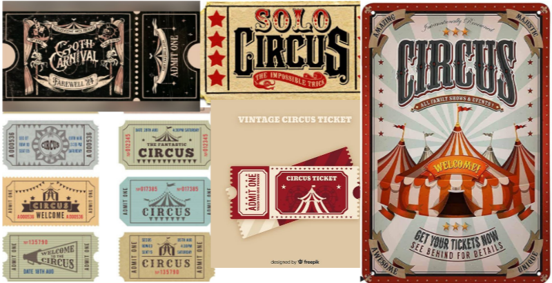
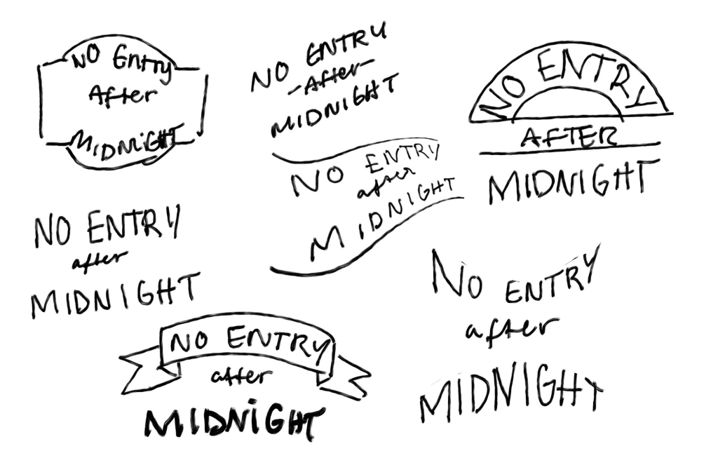
In the very quickly compiled mood board above, I have come to the conclusion that in my logo design, the font must be quite thick / chunky with a vintage feel to it. But before I jumped into finding the right font, I wanted to play with word placement and how it would look:
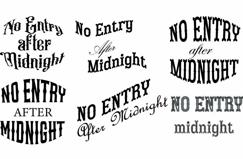
After that, I went to look for free fonts and play around with Adobe Illustrator for the word order. Addtionally I looked at a Youtube tutorial for a vintage font effect.
At first, I wanted this to be my finalised logo design but when I was trying to put it in different colours, it didn’t feel right. As a result, I went back to Adobe and worked on a different draft.

Finalised design
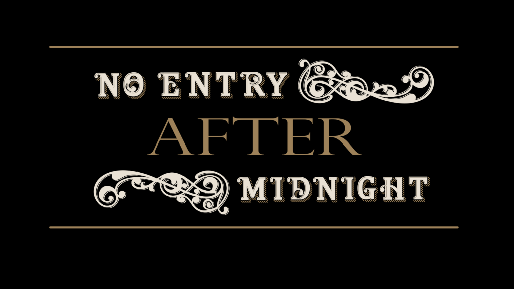
For my finalised design, I browsed Pinterest different ways to set out logos and eventually came across a ready made alphabet. With this alphabet, I tediously put the words together and went for a more simplistic approach, which in the end, I came to like a lot more.
Vintage circus alphabet – Freepik