
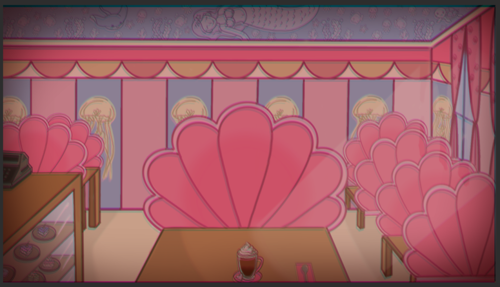
Initially, we were going to use Izzy’s first iteration of the the “evil” cafe, however, the red looked a bit harsh in comparison to the theme of the game. Although red connotes evil and horror, I asked if I could take this task up instead.
The first thing that I needed to do to make the background was find a video on how to make a glitch effect. Although Procreate has a feature that allows chromatic aberration, I wanted to use ClipStudioPaint again to build my confidence using a graphics tablet after getting used to my iPad for so long.
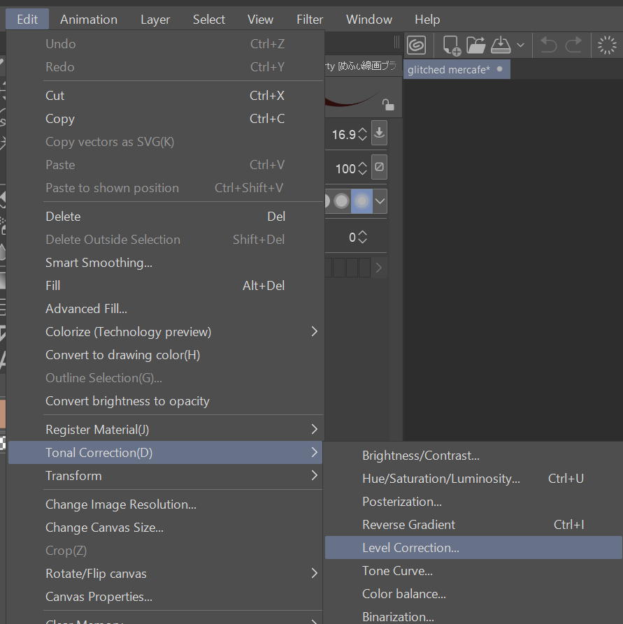
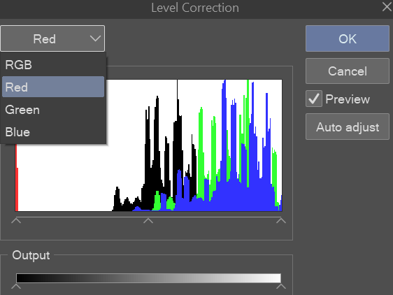
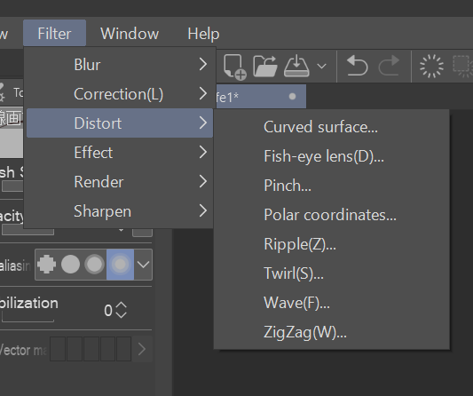
Although this tutorial uses Photoshop, the software I use has the same features. The tutorial starts off by copying the original photo twice, which results in three of the same photo. They should be in separate layers. Now, each image had to be a primary colour (CYM). I did this by going over to edit < tonal correction < level correction.
Once I had done that, to change the colour of the image, I needed to select RGB and select Red. At the bottom of the window, there is a section called “Output”, by clicking on the arrow furthest to the right and dragging it to the left, it completely gets rid of all the red in the image. This gives us the colour cyan. I do this for all of the images but select green then blue and dragging the right arrow left. This results in giving me the primary colours cyan, magenta, and yellow.
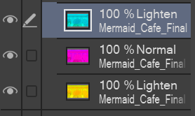
To make the chromatic aberration, I selected the top layer and changed the layer setting to “Lighten” I did the same thing with the bottom layer. Then I played around with the positioning of the cyan layer and yellow layer.
Eventually I came out with this result:
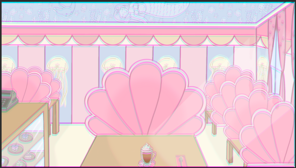
It looks really cool, but we aren’t done yet!
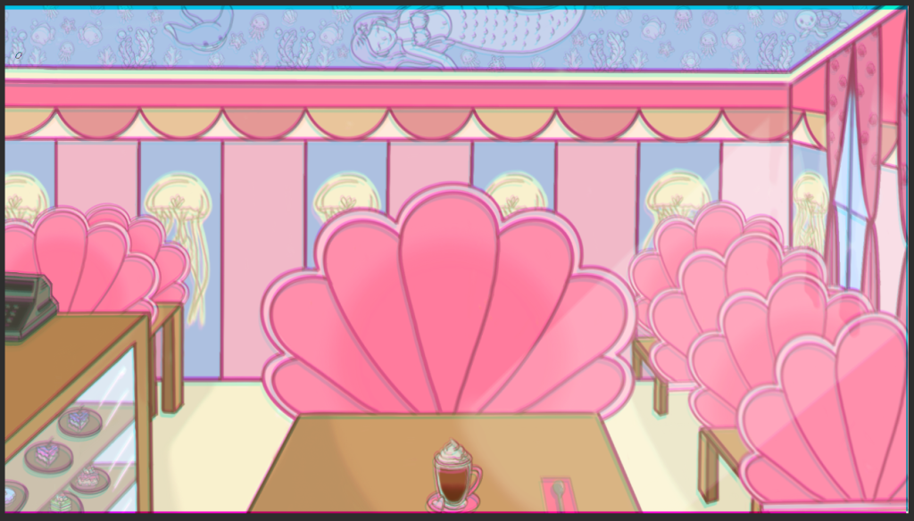
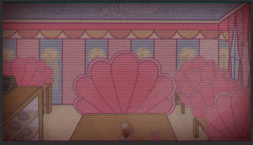
I duplicated the image and selected multiply mode, this makes the background look more saturated and it’ll look great with the effects I’ll add on later. Although it’s a small difference, a little goes a long way.
To make the atmosphere more sinister, I paint bucketed the entire image red and set it to multiply, then lowered the opacity to 35%. For the vignette, I used a dark red and airbrush to paint around the corners of the image.
For the finishing touches, I found a TV static image and set it to screen and used the noise feature and played around with the settings.
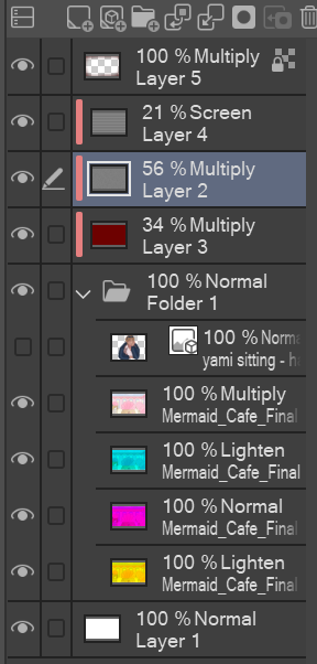
Layers that ended up being used.
Adding more effects
After a couple of days, I realised that the background looked too simplistic for me, so I decided to play more with the effect features and make it look more “glitched”. To avoid using too many layers again, I exported the image as a JPEG and imported it into a new scene.
To make the glitch effect, I first duplicated the image. Then I used the rectangle selection tool tool to actually start making the glitch waves. With random areas selected, I moved some of them to the left and some of them to the right.
(Still using this tutorial)
To go the extra mile, I selected random areas again but with the lasso tool and played around with the different distortion effects.
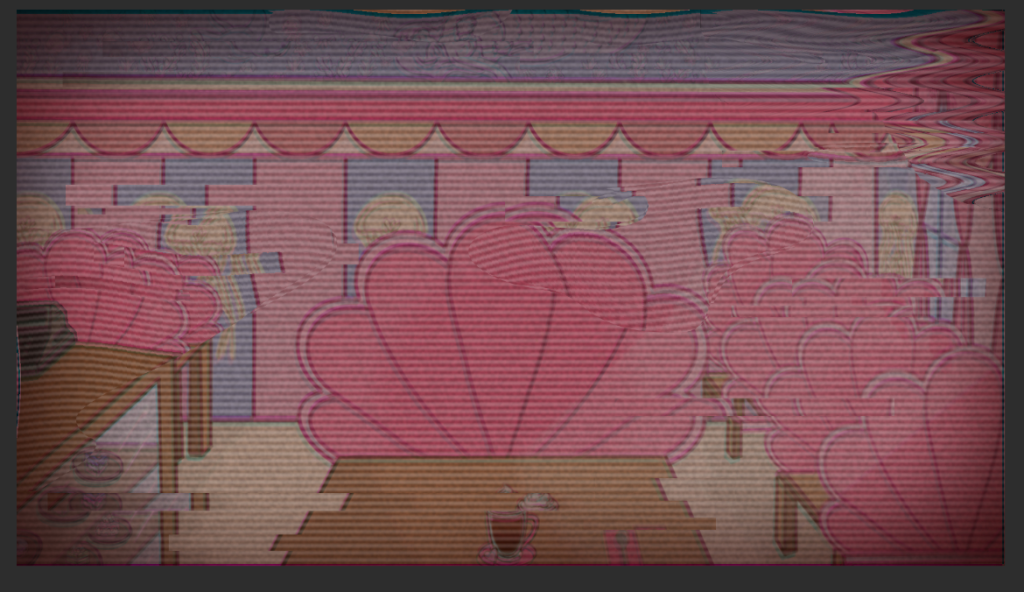
To finish up the background, I made the background slightly more red by paint bucketing the entire image a light red and set it to multiply. Applied a dramatic vignette with a dark red airbrush in the corners and set it to multiply. To make the scene have more glow, I used a light red airbrush and painted the centre of the image and then set it to overlay. The outcome came out like this:

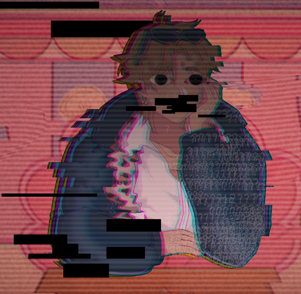
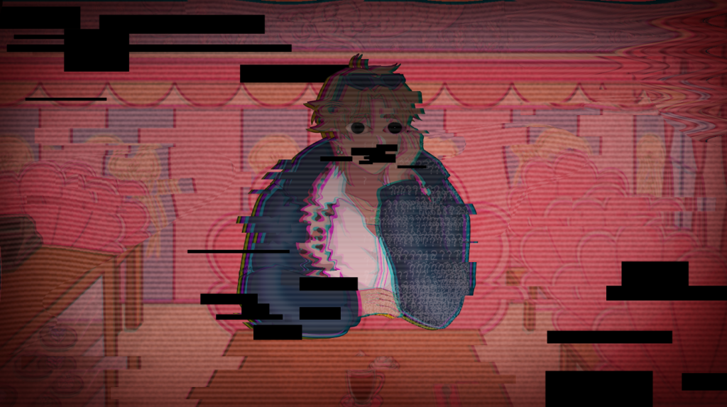
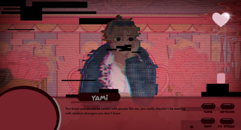
Yami glitch asset
To make Yami’s glitch asset I followed most of the steps as seen previously. I then added some more pngs from online to make it look creepier.
The finished look!
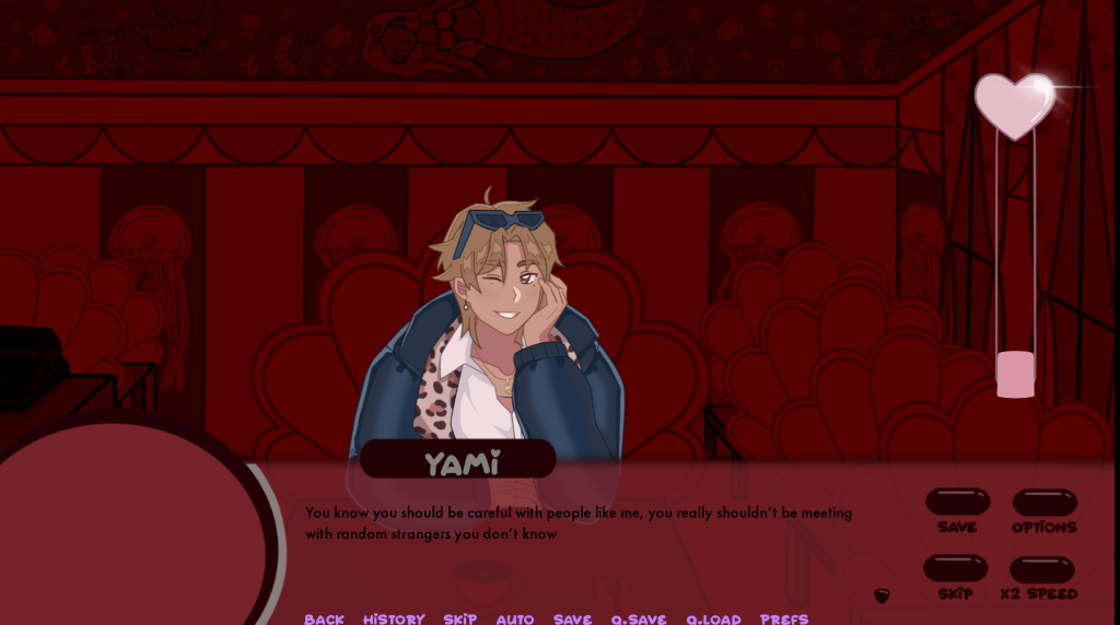
With the UI Maja designed:
My Thoughts:
Making effects on ClipStudioPaint wasn’t that challenging, however, in future, I would like to hone the skill to use Photoshop to make effects. The final look came out really well and I like how well it came out in the end!