In my game, I have come to realise after looking at a few RPGs, that not many of them have UIs. The vital things that are necessary to the game (such as the inventory), can be found in the pause menu. I think that following what most narrative RPGs will work out visually for my game as well. However, I still want to layout my main menu in an eye catching way for the player, the main menu’s buttons should compact and shouldn’t be far away from each other as this can make the player look at too many places at once.
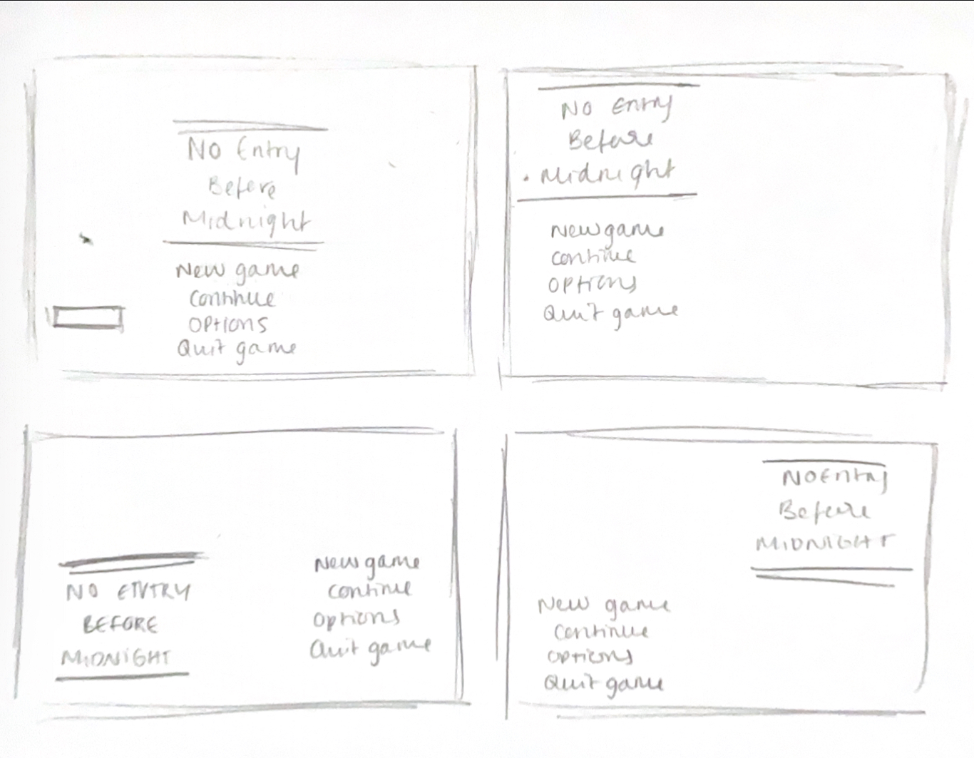
Above, I have come up with a few placements for the main menu. I was reviewing a few previous years GDDs and how they came up with their HUDs, UIs etc was that, they all stayed relatively minimal.
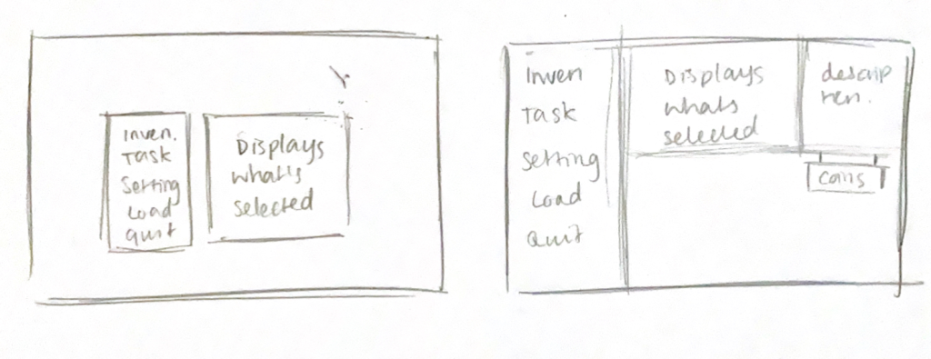
Then, I did a couple of sketches of what the pause menu could look like as well. The second layout was heavily inspired by Paper Lily by Leef6010
Feedback
I asked two people for their feedback for these concepts and how I can improve on these designs;
“I think it’s a good thing that you want to keep your menu screen buttons close together, whenever I play games, I find it a bit annoying when buttons are spaced out. Although it’s a small design choice, it keeps my sanity in check.”
(In regards to the pause menu) “I think you should try to develop the second concept more. The first one is minimalistic- it can be good but I think for your game it would be nice if you had a more intricate design.”
Finalised text layouts

Finally, I came up with this as the main title screen. The point of this concept is to show where the text could go. I also added Nola’s hat as what is currently being selected.
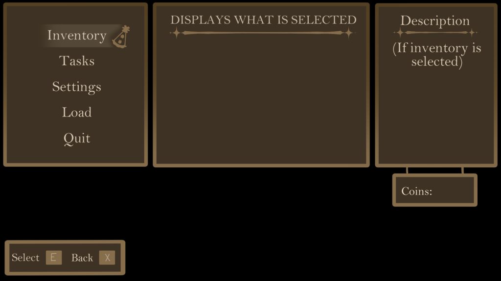
And here’s the mock up of the pause menu! I would also like to state that the back ground for the pause menu will be the current game the player is playing, but blurred.
