This week, we delved into character design and why it’s important in a video game. In this lesson, I am going to be looking into character pipelines and how to make a unique character.
Why do I need decent characters in a game?
Simple, characters can provide many different things that games with no characters can; They can provide emotional connection or a sense of relatability, players will want to know what is happening with the game world and what will happen to the characters they play as or the supporting cast; It also promotes an immersive experience, unique characters can make the player feel like they are apart of the world and could lead to a more entertaining experience; Finally, by having well designed characters, it offers an interesting story, this encourages the player to keep playing and investigate the world they live in.
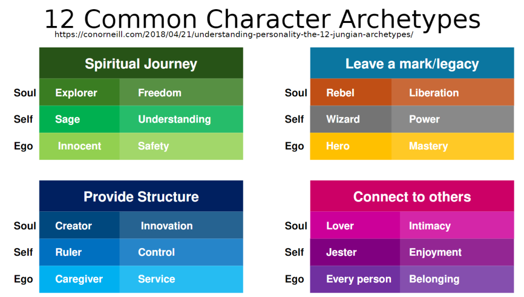
There are also several character archetypes:
- Protagonist
- Sidekick
- Foil / Straight man
- Love interest
- Confidante
- Morality chain / pet
- Villain
- Dependant
- Mentor
Activity: Focalising character
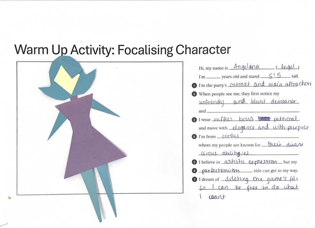
In this mini activity, I based off this character off of an initial concept for my game and thought that doing tis activity would help me add some meat on her bones. Although this task was supposed to be easy, it took me a while to figure out how she’d be like in my game. After that, we were provided some colourful paper and scissors. We were also told to use only 3 colours for this task; We needed to design the character but we could only utilise very basic shapes. This isn’t the character silhouette I had in mind, but this activity could prove useful in the future once I start coming up with initial character concepts.
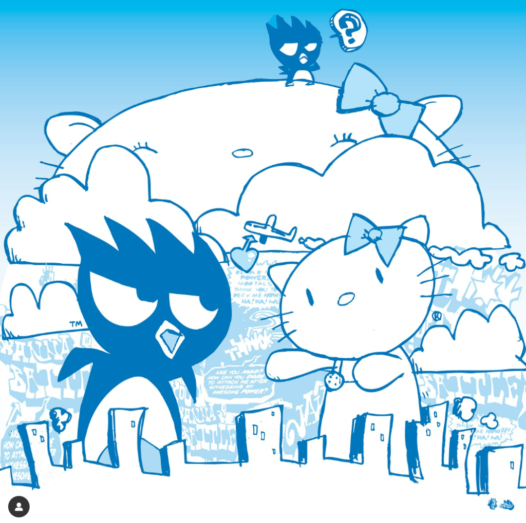
Moving on, we looked at shape language and how that translates to the eye, how different lines and curves can mean different things and how to make images look more lively:
- Smooth, flat lines creates a sense of stability and calmness.
- Vertical shapes can mean more exciting and the story is getting more active. Vertical shapes also rebel the Earth’s gravity and imply reaching towards heights.
- Diagonal lines are dynamic, it implies motion or tension.
- The upper half of a picture is a place of freedom, happiness and power; it also makes it feel more spiritual.
- The centre of the page is effective to showcase the centre of attention as its the greatest point of attraction.
- White or light backgrounds feel safer to us than darker backgrounds because of how well we can see in the day rather than in the night.
- We tend to feel scared looking at pointed shapes as it signifies aggression and we feel safer looking at rounded objects.
- The larger an object is in a picture, the stronger it feels.
- We associate the same or similar colours much more strongly than we associate the same or similar shapes
- Regularity and irregularity and their combinations can be powerful.
- We notice contrasts as it enables us to see.
- The movement and import of the picture is determined as much by the spaces between the shapes as by the shapes themselves.
Body shapes in character design:
| Circles | Squares | Triangles |
| Innocence, youth, energy, charismatic, endearing, harmless and friendly | Maturity, stability, balance, stubbornness, reliable, uniform, traditional and professional | Aggression, force, cunning, dynamic, competent, downward triangles are especially aggressive. |
Jake Detonator
This week, Jake came to teach us again, this time he taught us more about character design in depth. To recap, Jake visited us last week and briefly brushed on concept art, he is an illustrator, author and a graphic designer.
In this lesson he talks mainly about character design and how to emphasise your characters further through their posture, aesthetics and facial expressions.