
Analysing the Market
I was already quite confident about what the target audience of my game would be, as I have intended from the start to target both the family market with the game’s intuitive control system and bright colourful graphics and characters, as well as the more hardcore speedrunner demographic with the game’s post-game time trial leaderboards and high skill ceiling for using abilities. However, I wanted to look at some similar games to mine on websites like Newzoo to get some insight onto what platforms players prefer, as well as some other metrics.
Creating a Logo
I was very much inspired by the relatively obscure 1972 font Meander, made famous by its use by Julian House for the cover of Stereolab’s 1997 album Dots and Loops.
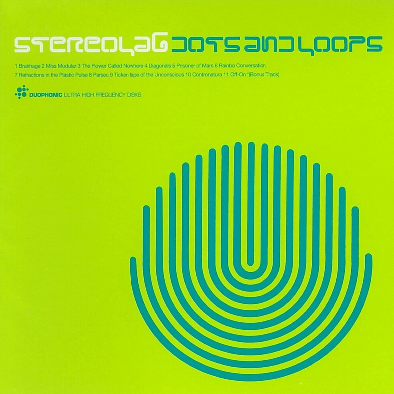
As such, I decided to use the same technique of creating a geometric typeface that used similarly curved lines to instil a feeling of movement.

This was my first attempt, but it still felt somewhat clunky, didn’t align well between the two words, and was in general not as dynamic and professional as I wanted it. I instead made a completely geometric typeface on a 3×3 grid with rounded corners, and this worked great.
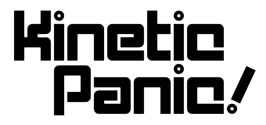
This looked very professional and fit right in with the game’s minimalist aesthetic, while the tilted exclamation mark adds a touch of playfulness and a nod to the game’s physics-based gameplay. The circles dotting the I’s (which have now been aligned properly) also evoke the spherical player character.
Leave a Reply