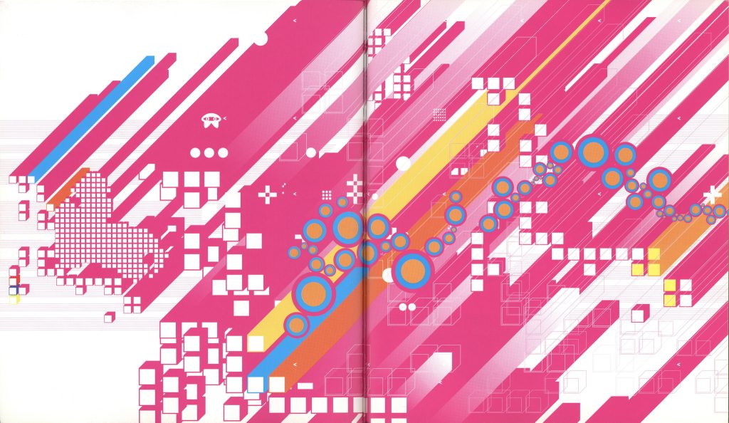
The art style of the game mainly takes cues from mid- to late-2000’s minimalist and abstract graphic design in terms of the shading style, bold colours and playful forms. It combines this with the use of realistic objects in the levels and art to create a unique collage style.
The provided concept art and moodboards should be sufficient for conveying the intended look of the game; the style is a unique mix of specific inspirations & concepts and tries to stray from vague “aesthetic” qualifiers (“y2k”, etc).
Inspirations
Artists and works to study for inspiration include my researched artists Julian House and Joshua Davis, as well as games mentioned in my blog such as Katamari Damacy, LittleBigPlanet, Rez & N++.
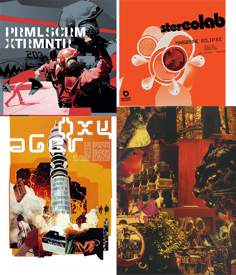
A lot of early-to-mid 2000’s graphic design is a great resource for the minimalist style of the levels, and some more examples can be found on my art style research post.
Environments/Levels
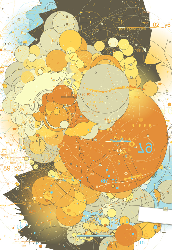
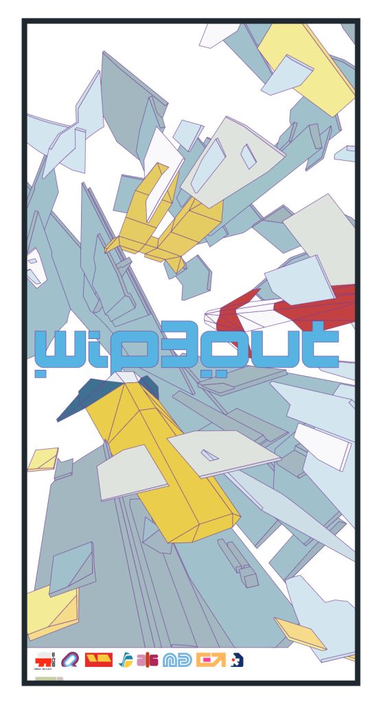
The environments seen in levels will have a distinct abstract art style similar to the examples shown above, minimal enough to not distract from the interactable objects but also with sufficient detail to make each environment distinct and evoke a sense of a real space. The backgrounds of the environment will feature bright skies with bold, bright colours. Thin outlines will be seen around level geometry to make them distinct from the background & objects.
All of the base environment will be flat shaded with hard shadows and outlines. Please look at my Unity prototype for reference. In my prototype I use Robin Seibold’s package for adding outlines easily but could not successfully exclude objects from having outlines, which is vital.

The skyboxes will feature collage elements taken from real-world pictures but these should be somewhat colourised to fit in with the vivid style (I used a gradient map in the concept art).
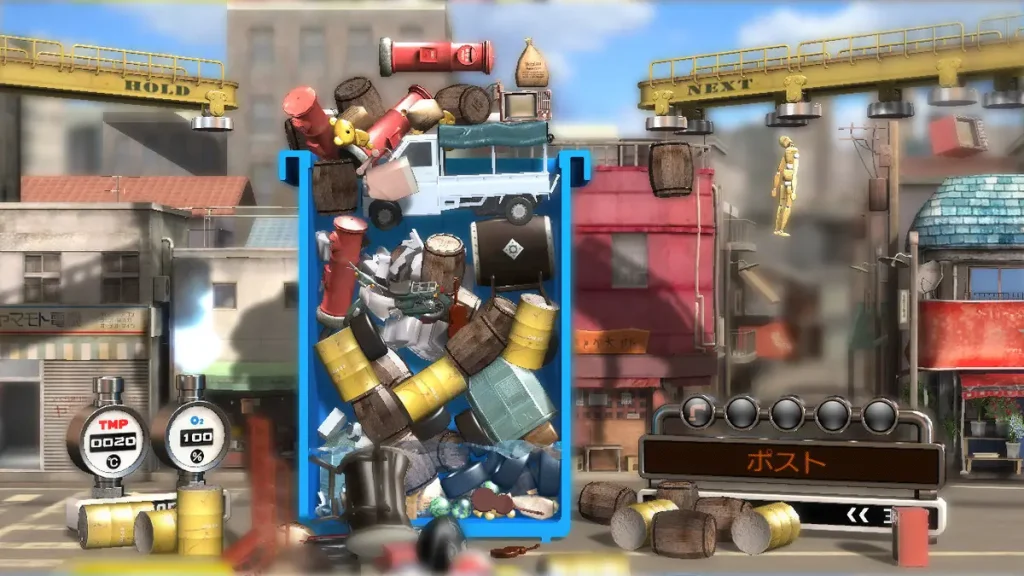
Docks/Oil Rig
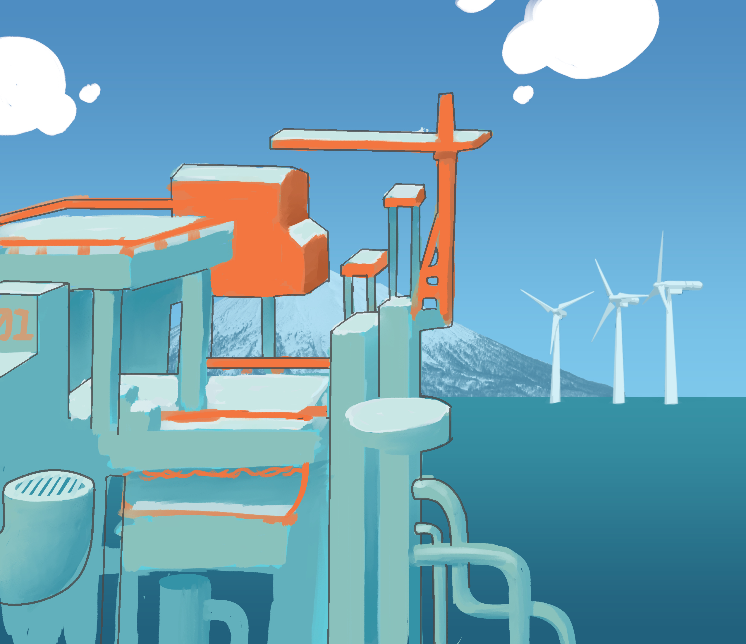
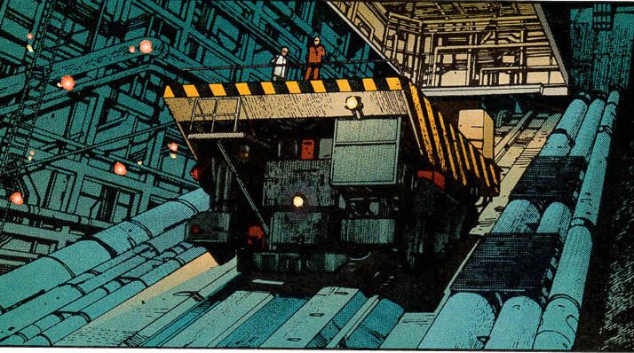
This environment will be set at sea, and consists of a lot of precarious platforms, both static ones held up by pillars as well as large mechanical moving ones, similar to the infamous Akira elevator used in Half-Life.
Cranes holding shipping containers dominate the higher parts of the level as well as small areas workers live in. The background will be made up of images of distant coastal mountain-scapes and arrays of wind turbines.
Objects
- Oil Drum
- Metal Crate
- Wood Crate
- Wooden Pallet
- Shipping Container
- Generator
- Work Light
- Large Steel Coil
- Pipe Sections
Rooftop Plazas
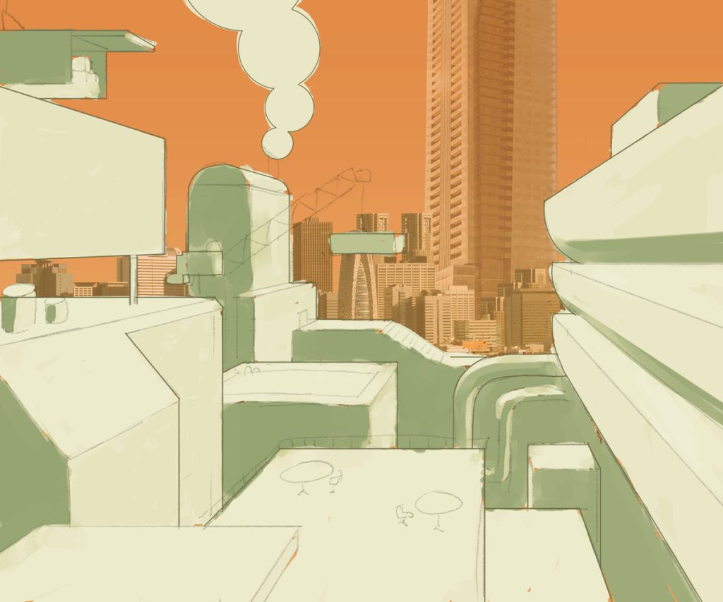
A large, foreboding glassy towerblock dominates the horizon in this elevated maze of rooftops leading to plazas, scaffolding, chutes, power generators and more!
Objects
- Tables/Chairs
- Lamps
- Air conditioning units
- Power generators
- Shipping containers (on cranes)
- Storage crates
- Barrels
- Statues
Geo-Dome
These will be large floating geo-domes full of plant life and 70’s retrofuturistic architecture. This is where affluent corporate types come to relax to get away from the smog.
Objects
The real-world interactable objects in the game are rendered in a semi-realistic style and have their lighting e.g ambient occlusion pre-baked and evenly lit, as there will be no dynamic lights in the scene to light the objects and they are all movable objects. They will also have no outlines.
Inspirations for semi-realistic object design and their variety includes games such as Trash Panic. Half-Life 2 and by extension Garry’s Mod also feature a wide variety of semi-realistic physics objects but Kinetic Panic should not have the “grimy” style of objects in that game.
Characters
The sprites for the Lords will be slightly shaded artwork, but with no shadows or outlines (Perhaps outlines could be used on the very outside of the sprite’s silhouette, but this is for artists to test). I used a large airbrush to get very faint and soft gradiations in colour. Their designs must reflect their associated ability/physics power, as well as potentially other references to the game’s core themes.
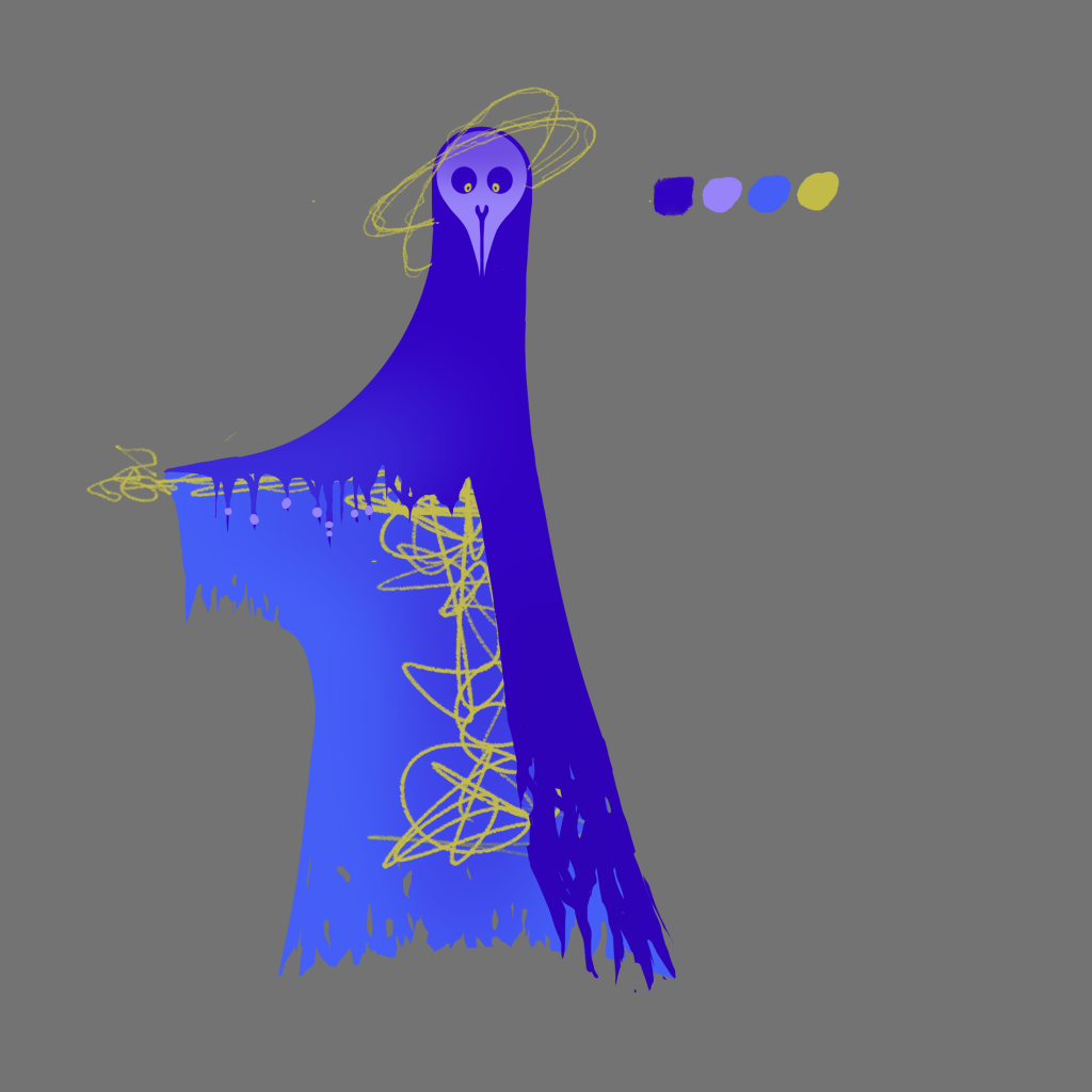
For example, Gravity’s design has a long, flowing cloak that falls straight to the ground, as well as small tassels on the arms weighed down by tiny beads. Potential energy flows around their head in a form reminiscent of planetary orbits. Their face also emulates the look of a fountain pen nib, as creativity is one of the game’s core themes.
Eta’s concept art features shadows and outlines as they will only be seen in gameplay as a 3D model. They will be shaded in a similar way to the environment.
Bold colours and shapes take precedent in all character designs. Inspirations include the character art from cutscenes in Katamari Damacy as well as Superflat-inspired vector art from the late 00’s and early 2010’s.
UI
The UI design will be very minimal and unobtrusive, comprised solely of basic shapes and lines.
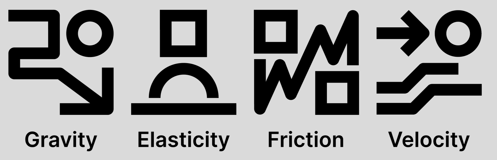
Ability Icons
All of the Lords have respective sigils that will also serve as icons for their abilities during gameplay.
The designs consists of basic shapes like squares & circles along with lines. These sigils can also be used tastefully in branding for the game.
As files cannot be uploaded here, either check the Teams upload space or get in touch with me for the source files to edit in Figma or Illustrator.
These will be shown on the radial menu for choosing abilties and the gameplay HUD as shown below.
Gameplay HUD
The gameplay HUD will consist of a component in the lower left hand corner of the screen that will show the player’s current amount of ability charges as well as their currently selected ability, as shown below:

The colour used for the UI is the same as those used for the Potential Energy, Energy Shards and Energy Clusters.
There will also be a radial menu that can pop up that lets the player quickly choose between abilities.