
In the final week before hand-in I showed my GDD and blog to Vanissa, and despite still needing some concept art and work on the marketing page, etc. It was recieved quite well. However, it was pointed out that my some sections of my GDD could be more clear. For example, I needed more diagrams on the Mechanics page and the explanations of the controls on the abilities page could be more intuitive. I was suggested to draw up a flowchart describing the process of casting an ability, and then asking my peers if it was clear.
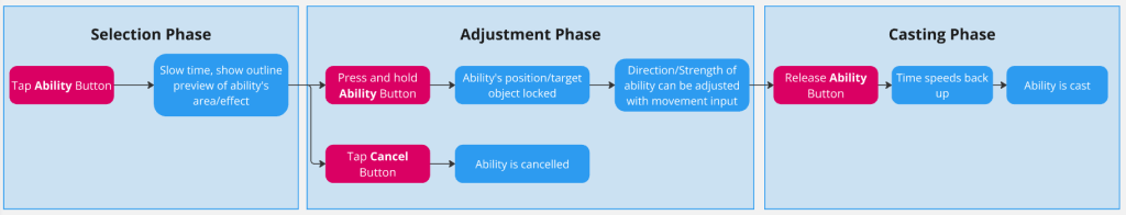
One person said this was indeed “very easy to read” thanks to the color distinction between inputs and game processes. As a result this is something I integrated into my mechanics page. I may also add additional flowcharts in this style to explain mechanics.
I also added some spatial UI elements to more of my abilities to properly indicate how their area of effect and the objects they will affect is communicated to the player. Here is one example for the Gravity ability:
Creating distinct spatial UI elements for the Friction and Elasticity abilities were difficult as they both affect surfaces but opting to go for circles vs. waves for them worked well.
Concept Art Peer Feedback
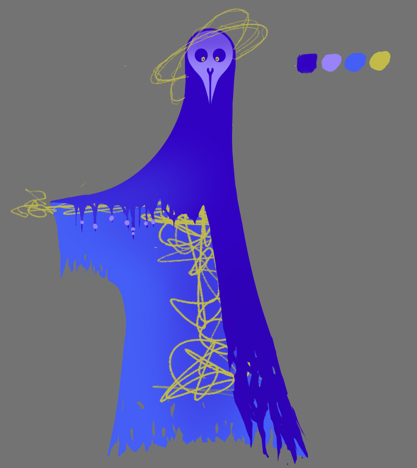
I also asked my peers in the class what they thought of my concept art for the Lord of Gravity after I had polished it up and redrew it to fit my game’s art style, and they enjoyed it, saying it worked particularly well for the Gravity theme.
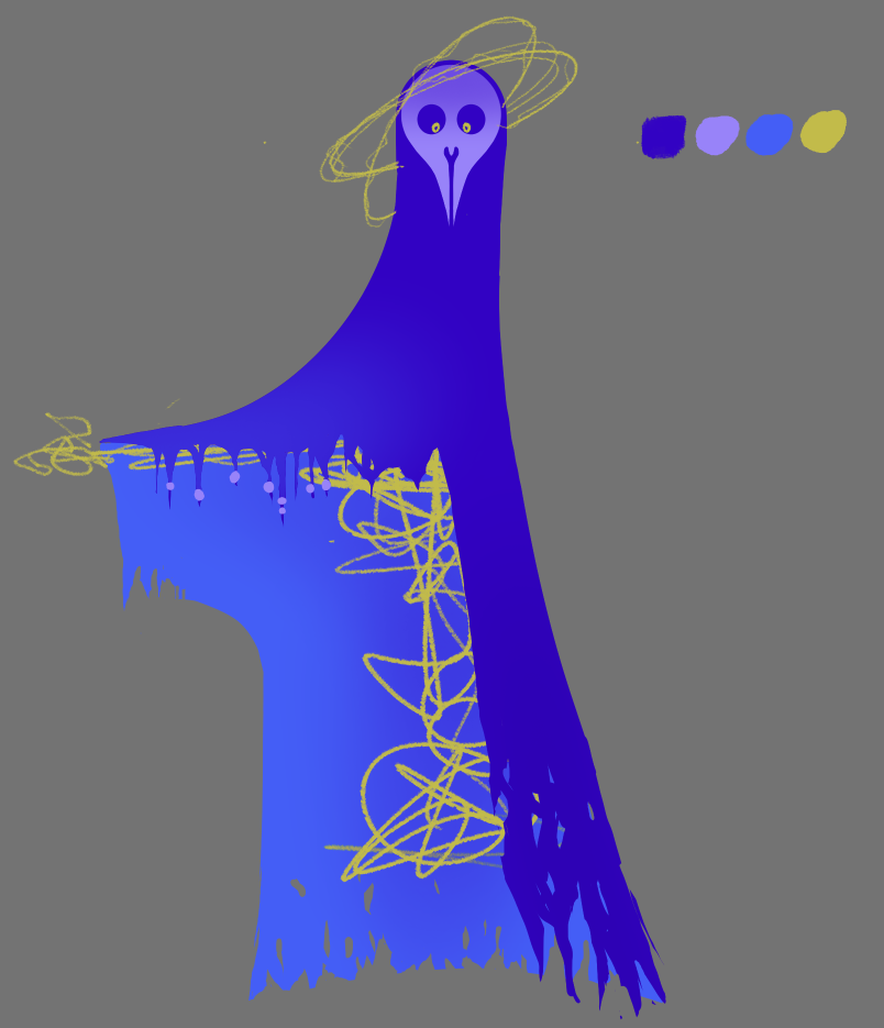
However, one of my peers suggested making the cpae more flowy to better illustrate the idea of gravity, which I definitely agreed with, so this is a change I implemented before adding it to my GDD.
Leave a Reply