After happening upon the work of Joshua Davis while writing my art style research post, I found it particularly inspiring to the art style I wanted for Kinetic Panic.
Near the beginning of his career in the late 90’s to the early 2000’s, Davis’ work very much resembled the minimalist vector style that a lot of other graphic artists were pursuing at the time, including those working on games like N , Wipeout and Rez.
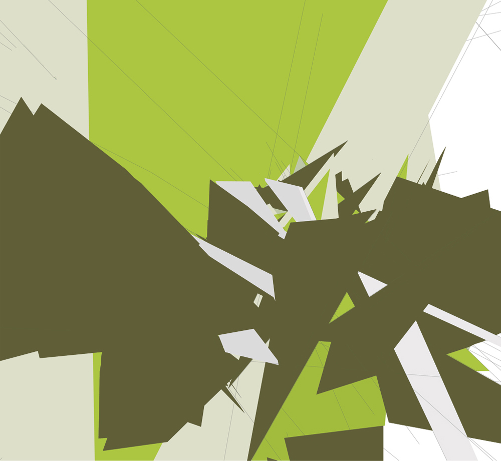
The clean, bright look of the work on the left and the contrast between poppy and muted colours are particularly inspiring, and definitely could be considered for level colour schemes.
Later on, in the mid 2000’s, Davis began to incorporate more of a playful, vibrant touch into this style, without looking tacky. In my research post I also mentioned the influence of the “superflat” art style on design at the time and this work can be seen as a fine example of this.
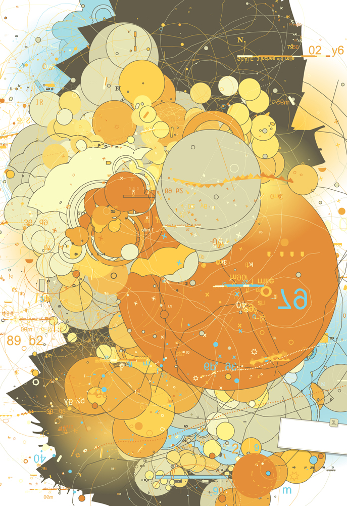
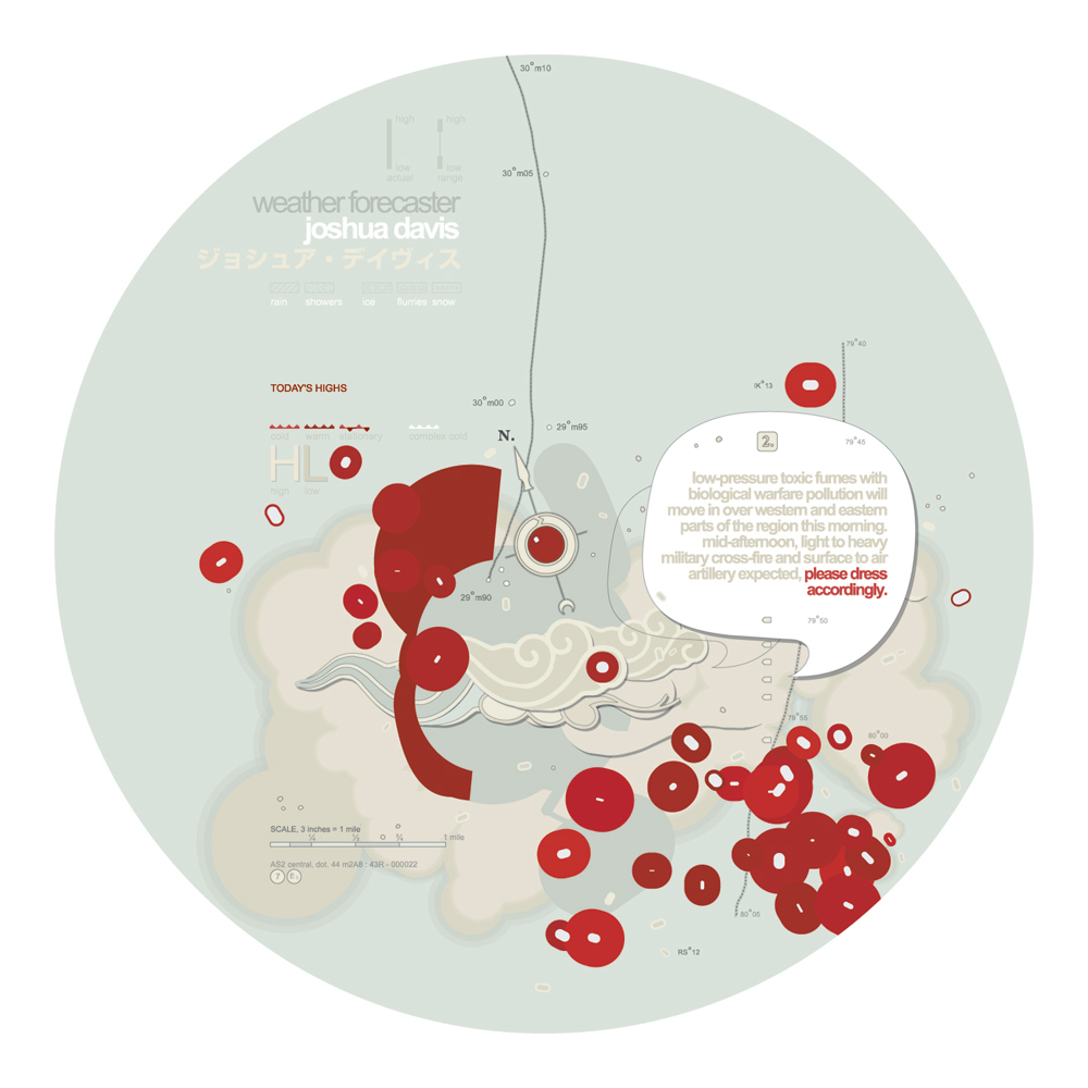
Note the same style of both bold, saturated colours and muted tones, basic shapes, and thin outlines, but now with a lot more round forms and bubbly, playful compositions. The work on the left also features some paint splash lines, again for a more organic feel. Again, the use of shapes and colour here will inform the design of both my UI and the environments in my game.
Leave a Reply