After doing some market research on existing games I wanted to look at other artistic influences in different forms of media. While researching the creation of the N games I wanted to learn more about its stylistic influences and contemporaries in the graphic design world, taking a deep dive into this as an influence for my own game.
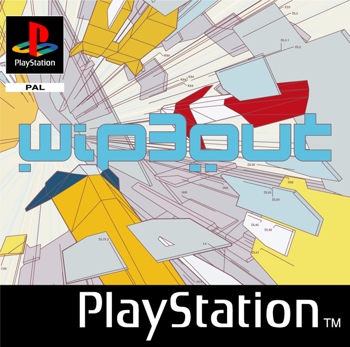
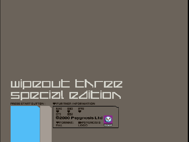
Flat, minimalist vector art was very popular with graphic artists working in the late 90’s to early 2000’s. One popular example from games is the Wipeout series, which commissioned British design house The Designer’s Republic to create a look for the game that solidified this art style in the public eye as one of bleeding-edge dynamic futurism. The pictures below are from Wipeout 3 which opted for a very minimal menu design and a refined colour palette which reflected the game’s more grounded style compared to the previous two entries in the series.
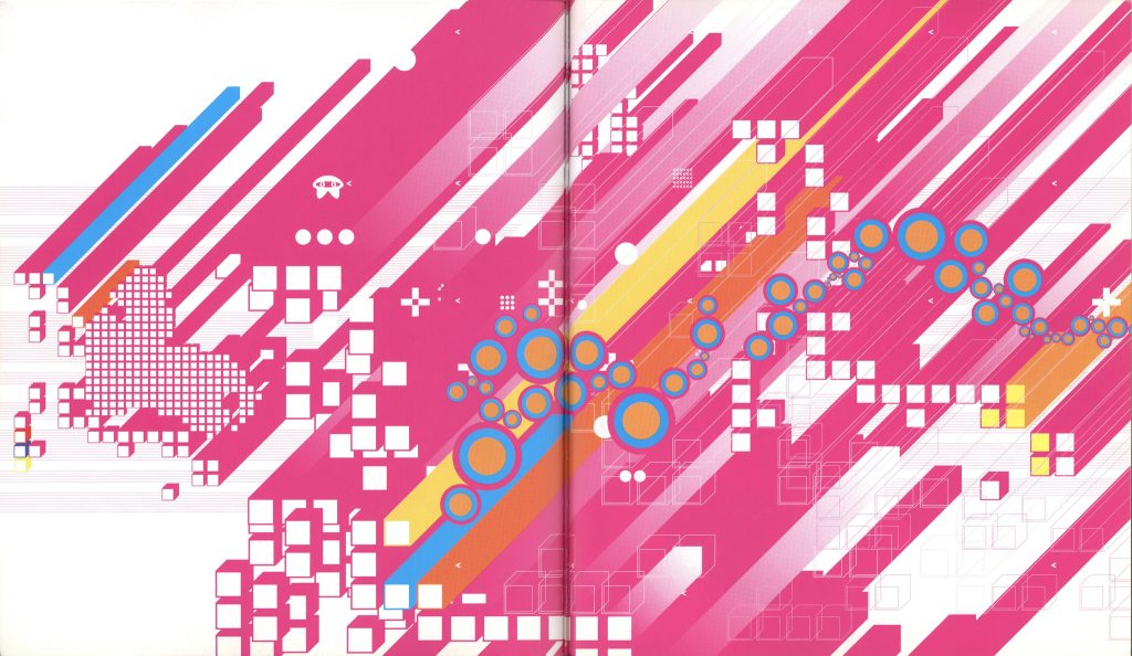
In the years since, this general style has been affectionately referred to by modern designers as Vectorheart, and has been described by some as a Y2K-era take on Swiss-style modernist design. Being an extremely popular style with designers at the time, it can be found everywhere, from games, websites, posters and adverts. While putting everything under one umbrella term like this can be reductive as artistic influences greatly vary and shift, especially in the modern era of design, it is nice to see this aesthetic style evolve through time.
The mix of sharp, dynamic lines and rounded geometric forms is something I found particularly inspiring for the design of my game as I want to keep the look of the levels minimalist compared to the objects that inhabit it, but I do not want to lean too much in this direction as I want to keep the game’s atmosphere playful and fun rather than sterile and futuristic. I am also aware of not relying too much on certain design cues that feel dated to me as I want the game to feel timeless.
The image below is a good example as it has the vector-art modernist elements, but retains poppy, fun, bright colours and the circles, pluses, dots and the small character give a playful touch.
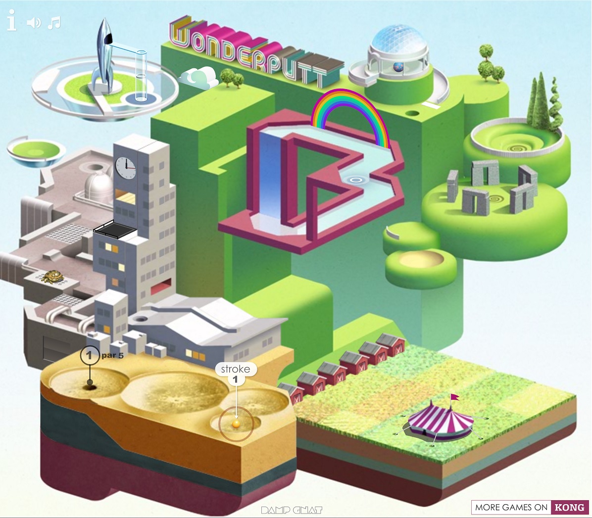
As the 2000’s progressed, flat shading and geometric shapes were still very prevalent in the design world, but we also saw the introduction of more three-dimensional objects and playful forms, with the “superflat” style coined by Takashi Murakami proving very influential in the latter half of the decade especially. 2004 saw the release of Katamari Damacy, which successfully used flat shading and a fun eclectic style as mentioned in my previous blog post, and another notable game which made use of this artstyle was the Flash game hit Wonderputt.
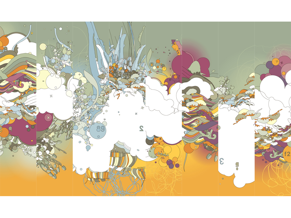
This is a style I find particularly nostalgic as it is what I saw a great deal of in digital art and design growing up. My aim for my game is to use a playful, bright and poppy artstyle along with simple shading and minimalist forms to keep the level design focused and bring attention to the interactable objects in the world. Another one of my game influences, LittleBigPlanet, also somewhat borrowed from this colourful eclectic style for its graphics, but leant towards using more DIY, hand-crafted elements as well.
This kind of work is often labelled under the term “frutiger metro”, but this is usually a misattribution as it ignores the stylistic influences & evolution from both Superflat art and vector graphic design, and many graphic designers and enthusiasts reject the term.
Leave a Reply