In the lead-up to my formative feedback session with Vanissa I created a one-page GDD which lays out a overview of my main design goals with the project.
I first had to come up with a working title, and for now I went with the name Kinetic Panic in reference to the game’s physics mechanics, as well as a nod to the Japanese games Doki Doki Panic and Trash Panic, the latter of which is also a quirky 2000’s game featuring a litany of real-world objects much like Katamari Damacy.
As for my essential experience, I thought about my existing ideas of the player improving and perfecting one’s use of their abilities in the game but instead changed it to a more open-ended, relaxed experience of surveying previous levels with new abilities in mind, somewhat like looking upon them “with new eyes”. This also lead into my game pillars, wherein I wanted one to be emphasising replayability. Games like Katamari and LittleBigPlanet have charming and intriguing game mechanics and puzzles but are overall quite linear, whereas I want to have a reason for players to come back to the previous levels, whether that be for progressing the story or the pursuit of improving their own times like in Super Monkey Ball or N++.
During my formative feedback session I worked out a lot of design problems I was struggling with getting my head around as I discussed my game concept. One example of this was the incentive for replaying levels, where I debated between maximising a score through execution or perhaps including a timer. Vanissa pointed out that a timer may feel antithetical to my decided essential experience, and as a result I decided that the levels will contain multiple goals or collectables for the player to reach similar to Super Mario 64, and that some of these may only be reachable with abilities unlocked later on in the story. I was also encouraged to do some UI mockups as well as level design mockups, as my minute-to-minute game loop is quite simple considering it is a puzzle platformer.
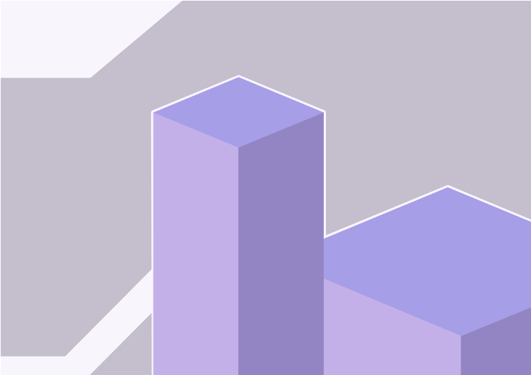
As a starting sketch to establish the visual look of the levels I made a quick mockup in Figma using flat colours. I chose a pale purple for this but ideally I would most likely go for bolder and brighter colours in future. Note that this will does not fit my ideal level design goals as it will be much more complex and with slightly more detail, still staying within an abstract flat-shaded art style.

I still need to create concept art and mockups for my characters and UI as well as some basic level designs, but drawing up level diagrams for a 3D game can prove difficult.

Leave a Reply