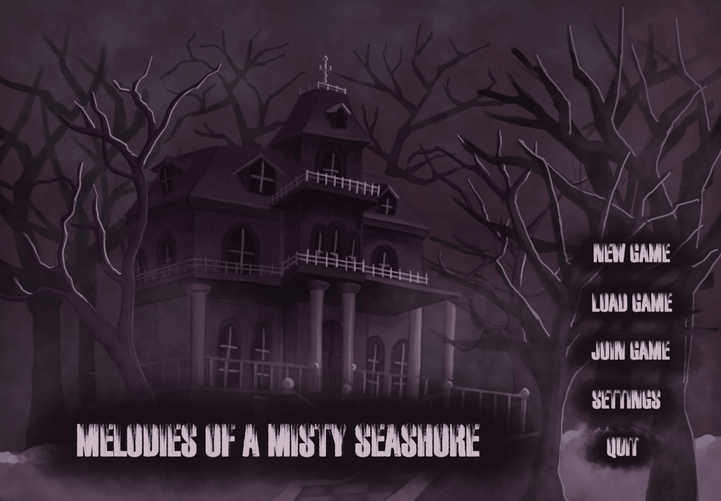
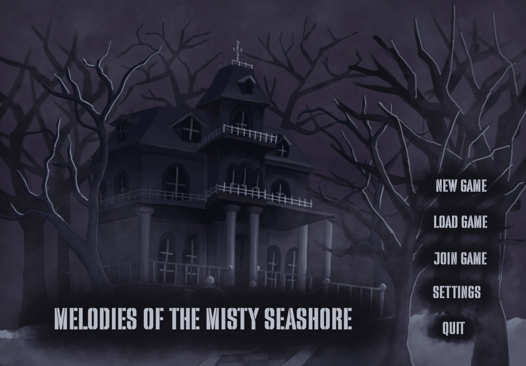
First two concepts helped me decide that the bluish/greyish made more sense for the overall game idea – the flashbacks in the story were supposed to be in that exact bluish colour palette. All the concepts that were created afterwards were kept in those colours.
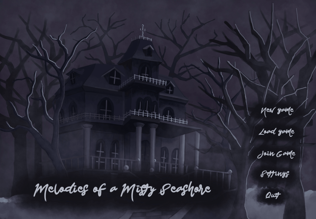
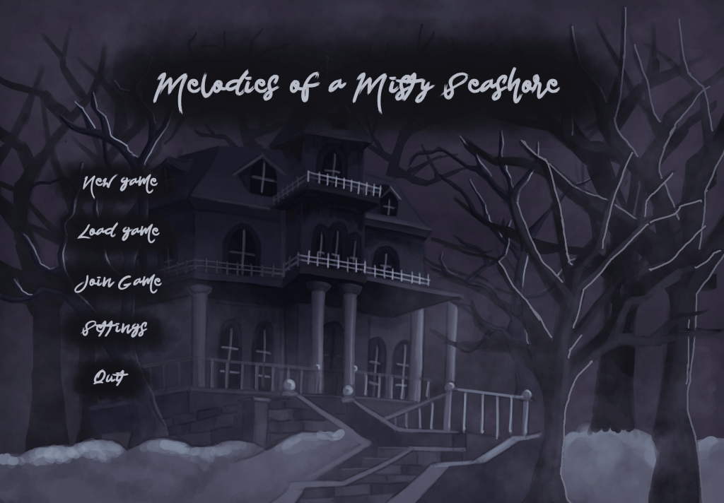
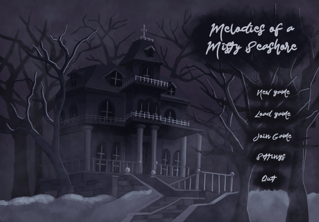
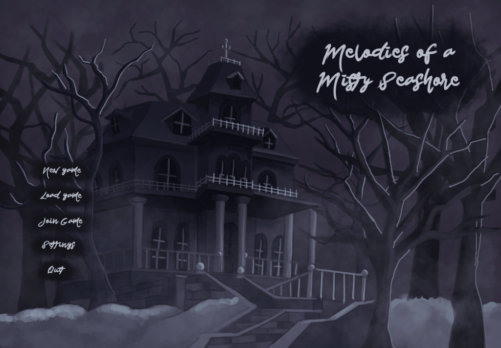
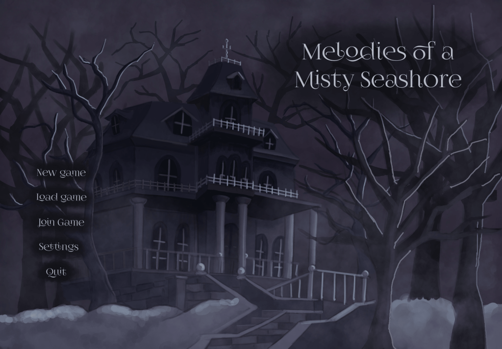
At this point I couldn’t decide which layout looks best, so I messaged my friend asking for feedback (ignore the typos).
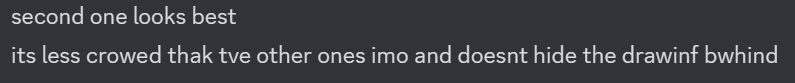
The second one, so the one they were talking about is presented here as the fifth concept and it’s the one I ultimately decided to use.
Last element of the starting screen that I had to choose was the font.

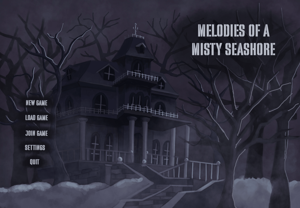
Since I couldn’t decide on which font I should use, I asked other people for feedback (see User Research)
In the end, FoglihtenNo07 was the font which was chosen by the surveyees most often, so that’s the font I went with.