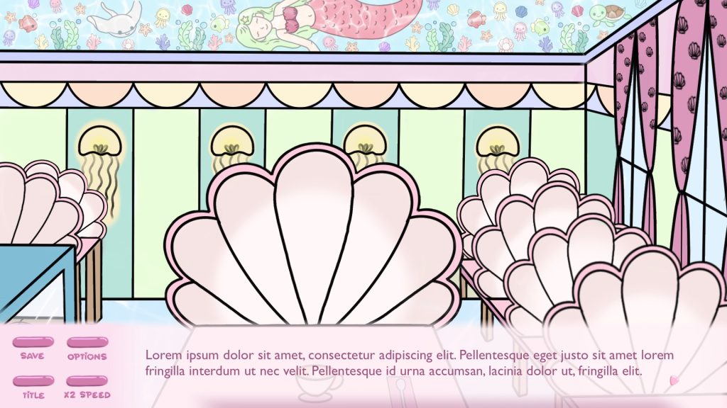
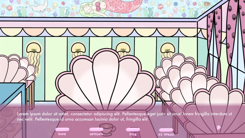
After Izzy made first background sketches, I uploaded them to Procreate and tried to design UI so that it would match the background in terms of aesthetics, and wouldn’t cover too much of the screen.
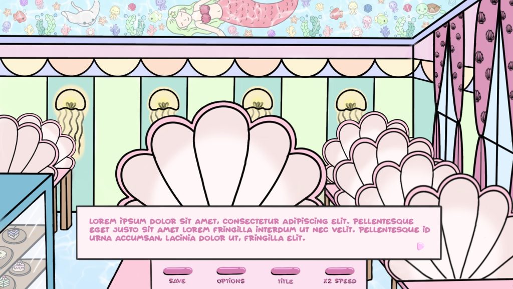
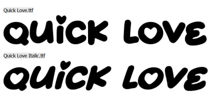
At first I matched the outline of the text box with the black lineart but then I thought I would try out a brighter colour to see how it would compose into the background. I experimented with different positions of the buttons on the screen and tried to see if the font Quick Love which was used for creating the logo of the game, would work for the narrative too.
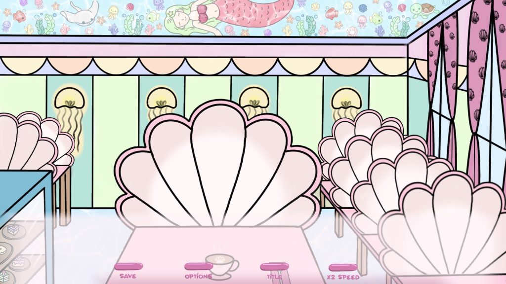
However, I didn’t entirely like how the font looked in the text box – it looked slightly cramped as the font is quite wide and decorative, so instead I opted for something that would be more minimalistic and easier to read.
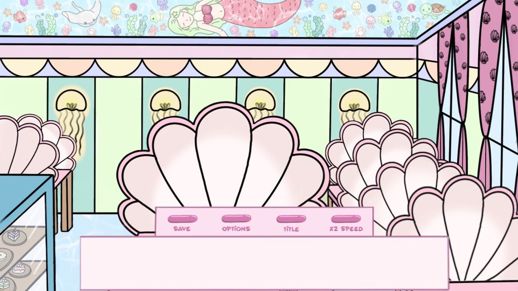
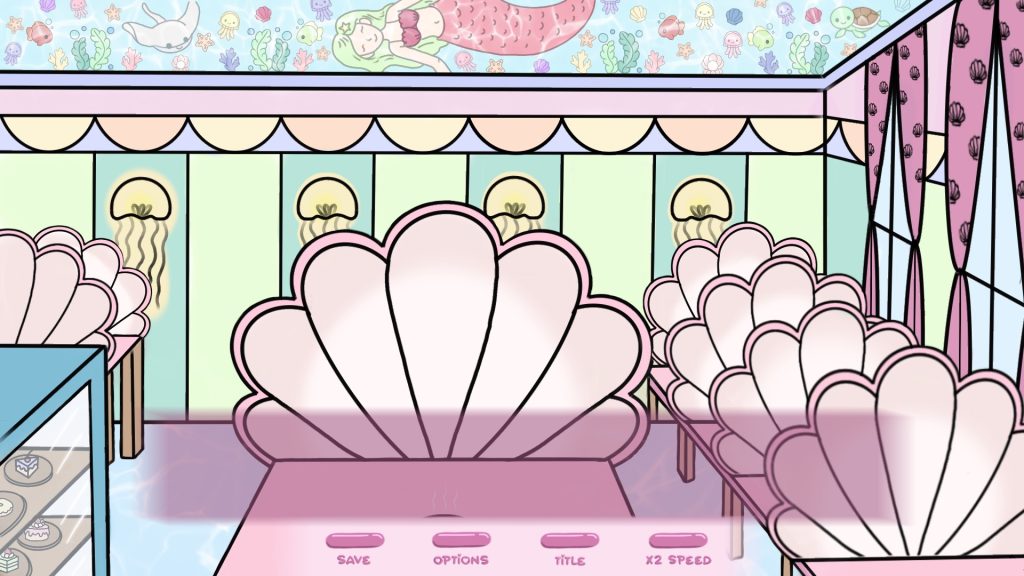
In the next iterations I got rid of the text box outlines and decreased its opacity so that the background would be more visible. As for the colour of the font, I tried to contrast it with the text box colour for better visibility but I also tried to match it with the rest of the UI.
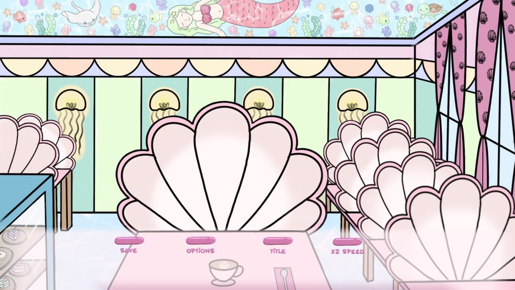
I also added a small arrow in the bottom right corner, which wasn’t essential for the game to work, however, I found that it could be a nice visual addition if it changed colour while hovered over and could help the players figure out they are supposed to click to continue the story.
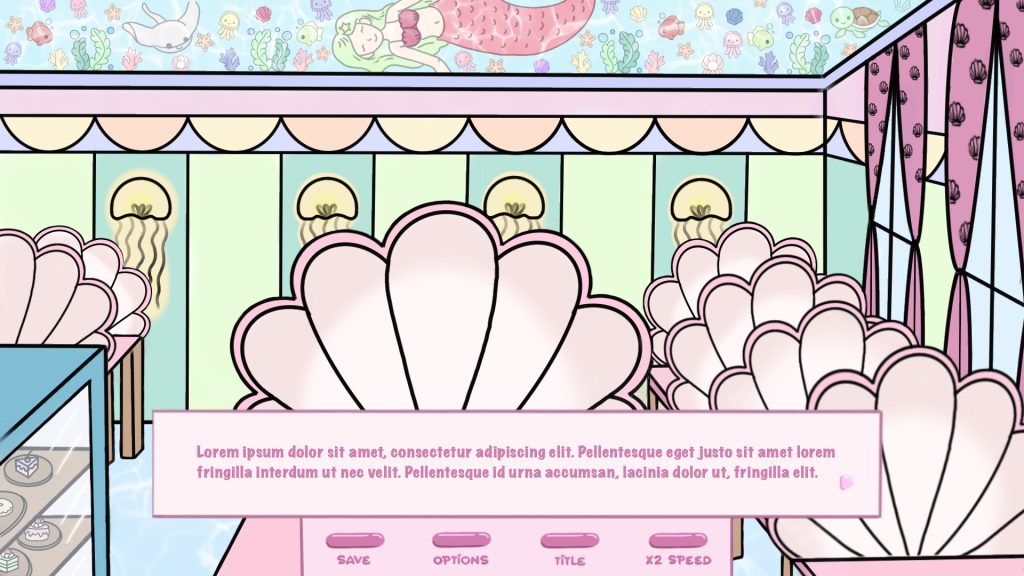
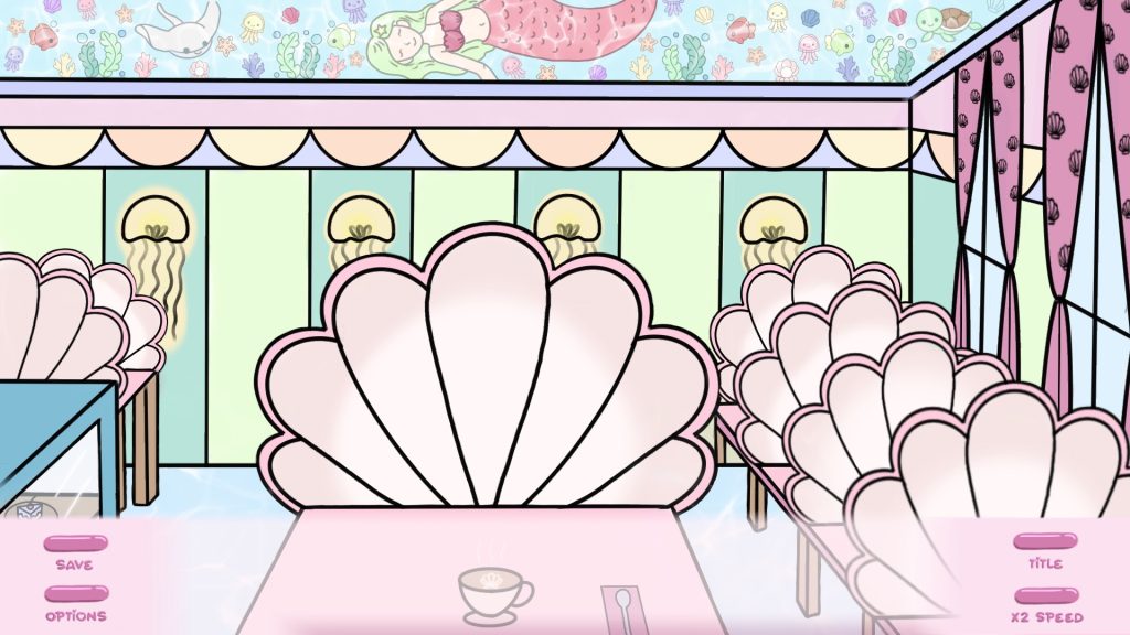
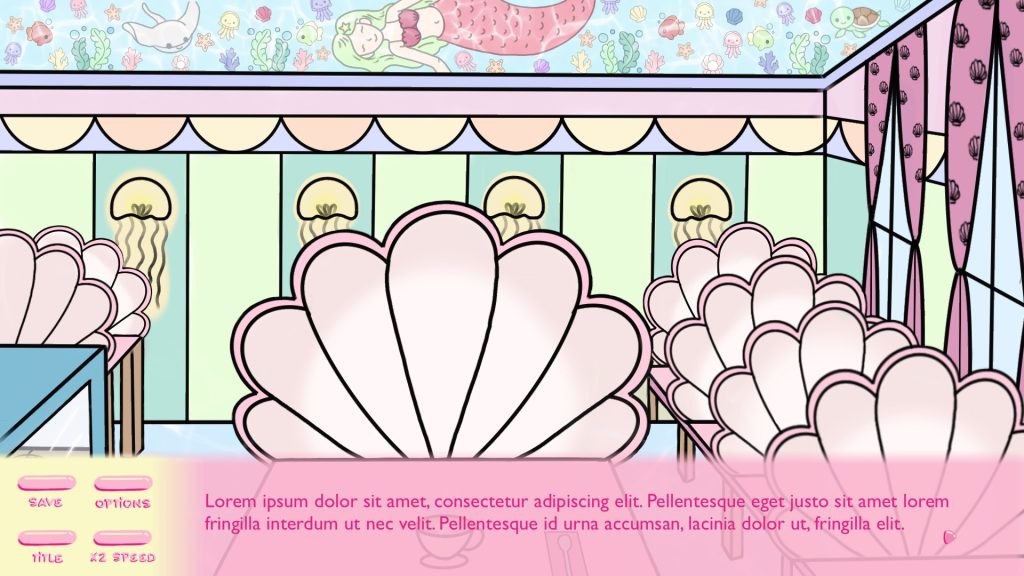
Below are more variations of the UI, this time with darker coloured text box and light font to contrast it with.
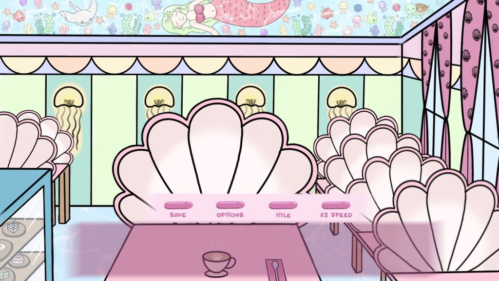
After I sent all the initial designs to our team Discord server, the last iteration shown above was liked best by my teammates. Another piece of feedback regarding light coloured text boxes was that they matched the sea shell in the background too closely and I got advised to experiment more with the saturation or hue for a better effect. That is how I got an idea to design UI based on the colours from the game’s logo.
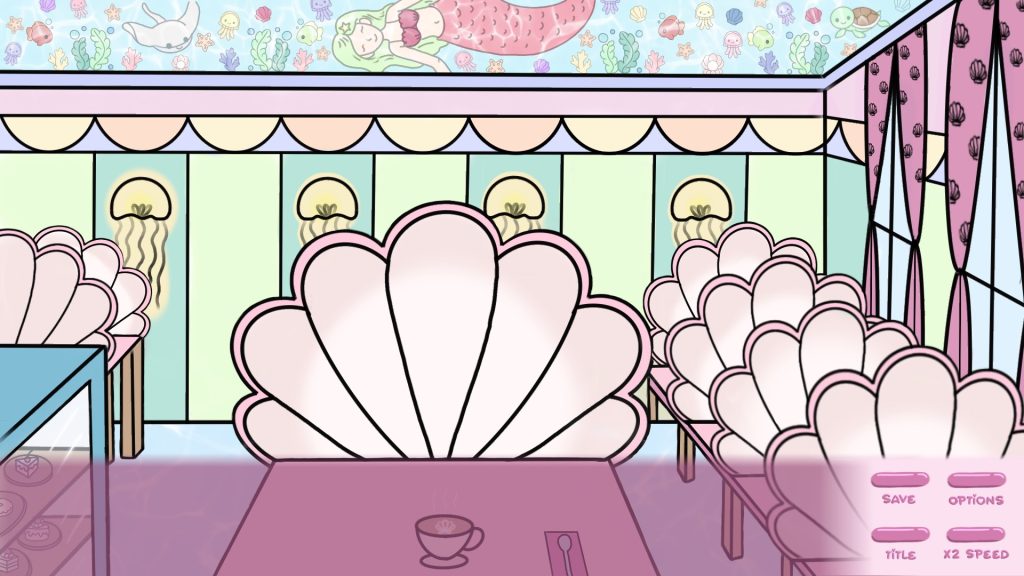
This is how the UI looked with the colours from the logo, however, I liked the earlier versions a bit more, as the shades matched the background more.
Paula also suggested I should include a name box for the character who’s currently speaking at the top of the UI. It would make the gameplay much easier for the player so I decided to follow that suggestion and made more designs including a name box in them.