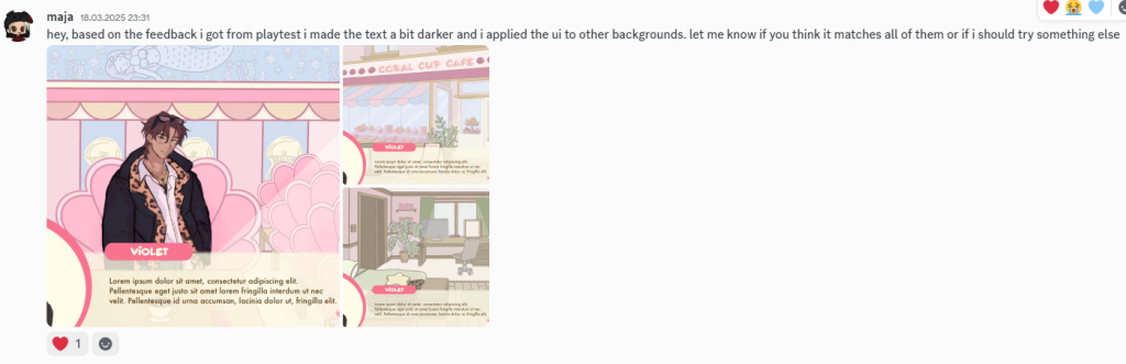
← After Feedback from the Team
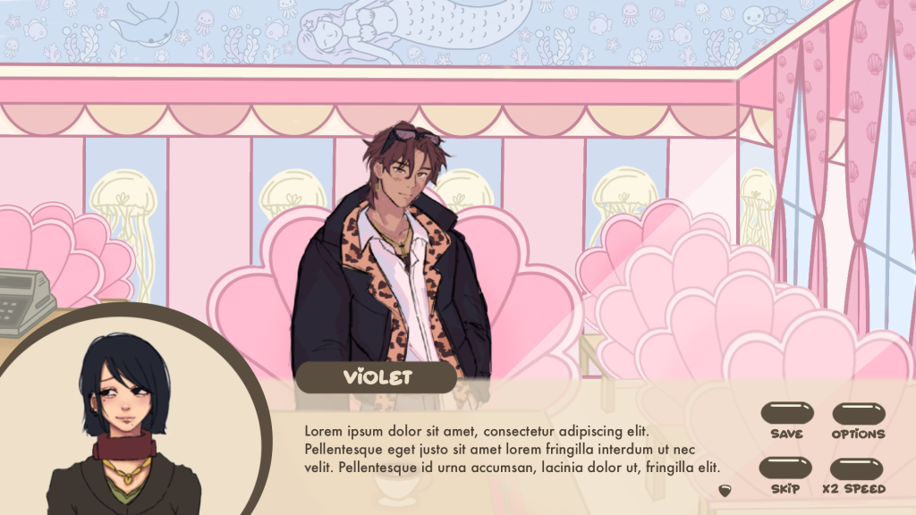
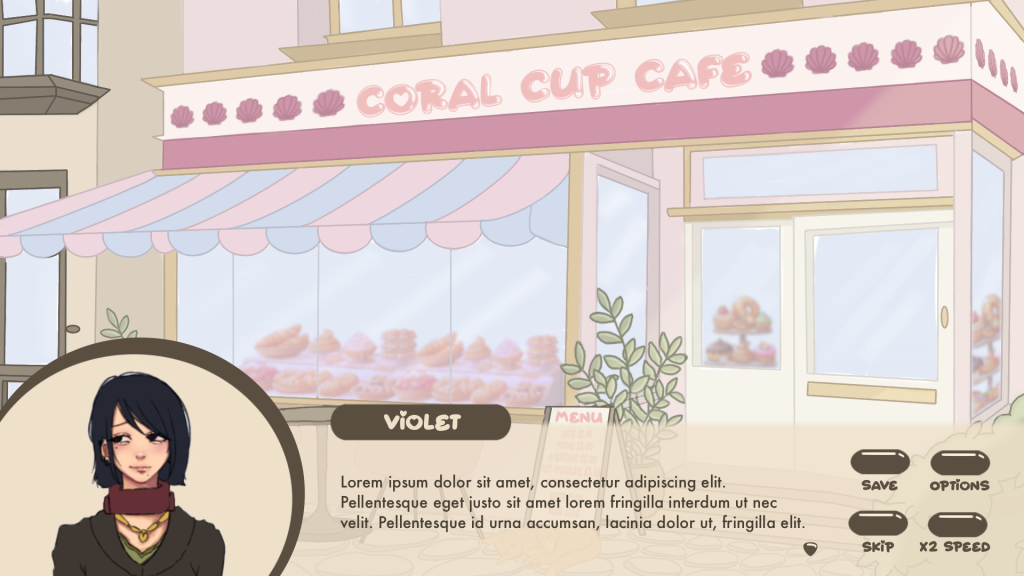
During the first playtesting session we received feedback to make the text in the text box darker, as it was slightly difficult to read. After introducing that change I applied the UI to all of the backgrounds and sent them to Discord for feedback.
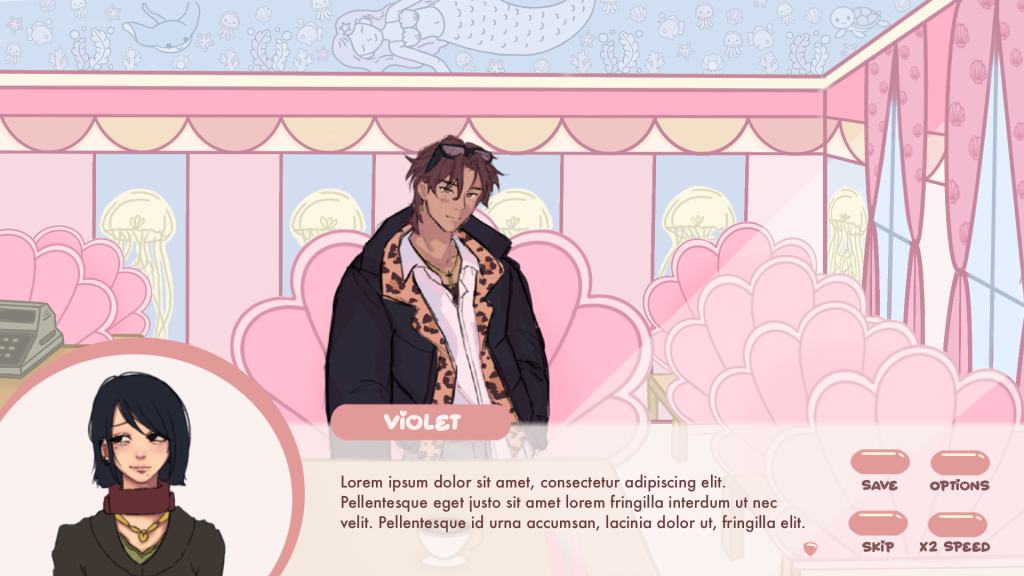
As the pink-beige design didn’t turn out to be an ideal solution I decided to try again, this time keeping the UI either entirely pink or entirely beige.
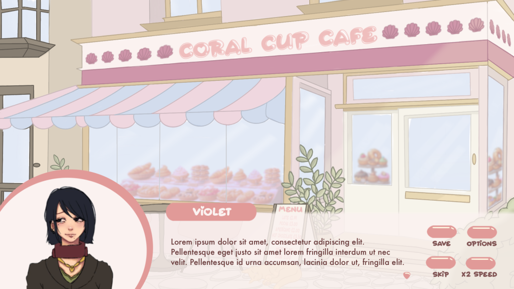
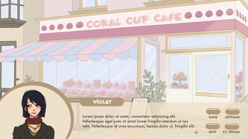
At first I tried light pink that had a slighty different hue than the rest of the background. I think it matched really well, except for the café, where it blended in too much with the back. I kept in mind that the font should be dark enough to contrast the text box for better visibility.
At this point I was quite satisfied with the layout of the UI so I mainly experimented with colours to find the best match for all backgrounds. Another solution I thought about was using different-coloured UI for each scene, however, together with the team we decided that the UI should stay consistent throughout the whole game.
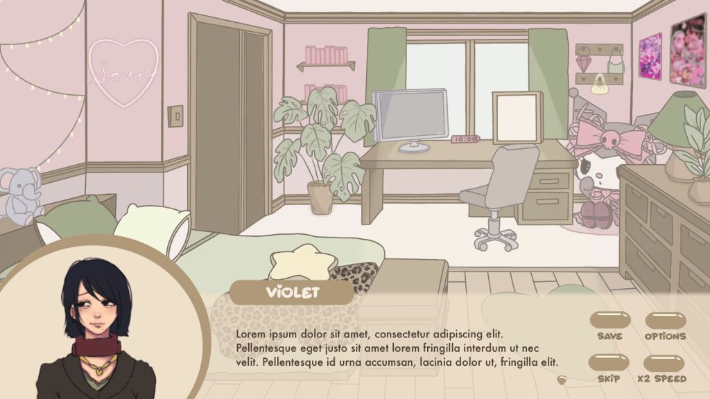
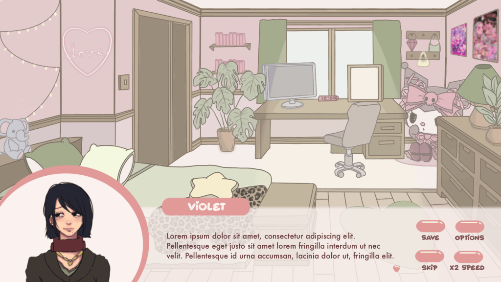
The light beige iterations also matched all of the backgrounds well. The only issue was the bedroom scene – the UI blended in too much with it. The only solution to that I could think of was making the brown shade even darker than the drawers and the wardrobe so that it wouldn’t blend in again.
That’s how the designs below came to be, though I quickly disregarded them because even if this version did end up matching the bedroom scene, it did not match the rest of the backgrounds at all. However, I still sent them to our Discord server for feedback just to see what my team liked best.
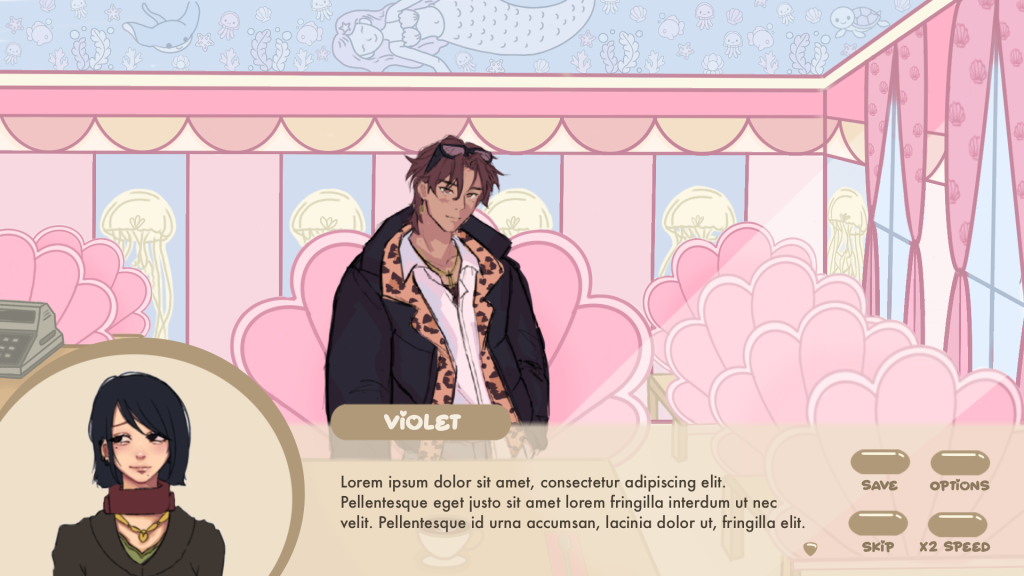
Given that, I came back to the original plan of using pink in the design and I experimented more with its shade to see if there is a way to match the UI up with all backgrounds. Eventually, the final UI design I decided on was in darker shade of pink – it would go well with all backgrounds but it would also slightly stand out from them.
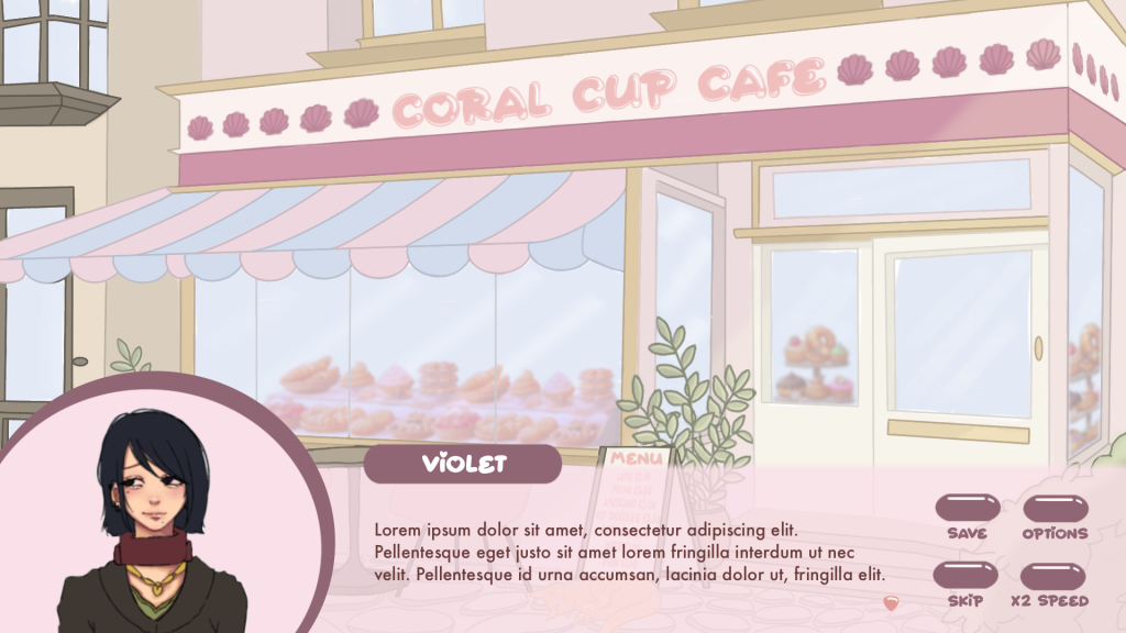
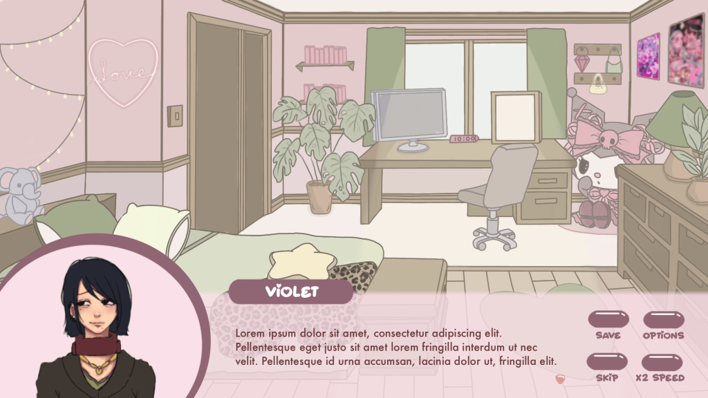

To make it slightly more interesting I also added a short white stripe on the right side of the character icon’s frame.
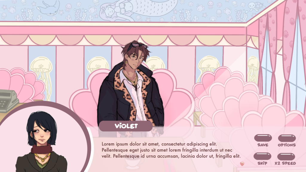
That was final UI designed used in the second playtest.