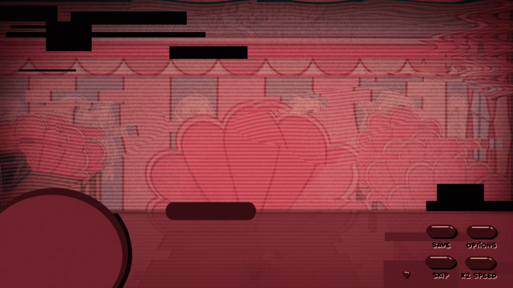
As Violet’s Dates has a short horror twist to it, it required designing a separate UI – the pink one didn’t match this background at all and would decrease the overall immersion into the game.
At first I tried out different shades of red to see which one would be the best option and afterwards I adjusted the colour of the buttons. I wanted to make sure that the captions of the buttons are visible enough to the player so I also added a light text shadow for a better contrast.
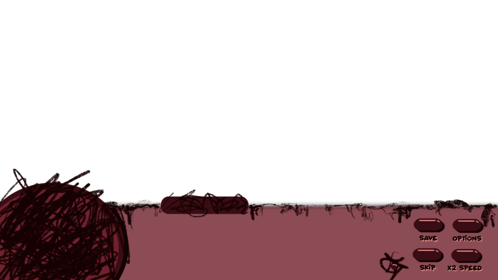
To further add on to the immersion into the horror fragment, I scribbled across the UI (without covering the option buttons) to make it look more disorganized and chaotic.