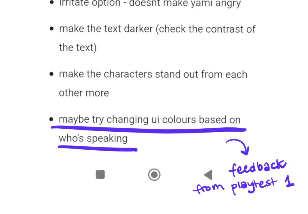
Looking at feedback from the first playtest I decided to design a separate UI for when Yami is speaking. As throughout the designing process my main debate was whether to choose pink or beige coloured UI I decided on using a shade of brown for Yami. It was slightly lighter than the iterations presented in After the First Playtest page, but still dark enough to stand out from the background. It also matched all of them.
Another small detail I added, and later on used in final version for the Violet UI as well, was the white blurred out hue around the character icon. It made the design more interesting and pleasant to look at.
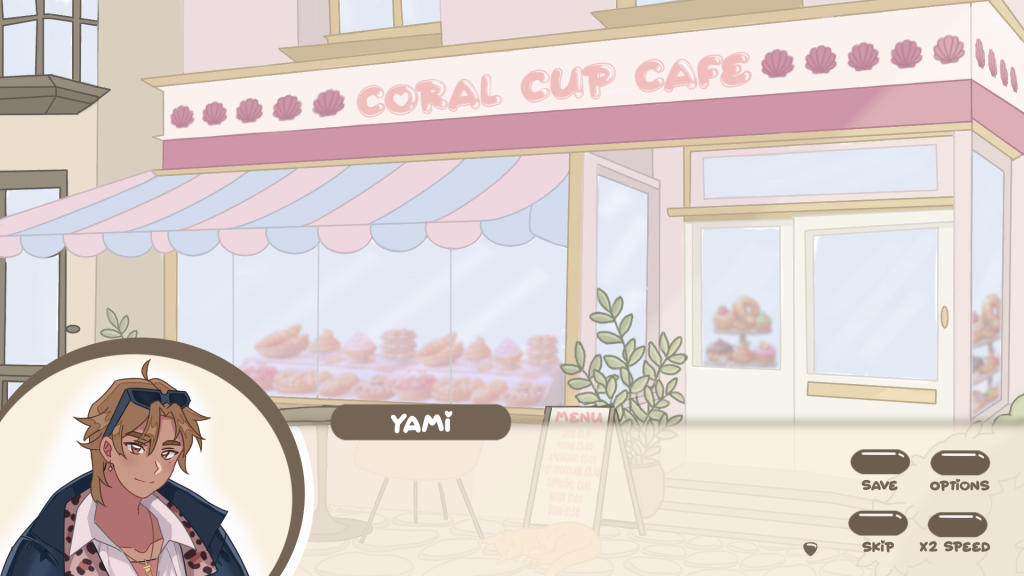
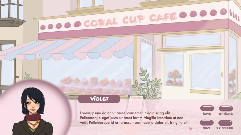
I also experimented with blur a bit – I wanted to see how it would look like on the character icon but I didn’t quite like the effect so I went back to the previous concept.