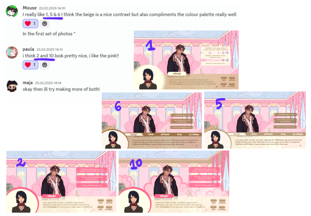
After improving on the most liked concept and introducing the changes my teammates suggested, the main dilemma I ended up with was whether to choose pink or beige shades for the UI. At this stage of development, Izzy, the environment artist, and Paula, the character artist, were still deciding on a consistent colour palette for the game so I had to consider different versions of the background when designing UI.
First two designs I made were saturated shade of pink and I experimented with them by adding ornaments around the dialogue options. Although I quite liked those decorations, the minimalistic version without them looked better, so the next iterations in beige were made that way. A new addition to the UI was also a small icon on the left to show who is currently speaking and a name box attached to it.
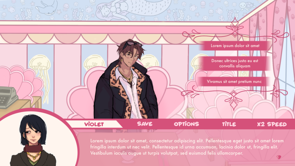
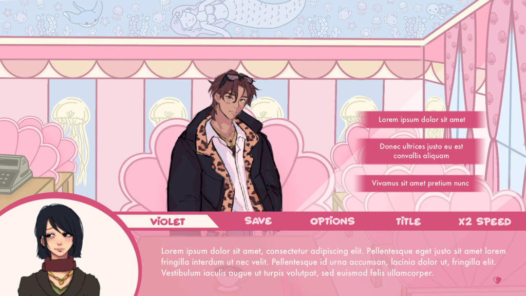
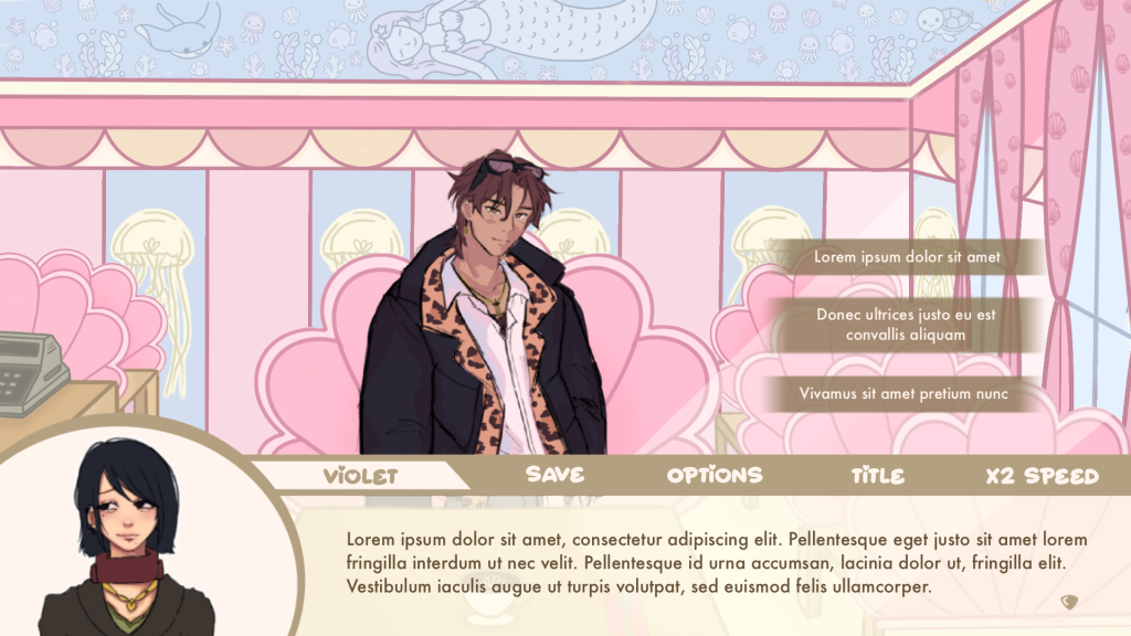
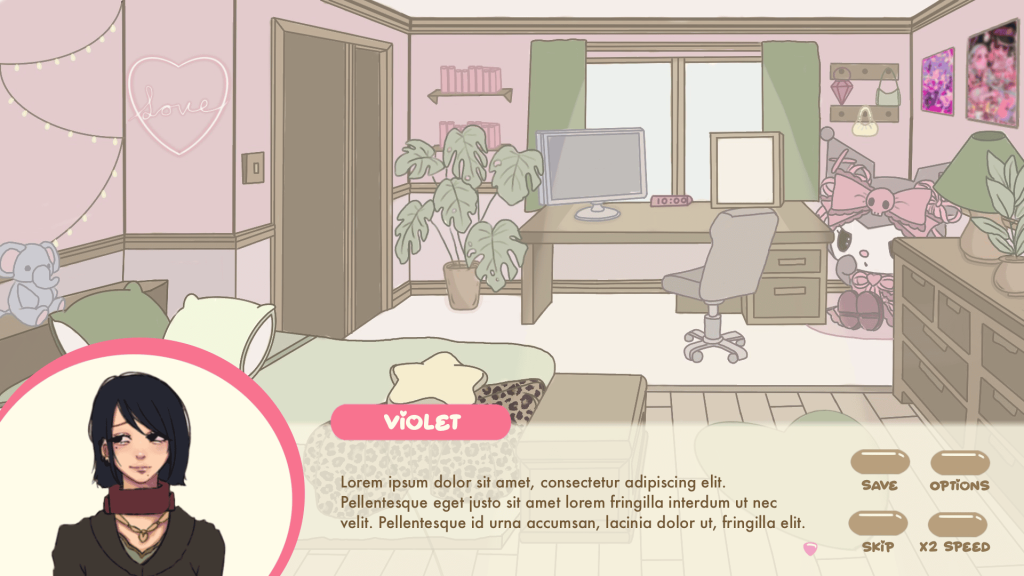
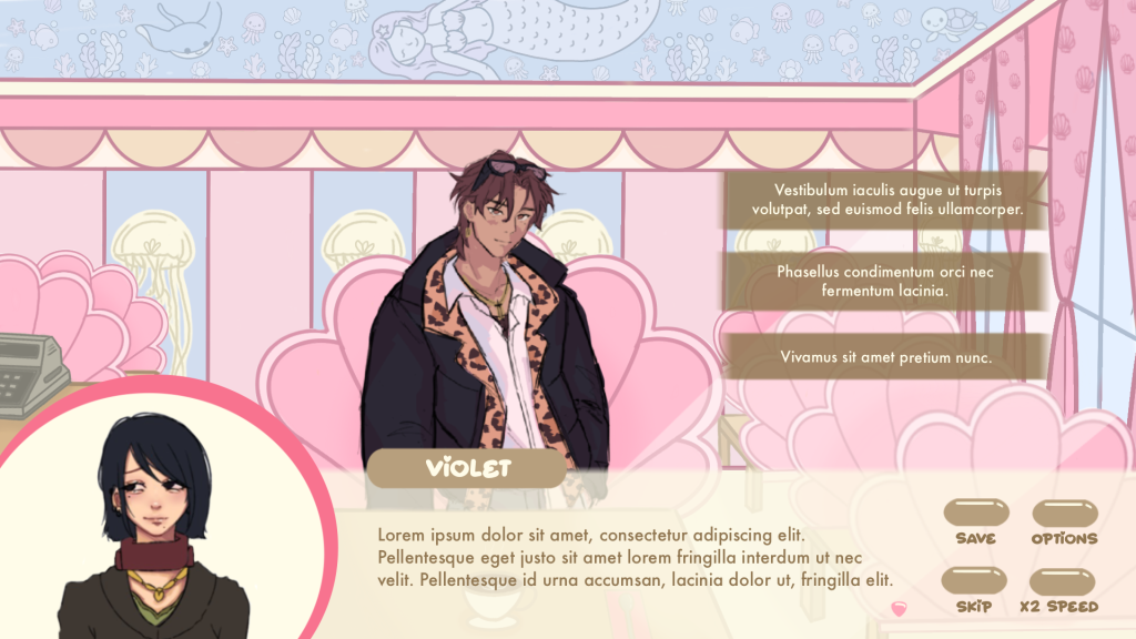
After the colour palette had been already decided, I tried to combine two main colours, pink and beige, into one universal UI which could be used in all of the backgrounds. I also made a visualisation of how it would look like when Yami was speaking to see how the UI would look with other characters.
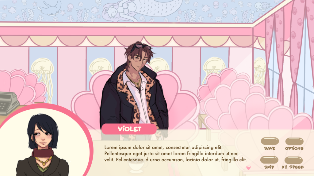


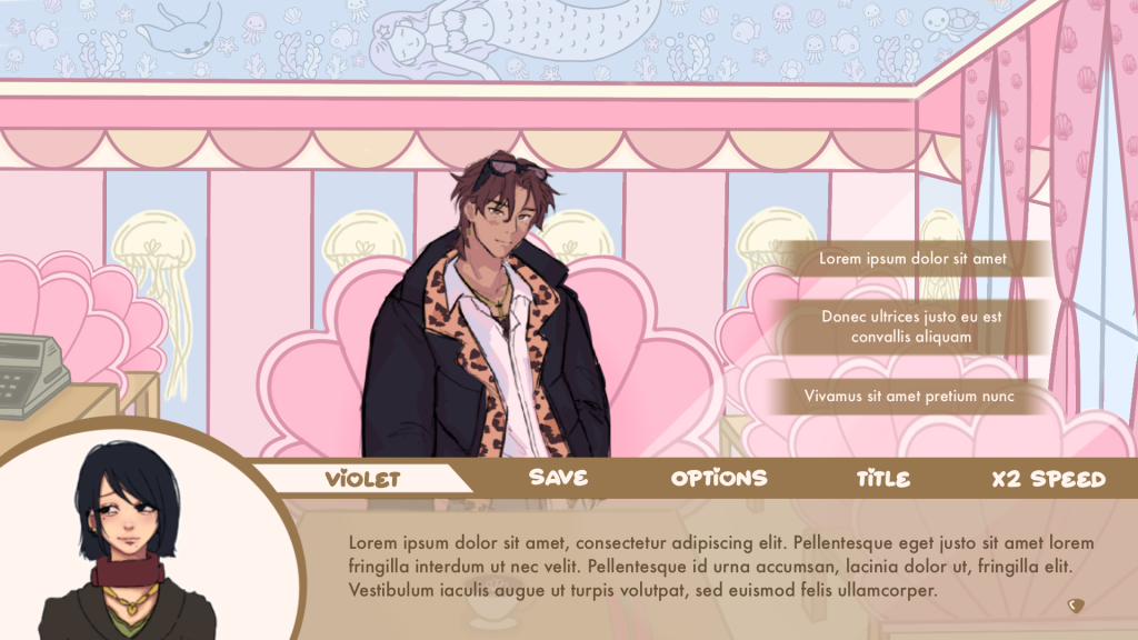
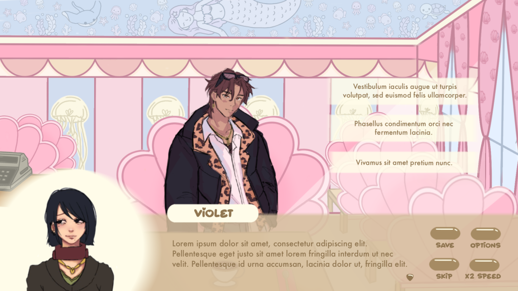
For the pink-beige text box, I still had to adjust the colour of the dialogue options so I tried using lighter and darker beige. I was also wondering how the character icon box would look like without the frame so I tried slightly blurring the edges out. The effect is shown below, and while I don’t think it looks bad, I prefer the framed version.
I sent the redesigned UI versions to our team Discord server and the feedback I received is that the beige and pink-beige versions look best. I quite liked all of them but I really wanted the UI to include pink, as I thought it would fit the overall aesthetic of the game, so for the first playtest I went with the design marked with number 2 (see below).