Initially, I prepared a couple of iterations for the option menu which included settings for the audio volume, screen brightness and text size. Options like save, skip or double speed would be accessible through the on-screen UI. I tried keeping the menu in pastel colours to fit the theme. The more iterations I made, the more I experimented with different types of decorations to see what works best.
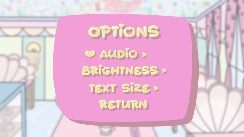
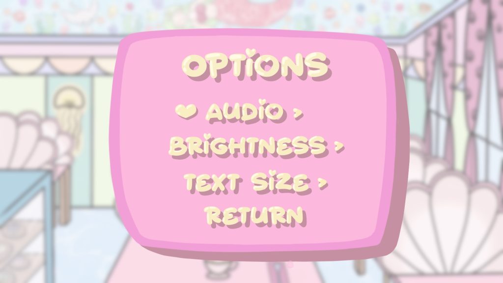
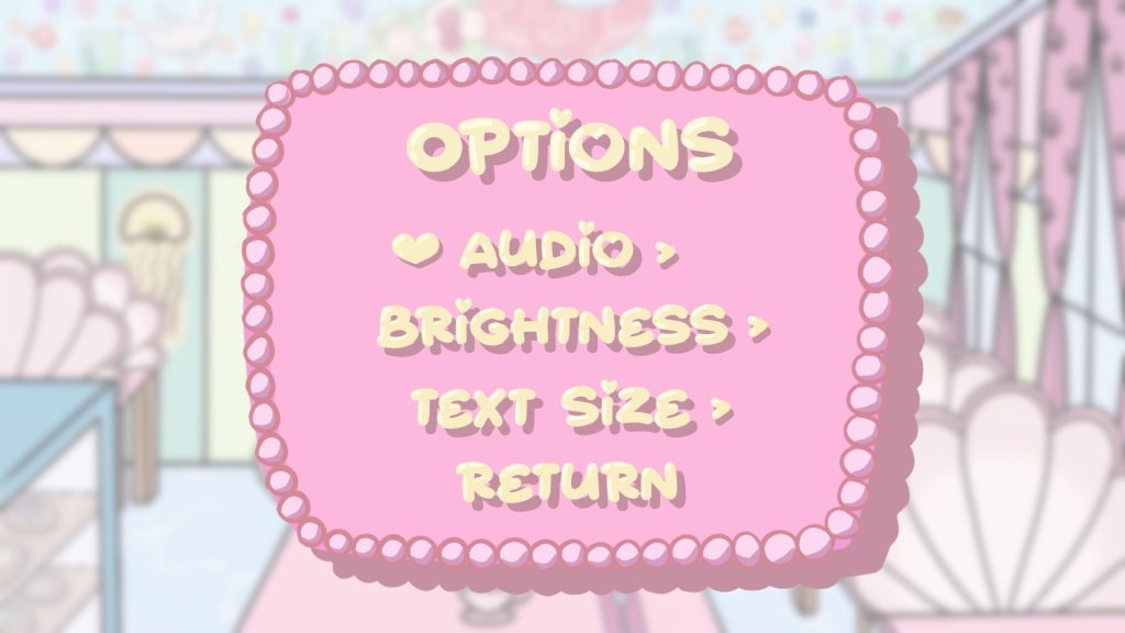
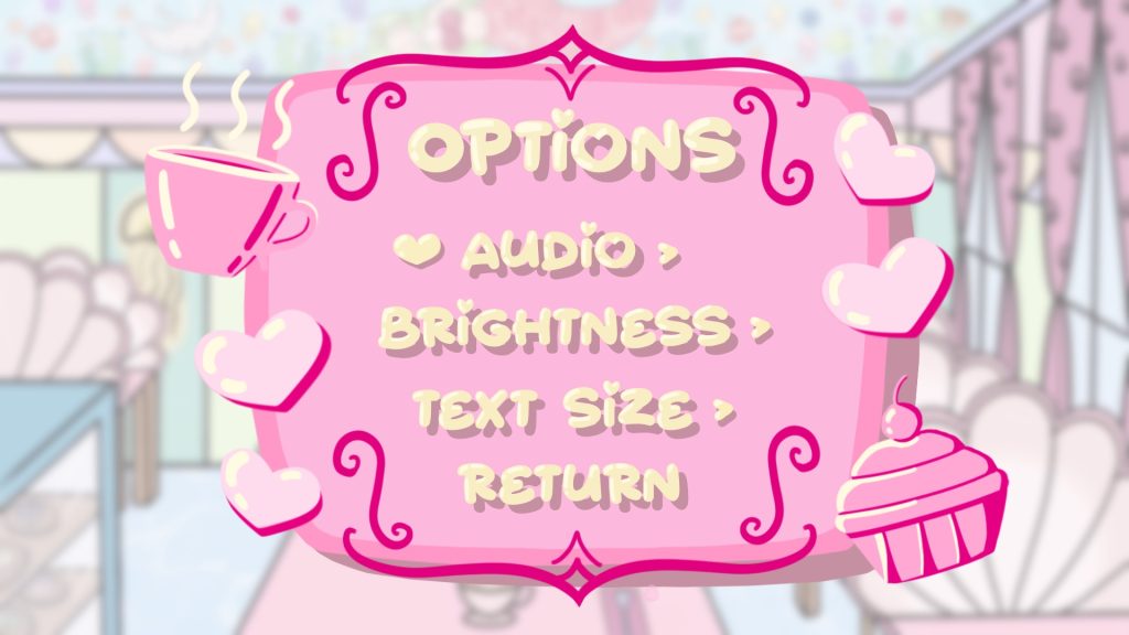
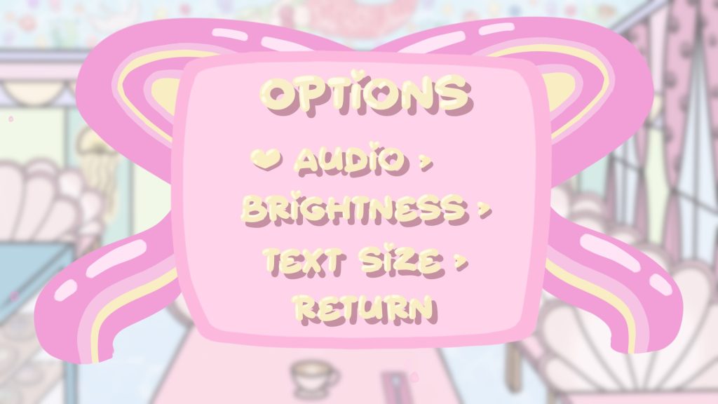
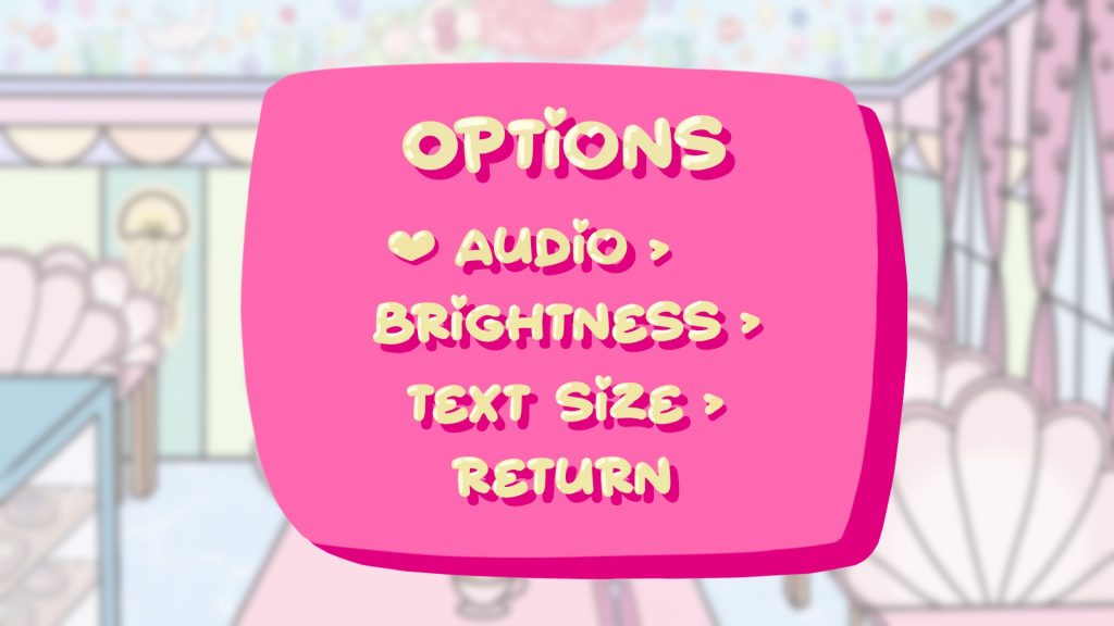
Later on, I also tried to use the colours from the logo instead to see if more vibrant, saturated shades look better. I wasn’t exactly sure which design I liked best so I asked my teammates for feedback.
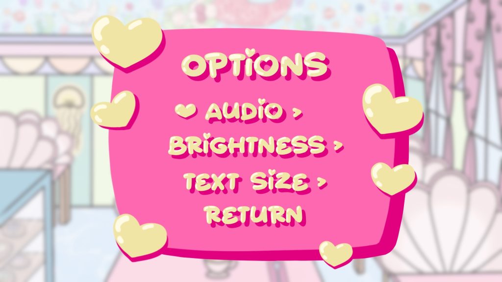
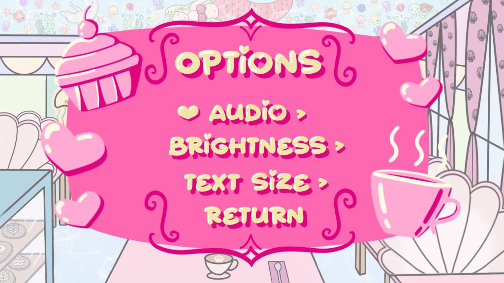
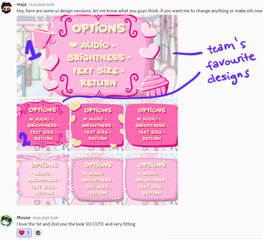
The most decorative option screens turned out to be the best designs and since everyone was satisfied with them I didn’t feel the need to make more iterations. Instead, I focused my work on the UI in the meantime.
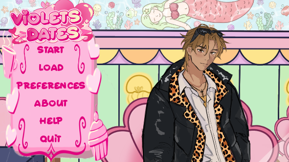
The option screen which the team chose was temporarily programmed by Jessie as a starting screen. It was originally designed to be for the pause menu, however Jessie decided to use it for the main menu as Ren’py already has a default pause menu and main menu was just blank.
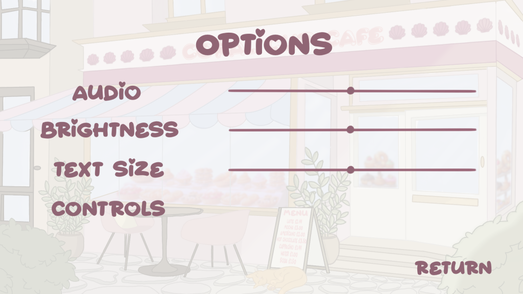
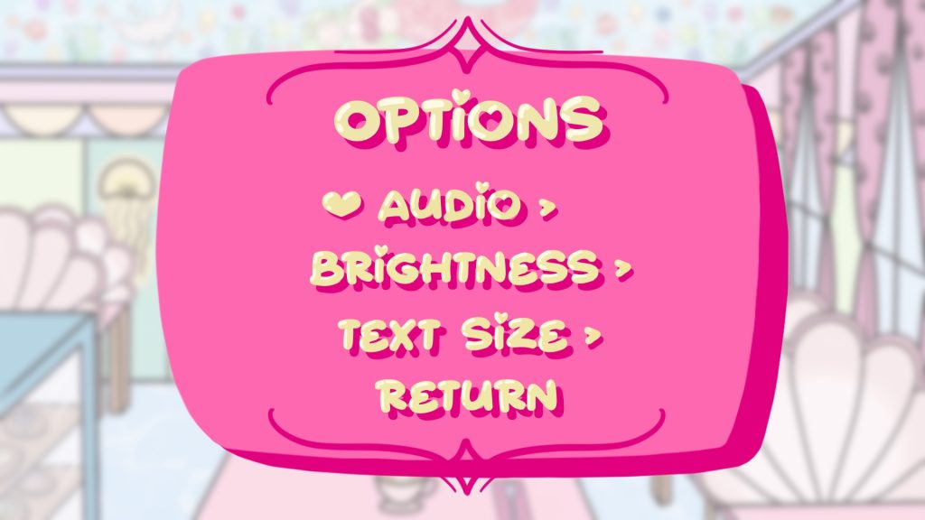
In the Violet’s Dates design process, option screen was not our first priority, as Ren’Py already offers a default option menu. Only after I was done with the majority of what I was tasked with, I made another attempt at designing a new, more minimalistic option screen shown above. However, in the end we did not manage to implement it for the final playtest as we prioritised other aspects of the game. It can still be changed though, if our team planned to move forward with the project.