To start of the process for creating the logo for my game I decided to start writing down different font styles for my chosen title this allowed me to choose which style of font felt most appropriate and would fit the simplistic style that I am going for. Here was some of the initial typography experiments that I conducted using predominantly pencil and occasionally with a black marker. This was able to give me a rough idea of the kind of font I liked, as well as which compositions.
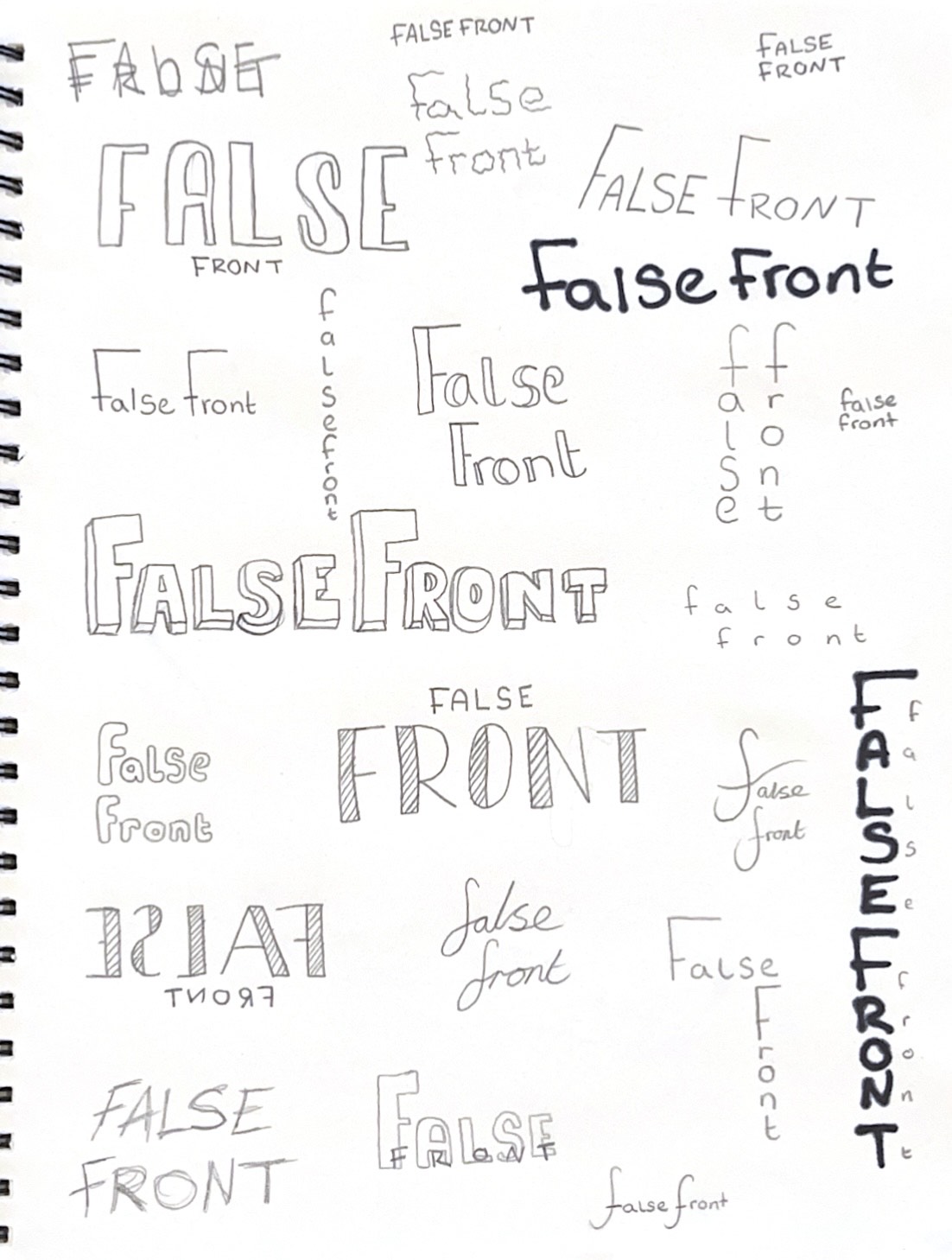
With some feedback from friends and family there were some mixed opinions on which ones they liked as some preferred the thinner font styles but most came to a similar agreement on the almost bubble like writing with the shadow around it. Which also happened to be my favourite as it was bold but simple and I felt like you could easily distinguish it from a distance.
My next plan of action was to start experimenting with the composition of the text as well as how I wanted to combine a pictorial aspect to my logo instead of just having text.
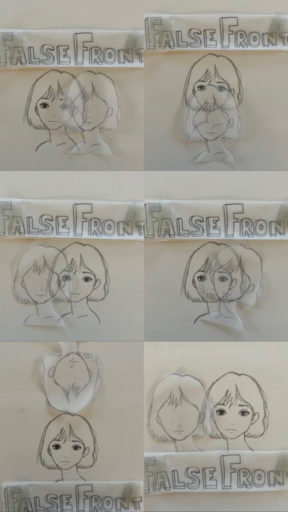

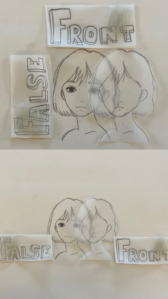
These were some of my initial trials experimenting with different composition etc. Below are the two designs that got voted by friends and family as the favourites which I will decided from and choose one to take forward and start doing more iterations. A side note I want my final logo to be digital so from here on I will begin the digital process.
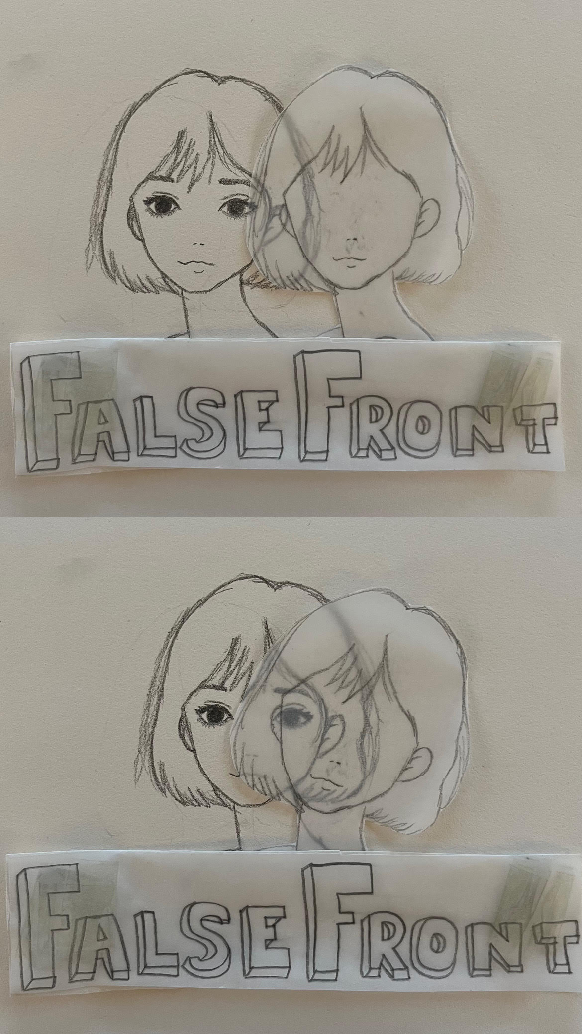
Why this logo?
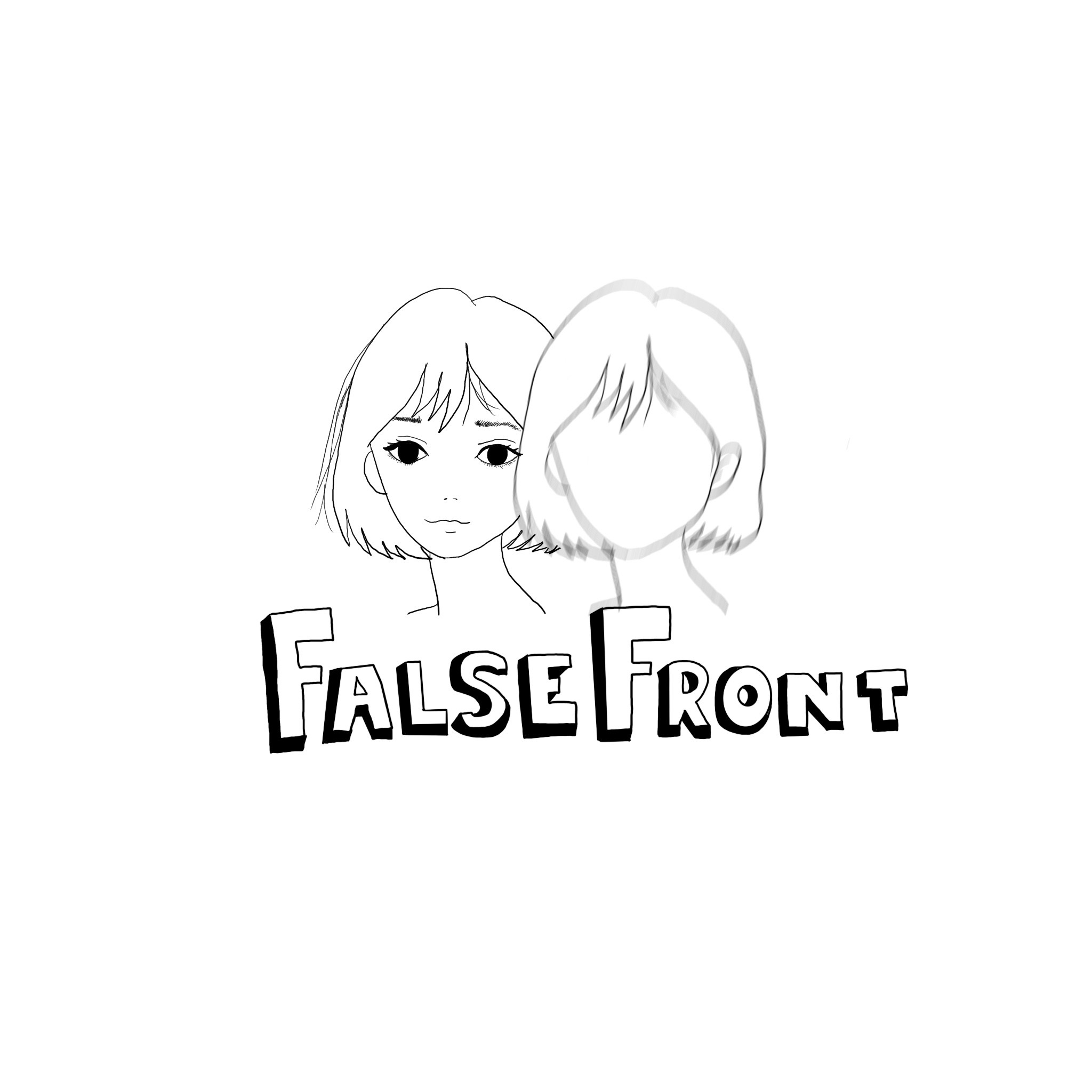
My reasoning for having this logo the way it is, is because I wanted the main character to be the face of the logo for obvious reasons but the thought behind the second face is all centered around the term of masking. For this I used transfer paper to layer over the top to give that masking affect which represents what women with autism are prone to doing.
Digital
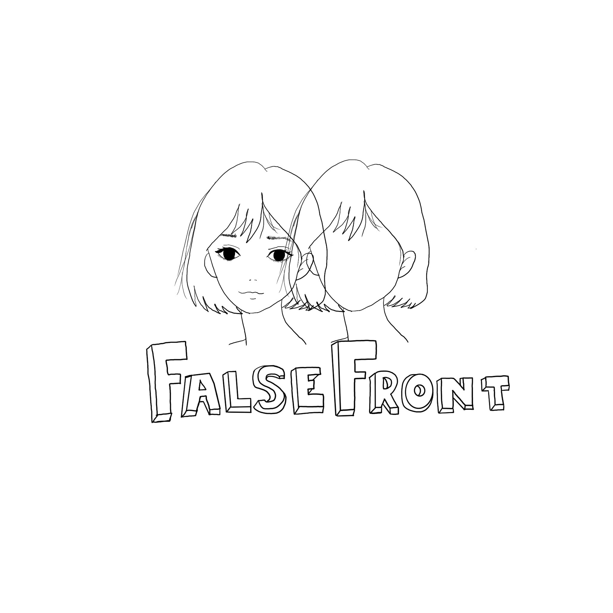
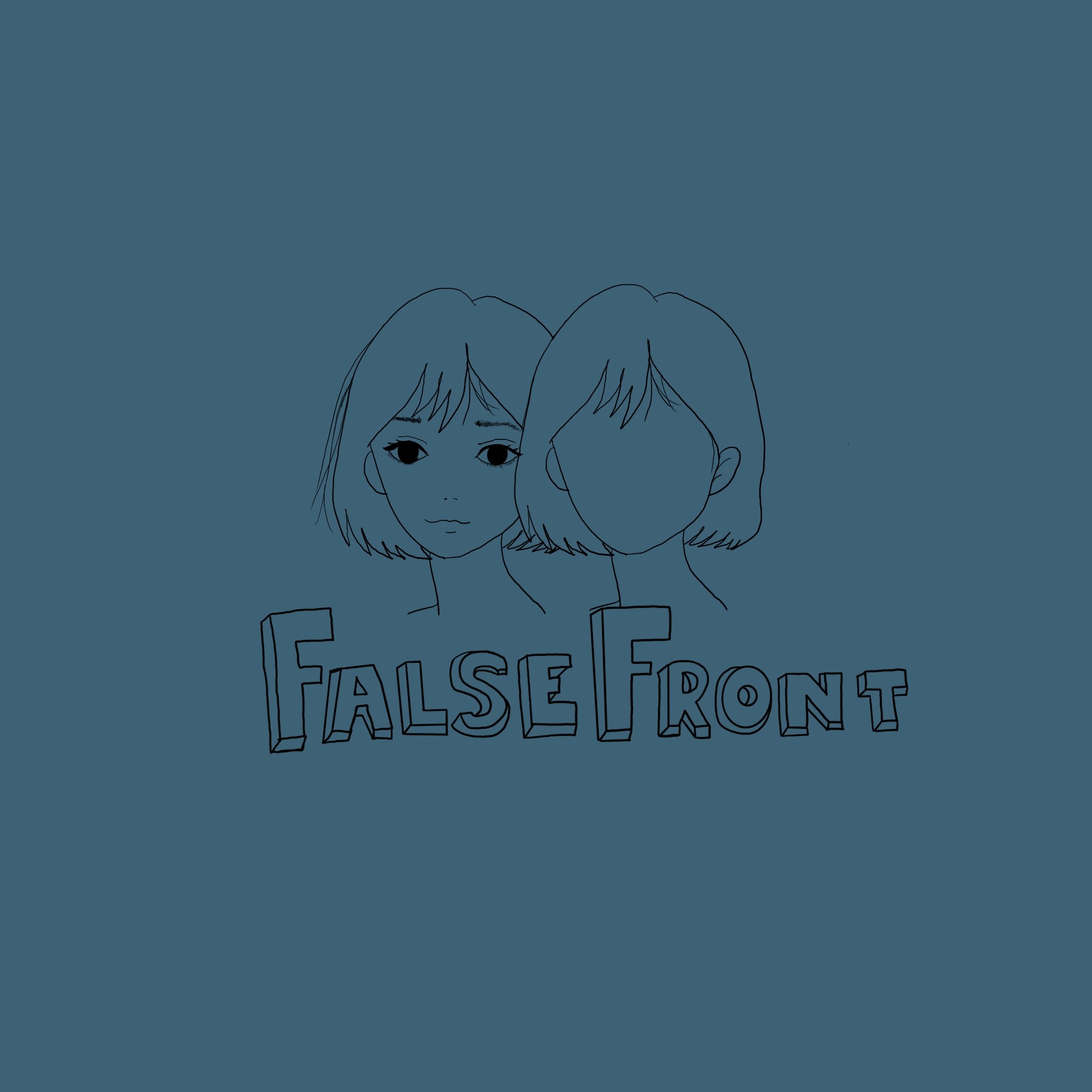
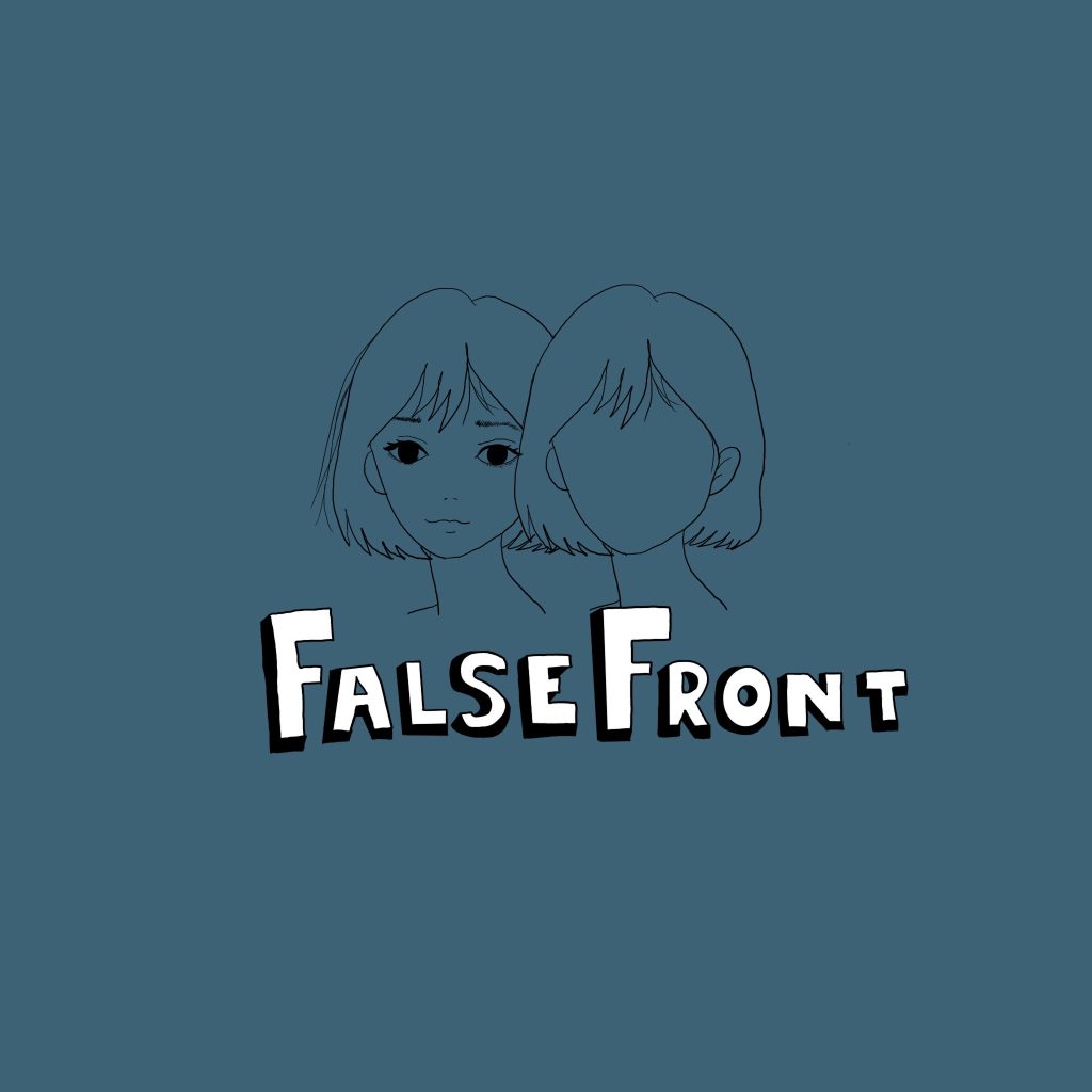
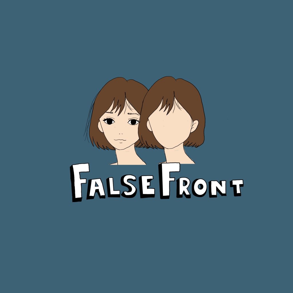
Here is where I started testing out whether or not I wanted to add colour or not, reason as to the blue background coming into play is because when researching I found that blue was closely associated with autism hence the decision to perhaps incorporate that. On the previous designs I had feedback from a friend stating that it wasn’t fully giving ‘masking’ and just looked like two faces and so they recommended I play around a bit with the second face to try and give the same illusion that the transfer paper did in the pencil copies.
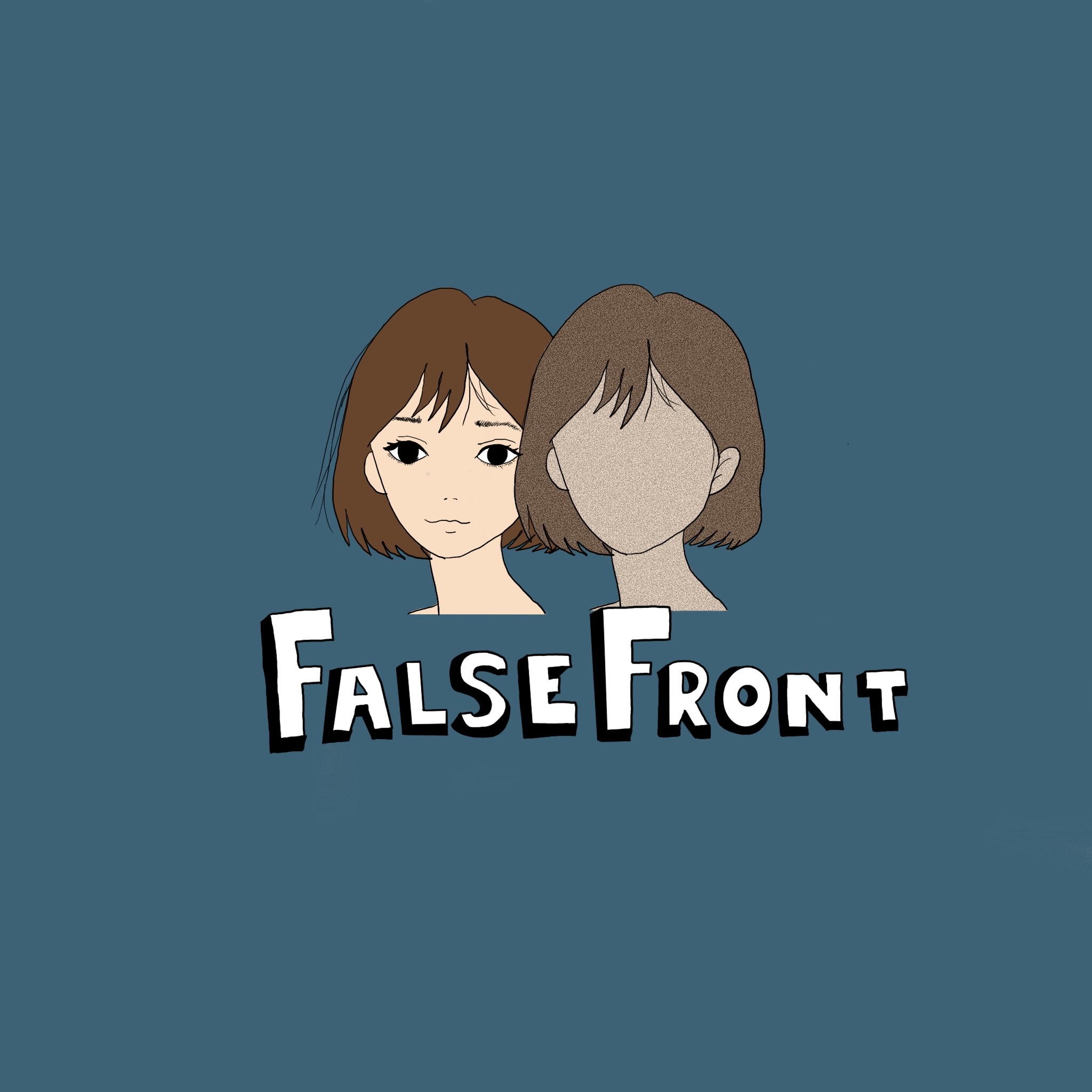
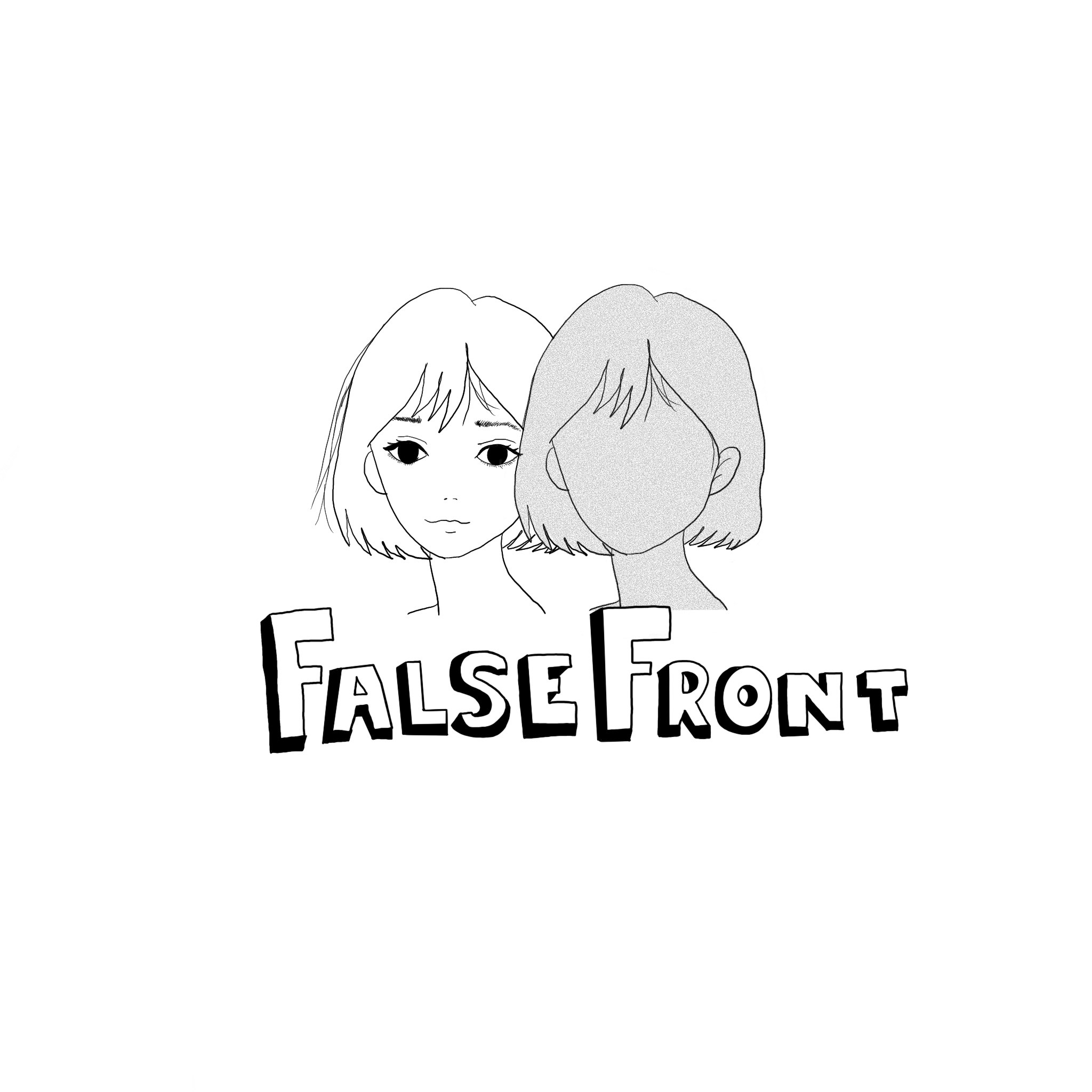

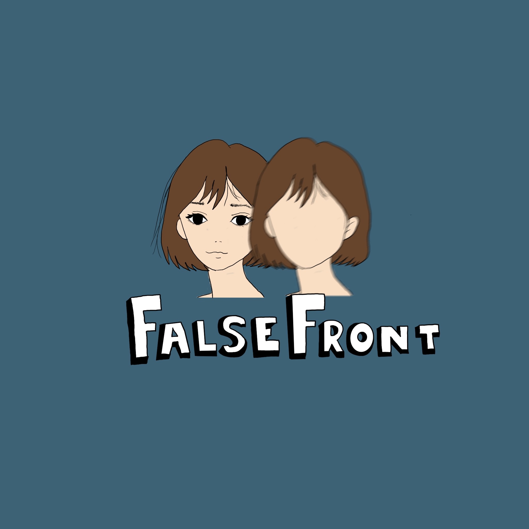
Here are my iterations where I used a noise brush which allowed me to almost create a film like texture over the second face and I was also able to use a motion blur brush to make the face look blurry. Again I asked for feedback of friends and family and majority liked the motion blurred style logo and so it came down to being a split decision between idea 8 & idea 9.
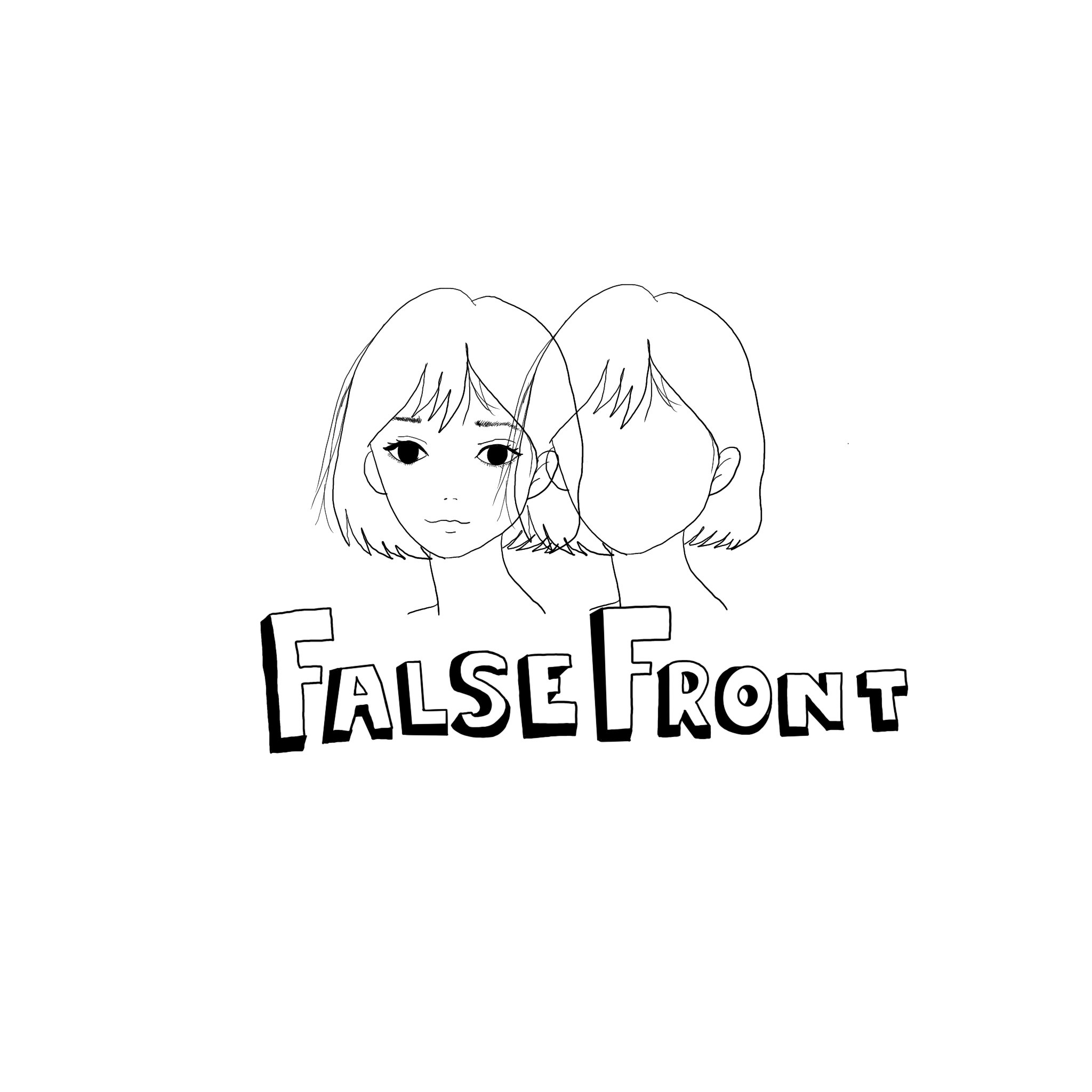
In the end I came to a decision that I preferred the non coloured version as it went with the simplistic nature that I was trying to achieve and it just felt right.
Final Logo Design
