Update: The final outcome of these experiments can be found here.
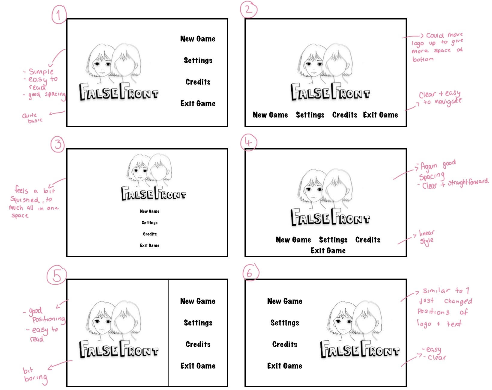
Here are some of my rough digital composition ideas that I made of the starting screen. Here I did 6 iterations and made comments of each one to find out which ones I thought were best. I liked #4 the most, followed by #1 despite it looking quite basic. However, after some consideration I felt like #4 was the right choice as it was clear and concise, had good positioning, followed a liner style and was easy to read.
Side Note: Font used Marker Felt Wide
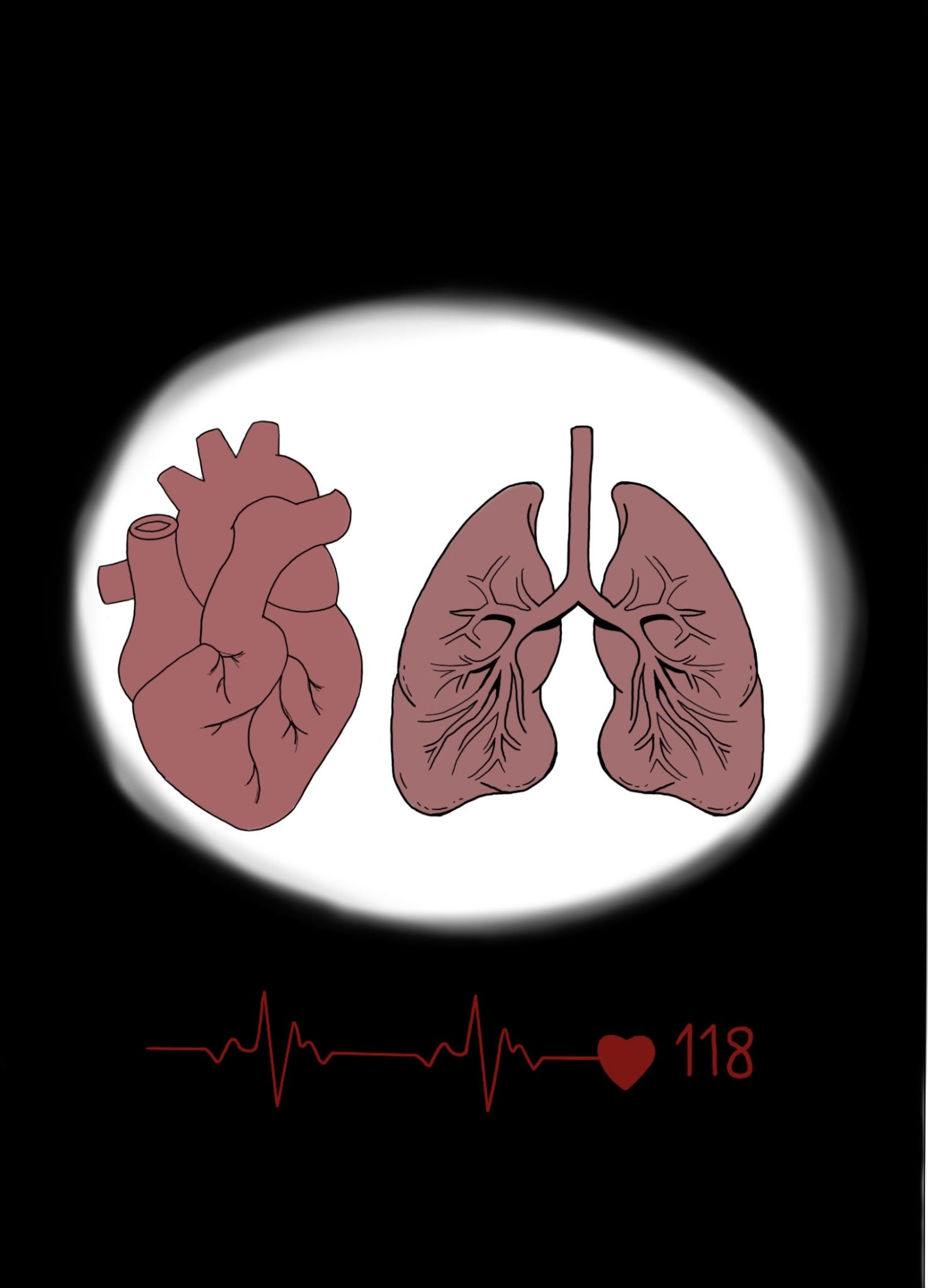
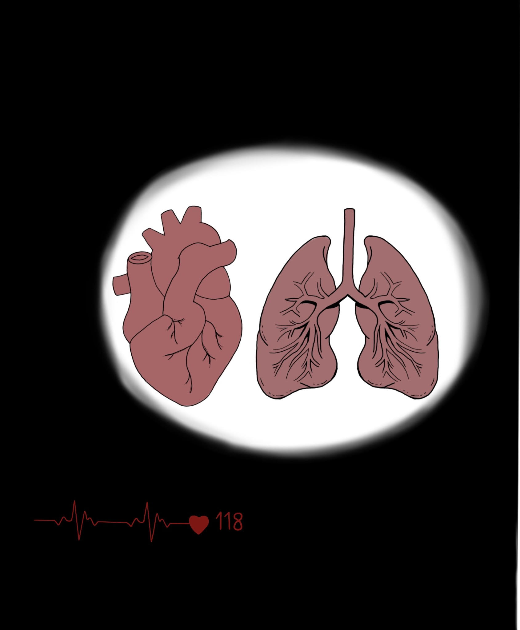
I did a couple of UI experiments. I changed the sizing and positioning of the heart rate monitor to see which composition was most efficient and I also show the mask of Emily’s face as another UI component.
Palettes and brushes used can be found here for reference.
I think during scene 10 I want the players to feel like they are really experiencing the panic attack and so having a bigger heart rate monitor could really help to give that feeling, I also might want to consider animating the monitor to be more realistic I could even look at making it bigger to go across the whole lower half of the screen.
Animated UI
Note: When exporting there was an issue and the white part didn’t export properly so refer to design up above for how it should look and use this for animation reference.
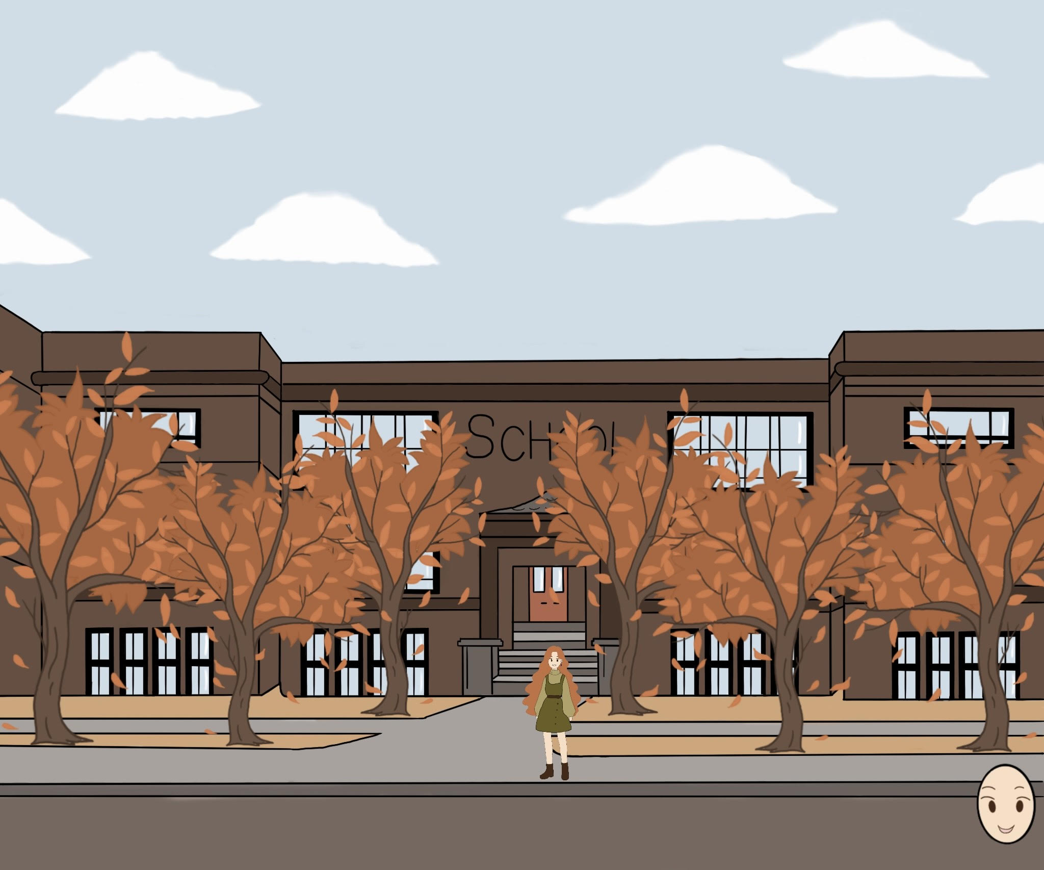
Below are some animations of the mask prompting players to click onto the mask.