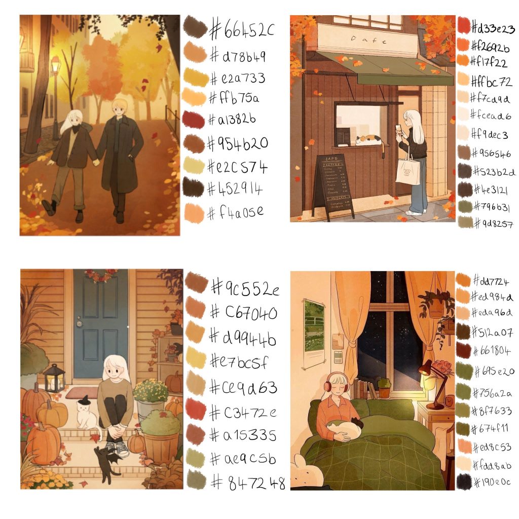
Colour Palette Choice
Here below is the colour palette that I decided to go with, I chose this because I wanted the colours that were prominent in the environment to match nicely with those colours shown within the characters.
Characters
Platform used to create all art: Procreate
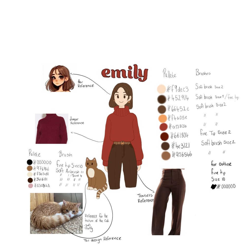
Here is Emily, this is the main character that you the player play as. Now you maybe wondering where the heck are her legs?!? And I promise there is reasoning behind why she is legless. This is because throughout the majority of the game you play through the perspective of Emily and the only time that you might be able to see her is within a bathroom scene when looking into a mirror and for that you only really need to see her top half. I have made sure to list the brushes that I used as well as noting down the exact colours that I used when creating Emily. I also included reference images for what the clothes would look like texture wise.
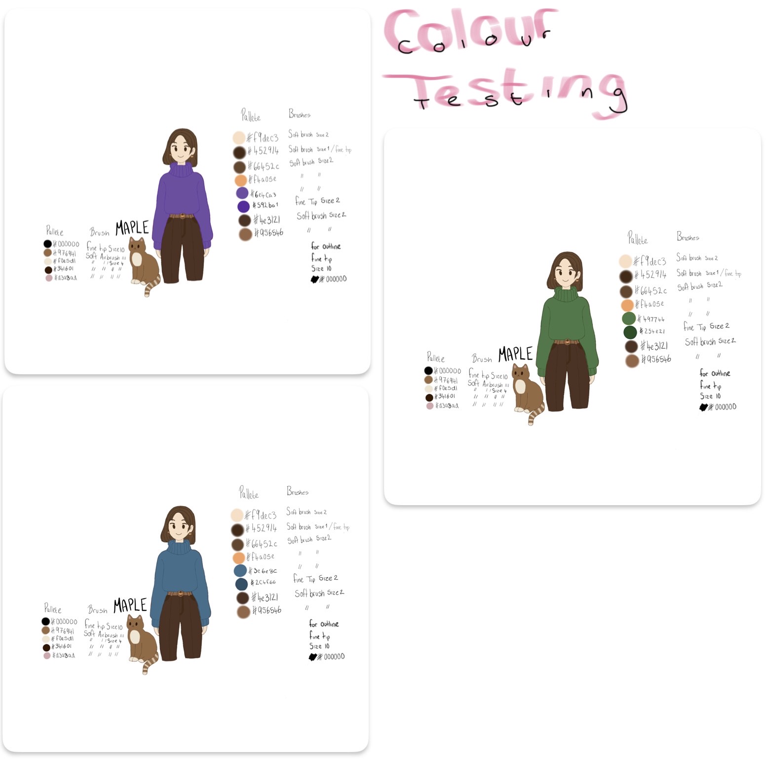
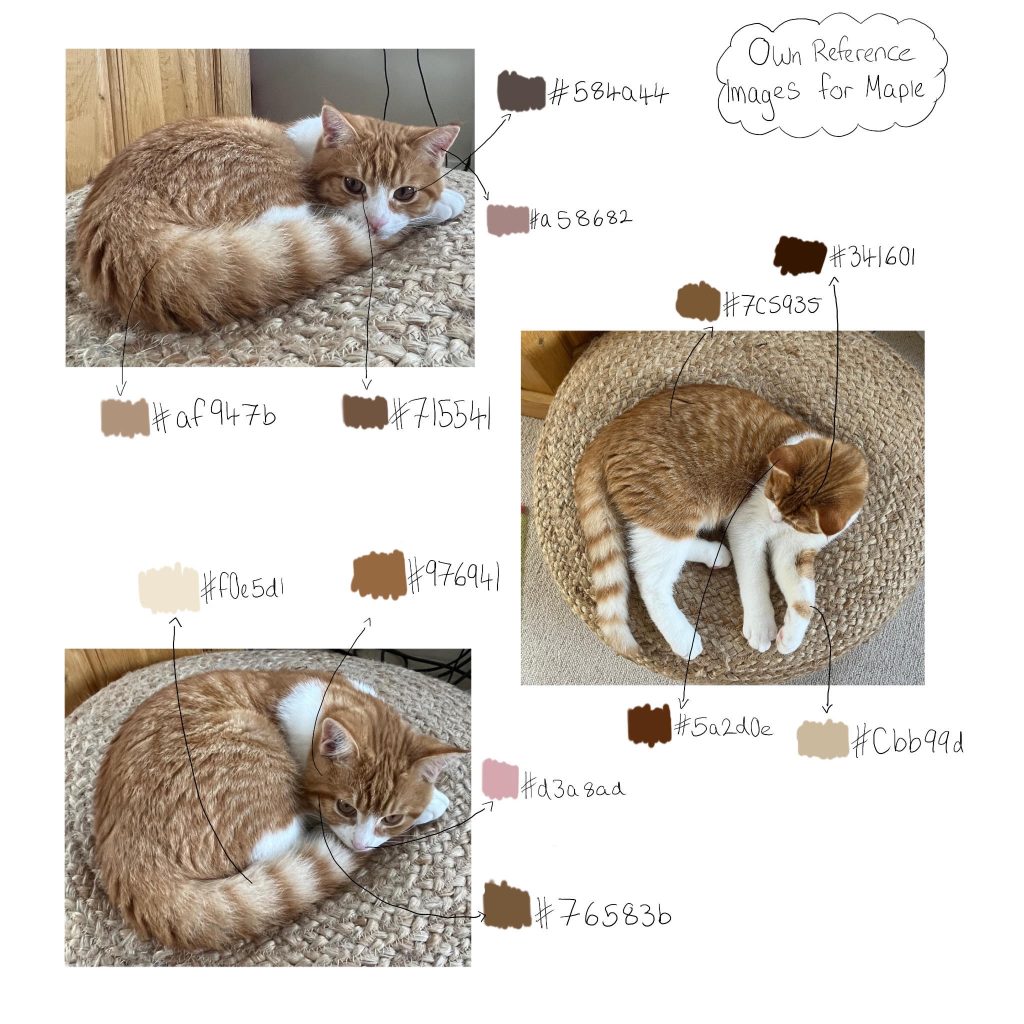
Maple’s reference palette
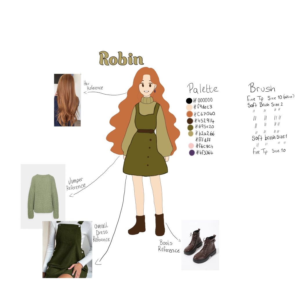
This is Robin. Robin is Emily’s best friend. When choosing Robins palette I wanted to go for flattering colours. Here I was able to apply some little fashion knowledge that I have, seeing as I myself am ginger and EXTREMELY PALE 🙁 I would like to think that I have some good knowledge of what is flattering. I find that greens compliment orange quite well and so keeping within the initial palette I went with sage and a deeper green for the clothes and then complimentary brown boots.
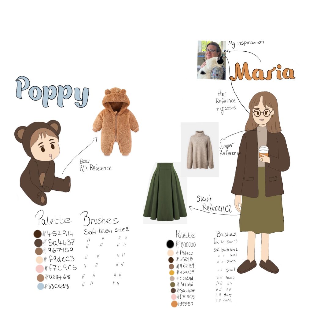
This is the mum and the younger sister. As you can see I took reference for the mum via my own beautiful mum (which just had to be done) The reference for the younger sister was more so inspired through the fluffy bear pj’s as I have seen them on babies and it’s just too adorable and so I decided to base her character solely from that item of clothing. Similarly to the other two characters I made sure to use the same palette so that everything would hopefully compliment one another. These two characters only appear on the rare occasion within my game but are still important none the less.
Colour Testing
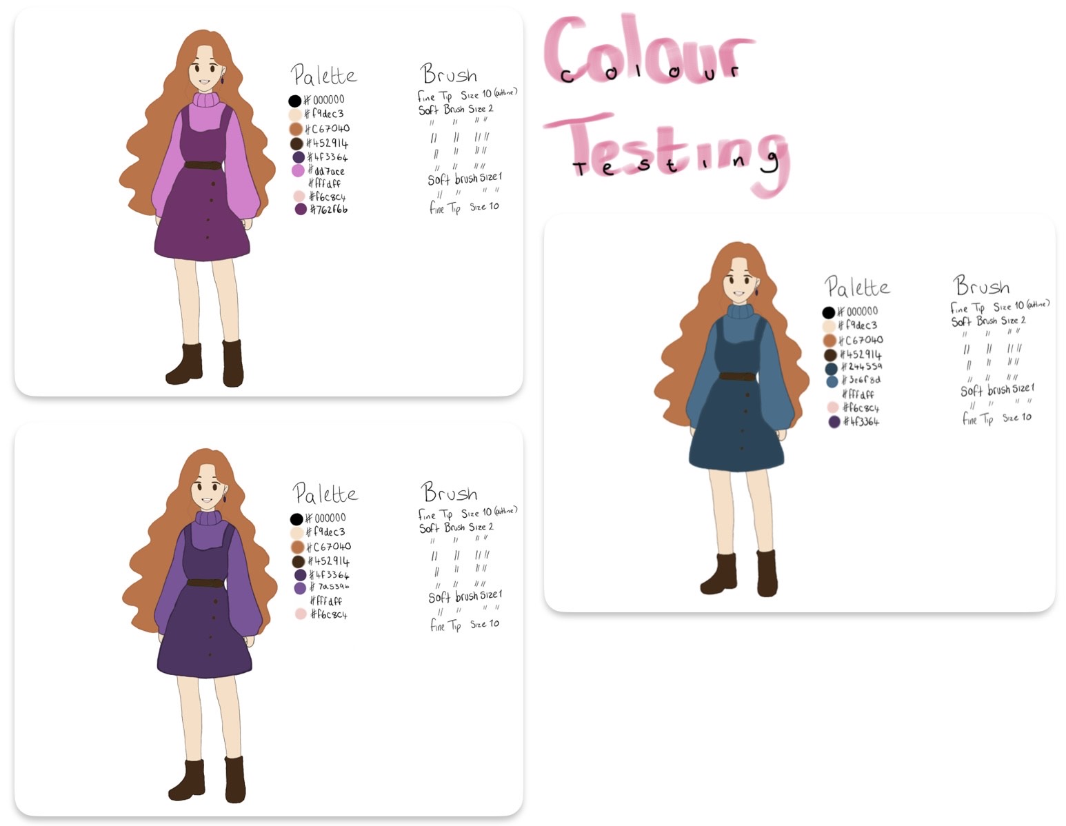
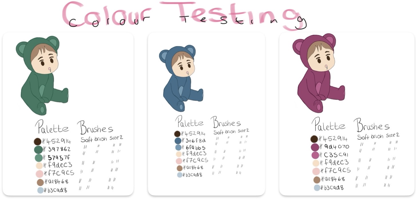
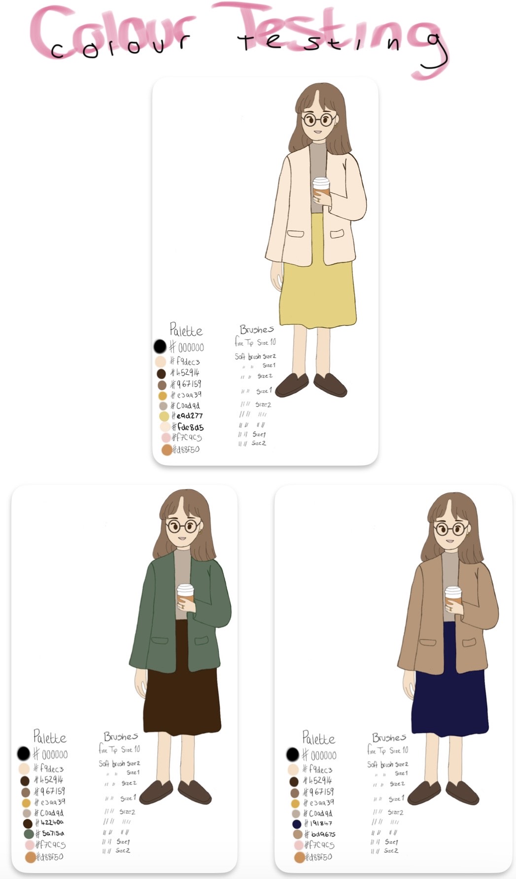
Here is where I was playing around with the some of the colour palettes within each character, this allowed me to test what colours worked well for each character as well as what I felt complimented their personality’s. These are all of the versions that I decided not to go with for numerous of reasons like, not matching their features/complimenting their base colours, not matching the cosy setting that I was going for and just overall not looking correct. Above these are the colour palettes that I did decide on but this allows you to see my development!