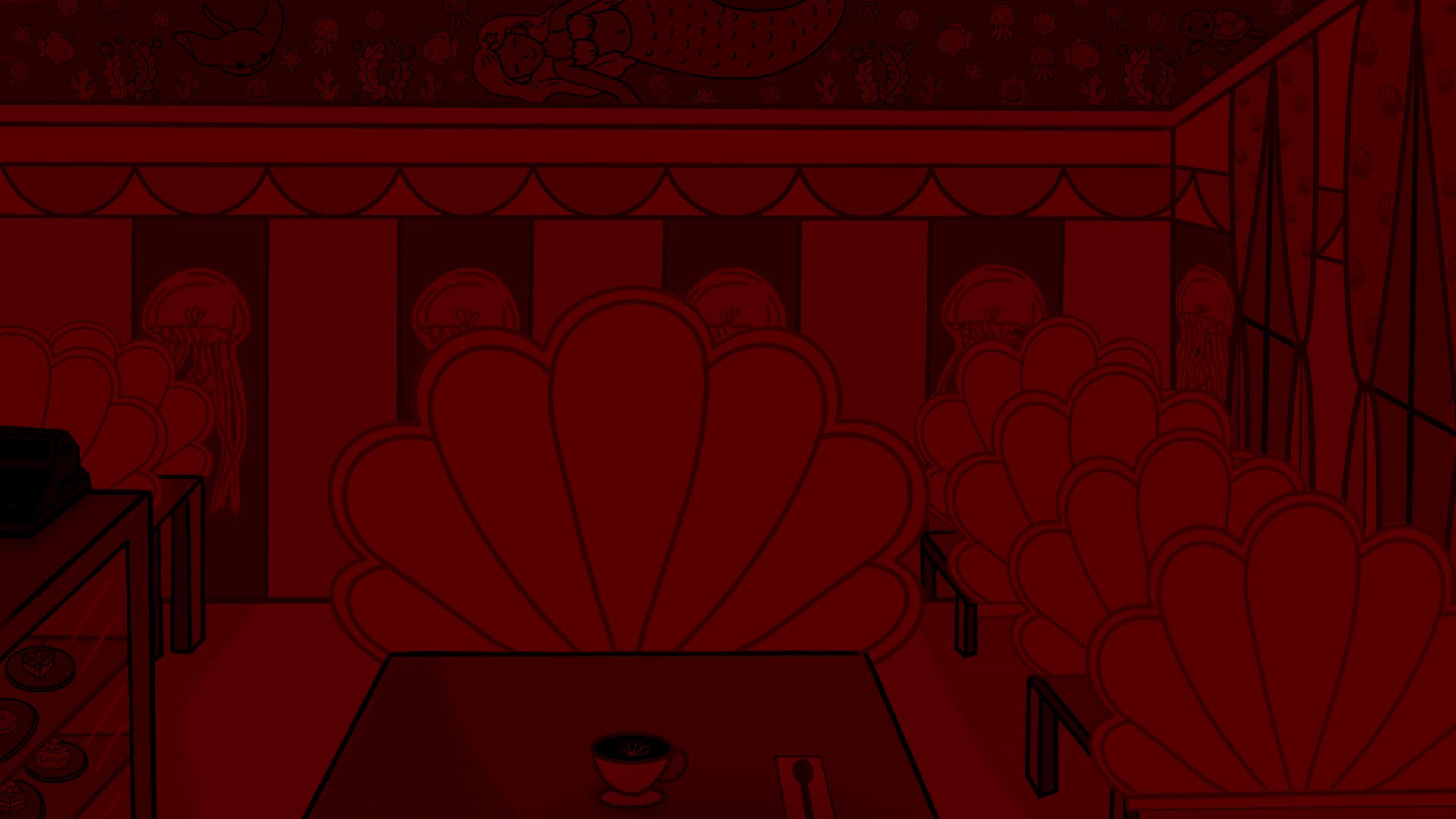
Due to this being an additional extra to Violet’s Dates and us coming towards the end of the project we agreed as a group to use the normal café scene and recolour it so that it had a red saturation to it to create that dark eerie feel to the game
━━━∙⋆⋅⋆∙━━━━━━━━━━∙⋆⋅⋆∙━━━━━━━━━━∙⋆⋅⋆∙━━━━━━━━━━∙⋆⋅⋆∙━━━
Here I got the original Coral Cup cafe and played around with the hues, I upped the red and was able to create the image down below. As a team we were happy that this gave the eerie dark feeling that we wanted.
━━━∙⋆⋅⋆∙━━━━━━━━━━∙⋆⋅⋆∙━━━━━━━━━━∙⋆⋅⋆∙━━━━━━━━━━∙⋆⋅⋆∙━━━
Software Used
Procreate
Brushes Used
Flat Brush – Size 1
Soft Brush – Size 3
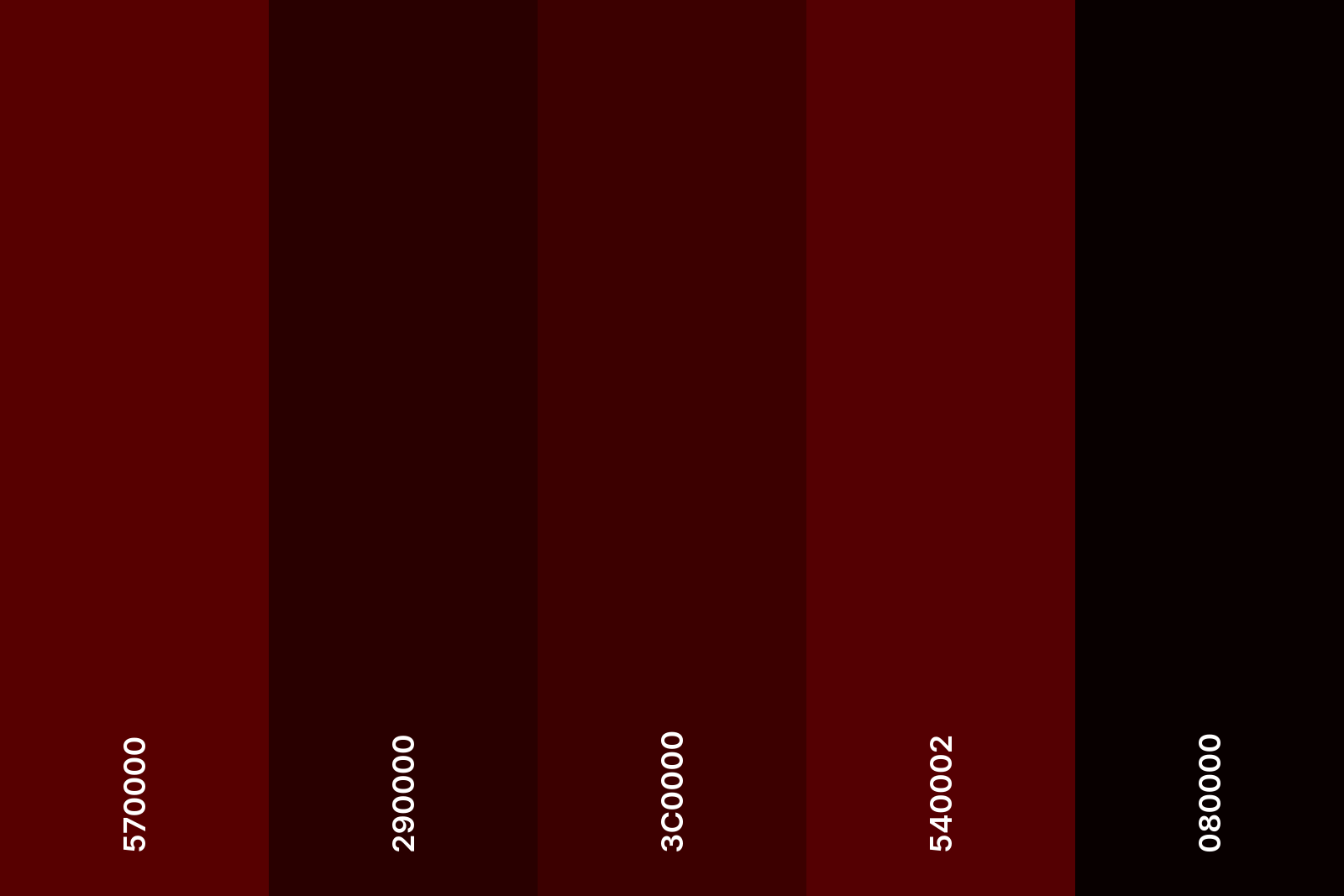
Colour Palette Used
Link to group Blog/Polished Environments: https://year2.wsagames.com/violetsdates/development-of-violets-dates/sample-page/
━━━∙⋆⋅⋆∙━━━━━━━━━━∙⋆⋅⋆∙━━━━━━━━━━∙⋆⋅⋆∙━━━━━━━━━━∙⋆⋅⋆∙━━━
UPDATE
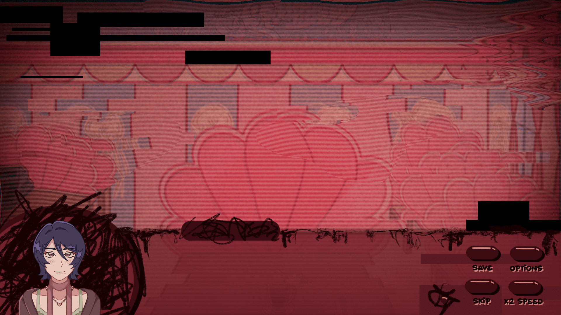
I hadn’t realised that this was the old version of the evil mermaid café until Jessie kindly pointed it out! As the café was the off centered version. Due to personal issues I wasn’t around to be able to fix it as quickly as the team wanted so luckily the team was able to come together and just make the little alterations to it that it needed.
Updated evil mermaid café with UI
━━━∙⋆⋅⋆∙━━━━━━━━━━∙⋆⋅⋆∙━━━━━━━━━━∙⋆⋅⋆∙━━━━━━━━━━∙⋆⋅⋆∙━━━