13/02/2025
Meeting / Creating A Colour Palette
━━━∙⋆⋅⋆∙━━━━━━━━━━∙⋆⋅⋆∙━━━━━━━━━━∙⋆⋅⋆∙━━━━━━━━━━∙⋆⋅⋆∙━━━
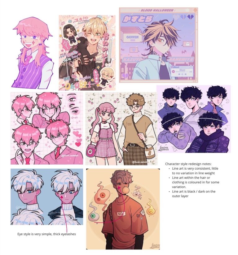
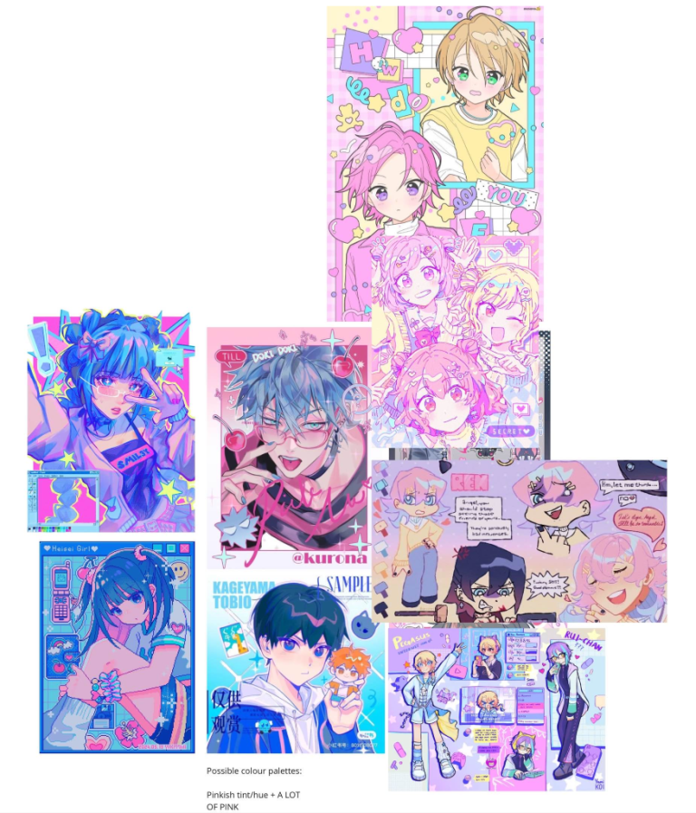
During week 3 Sophie mentioned how the colour palettes didn’t quite match up and so we came to the realisation that the colour palettes did not go.. like at all. Whereas Yami was in bold and warm tones the café was literally the polar opposite being cool toned and pastel colouring, which was neither artists fault as we were both following the GDD and it happened that they just didn’t quite go. So in preparation for our group meeting, myself and Paula collaborated on a Miro board where we shared our ideas for both character style and environment colours. Paula recommended that we steer towards more pinkish hues as she felt it would work better with the game.
━━━∙⋆⋅⋆∙━━━━━━━━━━∙⋆⋅⋆∙━━━━━━━━━━∙⋆⋅⋆∙━━━━━━━━━━∙⋆⋅⋆∙━━━
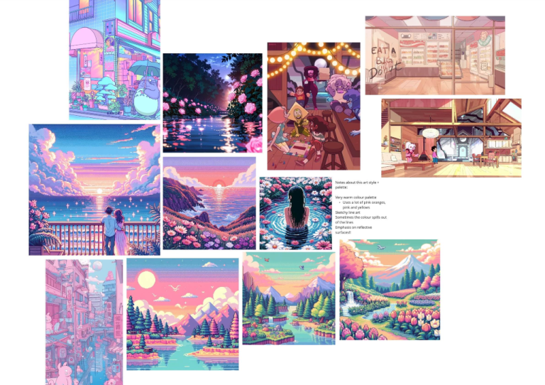
Before we had created the Miro Board I had been testing around with having more warm tones within the café however something still didn’t feel right so I was glad that we came together and created the shared Miro Board
━━━∙⋆⋅⋆∙━━━━━━━━━━∙⋆⋅⋆∙━━━━━━━━━━∙⋆⋅⋆∙━━━━━━━━━━∙⋆⋅⋆∙━━━
Miro Board
━━━∙⋆⋅⋆∙━━━━━━━━━━∙⋆⋅⋆∙━━━━━━━━━━∙⋆⋅⋆∙━━━━━━━━━━∙⋆⋅⋆∙━━━
18/02/2025
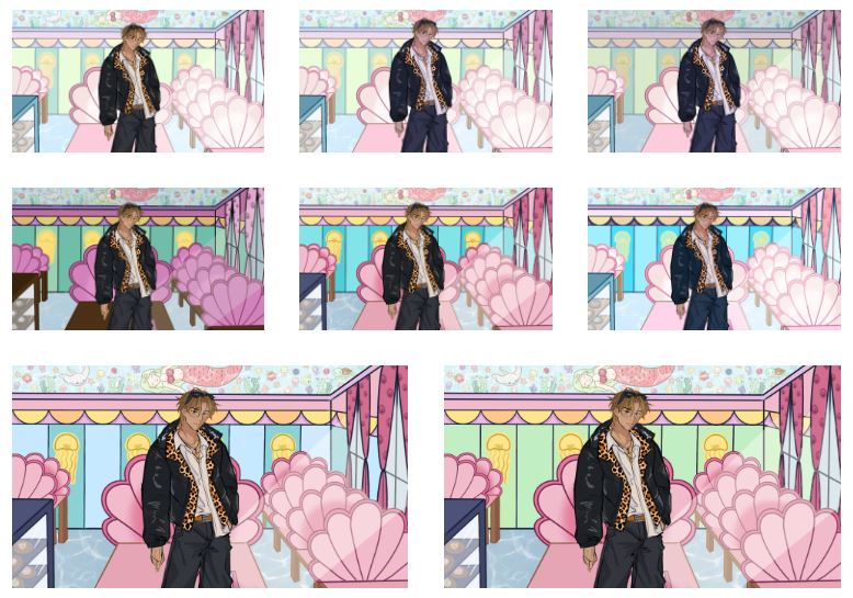
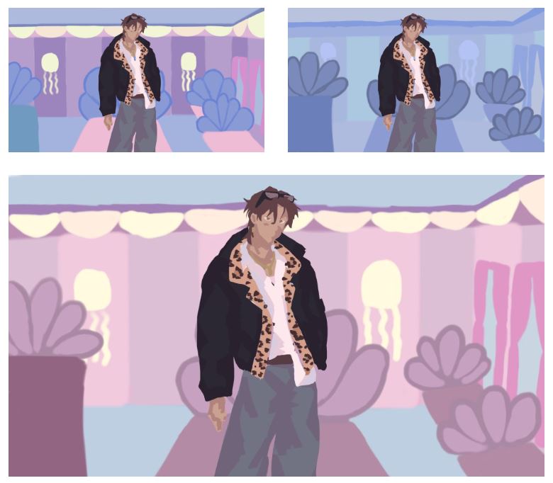
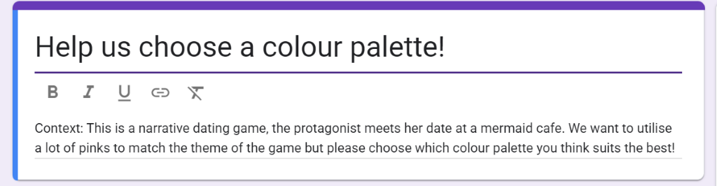
On the Tuesday, myself, Paula and Sophie came together to discuss the colour palettes and how we come to a cohesive colour palette/style. One point that Sophie brought up was creating block colour thumbnail sketches where we take away any line work and just focus on having the colours work together. Myself and Paula went away and created some thumbnails which can be seen below.
━━━∙⋆⋅⋆∙━━━━━━━━━━∙⋆⋅⋆∙━━━━━━━━━━∙⋆⋅⋆∙━━━━━━━━━━∙⋆⋅⋆∙━━━
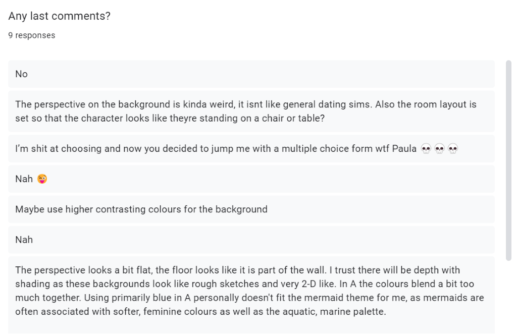
Feedback Form
Here were our results that we received:
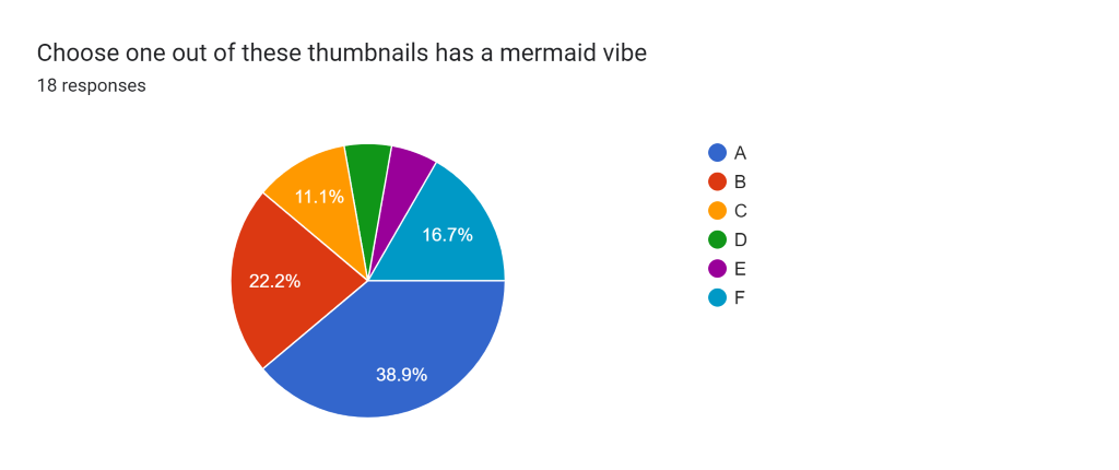
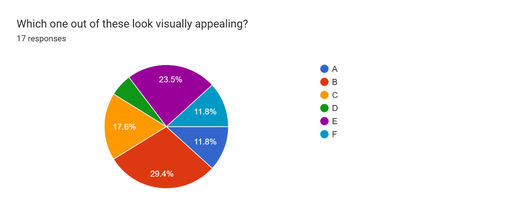
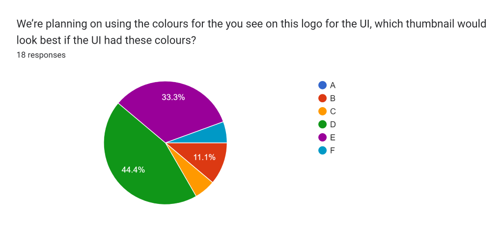
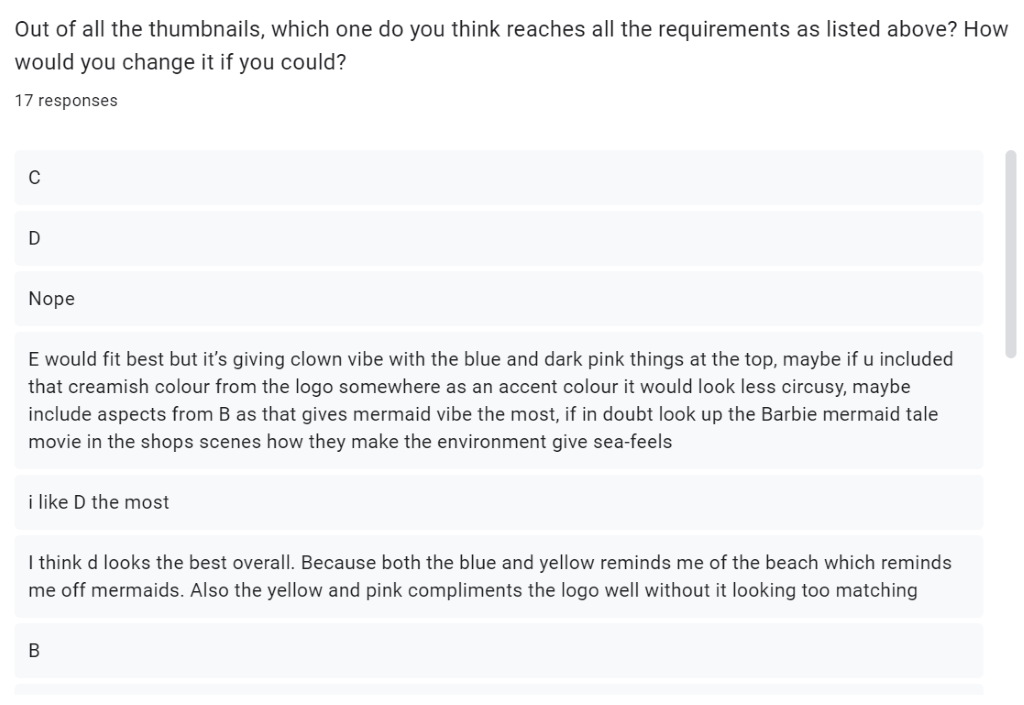
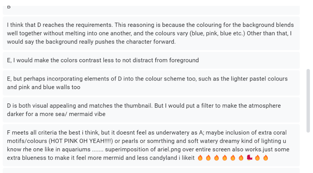
With the last question we were able to tally up what colour palette met all the criteria’s and that was…..
Thumbnail D!
━━━∙⋆⋅⋆∙━━━━━━━━━━∙⋆⋅⋆∙━━━━━━━━━━∙⋆⋅⋆∙━━━━━━━━━━∙⋆⋅⋆∙━━━
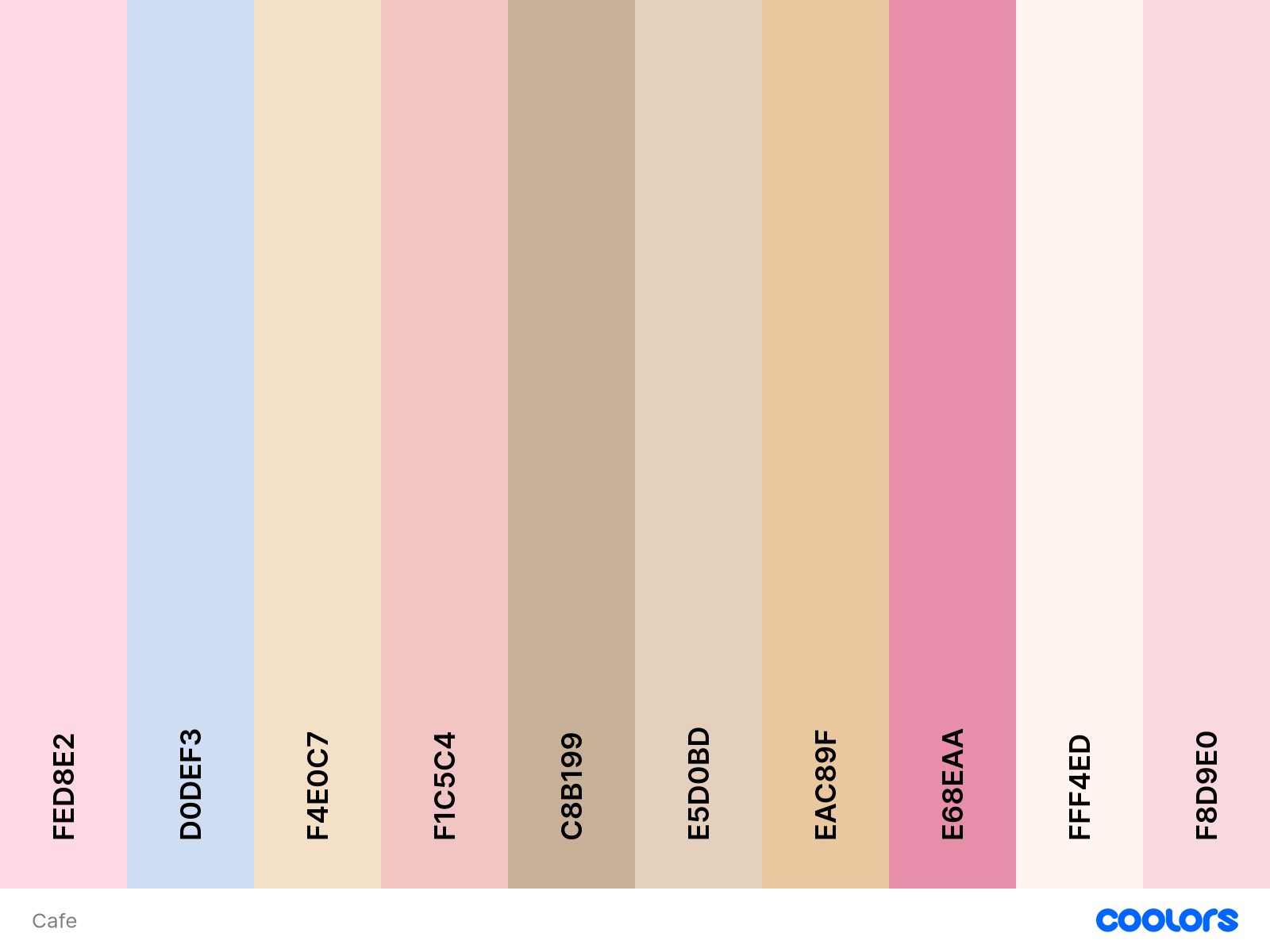
New Colour Palette
Here is our new confirmed colour palette for the environment, UI & character to help with better cohesion.