03/02/2025
I kick started this week by creating my first iterations of the café, following on from the thumbnail sketches I had created and sent over to the group, we came to a decision that they liked thumbnail 3 which can be found here: https://year2.wsagames.com/is3g23/mood-board-⋆-mermaid-cafe/
This thumbnail was inspired by the original design in Riya’s GDD which I’ve included an image for reference here: https://year2.wsagames.com/is3g23/mood-board-⋆-mermaid-cafe/
Down below is what I was able to achieve:
━━━∙⋆⋅⋆∙━━━━━━━━━━∙⋆⋅⋆∙━━━━━━━━━━∙⋆⋅⋆∙━━━━━━━━━━∙⋆⋅⋆∙━━━
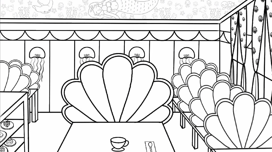
Here I was just doing the outlining to help me envision what the mermaid café would look like when it is in neat line work than before with my scruffy sketch work. It was also easier for me to then send over to the group to make sure that they were happy with what I had produced so far. The girls approved and were still happy with what I had produced so I decided to move onto adding colour.
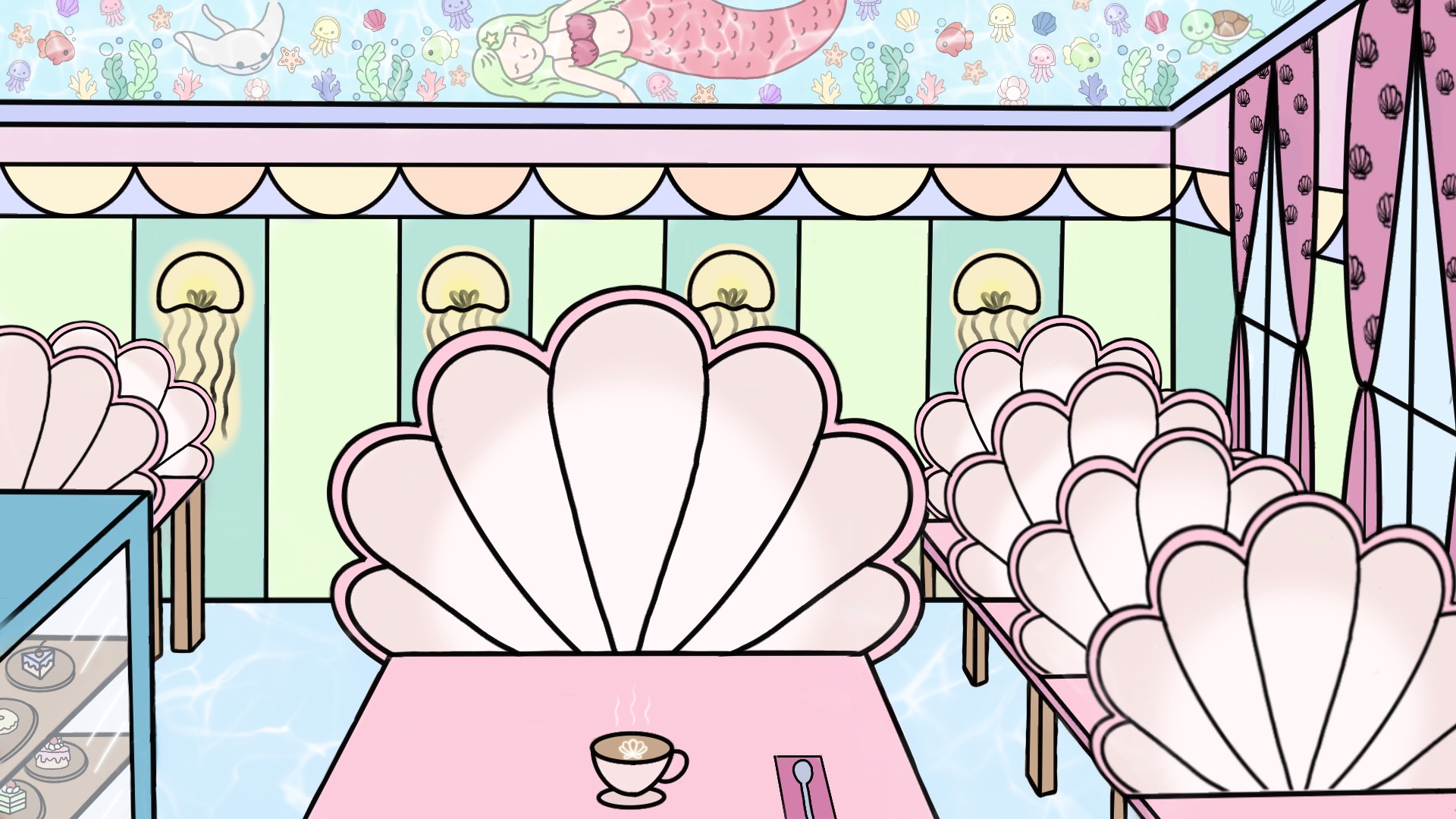
When adding colour to the environment I tried to stick closely to the colour palette that Riya had used in hers, adding a few more here and there / experimenting which lead me to have something like this! Afterwards I sent this over to the group and here was some of the feedback that I received:
“Where I have outline in black potentially try to colour match closer to the object e.g. the clam seats could have a darker pink outline, whereas the blue counter could have a deeper blue to outline etc.”
From this feedback I was able to reflect back to my work and see how the bold black lines stood out quite a bit which potentially didn’t fit the aesthetics that we were going for, so with this in mind and a couple of tips from Paula I was able to go back and start making those changes.
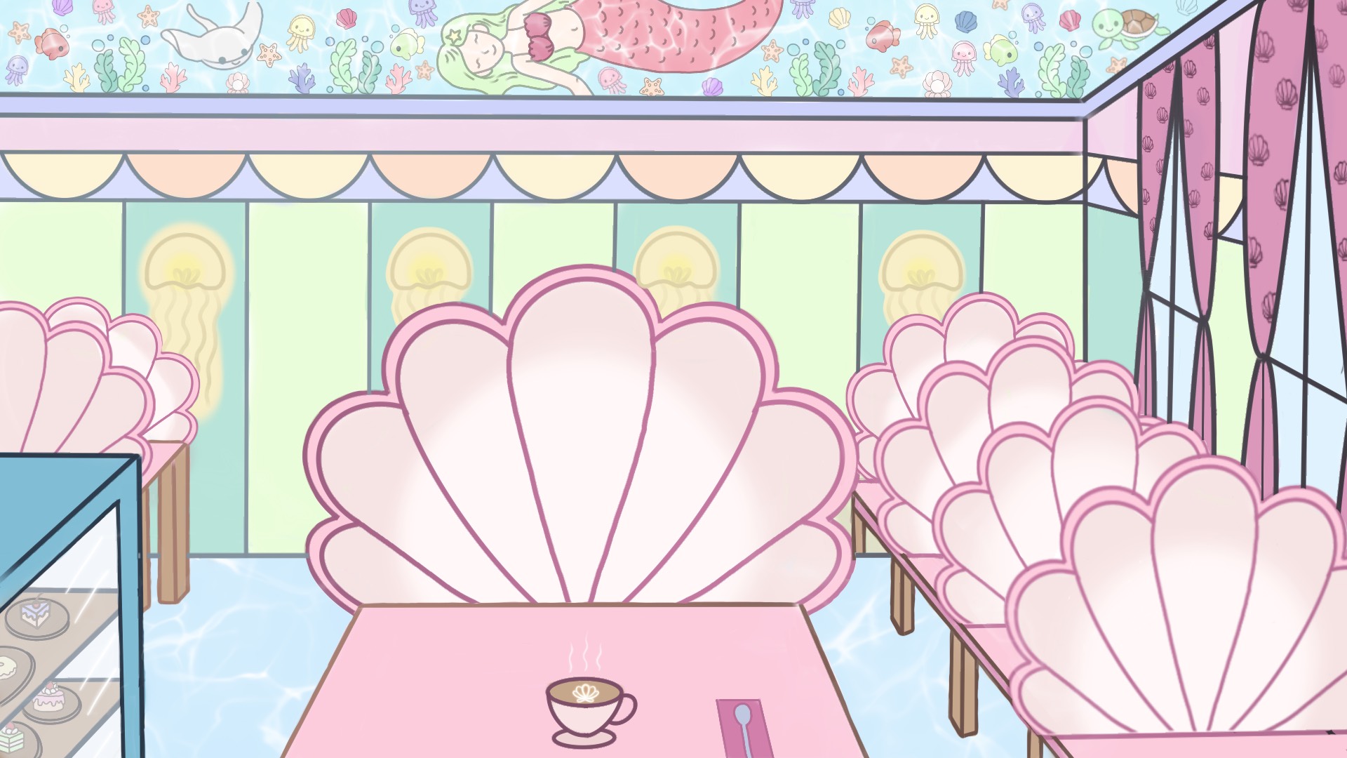
After the last feedback that I received this is what I was then able to produce, instantly I felt like it looked better and more cohesive which was nice and felt like a boost of confidence to my artistic skills. Again I wanted to check in with my team and so I sent over this new iteration to receive more feedback. This is what I got:
“To add some more depth to the environment consider adding shadowing / lighting to reflect the composition”
“Looks good!”
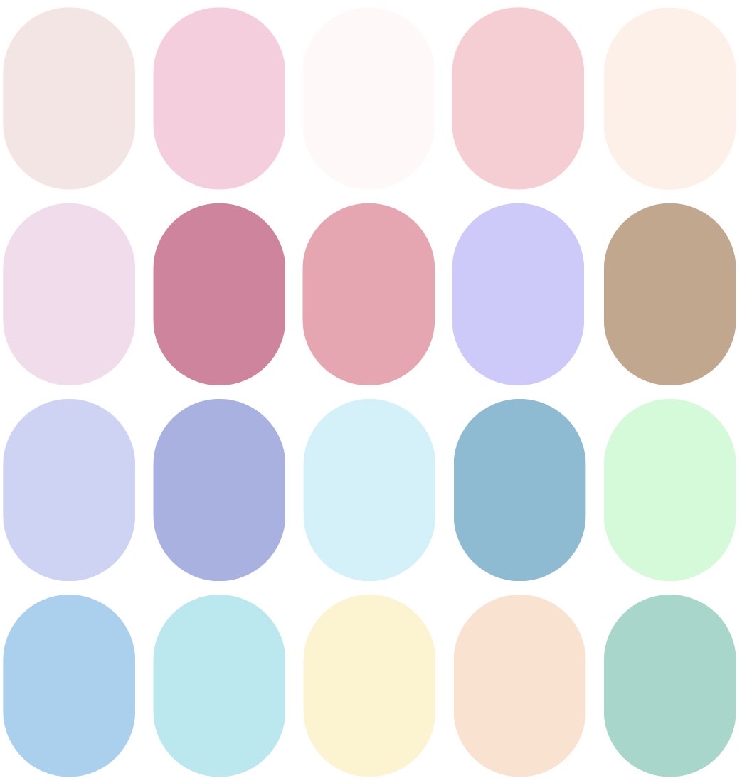
Initial Colour Palette Used
━━━∙⋆⋅⋆∙━━━━━━━━━━∙⋆⋅⋆∙━━━━━━━━━━∙⋆⋅⋆∙━━━━━━━━━━∙⋆⋅⋆∙━━━
UPDATE
Around week 3 we realised that the colour palette of the character and environment didn’t complement one another so from here you will see a lot of trial and error. Due to this it did slightly delay us but nothing too major. You’ll see myself trying more warmer toned pastels as well as some thumbnail sketches that I did so that myself and Paula could send out a google form to get some of our class mates feedback which I’ll also include down below.
Week 3 blog: https://year2.wsagames.com/is3g23/⋆week-3-teamwork-collaboration⋆/
Deciding on a colour palette: https://year2.wsagames.com/is3g23/⋆creating-a-colour-palette⋆/
━━━∙⋆⋅⋆∙━━━━━━━━━━∙⋆⋅⋆∙━━━━━━━━━━∙⋆⋅⋆∙━━━━━━━━━━∙⋆⋅⋆∙━━━