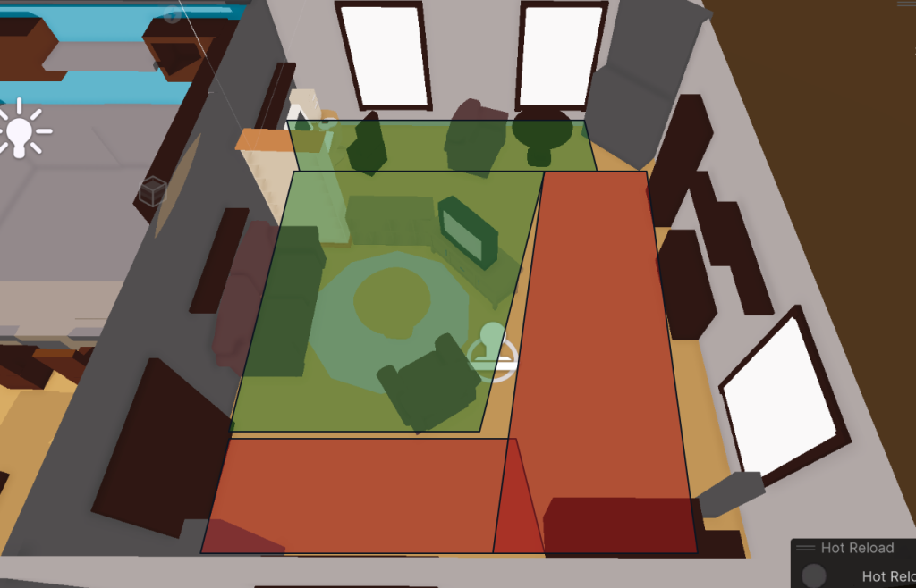
The first draft of the level design was inspired by my Uncle’s house in Scotland – Greenburn Haugh. It was a very rough draft, but even here I knew I wanted to guide the player’s movements along “loops” of safety, being able to dip in and out of “danger zones”. I designed accordingly:

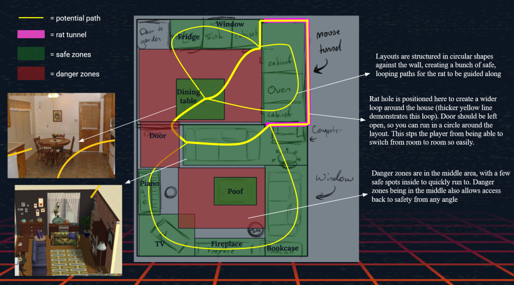
- Layouts are structured in circular shapes against the wall, creating a bunch of safe, looping paths for the rat to be guided along
- Rat hole is positioned here to create a wider loop around the house (thicker yellow line demonstrates this loop). Door should be left open, so you can run in a circle around the layout. This stps the player from being able to switch from room to room so easily.
- Danger zones are in the middle area, with a few safe spots inside to quickly run to. Danger zones being in the middle also allows access back to safety from any angle
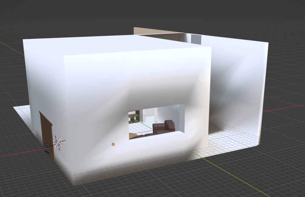
This iteration had several flaws – first of which being there was no door to the living room or kitchen from a different part of the house.

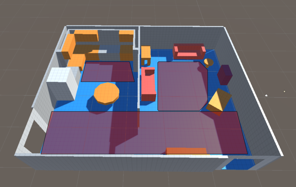
The greybox was a bit too big for the furniture inside, but I would fix that while making the whitebox so everything was proportional. A bigger problem was now the enormous stretch of “danger zone” that seemingly had nothing in it, because of the position of the door Hugo fitted. It meant the TV had to be pushed forwards, as well as the rest of the furniture to cluster around it. None of it really worked together.
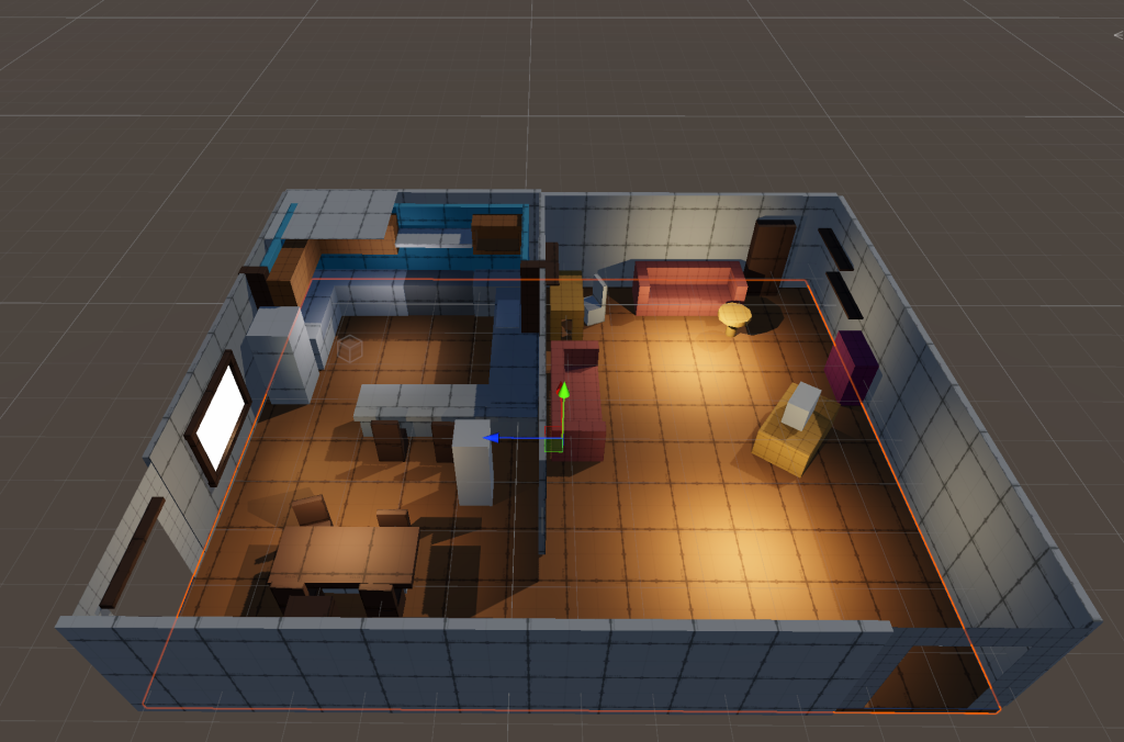
The kitchen was a fairly easy fix. Over the course of an afternoon, we worked together to firstly eradicate some of the rectangle dangerzone along the front of the map by moving the dining table along, and changing it from a circle shape to a square. The kitchen was transformed by way of extra countertops, which created another little loop and more places for the rat to run along and hide.
(1) The placement of the doors meant that nothing felt cohesive, and it was difficult to make big loops without leaving a huge dangerzone by the entry door. Eventually, Parker had the idea to make it more “segmented” – an idea which I didn’t hate, but the way everything was clustered now made the safe zones too safe and the danger zones too dangerous. The loop around the sofas and TV was too close knit for proper detection, and the far end of the room had the same problem.
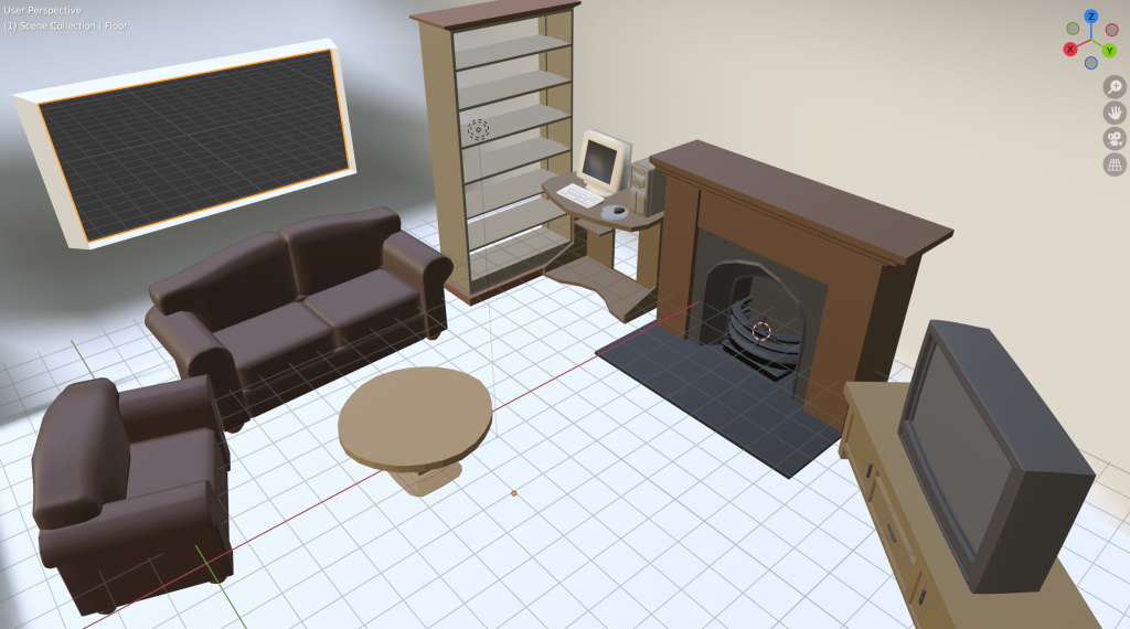
(2) The layout didn’t make any sense from a traditional interior design perspective. The front of the house only has one, small window. The fireplace only has one chair beside it, when usually a fireplace has plenty of furniture so people can cluster round for heat.
(3) Parker and Hugo wanted the house to have a middle-class aesthetic. I completely, STAUNCHLY disagree, for several reasons.
- Esi’s G.D.D. also lists Streatham, Peckham, Brixton, and Croydon as inspiration for the general vibe and aesthetic, which are infamously known for being poorer, rougher areas of London: this people should be working class.
- A working class household would be more relatable for consumers. While researching living room ideas, I came across a niche of Tiktok’s centred around British culture; particularly working class culture and its nostalgia for 2000’s toys and games. Even people with middle-class upbringings will be able to relate somewhat to working class aesthetics, as they are financially similar in comparison to the upper elite of English society. A cosy 2000’s house could have 90’s wallpaper and a 70’s avocado bathroom, and yet still be completely recognisable – something the player might have seen at a Grandma’s or friend’s house, or grown up in themselves.
- Middle-class aesthetics tend to err towards minimalism, sleekness, cleanness, and grey/white colour palettes, which would take away visual clutter for our rat to hide behind. They also tend to be in newer or rennovated houses, whereas most of the British population live in houses that have been standing for a little while, and have aesthetic choices of the past few decades set into it. Middle-class houses would also be less likely to have rats.
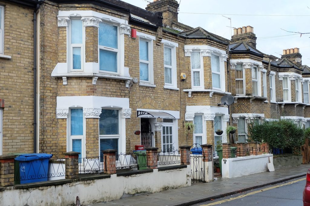
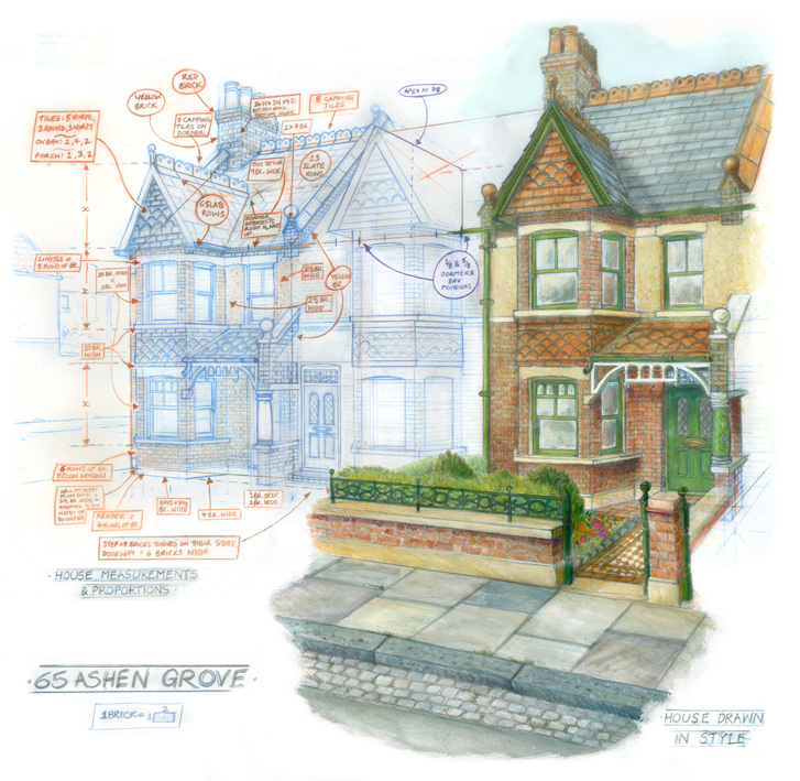
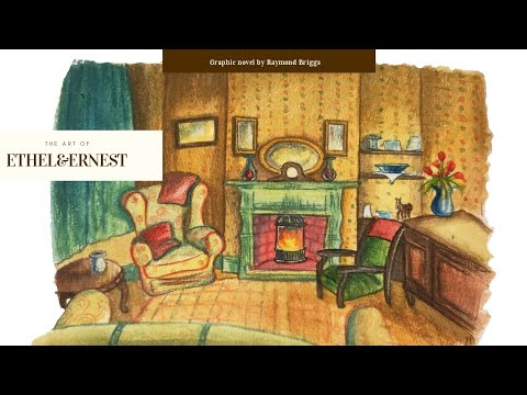
So I designed a third draft. This time I looked up images of a traditional London house to see how it would affect the layout if I wanted to reposition the door, like how Untitled Goose Game used inspiration from real-world towns. My inspiration was the house in Ethel and Ernest; a real London house that Raymond Briggs’ parents lived in back in the 30’s-70’s, as well as the interior of their living room.
Initially confident, once I saw it all laid out I lost a lot of my faith. It wasn’t finished – there was going to be a piano next to the armchair; the coffee table was going to have a different shape; the cabinet in between doors would have an entirely different design. But I didn’t think it was going to work. I’d gotten too hung up on the design making sense for a human, and now it wouldn’t work for the rat.
I was attempting to create an enormous loop around the room, but because of the fireplace and desk designs, there wasn’t a place to hide around that area. It felt sparse. It felt like there weren’t many places to hide. And I didn’t like it anymore.
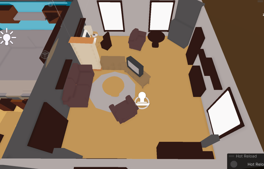
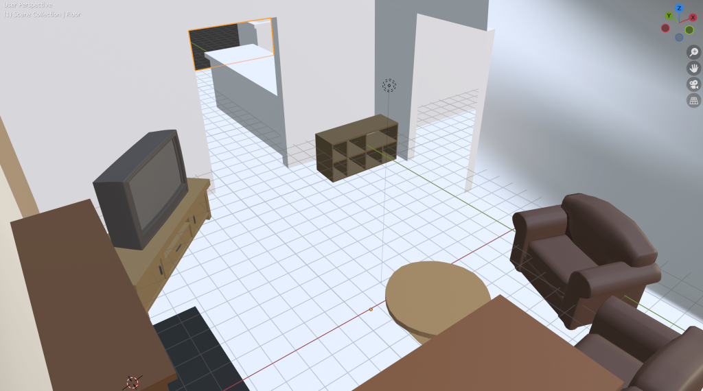
Eventually, the problem was that it felt too boxy and cramped, and some of the furniture didn’t quite fit in. I extended the front wall and added a wide, airy window, as well as a long window seat, and pushed the cabinet into a sideways position to open up the room a bit more. Finally, replacing the coffee table from a circle shape to square matched the sofa’s length, tying them together better.

The arrangement of furniture also needed to be so that the rat would be able to parkour around the room. The mantel shelf can only be reached by climbing on the TV first, and the piano only from the stool or neighbouring armchair. The lights are spaced equidistant from each other to parkour around them once you get on top of one.
I also took inspiration from my various moodboards in creating the props. The fireplace and kitchen cabinet are based on my own at home, and much of the general clutter was taken from 2000s living room inspiration. See here for my research.
When coming from the sewers and out of the vent, I set up a “cinematic shot” similar to techniques used in Stray. Inside the vent, the world is narrow. It opens up a little when you step out behind the TV, and then gives you a proper view of the room when you peek around – the entire living room before you!
To set up the puzzles, I used the Analyise->Solve->Execute method from my analysis of Little Nightmares. Players are guided into what they need to find via the UI “to investigate” list and dialogue cues – the “analysis” phase. This should take up 35% of the time on the quest.
strawberry cake quest
Once they’ve found the object of investigation, 50% of the time should be spent on solving it. There’s no direct conversation between the player and the game about what to do; they must decide for themselves, so some experimentation will be involved in figuring out what they CAN do. For example, picking up the strawberries and connecting them to the cake, or moving the cake while trying to interact.
strawberry cake quest
Finally, the remaining 15% should be spent completing their action. There are only a few strawberries to find, all in different areas to maintain interest, and pushing the cake off is even simpler. Having a difficult execution is not the main focus of the game; the exploration, stealth, and puzzle elements are.
Leave a Reply