
Diegetic UI – Realistic, or Distracting? – Extra Credits (2020)
During the mid-2000’s, games were obsessed with total immersion – but onscreen UI got in the way, as floating boxes denoting health and inventory wasn’t realistic. During E3 showcases, game UI was often removed from screens to make the shots more cinematic, realistic, and less game-y. So to get around this problem, developers started implementing UI into the game narrative.
There are 4 ways to do game UI:
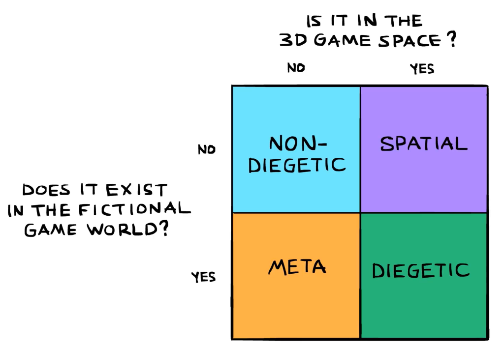
Non-Diagetic UI is UI that doesn’t exist within the gameworld – they are your typical floating hearts and health bars.
Diagetic UI is UI that exists entirely within the gameworld. The characters in the game will be able to see and sometimes interact with it.
Spacial UI can be used as a strange hybrid of diagetic and non-diagetic, such as glowing arrows pointing the direction to go, or exclamation marks over loot boxes – visible to the player, but to none of the surrounding characters.
Meta UI makes a distinction between the gamespace and the screenspace. The most common example is bloodsplatter on screens to show your character is taking damage.
Diagetic UI had a huge boom in the push for game realism, but developers found it was time-consuming, difficult to implement, annoying to play, and not very popular. Most games these days stick to 2D HUDS, because the UI information is incredibly necessary to gameplay, so displaying it in the most straightforward way is usually better. Diagetic UI can work, should be legible first, stylised second – form after function. On the flipside, non-diagetic UI that is confusing to read, or takes up too much of the screen, can be equally confusing and annoying.
Bridging the Gap Between UX Principles and Game Design – Jim Brown (2018)
Brown makes points about the crossover between traditional game design and UX design with three main points: clarifying intent, having empathy, and providing meaning.
- Clarify Intent through Encounter Design
- These are points of interaction in the game, so in order to understand what a player will do in an encounter, you must understand the lines they are thinking along. How they make choices, obtain infromation, and perceive the world – and these all have applications in UX design!
- Gestalt is a very well known principle in UX, and is the principle that the human brain will break up a larger image into smaller images. In an encounter, if the player is being attacked by 4 enemies on 2 sides, they are more likely to percieve it as 2 groups of enemies rather than a group of 4 enemies because of proximity.
- UX of Environment Design
- Game environments should be interesting and helpful over confusing, so UX factors that deal with perception can also be applied here with symmetry, laws of continuity, and laws of common fate helping to guide the eye over scenes. This lowers cognative burdern and helps players maintain focus
- Good environment design will show empathy by guiding the player along to a helpful conclusion.
- Principles like the golden ratio and rule of thirds are difficult to implement in 3D spaces, but principles that are unmoving like shape theory can. A world built off circles will seem friendly, a world built from squares will seem strong and safe, and a world built from triangles will seem dangerous.
- If you understand how players are seeing, you can control what they see.
- UX of System Design
- Designers should think how systems affect a player over time. Imagine how the player will feel, imagine the experiences they will have, and think about what they’ve had to learn.
- But systems don’t always need to be player-facing. In Gears of War, if you’ve ignored the warnings about your health and depleted it, you may feel on the “verge of death” – however what the player doesn’t know is that the last bit of health is more resistant to damage than the rest. This artifically crafts an experience of narrowly escaping a gameover, when in reality this wasn’t this case.
userinyerface
This was one of the most frustrating games I have ever played, all because of the absolutely abysmal UI design – which was the entire point. The beginning started okay, and I made sure not to be tricked by visuals and instead always clicked on the direct word meanings in the popups, however when it came to the captcha’s I completely lost all patience, because I kept forgetting which pictures you were supposed to click and it always sent you back a page on failure. In the end the experience was so frustrating I gave up on the game without finishing it. It was a very good way to highlight UI importance.
Reflection
Playing userinyerface and reading about diagetic design made me realise the importance of simple and straightforwardness. While I originally planned to have most of the effects diagetic for realism’s sake, I now see that the experience could just end up frustrating – so time to 180 on that idea. While some aspects will remain diagetic (eg; health), others like inventory will become non-diagetic.
Leave a Reply