Visual style
Blend of post-apocaliptic enviroments as a primary setting of the story with rigid, simple and battery-powered, durable technology as means of conveing the menus and control screens for the game mechanics.
The artistic expression for this game would be a mix of collage art and photorealistic images. The Pohotorealism serves to convey the reality of the events taking place in the game. The collage is used to put together the main UI screens and controls. They should use a lot of photocopied and rendered real-life blurpints of notes on graph paper as well as digitally reconstructed elements of old UI.
Game world style
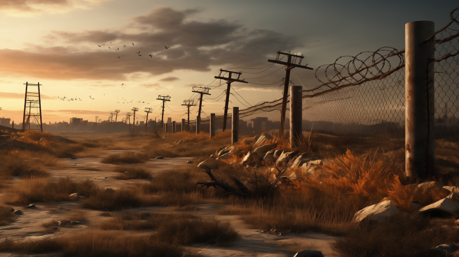
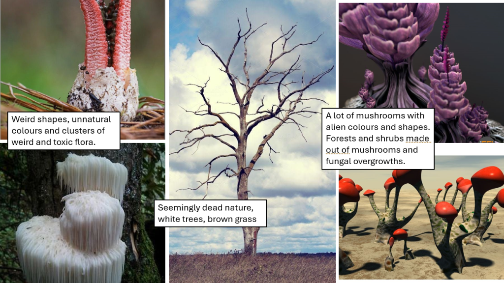
The setting of the game – The Otherwolrd – is a world devoid of greenery and life as we know it. Therefore, none of the game assets should include any green – to portray the final death of nature of our world.
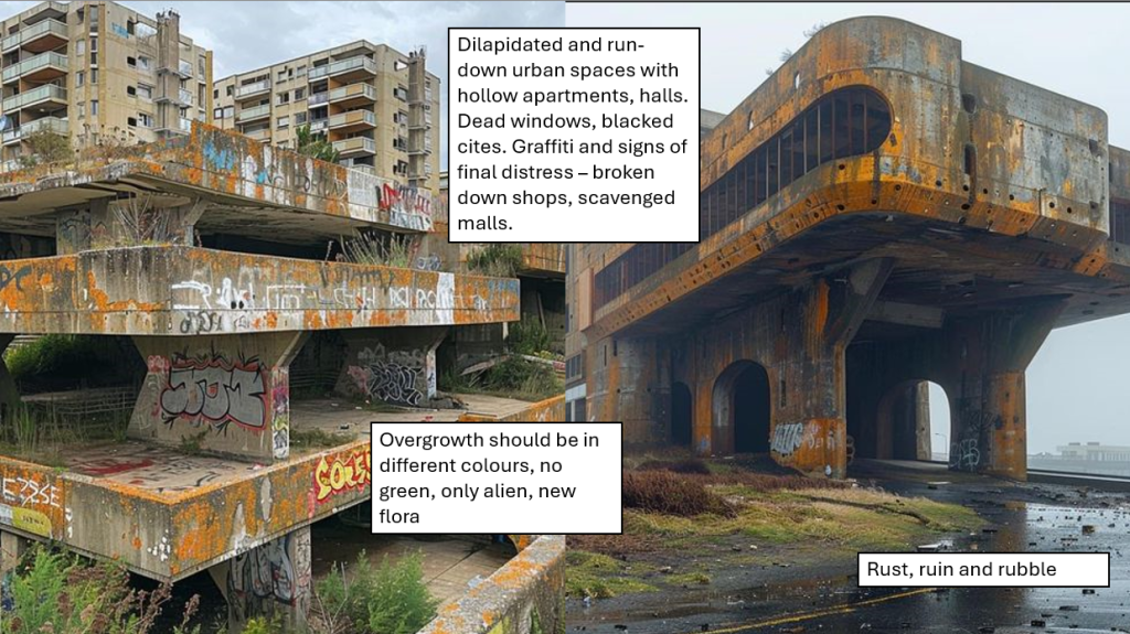
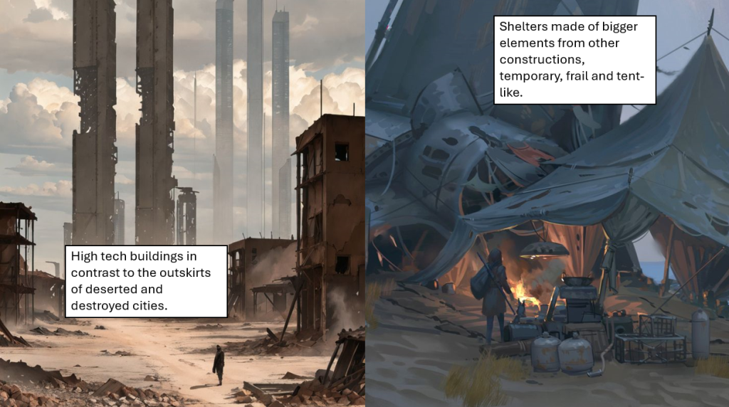
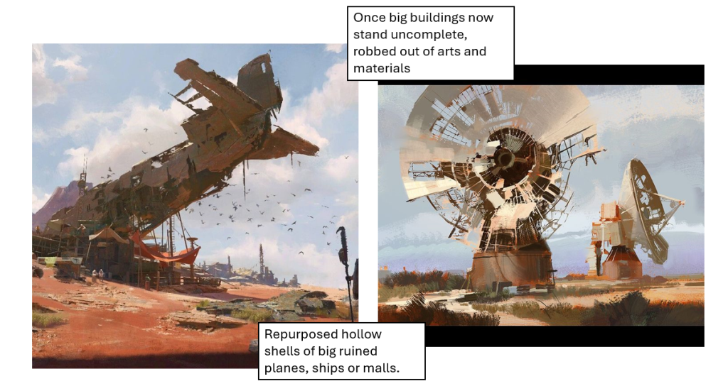
The spaces should be mostly empty, with unrecognisible, wicked nature that for our eyes seems dead. The world is vast and open, with danger lurking in the shadows. Monuments of the old world stand tall, towering over desolations. The once-great cities are husks of their former self. The spaces inside them, designed to be crowded and loud are empty and echoing the slightest whisper. Modern architecture – the elements of human tents, camps ect. should have some sort of patchwork character to them. Pieces of different elements that we can barely recognise to be from something different.
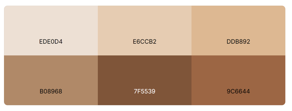
Gradient of browns for the background:
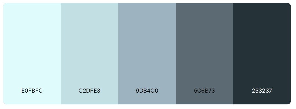
Palette of cold colours for distant mountains, sky and bare ground in a colder climate:
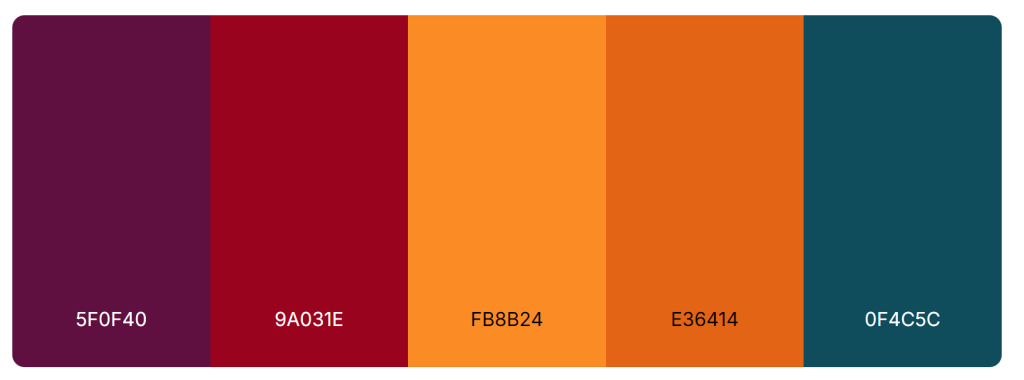
Pallete for deserts and desolation with crimson red and purple for alien, unknown new flora, as well as dark blue hue for accents:
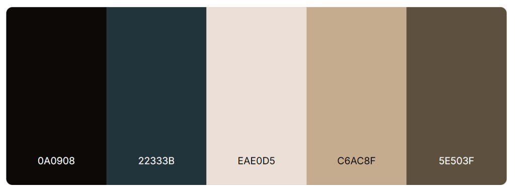
Main clothes colour palette – for cloth and other materials, sythetic (blueish) and organic (dusty, brownish)
The colour palette used for the enviroemnt should consist mostly of yellows, oranges and dysty colours. The shading should be very accentuated. A bluring effect should be used to obscure horizon. White and black shoud act as contrasts, the natural colours of sky (white) and desolate ground (black).
The world of the game will be portrayed through pictures ilustrating the events. They should be in a postcard format – piece of a greater whole serving as a representation of the situation or a place. Imagine as if they were photos or images that would follow the urgent message to the leader. They should reflect the story of the event
The illustrations for the events can have an element of the comic to them. They can portray the events narration in a sequence of illustrations (like series of photos documenting an event that took place), and can be used in this way also to portray the narration of the results of the decision.
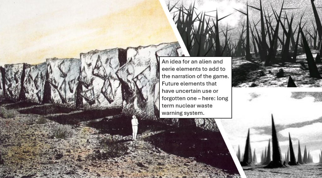
Sometimes, to portray the future aspect of the game, player can encounter buildings or constructions that they do not neccesairly know from our modern world. Concept architecture such as Long Term Nuclear Disposal Warnings can be used to create the athmosphere of dread or alienation from the world.
In here I have gathered the main sources of inspiration – post-apocaliptic worlds I have used in creating my project:
UI style
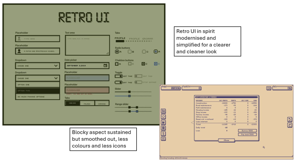
The management simulator character of the game makes the UI far more important and far more frequent for the player than the game world visuals. The UI will be visible at all times while the game world art is neccessary for the events. I use the term UI to describe the menus, buttons and screens that will be the game screen. For the UI that is the caretaker of the game itsel (main menu, options menu) i will use the term “menu”. The menu for the game should be designed in the same spirit as the UI elements but far less detailed and stylised. The UI is the characteristic part of the game, the menu should only mimic it while taking the step back in prominence.
The world is deteriorating and with it the high-technology. The one that is in use is old and only reliable because of its battery power sources. That makes the UI take on characteristic traits, such as big frames, rudimentary graphics interfaces and old bright colours of the old interfaces (rule “no green” applies here aswell).
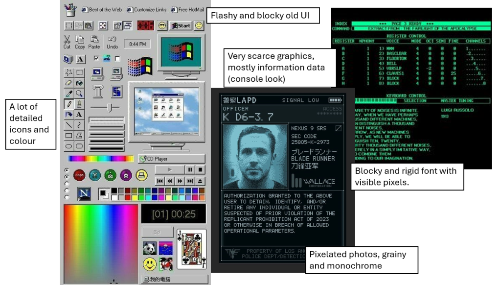
A simplistic and modern rendition of the retro UI is a perfect fit for the design of the menu part of the game.
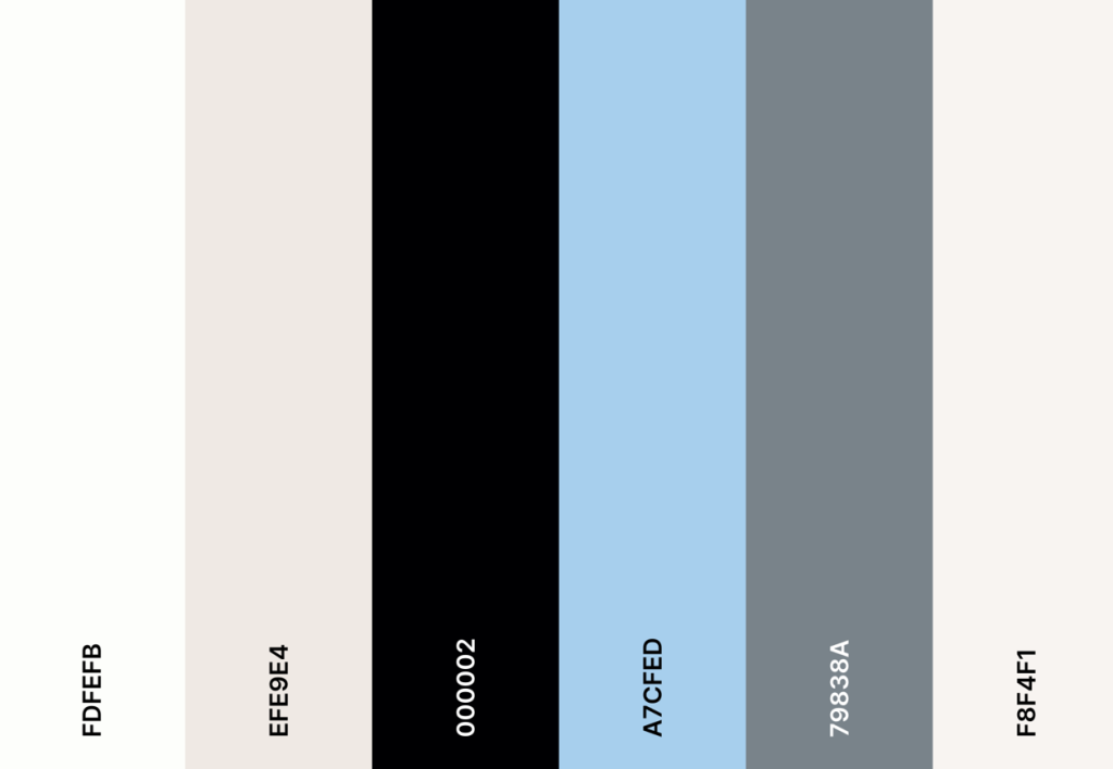
Palette picked from old windows UI:
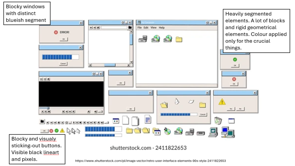
The point of the UI design is to make the player experience the work with multiple screens – small ones, on a workbench or a worktable. The background can use graph paper with some irrelevant notes or numbers. It can also use the blueprints. Both, their colours and their schematics are a great way to portray the work enviroment. The screens should remind us of the screens from satelit computers. The UI should be bland and blocky. The buttos should be visually jarring, the windows should be irritating in their visual style. The UI reinforces the visual message of dire circumstaces (technological decline) but at the same time should be clear and inntuitive in use – difficulty is a visual illusion. Photos of the family members or the survivors should be pixalated and only a suggestion of shapes – not if they appear in the events, then they should be visible, more realistic.
The main game screen. On the top, on the graph paper, there is a place for the resources to be listed in a note-like format. On the right, there is a sequence of the ID cards that should portray the family members. Hovering over them should promt a comment from them, saying their thoughts about the state of camp as is. The big white place is the place for the decision making screens to appear. The background is combined to evoke the haphazardness of the space and the decision making space.
The event screen is a pop up that will deliver the event dilemma for the player. One at the time. It is designed after the satelite computers – big frame, small screen.
The way of combining the event screen and the main screen. The resource graph paper is still visible, for keeping track of the resources while deciding, as well as the right part of the screen – with faily members. Hovering over them promts their opinion about the event presented on the screen.
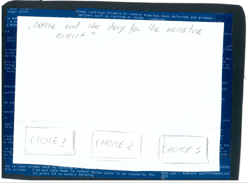
A sketch of the event screen with the event. The majority of the screen is for the narrative description and the photorealistic images portraying it (imagine sending someone a message with photos to portray it). The screen can have a scrolling bar inside of it – it should be visually treated as its own computer. The choices should be visible at all times (not scrollable).

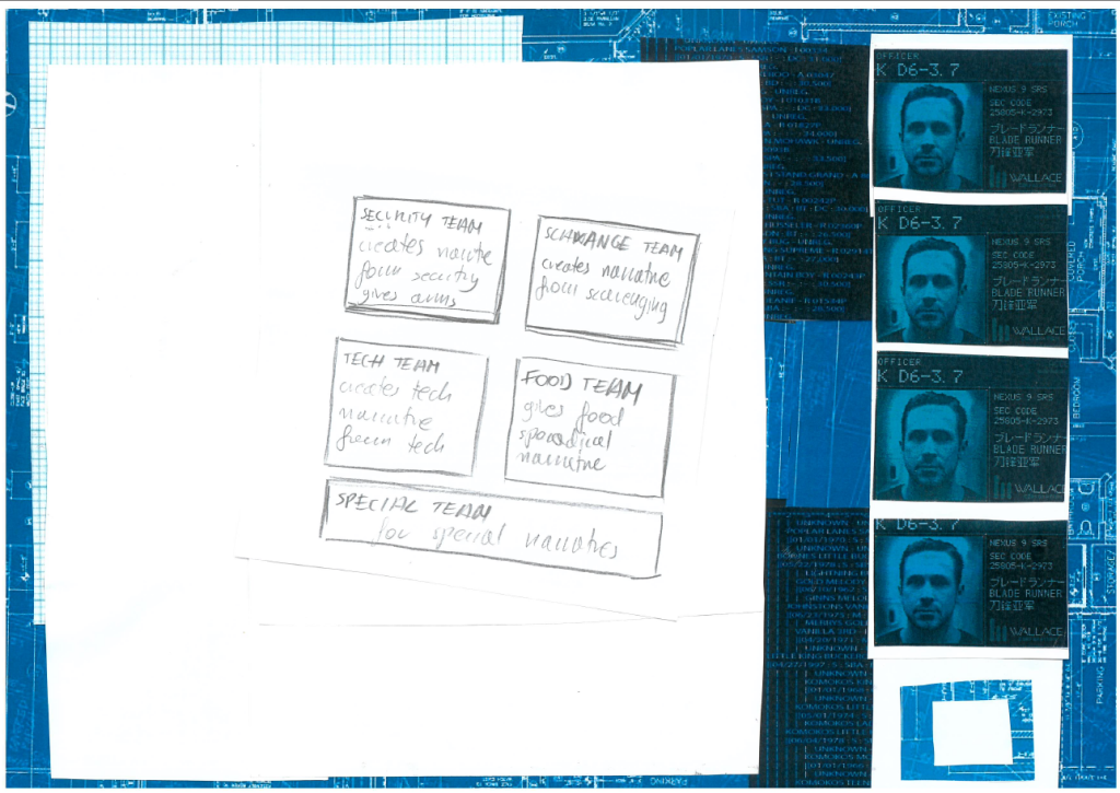
Delegation task – it consists of two main spaces – the survivors pool window, a place where the player can choose a survivor’s id card and see what they are good or bad at and the various teams windows, on the left – smaller windows the player can drag the id cards into.
The team view – this is the moment for the player to view their teams and decide wheter it is their final decision. This is the screen the player will see in between popping of the event screen, keeping track of the people sent to various tasks.
(the sketches are just conceptual draft scanned crookedly, they should be upright and scaled to fit the white space of the main screen)
UI dicussed in-dept – both the inspiration and the portrayal of function:
Short-list of possible assets:
– UI window frame
– UI button
– UI icons
– family ID cards, involving family pixelated pictures (right part of the screen)
– survivor ID cards ( the delegation of tasks screen)
– satelite computer frame (events screen)
– worktable background collage
references for the art can be found on my designated Pintrest board: