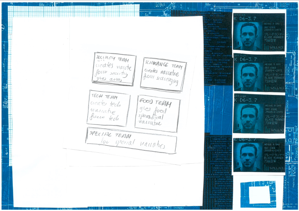
This week I have focused on making my UI concept more lifelike. I have started with a very rudimentary sketch that needed some colours and more in-depth explanantions.
In my game the UI is the most vital element. As a management game it should rely on the numbers, statuses and visual clarity of available assets.
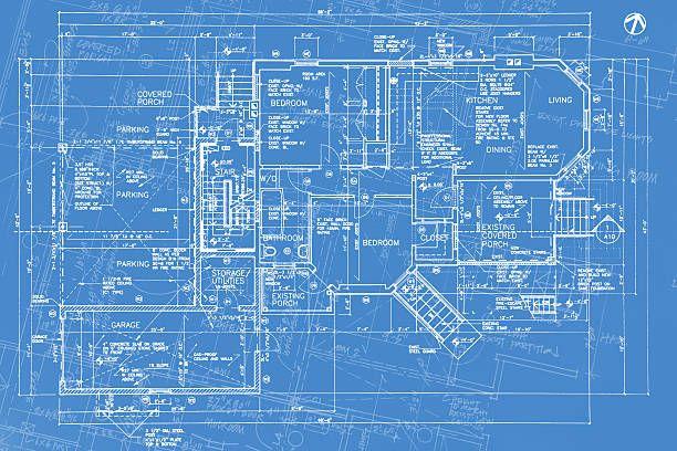
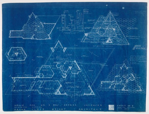
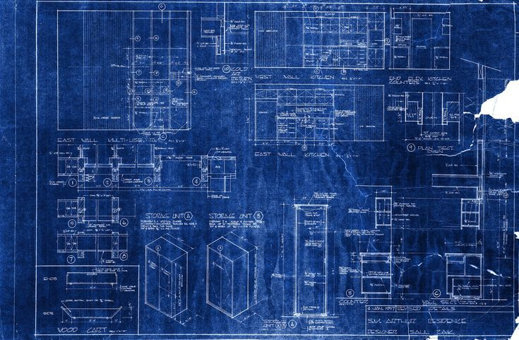
The blueprints serve as a memory of grand designs, the leftover pieces from the old launch pad designs that litter the workspace but can also be used as a new blueprints, to design the future for the survivors.
Blueprints make me think about planning, future, design work and that is what the player should be thinking about while making choices – everything will be a building block for the future of survival.
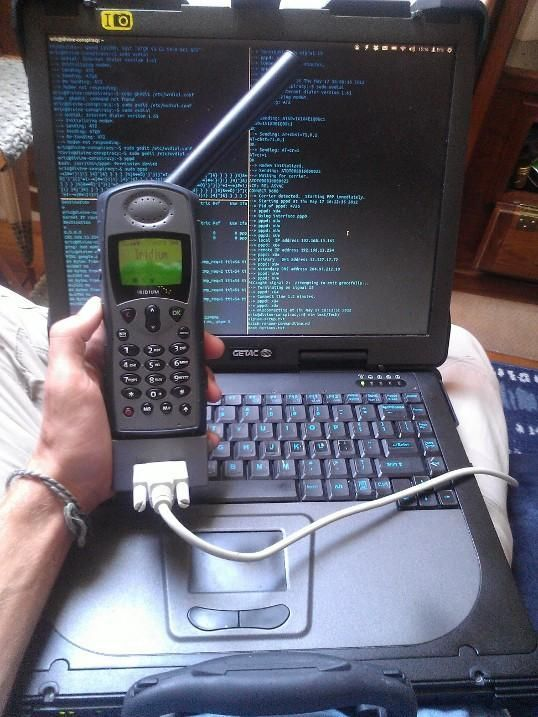
The satelite computers are the inspiration behind how I invision the UI and how I approach creating the experience. Limited space, big frames and nonexistant graphics is what I strive for in the design, maximum use of space and resources.
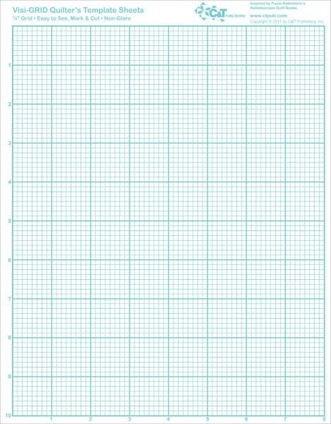
The graph paper symbolises the engineering process, innovation and economical side of the ideation proccess and it serves me as a place to store numerical data.
There is an important thing to keep in mind. While UI and text boxes can be scaled, they cannot be scaled indefinetly. As I am trying to make a text and narrative heavy game it cannot be contained on a small screen – such as phone or portable consoles. TI have found three key things that need to be considered when debating the UI and the screen:
– text based games as focused on text and pondering the text, game that needs a constant game space that allow for longer reading, understanding derives from calm and quiet enviroment;
– text based games as text focused interface – clear fast reading, bigger screen, legibility and the spacing allowing for faster looking through and finding the key information;
– text based games as rpgs that combine detailed graphics and detaild encounters (combination of information and graphical information too compex fo small screens), to make good decisions you need to make informed decisions – at one glance you should see the most important statuses of your game, resources, background information and you should easily find any other detailed information from that screen.
In my game I want to use two screen solutions – status screen and the decision screen. The first one is to survey the details of active storylines, the decisions we have made regarding the week and to se the resources and the family members. The other screen is strictly to make narrative decisions and it pops up, covering only a part of the status screen – family members and the resurces counters should still be visible. The decision screen gives us all the information about the choice, narrative and presumable outcomes and the unobscured elements of the status screen should give us the basic background information – family members’ opinions and the resources available.
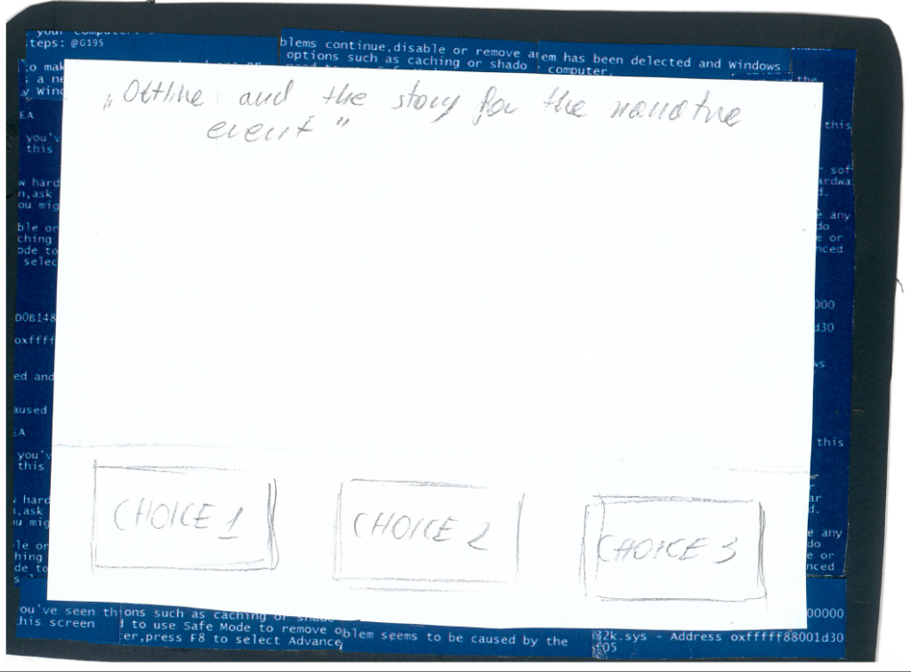
The choice screen:

The assignment screen: